
Website accessibility takes into account users’ needs in terms of how they might experience the website in various capacities. For instance, thinking about how a user would interact with a website using a screen reader exclusively or how a user with limited mobility might navigate a site would both be scenarios to consider when developing a website that is more accessible. It is unlikely that every website creator will have the option to test their website’s accessibility with real users. Luckily, there are several website accessibility guidelines that designers and developers can follow to make sure that they are creating a user experience that is not only delightful but usable for more people.
There is a lot of guidance out there on how to create a more accessible website. To get you started, we compiled a few high-level things to keep in mind when creating your website to make it more accessible.
Why is Accessibility Important?
Having a disability should not prevent a person from using a website and a website should not be a burden for anyone to use. Having an accessible website means that all users, particularly those with disabilities, will have an equitable experience and be able to easily complete tasks and access the information they need with minimal frustration. It is the responsibility of designers and developers alike to create these digital products with all potential users in mind.
Disabilities vs. Situational and Temporary Limitations
Making something accessible for people with disabilities often benefits people without disabilities in unexpected ways. For example in the physical world, take a look at curb cuts, which disability advocates argued for heavily in the years preceding the Americans with Disabilities Act (ADA) of 1990. It wasn’t until after the curb cuts were installed, that many more uses revealed themselves, including but not limited to, families with strollers, bicyclers and skateboarders. (Source)
While temporary or situational/environmental limitations are not the same as a disability, people are often unexpectedly faced with trying to navigate spaces, products, or tools in ways not typically designed for them. A situational or environmental limitation, like a parent trying to use their phone with one hand while holding their baby, or a temporary limitation, like someone being unable to speak because of laryngitis, may not be as essential as recognizing the lived experiences that people with disabilities face on a daily basis. However, recognizing these diverse experiences could help to further the understanding of why having accessible websites, products, and apps should be an essential part of design strategy and not an afterthought.
Designing for accessibility is not designing for a niche user group; it’s designing with a variety of potential users in mind, even those you might not have expected.
The Basics of Web Accessibility
Accessibility guidelines: WCAG 2.1 Compliance
Industry-standard web accessibility guidelines are abbreviated to WCAG (web content accessibility guidelines). These guidelines are updated whenever new information is made available, and the most up-to-date guidance is then posted on the W3C (World Wide Web Consortium) website. W3C is an international community that “develops open standards to ensure the long-term growth of the Web” and focuses on making the internet and other digital products as accessible as possible for everyone.
The latest version of their guidelines is WCAG 2.1, which just includes additions to WCAG 2.0. There are three levels of accessibility compliance (A, AA, and AAA). Each level is more accessible than the previous with level A being the minimum requirements necessary (but not fully accessible) and AAA being the most optimized level of accessibility.
For instance, in order to ensure that users are able to navigate and find the content they are looking for on a website, one of the requirements (among others) that pages must have are titles that describe the content of the page to meet level A standards. Moving into level AA standards, one of the requirements is that pages must include headings and labels to describe the topic or purpose. Moving further into level AAA standards, one of the requirements is that pages must use section headings in order to organize the content of the page.
There are a lot of guidelines to meet all WCAG standards, but, with more practice, it will become second nature.
8 Web Accessibility Tips
There are a number of requirements needed to meet accessibility guidelines, but here are a few tips to keep in mind to make sure that you are meeting basic requirements for the different elements on your website.
1. Header Structure
One of the most important pieces of web accessibility is orienting users to the website and the content they’re interacting with. This is where incorporating a header structure is essential.
While it’s easy enough to visually make headings on a website by changing the font sizes, if those headers are not labeled as such, the structure of the website is not going to be recognized by screen readers in particular. Not having a decided header structure can also put you at risk of having inconsistencies on various pages of your website. To avoid running into these problems, set up a structure for your website so that there is a clear hierarchy of headers. This would look like having a dedicated H1, H2, H3, and so on that’s not only reflected visually but also embedded in the website’s code. Not only will this be helpful for users using screen readers, but it also ensures consistency throughout a website, giving everyone a better experience.
As a bonus, having a dedicated header structure allows search engines to better scan your website, leading to better SEO.
- Text hierarchy is clearly established (e.g. H1, H2, etc)
2. Links
Users have well-established expectations for what they see and interact within digital spaces, and links are one of the things that have worked the same way for years. For instance, when reading a body of text, it’s safe to assume the linked text will be underlined and potentially a different color than the rest. Because this is a user’s expectation, developers and designers should embrace it rather than depart from it for style reasons. The visual indicator of underlined text gives the user a cue to decide whether or not to interact with the element and ensures that they are not missing out on information.
Additionally, the linked text is more accessible when it’s descriptive. Phrases like “Learn More” and “Click Here” do not give users any clear indication of what they are going to encounter through the link. However, using linked text such as “view our UX resources” gives users a better hint of what to expect when clicking the link.
- Linked in-line text is clearly identifiable from body text
- All hyperlinks are clearly phrased to indicate to users where the link leads
3. Images
When it comes to including images on your website, one important thing to keep in mind is how images are labeled. Alt text (also called alt tags and alt descriptions) are used to describe images within a web page’s code so users can understand what’s in an image without having to actually see it. (If you’ve ever been on a website and an image doesn’t load but there’s text in its place, that’s the alt text.) Alt text is especially useful for users interacting with a website through a screen reader because they are able to get a sense of what the images convey too. Just remember to be mindful of the amount of detail going into these alt text descriptions. If an image is mainly for decorative use, a short and simple description is appropriate rather than a slightly longer description that might be used for a more essential image for a page.
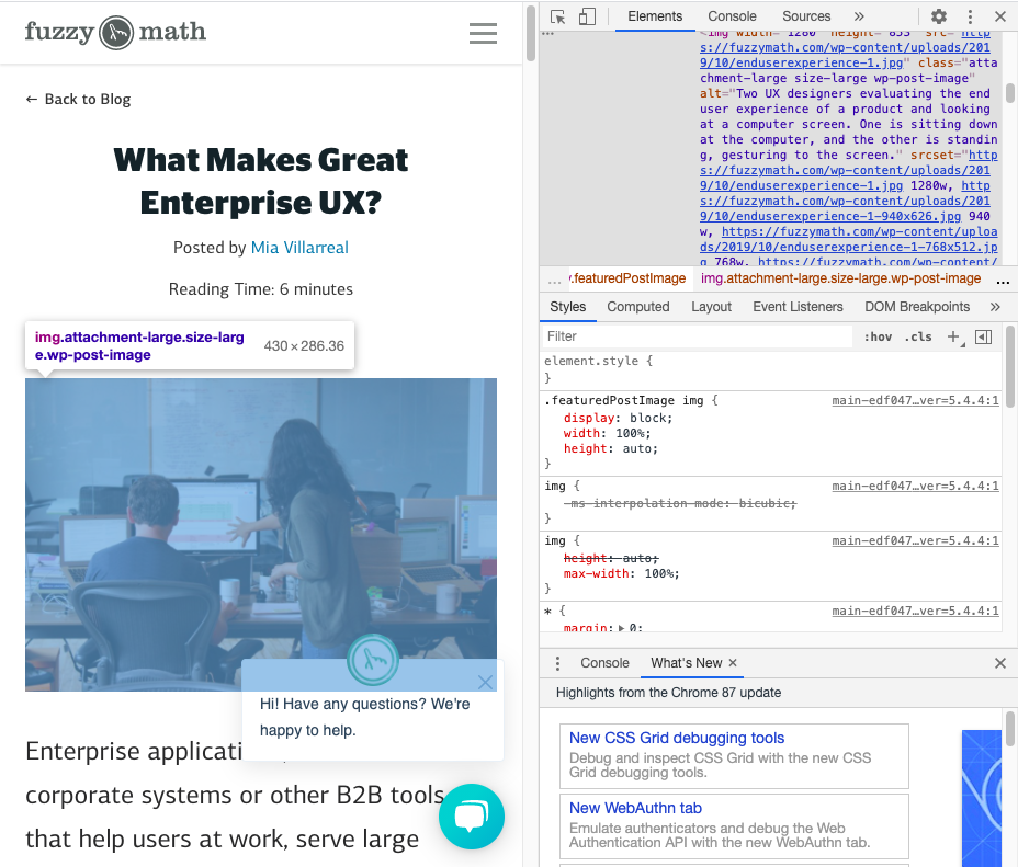
- All images are accompanied by alt text
- Alt text is appropriately descriptive for image types
Read more: Improve Accessibility for Users Who are Visually Impaired with These 9 Tips
4. Audio & Video
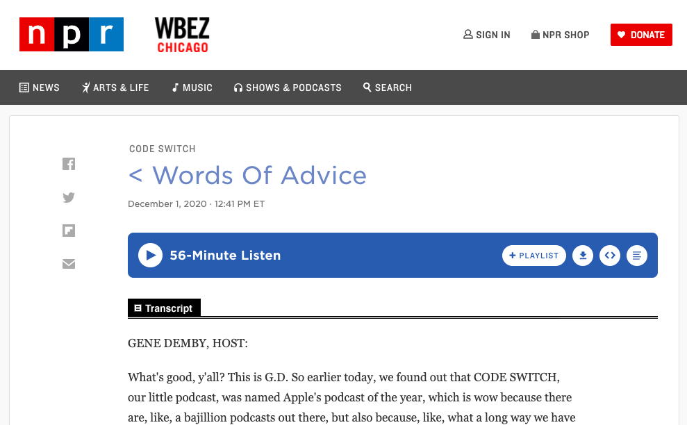
W3C has lots of guidance on how to make audio and video more accessible. The important thing to keep in mind is that there should always be a text option available. Including captions or having a transcript to accompany all audio and video files is essential to accessibility. Users who are Deaf, hard of hearing, or even just in a setting where listening to audio is not an option (e.g. on a noisy subway car without headphones) will be thankful that they are able to consume your content with ease.
Make creating closed captions a regular step in your video creation process. Even better, embed captions into your videos so that no matter what platform the video ends up on, users will be able to read them without having to toggle captions on or off. It’s also a good idea to include transcripts to accompany audio files. While these do take time to develop, making transcripts available to your users provides them with another avenue for consuming your content in the way that works best for them. On NPR’s website, for example, a number of their shows are accompanied by transcripts for users to read when listening is not an option.
- All videos include captions
- A transcript of audio content is easily available for users
5. Colors
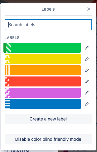
Colors can be used to communicate a number of things to users in the digital world. For instance, red is typically associated with danger or an error while green is associated with something good or it means that a task has been completed. But what if a user has a color vision deficiency? How can those same messages be effectively communicated beyond color? Including other pieces of communication in these cases, like clear text and icons, can ensure that users understand your message without it relying solely on color. You should also consider adding in patterns or textures to indicate visual differences like Trello has implemented into their platform.
In a similar vein, ensuring that strong color contrast between elements and backgrounds throughout your site is a key component to accessibility. Strong contrast allows users with vision deficiencies to better see what’s on-screen. There are a number of tools out there to determine if color combinations are WCAG compliant (like this online contrast checker) by giving contrast ratios that are less obvious to people without color vision deficiencies. It’s always a good rule of thumb to check color combinations before committing to them to ensure users are able to effectively interact with your website.
- Colors alone are not being used to communicate important messages to users
- Patterns or textures are used to indicate visual differences on charts, graphs, etc.
- Elements have a strong color contrast compliant with WCAG. Use a contrast checker if you’re unsure!
Read more: Accessibility and Me (and You)
6. Typography
An essential element to consider when getting started on creating or updating a website’s designs is typography. Website typography should be able to give users the information they need in a legible, easy-to-understand manner. Legibility is especially important for users with low vision who still see the screen but might not see all of the details as clearly on a webpage.
Choosing accessible typeface(s) includes paying special attention to whether or not characters look distinguishable from one another and whether the font has adequate spacing between letters. Some additional typography best practices for accessible design include aligning text to the left (for languages read from left to right), ensuring text can be able to be easily resized, and making sure line length is around 66 characters per line (with exceptions for text with more spaces).
To help combat inaccessible typography some organizations have developed more accessible fonts, like this typeface from the Braille Institute, making it easier for designers to make their websites accessible. It’s also recommended that designers opt for larger font sizes in order to make text easier to read and characters easier to distinguish.
- Typefaces are legible and characters have distinct features from one another
- Large bodies of text are left-aligned
- Text can be easily resized and the webpage still functions as expected
- Line lengths are close to 66 characters per line
7. Navigation & Site Structure
There is a lot of information out there about how to properly develop a website so that it is accessible for users navigating using a keyboard rather than a mouse. However, designers also need to be mindful of these users during the design phase. This is particularly important when designing a website’s navigation. While someone using a mouse typically scans a website with their eyes then clicks a navigation item, someone using a keyboard to navigate typically utilizes the “tab” key to navigate to get a sense of what’s on the page before engaging with it. If a website’s navigation is lengthy, that keyboard user could easily get frustrated with the vast number of options to get through in order to find the information they are looking to access. To avoid this, make sure your site navigation only contains the necessary items that get users where they want to go. Also, make sure the website’s code follows navigation best practices to get people using a keyboard around the website easily without having to go through unnecessary items.
- Navigation is succinct and includes only necessary high-level categories
- Website’s code follows navigation best practices
8. Forms
Forms seem like a straightforward design pattern that doesn’t need much guidance. However, there has been a recent emergence of forms taking on a minimalist approach where there are no clearly defined boundaries or labels that remain in place once a user starts typing. This makes forms that are seemingly simple, unnecessarily difficult for many users to interact with. Instead of removing key boundaries and borders to simplify a form’s design, just remember to keep the basic elements in place. They work for a reason!
- Form fields have clearly defined boundaries and borders
- Form fields have clear labels
Free Accessibility Evaluation Tools
There are a number of free resources out there to evaluate the accessibility of your website or application. Here are just a few:
WAVE
WAVE evaluates the accessibility of a webpage by looking at key accessibility traits in the webpage’s code. Simply enter the URL of any currently published website and WAVE will highlight areas that are and are not accessible making it easier for you to go through your website’s code to make improvements.
Web Accessibility
Similar to WAVE, Web Accessibility evaluates the code of a webpage and indicates where accessibility improvements can be made. This tool also provides an overall WC3 compliance score out of 100, so you can see how compliant your website is.
Sort Site
Sort Site is another evaluation tool that uses a website’s URL to evaluate its accessibility. However, this site scans through an entire website and compiles a report to note where issues lie. It breaks down the overall quality of the site but also highlights any errors (such as broken links), accessibility problems, usability problems, and more.
Downloadable Accessibility Checklist
Web Accessibility Checklist
Get the ChecklistIt’s the role of designers and developers alike to ensure that their tools are built to suit all users.
Check all the boxes on basic web accessibility with our Accessibility Checklist.
Understanding how your product or website works for people with disabilities is a key part of our expert process. Get in touch to learn about our web accessibility services.
Additional Reading
- 7 Things Every Designer Needs to Know about Accessibility
- Email Accessibility Best Practices
- Understanding WCAG 2.1
- Simple accessibility tools for UX designers