Like a lot of millennials, I grew up when console video games were just coming into their own, which meant I spent a lot of time playing them – especially the Pokemon games on GameBoy Color and Advance. My brother and I spent an absurd number of hours trying to build the best teams and, of course, to Catch ‘Em All. For me, though, many hours were also lost. Because I never noticed when the power indicator light switched from green to red, I often wouldn’t get the chance to save my progress before the batteries ran out. I never knew how it was so obvious to my brother and my friends when that light changed colors.
Sometime in high school, I figured out that I’m color-deficient.
Specifically, I have mild deuteranopia, or red-green color blindness. The things that come up most frequently are that I struggle differentiating between similar-saturation reds and greens, and I can’t see purples. They always look either blue or pink to me. Most of the time this isn’t an issue anymore since I haven’t played GameBoy in at least a couple years, but once in a while I’m reminded that my view of the world is quite literally different than the average person’s.
Colors and My Life Now
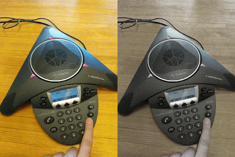
At Fuzzy Math, each of our conference rooms is outfitted with a conference phone, and once in a while we have to mute our microphone. The conference phone has indicator lights that are green when you can speak and red when the mic is muted; I can’t tell you how many times I’ve talked at a muted phone because I can’t tell what color that light is.
In any of my HCI classes that ask for visual design, almost any time I try to pick a blue, I end up with some kind of purple instead.

Sometimes this is frustrating, but on the bright side, there’s a reasonably well-founded theory that Van Gogh was color deficient as well, and there are some people who think that other color deficient people can appreciate his art more fully than people with normal color vision.
But I digress.
Designing for Disabilities
I’m fully aware that my colorblindness is mild and affects my life in relatively small ways; there are plenty of people whose disabilities are more noticeable and are often left out of experiences, thanks to designs that only considered the “average” non-disabled person. Colors on screens aren’t the half of it – people with Parkinson’s disease often struggle to use touch screens, blind people with screen readers struggle to parse poorly-designed websites. The list goes on.
But what does all of this information about disabilities mean for you, the designer? Well, a few things:
- Accessible design isn’t just for digital products. It’s not just about indicator lights or colorblindness either – there are tons of ways that disabilities can hinder large swaths of the population while using a product that wasn’t designed with them in mind.
- With respect to the digital space and colors, pay attention to your saturation levels. You might be able to tell apart those two colors in your design, but someone who’s colorblind might have to use other cues to know what’s going on. If you want to check your designs early, there are tools out there to help you with that – here at Fuzzy Math, we often use the Stark plugin for Sketch.
- If you’re having trouble empathizing with a disability, think of a situation where you might have similar types of trouble. Color deficiency isn’t too far off from trying to view something on a bad projector or old computer monitor; you become hard of hearing when you try to talk to friends at a loud club or a concert. These situations embody what’s known as Situational Disability, and they happen more often than you might think. Microsoft Design has an inclusive toolkit with more examples (jump to page 42 of their Manual for those examples, but the toolkit in general is a great resource).
- For truly accessible design, test your products with people who have a disability. Find an online forum, a slack group, or an in-person group where people with disabilities gather – I’d be willing to bet at least a couple of them would be thrilled that you’re trying to design with them in mind.
Maybe accessible design isn’t a huge priority for you right now, but almost 10% of the population has some kind of color deficiency, and almost 20% of the US population has some other disability. Disability is a huge market, not just an edge case.
If that doesn’t convince you how important accessible design is, there are tons of examples of times that designing for disability has had benefits for everyone – text messaging was designed for deaf people, and those potato peeler handles that are actually nice to hold were intended for people with arthritis. Accessible design forces us as designers to come up with more creative and often better solutions than sticking with industry norms ever would.
Downloadable Accessibility Checklist
Web Accessibility Checklist
Get the ChecklistIt’s the role of designers and developers alike to ensure that their tools are built to suit all users.
Check all the boxes on basic web accessibility with our Accessibility Checklist.