Web Accessibility Checklist
Web Accessibility Checklist
Designing for accessibility is not designing for a niche user group; it’s designing with a variety of potential users in mind, even those you might not have expected. It’s the role of designers and developers alike to ensure that their tools are built to suit all users.
Download the printable checklist.
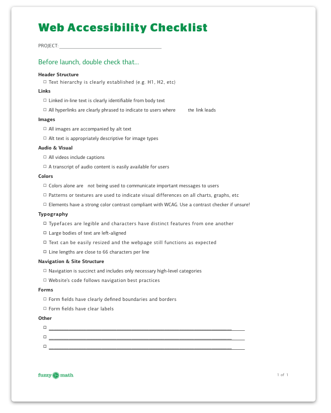
Before launch, double check that…
Header Structure
- Text hierarchy is clearly established (e.g. H1, H2, etc)
Links
- Linked in-line text is clearly identifiable from body text
- All hyperlinks are clearly phrased to indicate to users where the link leads
Images
- All images are accompanied by alt text
- Alt text is appropriately descriptive for image types
Audio & Video
- All videos include captions
- A transcript of audio content is easily available for users
Colors
- Colors alone are not being used to communicate important messages to users
- Patterns or textures are used to indicate visual differences on charts, graphs, etc.
- Elements have a strong color contrast compliant with WCAG. Use a contrast checker if you’re unsure!
Typography
- Typefaces are legible and characters have distinct features from one another
- Large bodies of text are left-aligned
- Text can be easily resized and the webpage still functions as expected
- Line lengths are close to 66 characters per line
Navigation & Site Structure
- Navigation is succinct and includes only necessary high-level categories
- Website’s code follows navigation best practices
Forms
- Form fields have clearly defined boundaries and borders
- Form fields have clear labels