
What is web accessibility and web design for blind users?
Plainly put, web accessibility enables people with disabilities to perceive, understand, navigate, interact with, and contribute to the web. Much like how years ago, the Americans with Disabilities Act stepped up for those who cannot walk and required wheelchair access to all buildings constructed after 1991, user experience (UX) designers should ensure equal accessibility for all users by designing web-based experiences that can be used, understood, and accessed by people with a diverse range of visual, auditory, cognitive, and physical abilities.
Because web experiences are inherently visual, the web is fraught with sites, tools, and apps that are practically unusable for people with visual impairments. For example, it’s not uncommon to see websites that use combinations of background and foreground colors that make pages virtually unreadable for colorblind users. Despite all this, people with visual impairments use the web every day to surf, read and write emails, and to do anything else anyone can conceivably do on the internet.
So what might happen when Joe Shmoe, who is colorblind, cannot read the text on a site because it blends in with the background? Easy: He must move on. You see, inaccessibility equals exclusion. Not only does Mr. Shmoe miss out on the information this site offered, but the site owners lost a potential customer, subscriber, and/or an opportunity to share their message. Users with visual impairments should not have to adapt their behavior in order to effectively accomplish their goals. Rather, good web design should accommodate the needs of all users, including people with visual impairments.
“The power of the web is in its universality. Access by everyone regardless of disability is an essential aspect.”
Tim Berners-Lee, W3C director and inventor of the World Wide Web
The Problem
According to Prevent Blindness America, 53.2 million Americans aged 45 or older have some form of visual impairment, from mild to severe, and about 18 percent of those affected are “legally blind.” Visual impairments span a range of issues and disabilities, the most prominent of which are color blindness, low vision, and blindness.
Color blindness includes difficulty distinguishing between colors such as between red and green, or between yellow and blue, and sometimes inability to perceive any color whatsoever. The most common forms of color blindness are deuteranopia, which is a reduced sensitivity to green light, and protanopia, which is a reduced sensitivity to red light. Globally, color blindness affects 8 percent of the male population & .5 percent of the female population, so if you’re a Web designer, think about it this way: If 100 people visit your site, statistics would have it that approximately 10 of them are not able to see colors at a normal efficiency.
It is estimated that about 285 million people are visually impaired worldwide: 39 million are blind and 246 million have low vision. Individuals diagnosed with low vision are able to see colors, but struggle with having poor acuity (vision that is not sharp), tunnel vision (seeing only the middle of the visual field), central field loss (seeing only the edges of the visual field), or clouded vision. Those who have vision impairment that is beyond diagnosed low vision are considered blind. Blindness, by definition, is substantial, uncorrectable loss of vision in both eyes. Perhaps you’ve heard the term “Legally Blind.” This does not always insinuate total darkness, but the vision impairment is significant enough that one cannot function without personal or technological assistance due to the extreme loss of visible acuity.
As UX designers, we understand that although the statistical proportion of users who have a visual impairment is small compared to those who do not, we still must account for them during the design phase. It would not be fair, nor would it be right, to fail to incorporate designs that offer assistance and ease of use for those who have a visual impairment. Therefore, we provide the following nine tips to improve usability for these people based on Web Content Accessibility Guidelines (WCAG) and Americans with Disabilities Act (ADA) guidelines. We distilled the aforementioned guidelines into a focused set of tips and tricks that other designers can (and should!) use in their design process. While the following tips aren’t exhaustive, they do cover the common issues people with visual impairments experience when using the Web.
9 Tips on How to Make a Website Accessible for the Blind and Visually Impaired
1. Provide sufficient contrast using colors and textures
Test colors to make sure they have the proper contrast ratio for readability, using tools such as the Stark plugin for Sketch. Tools such as this one test combinations of text color on background color, and also take text size into consideration. For example, WCAG 2.0 level AA requires a contrast ratio of 4.5:1 for normal text and 3:1 for large text (i.e., 14 point and bold or larger, or 18 point or larger). Color contrast checkers typically check for compliance with this standard, so it might be a good idea to bookmark the standards and guidelines WCAG has laid out.
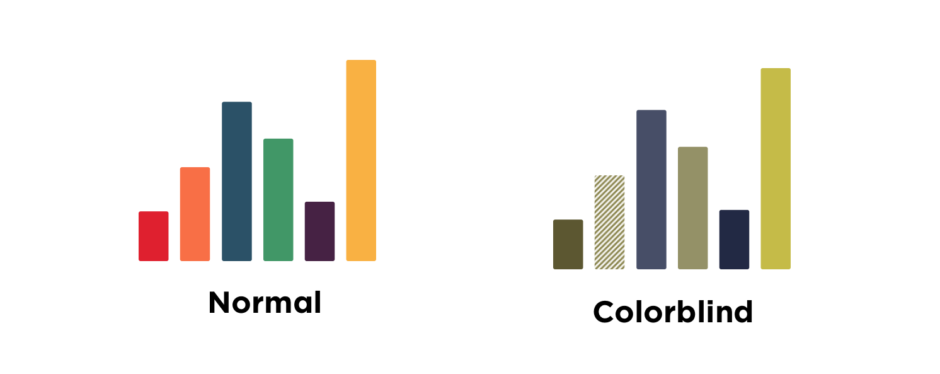
Furthermore, when using graphs, consider adding textures or patterns. These provide an extra layer of scannability and differentiation between data points when the ranges of value, hue, and saturation start to break down.
2. Limit and prioritize color in the interface
The more colors you introduce to a design interface, the more difficult it will likely be for even a non-vision-impaired user to quickly identify primary actions and links. For an individual with color blindness, this only becomes more difficult as more colors are introduced.
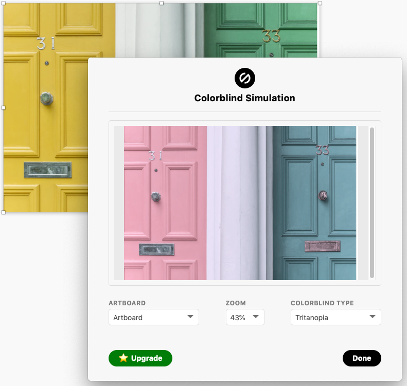
Fun fact! Adobe® Photoshop® CC software offers support for simulating color blindness. According to Adobe, “Users can proof images with Color Universal Design (CUD) to ensure that graphical information is conveyed accurately to people with various types of color vision impairment, including people with color blindness.”
Additionally, Color Safe is another useful tool that creates color palettes for sites or applications.
3. Allow manual font size adjustment
Nowadays, there are a number of ways to better accessibility for the visually impaired, including magnifying software and providing the ability to adjust text size in browser settings. However, many people with low vision, especially older people who may be experiencing age-related vision loss, do not use magnifying software, and they may not be familiar with their browser’s text size adjustment options.

By providing users a clear option, whether it’s a slider, a drop-down, a button — anything — to alter the font size, brands and businesses (especially those with content-heavy websites) become friendlier to visually impaired users.
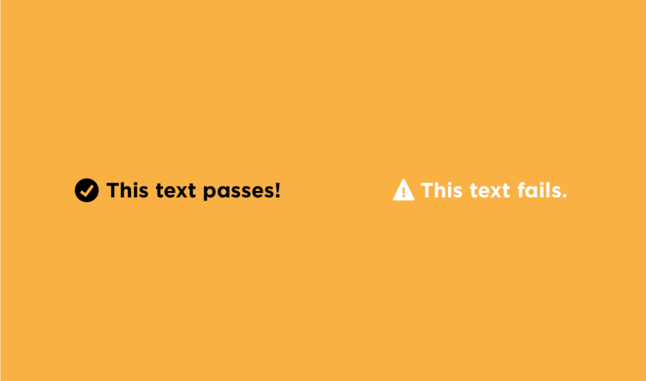
4. Don’t rely on color alone to communicate important information
When it comes to alerts, warnings, and actionable page elements such as textual links and buttons, clarify that these are meaningful to the user by incorporating more than a simple color change. Almost universally, people understand that underlined blue text is a link. On the flip side, there are still sites out there that underline blue text but do not link to anything. Colorblind users should be able to trust that when the color treatment is taken away, the underline will let them know that it is a link.
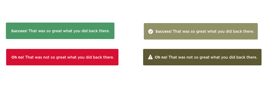
Moreover, users will benefit from the use of icons and relevant labels accompanying alerts and actionable page elements. Each page element should have more than one visual cue. Images, links, buttons, and other similar elements can be enhanced with an icon, shape, positioning, or text. Much like the underlining of links, users will recognize primary action cues, such as size, placement, boldness, and icons.
5. Grant keyboard accessibility
Keyboard shortcuts can make navigation for visually impaired users far easier. A mouse is not useful for navigating because it requires hand-eye coordination. This is especially true for users who are blind and use screen readers to surf the Web.
For people with low vision, keyboard commands make it possible to navigate a site without having to strenuously focus and follow a mouse cursor across the screen.
6. Use explicit and descriptive labels for links and buttons
Avoid using vague link labels such as “click here.” People who use screen-readers often use a keyboard shortcut to list all the links on a page to navigate more efficiently. Since this list of links has no surrounding text, it creates a contextless state. As such, it’s imperative to create descriptive and explicit link labels that make sense out-of-context. This is a best-practice that benefits all users. Descriptive link labels can also promote scannability for sighted users, and as a bonus, this helps boost search engine optimization (SEO) for the site.
A side-note for understanding screen-reader accessibility:

The most common way for users who are blind to surf the Web is with a browser and screen reader (also known as text-to-speech software). Some of the most commonly used screen readers are Microsoft Narrator for Windows users and VoiceOver for Mac users. Understanding how text-to-speech software helps the visually impaired “read” websites is essential for anyone designing for such users. Here’s the low-down: A screen reader translates Web pages into plain text. It then scans through the entire page (in its plain text format) and reads it aloud line by line, one element at a time, progressing down the page in a linear fashion.
This linear progression through page content creates a number of challenges for users who are blind, particularly related to ease of content consumption, comprehension, and scanning. For example, when arriving at a new page, sighted users can quickly scan the page and understand, at-a-glance, the purpose and content that lives there. On the other hand, users who are blind must skim through the page linearly, one page element at a time, and must listen for the content they sought out in the first place. This can be highly time-consuming, and requires ample concentration, or else a user might miss what he or she visited that site to find in the first place. For more information on how to design for screen reader compatibility, visit webaim.org, and pay close attention to our following tips.
The next few tips are related to screen reader compatibility:
7. Provide alt text or descriptions for non-text content
When a screen-reader reads an image or graphic, it will say “graphic” or “image” and then read the image’s alternative (“alt”) text. If an image doesn’t have alt text, the screen-reader will skip it, so for this reason, it is best to provide alt text for images and graphics. Aim to keep descriptions for video and audio succinct and to the point. Remember, screen readers go line-by-line, so get your point across through your text and alt text in as few words as possible.
8. Use headings to organize page content
This is a best practice that benefits all users. There are a number of ways in which screen readers that support scannability allow users to skim pages to get an overall impression of a page’s content. One common way to skim a page with a screen reader is to jump from heading to heading. While skimming with a screen reader, users can hear an overview of the page’s key information, then backtrack to read the parts they are most interested in. Unfortunately, too many websites lack headings on pages. Without headings, this method of skimming through content is virtually impossible. Bearing this in mind, it is a crucial rule that designers organize content with headings that, to the extent possible, represent an accurate overview of the content on the page.
9. Use descriptive titles for every page
This is another best practice that benefits all users. Along with having headings outlining the content within Web pages, sites should always contain titles that describe the topic or purpose of the page. The reason being that screen readers announce the page title (the “title” element in the HTML markup) when first loading a Web page. Users who are visually impaired and need to use a screen reader profit by this, in that they get to take back the valuable minutes they would have spent scanning a page to determine what kind of content it possesses.
Understanding how your product or website works for blind and visually impaired users is a key part of our expert process. Get in touch to learn about our web accessibility services.
Takeaways When Designing Websites for the Blind or Visually Impaired
There is much that remains to be done still in order to make Web experiences more accessible for people with visual disabilities. Attainable and practicable Web experiences not only minimize accessibility barriers and make the internet easier to use, but can also empower those with visual impairments through the provision of freedom and independence online (especially for people who are blind).
Consider integrating the nine aforementioned tips into your workflow; take these tips back to your design team to facilitate conversations about the importance of designing for all users across a wide range of abilities. Utilize free, Web-based accessibility evaluation tools such as WAVE or EvalAccess 2.0 to assess the content on your website and ensure compliance with WCAG. Make accessibility a priority in the design community, and you will open up a world of possibilities for a whole new audience of Web users, as well as a plethora of opportunities for innovation within the UX domain.
Downloadable Accessibility Checklist
Web Accessibility Checklist
Get the ChecklistIt’s the role of designers and developers alike to ensure that their tools are built to suit all users.
Check all the boxes on basic web accessibility with our Accessibility Checklist.