After receiving a request to look at the flip side of Footer Best Practices, we wanted to bring forward a guide on Header Best Practices. Specifically diving into the do’s and don’ts of headers within web-based tools and applications, a stark difference from the marketing sites we normally see.
What is the importance of a header?
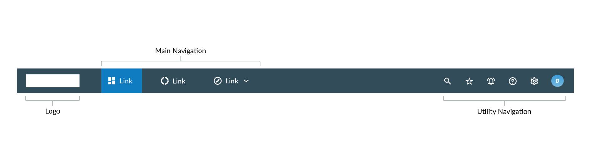
Headers, at their core, serve to ground users in the application. They provide context for where they are in the application and key actions that can be taken across all pages within the ecosystem. Headers are the most fundamental part of an application’s design. They are the beginning of site maps and allow users to access all of the functionality within the platform. The simplest headers contain items like:
- Logo – Indicates the brand behind the application, the “who” that is responsible for generating this platform.
- Main Navigation – These are the features that a user can navigate to within the application. These elements could exist within or outside of the header.
- Utility Navigation – Other features of the application that don’t quite fit under any of the main navigation functions. They are still important for users to access on a global level.
When designing a header, there are a few different design considerations that should be made. From our own decisions made collaborating with clients and through looking at other user friendly patterns, we have developed best a few overall header best practices:
- Use white space wisely
- Keep the header well organized
- Decide the best way to frame page content
- Utilize a fixed (or sticky) header for platforms where users will be scrolling down frequently
We dive a bit more into detail of each of these best practices below:
Use white space wisely
White space gives a chance for the design to breathe not only in page content but also in the header. There should be a space hierarchy so that users are able to see what the primary and secondary actions are. For example, items like navigation links should be equally spaced apart so that users are able to focus on them one-by-one. If the application is data heavy and search is encouraged to use, then having the search bar take up more space will drive users to this function.
Keep the header well organized
The goal of the header should be to help guide users to their next task at hand and should do it in a way that won’t cause confusion. With the elements described above (logo, main navigation, utility navigation), there are well defined best practices for their placement. Ensure that the placement of each of these elements is predictable so that users feel comfortable in the application.
Decide the best way to frame page content
Color is another important consideration when designing a header. There are a few questions that can be considered to decide the best course of action:
- Should the header standout and act as a frame for the page?
- How often are users moving to different items of the header?
- How data intensive is the application?
If the header helps to frame the page content, especially in more data intensive tools, opting for a darker background will help users to feel more grounded. Utilizing a darker color will also serve to differentiate the header from the rest of the page content.
Alternatively, utilize a lighter background header when the header does not need to standout from the rest of the page.

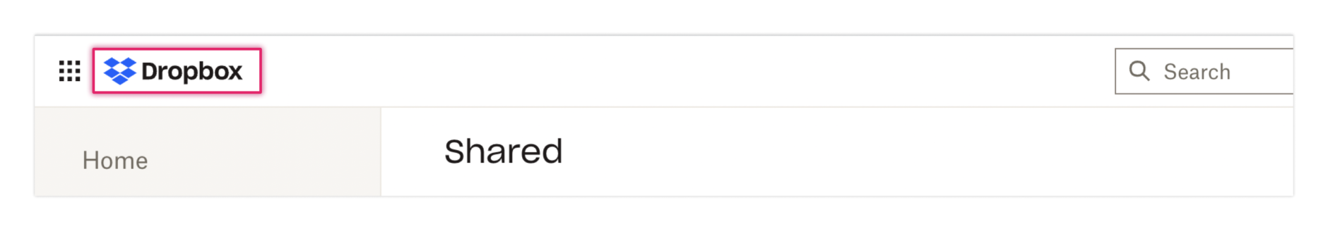
Dropbox utilizes a white header with their colored logo. This fits in well with Dropbox’s stylization. Due to the lighter color, the header provides a little less of a “framing” for the platform. This works here as the user will be primarily focusing on page content rather than relying on the header to navigate between sections.
Utilize a fixed (or sticky) header for platforms where users will be scrolling down frequently
A popular trend in current website design is the use of a fixed, or sticky, header. This means that the header moves with the user while scrolling down the page. Fixed headers are very useful for sites where there is a lot of content to scroll through. For example, if a user is looking at data visualizations in a long dashboard layout, it would be beneficial for the user to be able to have access to the header when they navigate to another part of the application. For most of the clients the Fuzzy Math team works with, we usually recommend a fixed header, but that is largely due to the complex environments we work with.
These more global best practices are important to keep in mind when designing the header. Look to discovery research to answer questions around what sort of content will be important to users here. The design decisions made around headers are imperative to ensure that users feel grounded, and that it is structured to support their workflow.
These high level practices do need to align with other best practices when it comes to logo and navigation patterns. In the next few sections, we are going to break down these elements that are typically found within headers.
The Logo
The logo is the key component that lets users know what website or application they are in. However, they should exist in a way that does not distract the user from their workflow. Unlike marketing websites, branding should not be the main focus for website application and tools.
A few best practices to consider when it comes to logos:
- Apply the correct logo variation
- Be consistent in placement and interaction
- Ensure that the background color does not conflict with the logo stylization
We dive into all of these best practices a bit more thoroughly:
Apply the correct logo variation
There are a few different variations for logos: logotype and logomark. A logotype is a logo centered around a company’s name or initials, such as Google or VISA. While the font can be stylized, it is primarily textual in nature. A logomark is a logo centered around a symbolic image or icon, such as Twitter or Apple. However, both of these can be combined to create a logoform, meaning that it contains both an image and text – such as Microsoft. While we’ve seen both utilized in applications, how do you know which one to choose? At Fuzzy Math, we typically try to utilize the full logo if there is adequate space for its placement as it helps to establish brand trust. In enterprise applications, however, space is not always available. We typically opt to use the logomark in these sorts of instances. Let’s look at a few examples:
For Dropbox, the application utilizes a logoform in its header. Dropbox is a well known platform so why is the full logo here? Our assumption is that while Dropbox does allow for a fairly robust way to organize and store files, the overall concept is pretty simple. Users are clicking down into specific folders to find the file they want. When the user chooses to preview the file within Dropbox, however, the logo is removed. Dropbox highlights their logo in the areas of the platform where it will not get in the way of a user’s workflow, then removes it when users reach the point of needing to turn on their brain power to preview, and possibly review, a document.
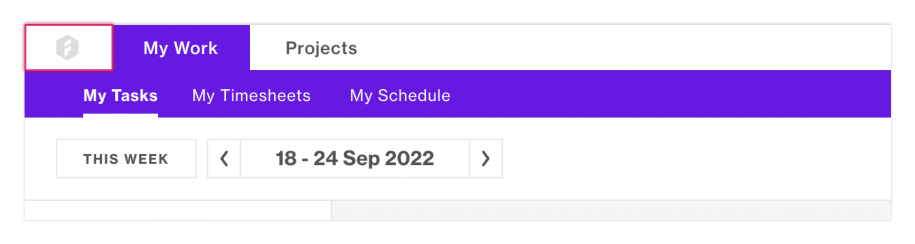
In Forecast, a platform for project management and time tracking, the logo is reduced to include only the icon. While Forecast has a reduced-scale main navigation, it has a fairly complex platform that companies can customize to track and manage project hours. So why did Forecast limit the amount of space their logo takes up? While we cannot gander over to the Forecast UX office, our assumption is that the platform aims to give as much space to the user as possible to complete their actions. The header for Forecast is also fairly slim in height, supporting this theory.
Be consistent in placement and interaction.
According to Nielsen Norman Group, logos should consistently exist on the left side of the header and be a clickable element that goes back to the homepage. Users look at websites in an F- or Z-pattern, depending on content. This article does a great job diving into the complexities of visual hierarchy overall.
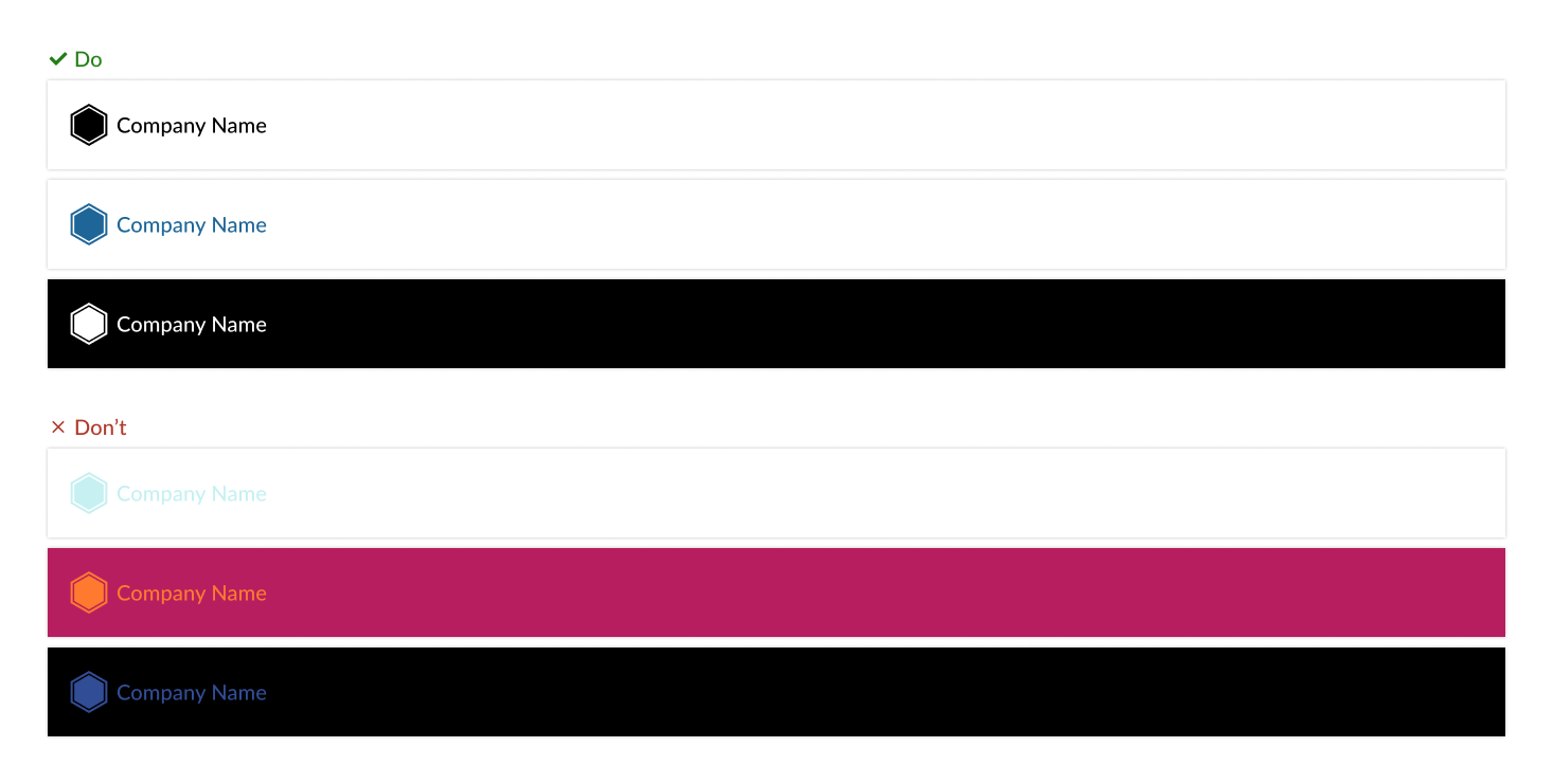
Ensure that the background color does not conflict with the logo stylization
Logos should be noticeable in the header but not too distracting. What exactly does this mean? Overall, do not let the branding take over the web application and instead give the user plenty of room to complete their tasks. Take care to ensure that the logo compliments the color of the header. For darker colored backgrounds, we recommend utilizing white for the logo. For lighter colored backgrounds, we recommend using black. While you can utilize other colors, it is advised to pay attention to ones that compliment each other and that they meet accessibility requirements. WCAG 2.1 guidelines require a 3:1 contrast for graphics and user interface components.
Throwing a logo in the header as is and calling it “good” might be the easiest option, however, there are implications involved with user expectations that should be referenced before making any concrete decisions.
Main Navigation Elements
Main, or primary, navigation contains sections of functionality within a platform that users will navigate to often. In web applications, it is important that functionality is siloed out into different sections. This is so that users are able to access all of the important items relevant to their workflow in one place.
A caveat with the main navigation is that while it can exist within the header, it can also exist outside of it. Depending on user needs and company goals, the main navigation may make more sense to be separate and have its own controls.
Multiple exercises can be utilized to understand what users need from the main navigation and how it should be formatted, for example, card sorting and tree testing. Seeing how users expect for content and functionality to be organized clears the future path of frustration.
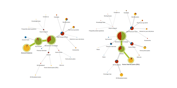
Image from: Optimal Workshop
Within a web application’s information architecture, it is vital to not only test on how users reach the end point of their workflow but also understand how they interpret those initial, main navigational elements. There are a few best practices we recommend:
- Design for the number of navigational elements
- Consider the language utilized for navigational elements
- Include icons if it helps to convey content
Let’s break down these best practices in more detail.
Design for the number of navigational elements
One of the first steps that should be considered before considering where main navigation should live is by defining the number of navigational elements. If the navigation is to exist within the header, the number of elements should be limited so that there is plenty of white space. In applications where there are a large number of navigational elements, it may make more sense to move navigation outside of the header. While we could have a whole other discussion on different types of navigation that can exist, let’s consider only the type that exists within a header. What should an application do if there is a lot of functionality but placing the navigation elsewhere does not make sense? We could then consider an overflow menu.
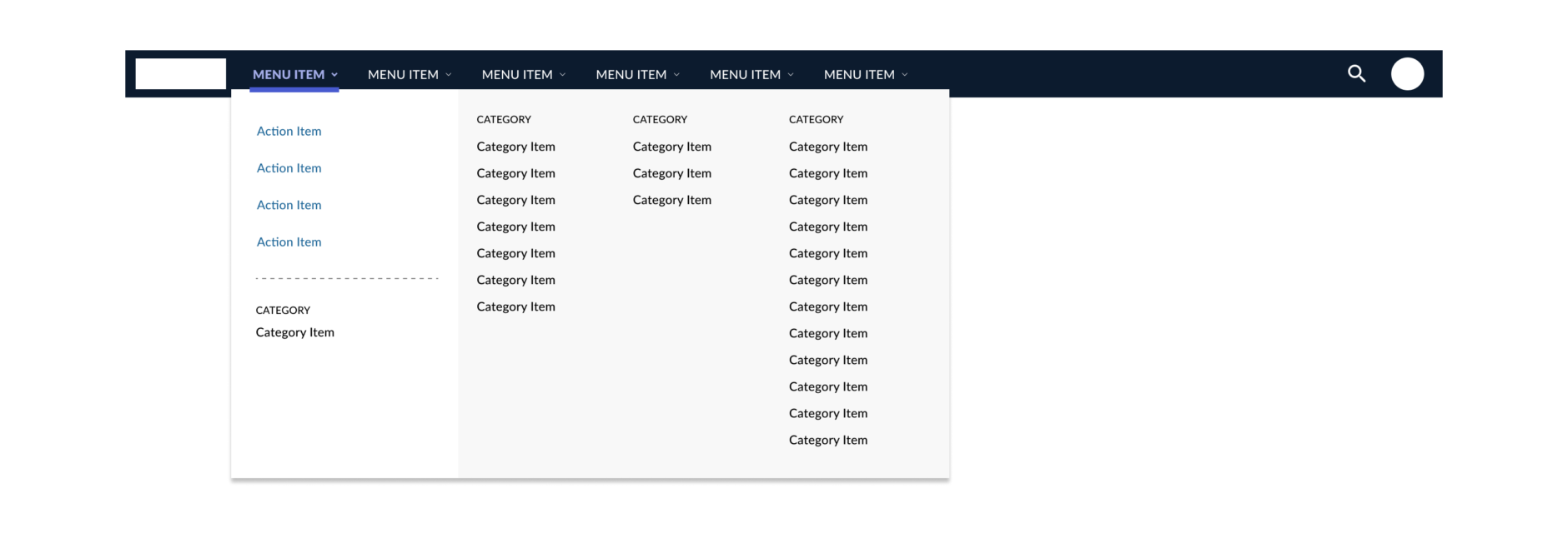
In this example, the amount of functionality and places a user can move to is complex. Utilizing this pattern allows for a user to start off at a higher level before jumping into more categorized options. In these instances, it is important to ensure that language is being utilized correctly so that users are not spending more time than necessary figuring out where to go.
Consider the language utilized for navigational elements
A key factor that we at Fuzzy Math test with users is how the language is interpreted. Does using a certain term make sense in regards to what user’s expected to find? It is important that users should know what to expect when clicking on a link – the language should be clear. There are a few different ways the language of navigational elements can be handled.
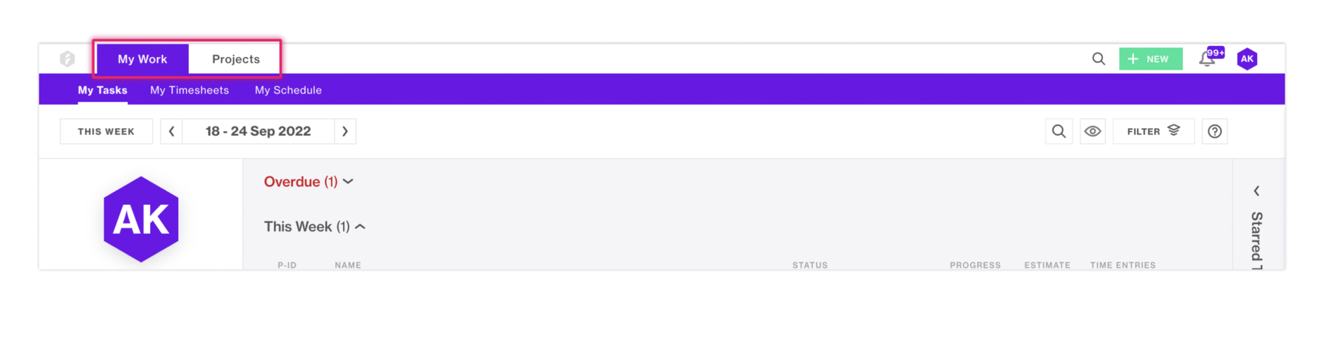
Within Forecast, language plays a factor here to convey functionality. It gives users a glimpse of what can possibly be behind that section before they click. The use of “My” in “My Work” is intentional in that it lets users know that the content behind that tab is relevant to their specific tasks.

In other applications where users are completing tasks and taking action, utilizing more action-based words should be considered. With words like “Analyze” and “Explore”, users will be able to understand what sort of tasks they can complete here before actually navigating to the page.
Include icons if it helps to convey content
While language is extremely important to consider, it is also important to consider the usage of icons. Icons benefit the design in many ways: they are more compact, easily recognizable, and can be easily translated. Although, there is a caveat when it comes to use of logos for an international product. Care should be taken to ensure that the icon utilized is familiar with users across the globe. Due to this, an icon can be misinterpreted. Without the add-on of text to help convey to users the purpose of a navigational element, there is a chance that users could misunderstand what the section contains.
A user’s understanding of an icon is based on previous experience. Due to the absence of a standard usage for most icons, text labels are necessary to communicate the meaning and reduce ambiguity.
Norman Nielsen
For Forecast, the use of icons is limited overall, and non-existent within the navigation. Sections like “My Work” and “Projects” don’t have a clear icon that would accurately represent them.
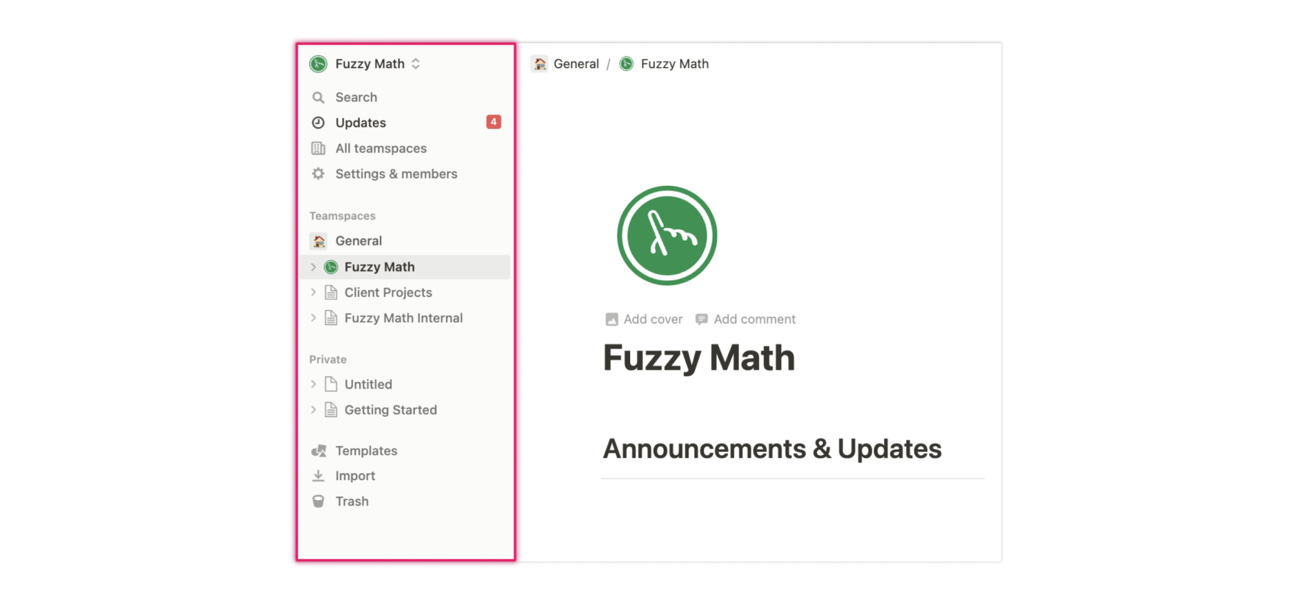
Alternatively, in a tool like Notion, the navigational elements contain icons as they are more universally known, like Import and Trash. Notion also has a page structure in place that utilizes the “page” icon to represent the items users have created. It gives users the power to edit the icons used to represent those pages. This pattern allows for users to input their own icon interpretation that will make sense to the rest of their team as well.
Navigation has quite a few more nuances than other elements within the header. It can be influenced by company goals, user needs, and also the style guide that is primarily in place. Paying attention to language and icons is important since the elements under navigation can differ vastly from tool to tool. Within our next section, utility navigation, there is a bit more of a standard structure.
Utility Navigation
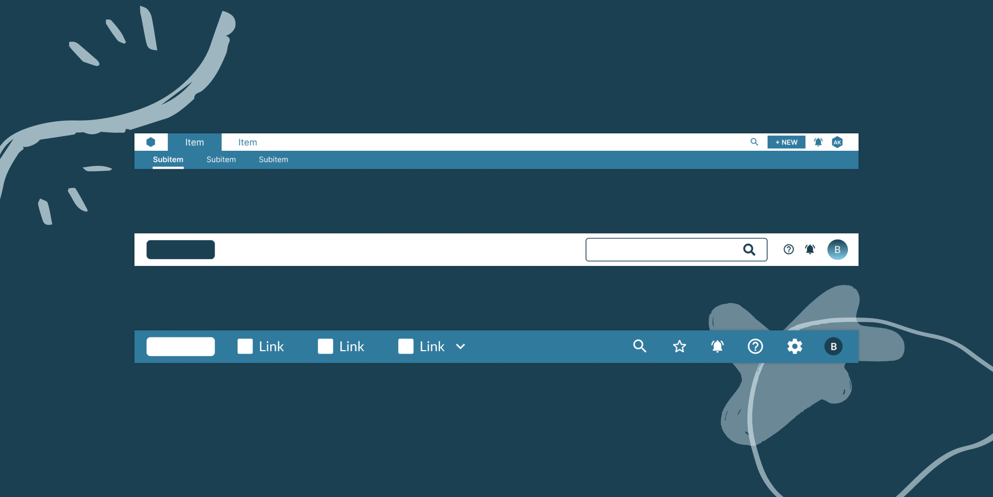
The utility navigation contains secondary actions a user can take from any point within their process. While it is important for a user to have access to these items, they won’t necessarily utilize them all the time and it is not “core” to their workflow. Think of items like Profile and Settings, or actions like Search and Logout. Within utility navigation, there are a few more standard UX best practices to follow:
- Place utility navigation in the top right corner or next to the content they influence
- Create a visual hierarchy within the utility navigation
- Consider icons and the use of text
We will break down each of these best practices in a bit more detail below.
They should be placed in the top right corner or next to the content they influence
While utility navigation used to not have a standard placement, that has changed over time. Within all sorts of marketing websites, applications, and tools – utility navigation is typically found in the top right corner. For headers, the utility navigation located there should affect the application on a global level. For utility elements that affect the page level, they should be placed next to the content they influence.
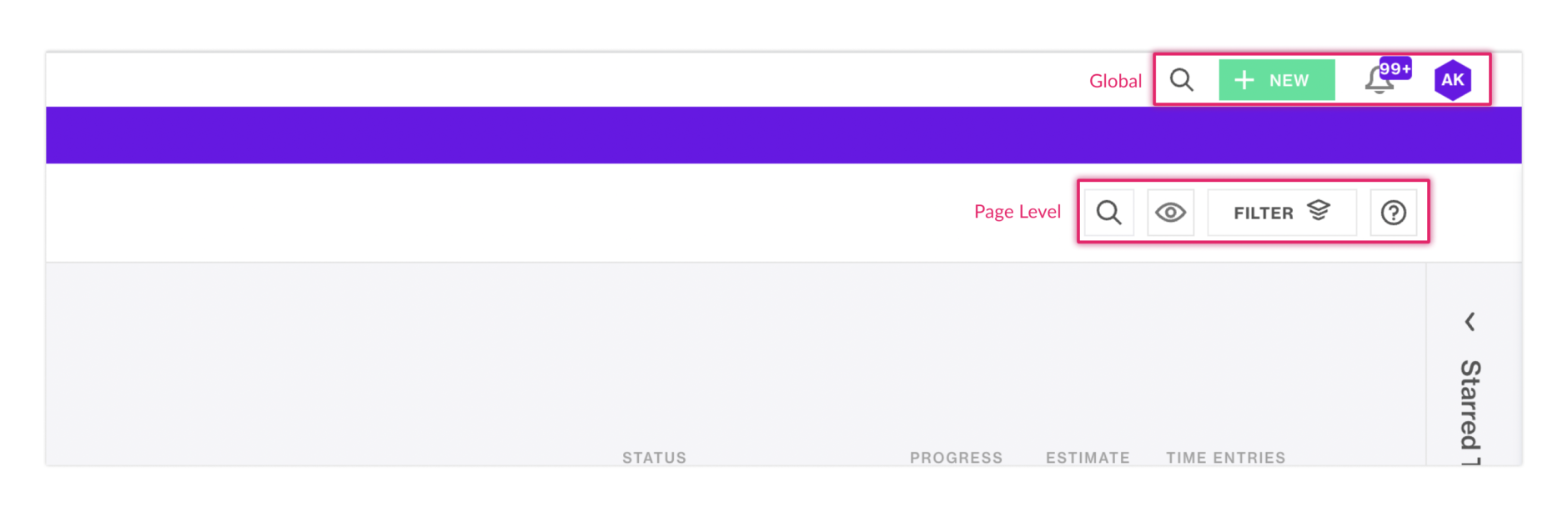
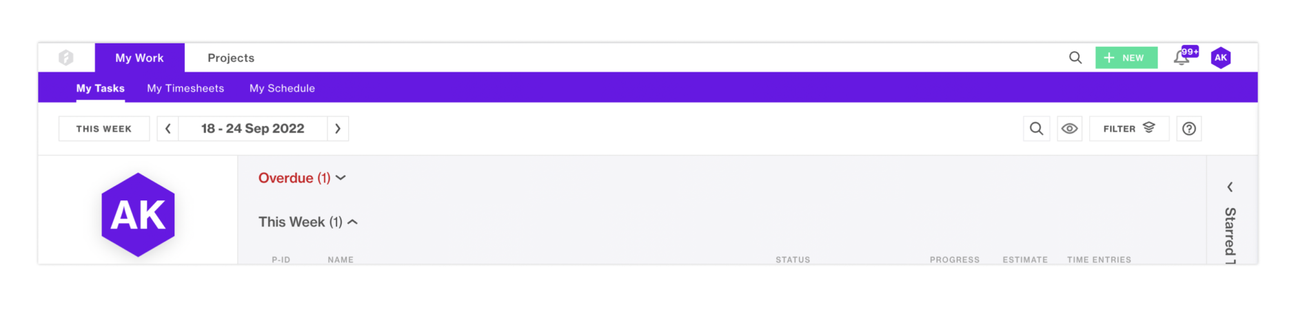
Within Forecast, you can see that the more global utility navigation is placed in the upper right corner. While the page level utilities are placed on the page, next to the content those actions influence.
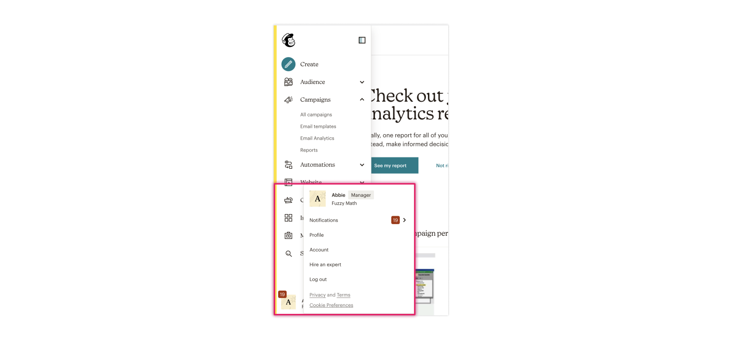
Mailchimp takes a different approach to their utility navigation by placing it at the bottom of their side navigation. A potential explanation for this approach could be that users don’t need to access these items readily so it does not need to have a prominent place on the page. However with Notifications placed here, there is a good chance that users will miss this functionality. User research here might lead Mailchimp to move away from this approach and allow for users to easily access their utility navigation rather than hiding it.
Create a visual hierarchy within the utility navigation
Depending on the different types of elements found here, it may be important to highlight specific ones over the other.
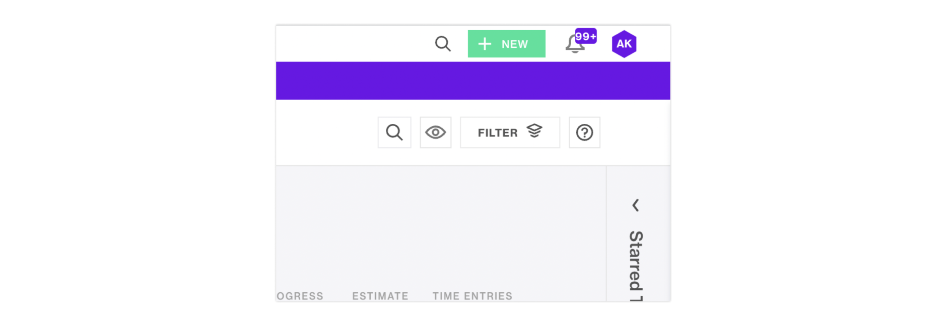
Here, you can see that the “+New” button stands out visually from the rest of the utility items. Users can add a new task, time entry, or expense item from here, which are the primary actions a user takes when utilizing the platform. Having this item highlighted draws the user to this element, encouraging them to take action here. The Notifications icon is also highlighted to bring attention to the user that they have pending notifications they need to look through.
Consider icons and the use of text
Similarly to main navigational elements, it is important to consider when to use an icon and/or text here. For items like Navigation, Search, Profile, users do not necessarily need text to explain what they do – the expectation of what they do is universal. However for more abstract items, like “Share” or “Invite Members”, using text can help to aid the interpretation that action would trigger.
It is important to not overload your utility navigation section with elements as well. Ensure that the items listed here are important to your users. There are patterns utilized in a multitude of applications where other utility-like content is found underneath a broader Profile section. User research will be beneficial to understanding what is needed.
In the beginning, there were headers…
Throughout this post, we have looked at all the elements that a header can consist of. However, all header designs should be driven by one key aspect: user interaction. Without understanding the ins and outs of your user’s needs, wants, and workflow, it can be difficult to know the best way to structure a header and the elements within it.
At Fuzzy Math, we believe in the power of user research and how it can drive design and business forward. At the intersection of people, processes, and data, we think we are experts.