Web-based tools and applications have become the favorite framework to support many essential (and fun!) things we do on the internet like creating arts and graphics, taking notes, or managing our most important data.
Unlike a desktop application, which is installed and runs locally on your computer, a web-based tool/application is accessed via a web browser. They are different from websites in some important technical ways, but today we want to talk about one feature in particular: the footer.
Remind me, what is a footer?
Footers are a critical and fundamental part of a website’s design. Most commonly used in marketing, e-commerce and large enterprise sites, footers are a place for important content, an extension of navigation and a way for users to browse additional brand content. Typically located at the bottom of a page, footers contain items like –
- Utility links – Copyright, privacy, terms of service, site map, contact
- Engagement – Social handles, links to an associated app, newsletter, testimonials, awards
- Brands within the organization – If there are other brands within or related to an organization, the footer is a good place to link to that information
- Navigation information – The footer can be a great place for navigational elements not present in the global navigation (like a link to Careers)
When designing the footer for a web-based application, the standard footer rules don’t always apply. Web-based application footer designs run the gambit. We have noticed a few user friendly patterns and have developed best practices from our work in the web-based space.
Consider including a footer –
- if it’s crucial to surface legal information on every page
- if the site doesn’t require a login to access most of the information or functionality
- when the information architecture is simple and shallow
- when there’s more content and information and less interaction
- when it’s necessary to highlight brand/company information – contact, sister/subsidiary brands
Skip the footer –
- in a logged in state (logging in is required to access most of the site’s functionality)
- when the site is more of a tool (like Canva, or TurboTax)
- if footer information might fit better in a flyout menu
- if the information architecture is shallow, and information might fit better in the sub navigation
Internally, we distinguish between a web-based tool and application
The terms ‘web-based tools’ and ‘web-based applications’ are generally used interchangeably, but internally we find it can be useful to acknowledge the subtle differences between them. Applications and tools have characteristics that inform unique user mindsets and mental models. These differences become relevant when deciding whether or not to include a footer, and what purpose it will serve.
Tool vs Application
Web-based tools are more immersive and behave differently than a traditional webpage. Because of this, the navigation and footer content are more holistically distributed within tools, omitted, or located somewhere else in the information architecture. The bulk of the user interaction and content require the user to log in before they can really do anything in the tool (think of sites like Figma, Google Workspace, and TurboTax).
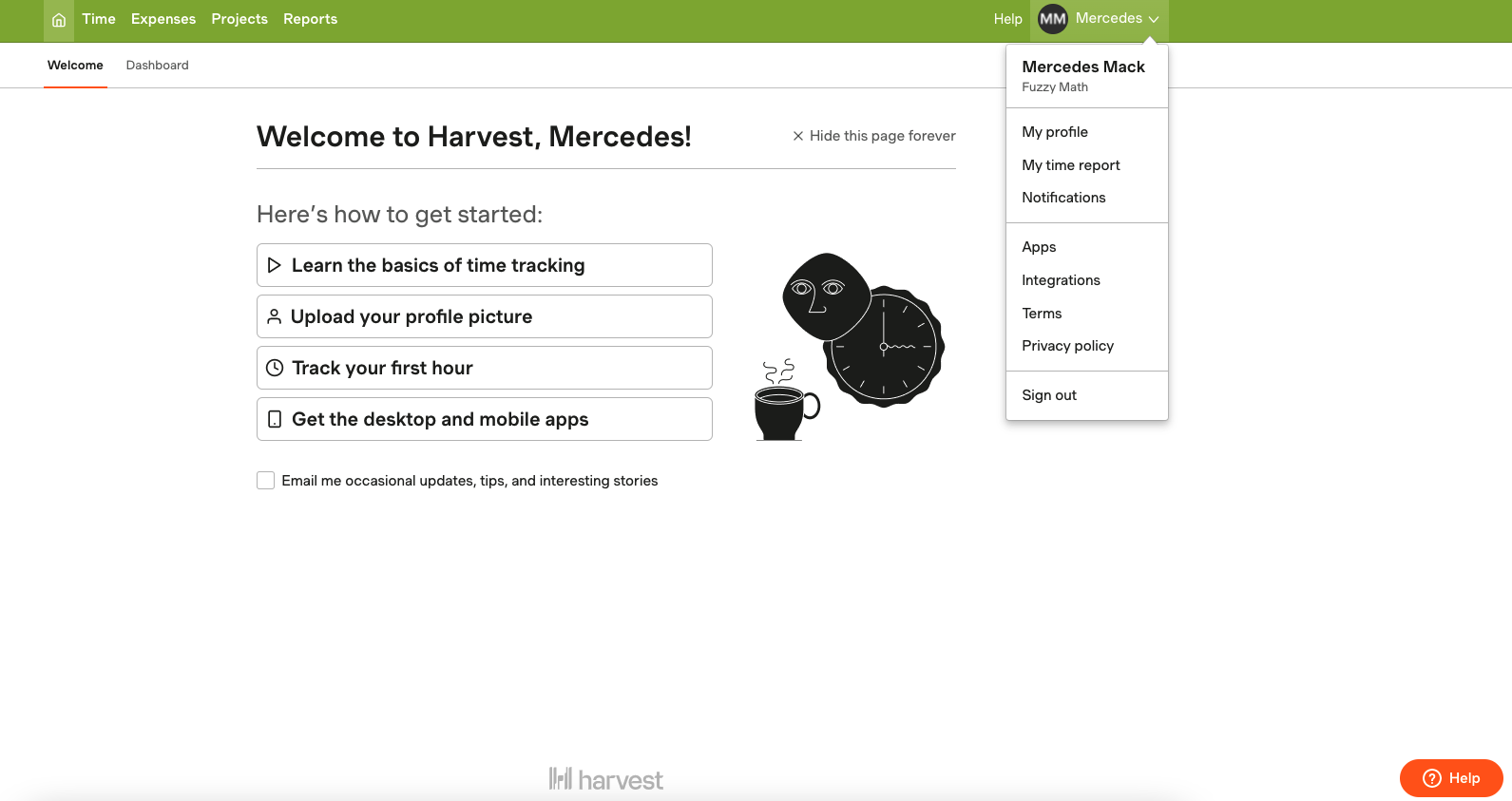
Harvest is a great example of how traditional footer information is redistributed in a web-based tool. Harvest’s footer consists of their logo and floating help button. They included footer items like terms and privacy policy in the account’s sub navigation.
More complex tools may put traditional footer information like contact, privacy, and important secondary navigation items in a flyout menu (more like a navigation item, and less like a footer item).
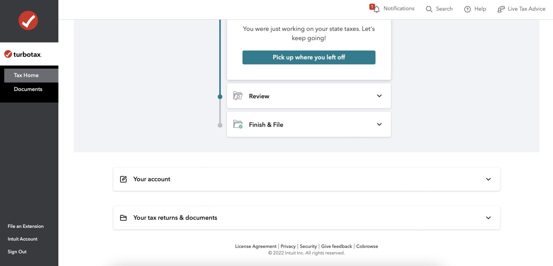
TurboTax has an even more niche take on a footer design. In addition to traditional footer content, they include a quick access Account and Tax Document section. It is present on every page of the process, functioning very similarly to a footer. This is a great example of how we can reimagine patterns to streamline user experiences.
Avoid using a footer for a tool, and include footer items (terms & conditions, privacy policy, etc), elsewhere in the information architecture.
Web-based applications tend to follow traditional footer design patterns, sometimes nesting traditional footer content in a flyout menu.
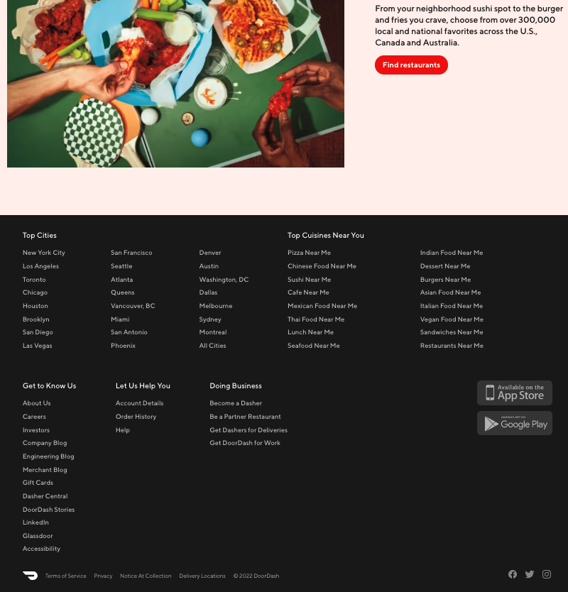
Take Doordash for example – in addition to expected footer content (about, help, copyright, terms and privacy, social), Doordash uses the footer to highlight top cities and cuisines as well as links to download their app.
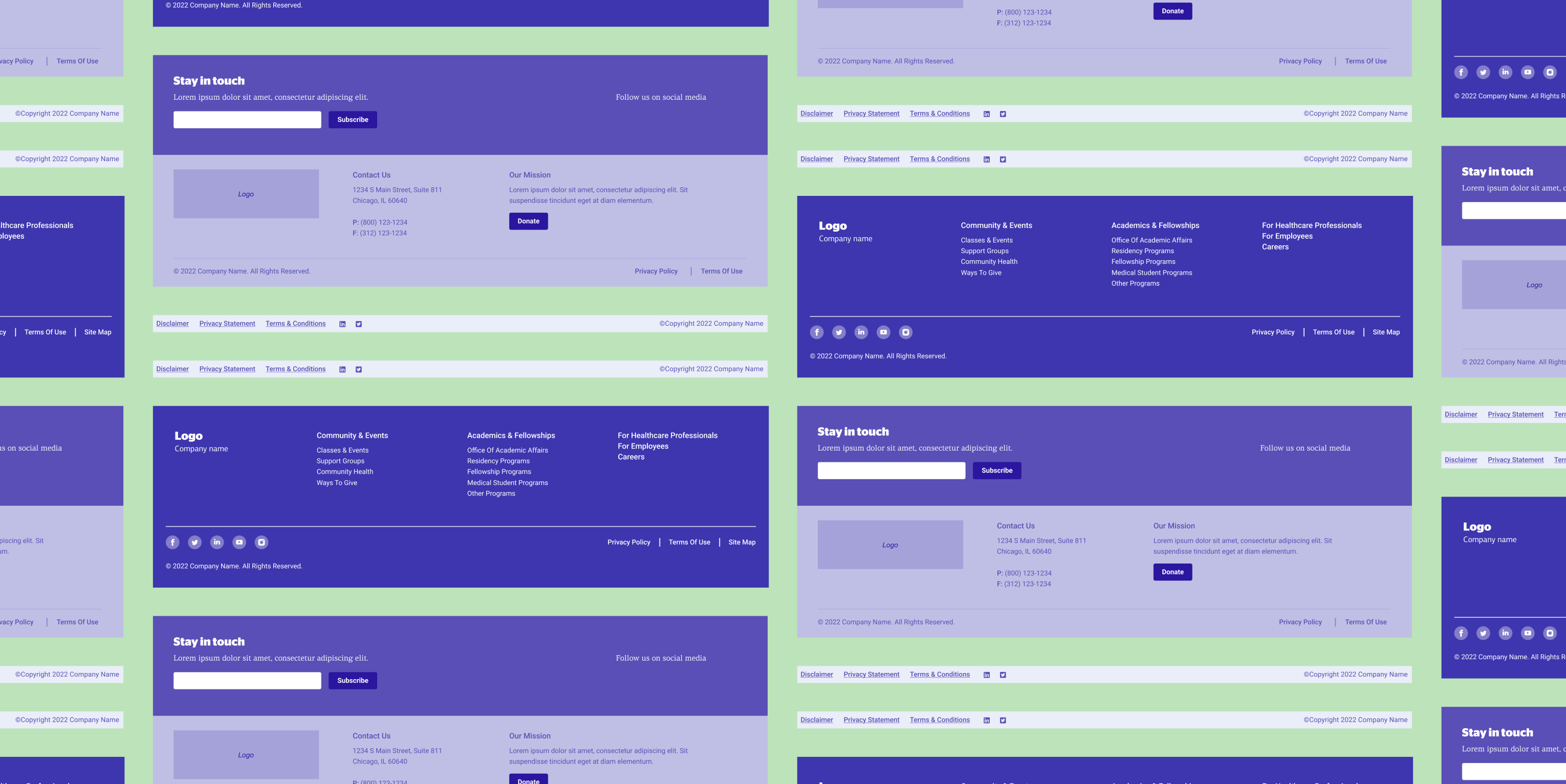
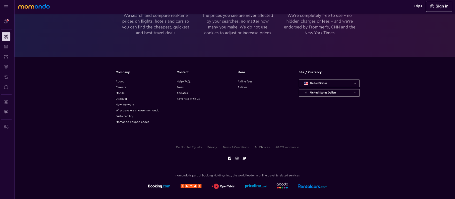
Momondo adheres to a traditional footer pattern (utility links, sister brands, company/contact info, engagement links, privacy info).
Use a footer for an application. Include footer items as you would a traditional footer or in a flyout menu.
Footers matter.
The web-based world is a playground where design patterns are not yet entrenched. As designers we can imagine new and useful ways to structure or redistribute footer information. As best practices develop, user research remains an important method validate designs. Understanding how new and returning users interact with your web application will help ensure the footer information is right where it needs to be.
Related:


Does your company have a web app challenge? We can help.