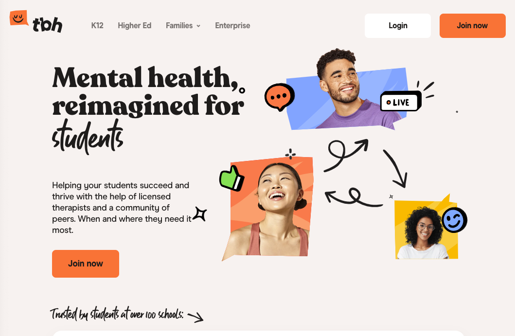
When you picture mental healthcare, maybe you picture a patient lying down on a velvet chaise in a room full of dusty books. Or, more generally, you associate psychological treatment solely with weekly talk therapy and expensive medication. Either way, psychological treatment has been reserved for the lucky few with the time and money to exercise their mind.
Times are changing, however. Mental healthcare is becoming more accessible and more digitized. Services such as telehealth and patient portals are leading the charge into how millions of people receive mental healthcare. This means that a company’s UI is usually the first touchpoint in someone’s journey towards getting help. Color, as a result, plays a big role in the perception of each service.
We will be exploring the current state of color in mental health UI, but we’ll also be taking a look at the UI of trailblazing start-ups representing the changing state of mental healthcare. Through studying these examples, we might catch a glimpse of the future where technology-driven color interventions hold serious potential.
How Mental Healthcare Stands Apart
Traditionally the healthcare industry has taken a more conservative approach to visual design. According to 99designs, 85% of industry-leading healthcare companies use a shade of blue for their logos, which often extends into the UI. The second most popular color is green, but only 22% of healthcare companies use it for their logo. It’s not a terrible approach by any means; playing it safe and assimilating to the standards of the industry to appear professional and trustworthy is a reasonably safe bet. However, one significant downside to this visual aesthetic is the potential lack of brand recognition.
Though it’s treated as a subsection of the overall healthcare industry (particularly by insurance companies), psychology and psychoactive treatment is handled quite differently than your average doctor visit. As a result, the visuals associated with mental healthcare—particularly the color palettes— often stand apart from the broader healthcare industry. When we looked at some of the most popular mental healthcare websites, we quickly noticed the status quo was a no go. Mental health digital experiences flipped conventional thinking on its head; we noticed a wider variety of colors including pastel shades and warm shades of orange and yellow.
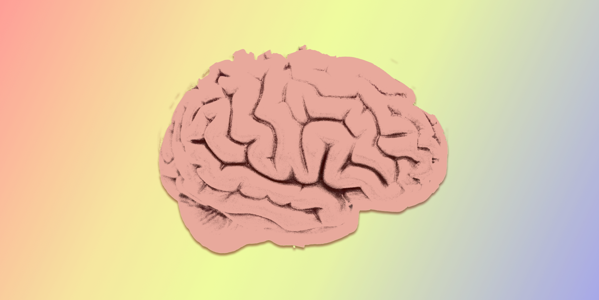
The Psychology of Color
During a recent project (grappling with the very topic of this article), our client sent us a link to the Manchester Color Wheel Study. In this study, researchers sought to understand whether those who were diagnosed with Anxiety or Depression reacted differently to color than those considered “healthy.” They used 10 colors (red, orange, yellow, green, blue, purple, pink, brown, black, and white) on a numbered wheel with a few varying shades for each. Researchers then asked participants which color they associated with their mood lately.
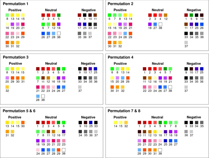
“Healthy” participants (those who were not diagnosed with anxiety or depression) associated their moods most often with yellow hues. Depressed/anxious individuals frequently associated their moods with gray shades, avoiding warm colors like yellow, red, and orange. In one of the three experiments during this study, researchers also asked participants to describe these colors more generally. Using the categories “Positive,” “Neutral,” and “Negative,” individuals largely labeled darker hues with a “Negative” connotation. For instance, light blue was considered positive or neutral, while the darkest shade of blue was considered negative in a few of the permutations (so blue might not be as safe as we think!).
This study is a useful reference for designing a mental health color palette, but it’s worth considering the bigger picture. Yellow and orange may have positive connotations, but would an exclusively-warm color palette properly represent the average care-seeker? Individuals experiencing depression might feel that yellow does not represent their current mental state. In order to meet the user where they are (instead of solely where they would like to be), the website must consider users’ color perception in their current mental state. Additionally, companies would benefit from utilizing these colors to achieve various outcomes, such as creating a calming or uplifting atmosphere. There are a few mental healthcare companies out in the wild that successfully achieve this balance — and look great doing so!
How Companies are Using Color
Mental healthcare companies benefit from using a color palette with a range of colors and associations to attract the right audience. They must also consider usability heuristics and accessibility best practices to ensure both an empathetic user experience AND a successful conversion rate. After all, one study found that buyers will form an opinion about a product in 90 seconds with 62-90% of that interaction being determined by the color of the product alone. This is explored in greater detail in Why Is Choosing Color So Difficult, but for now let’s look at a few mental healthcare examples that use color successfully:
Studiovolia
Studiovolia is a modern approach to the visual design of mental healthcare websites that helps students connect with licensed therapists and gives schools valuable information about at-risk students. Although telehealth is used by all age groups, younger age groups (particularly individuals in their late teens to early thirties) tend to be more active in seeking mental health support online. Younger demographics also resonate with organic shapes and energetic shades of color compared to older generations that lean towards darker, neutral colors. Studiovolia represents their demographic by using a deep orange and yellow, as well as a pastel blue and green. This palette reinforces their engaging, intuitive platform with clear visual heuristics and affordances.
Ginger
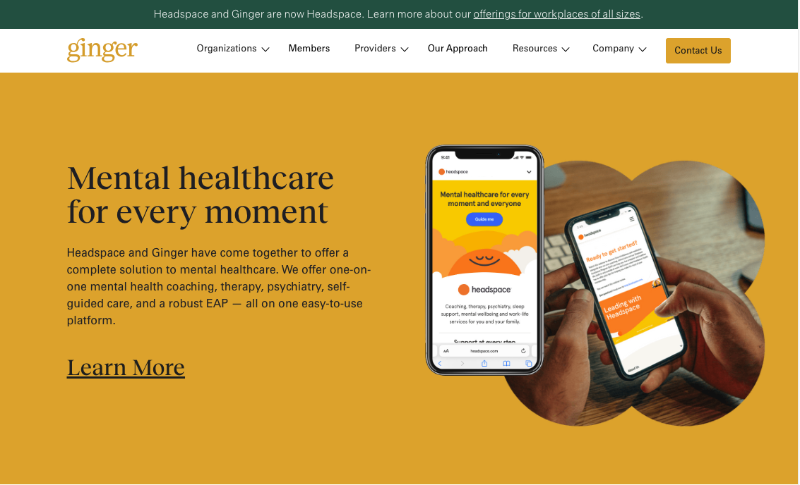
Ginger is another platform that connects users from around the world with coaches, therapists, and psychologists. Partnered with cheery Headspace, Ginger presents as the meditation app’s sophisticated, older cousin. They use forest green, navy blue, and various shades of yellow, including gold and pastel. These shades are darker than Studiovoila’s, giving the website a more mature feeling and appealing to a wider variety of age groups.
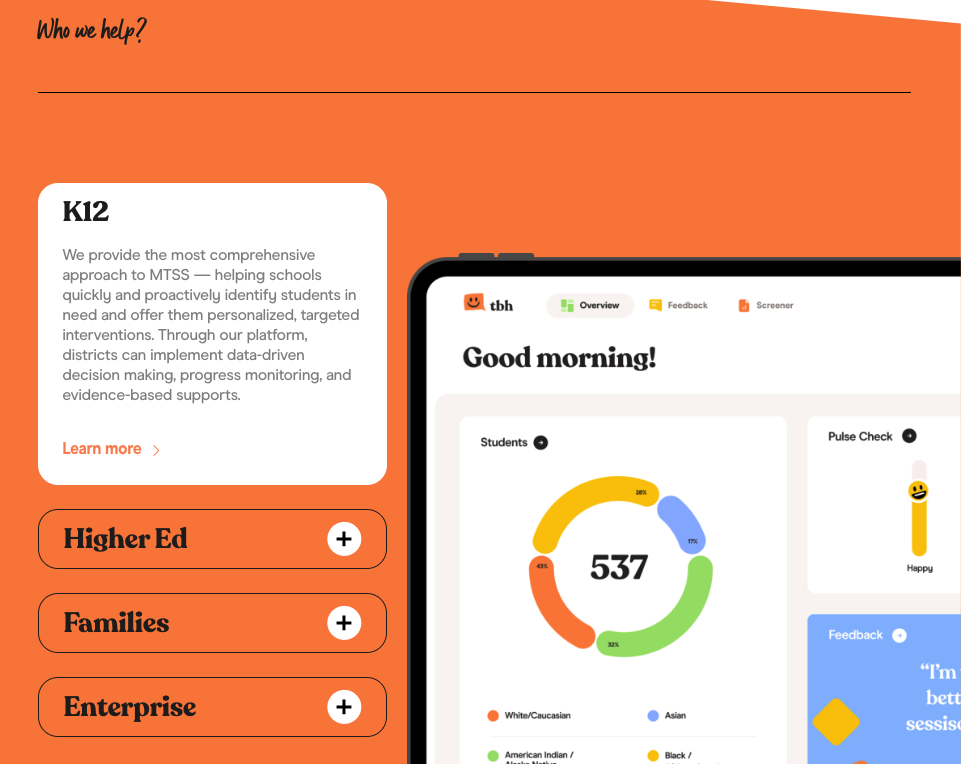
As mental healthcare becomes more accessible and adaptable towards an individual patient’s needs, startups all over the globe are jumping on the opportunity to create and advertise innovative solutions to mental healthcare. Let’s take a look at a few of these innovators finding their audience through distinct digital experiences:
Mindbloom
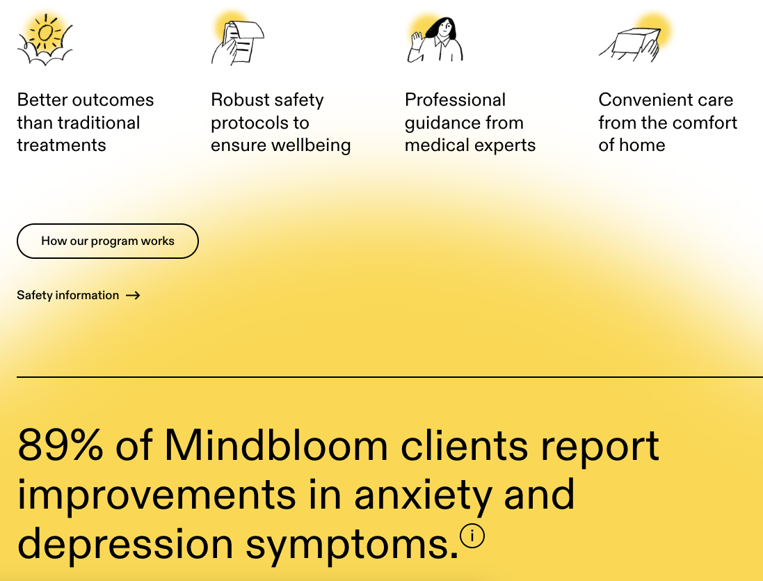
Mindbloom’s tagline in the hero section immediately lets the user know what they’re about: Mindbloom provides Ketamine therapy for anxiety and depression. This simplicity is reflected further in its heavy use of yellow, with smatterings of blue and orange throughout the site.
The yellow is warm and inviting, but due to its darkened shade it does not feel overly joyful. This shade of yellow is a great color to use because it represents the intended audience more effectively than a pastel shade of yellow, but it still feels hopeful and energizing – necessary motivation for taking steps towards treatment. The amount of yellow does not feel repetitive either; the site uses gradients and blurs for visual interest rather than a variety of colors.
Greenspace
On the other hand, Greenspace is another notable start-up with the opposite approach. Greenspace is a platform that is redefining mental healthcare access and uses a wide range of color in their digital toolkit.
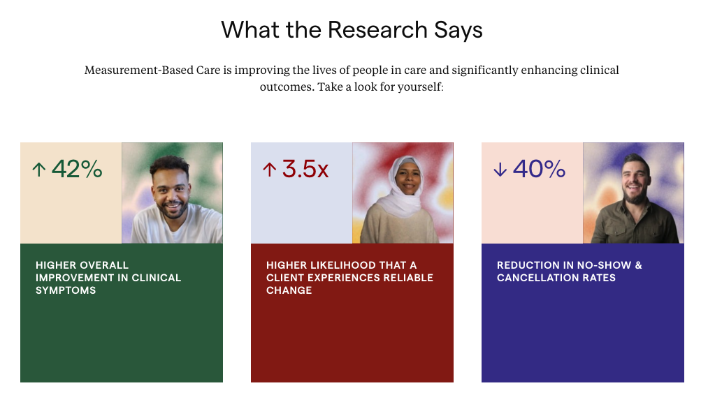
The primary brand color is (you guessed it…) green, but the company site also uses cobalt blue, brick red, pastel green, beige, grey blue, citron yellow, and periwinkle. This amount of color could easily become overwhelming, but they balance it well with a strategic hierarchy and logical grouping. Colors are paired with their complementary counterparts and only use the boldest colors for the most important information. Using a wide variety of colors gives this company a flexible system that allows for company growth and diverse user representation.
Fuzzy Math’s Approach
With this influx of diverse healthcare seekers, a color palette solely based on familiarity and traditional association might not cut it anymore. A mental health company has a tough task ahead of them when thinking about marketing: it must represent and attract a wider variety of consumers than ever before, while remaining hopeful, optimistic, and trustworthy. At the same time, a brand should feel distinct enough that the target audience can discern its voice from the crowd’s.
Here at Fuzzy Math, we conduct visual kickoffs that help us learn more about the current state of a client’s brand, the ideal future state of this brand, and a client’s ideal audience. We then create color palettes in mood boards influenced by both the responses to these prompts as well as color psychology and accessibility guidelines. With this approach we are able to create a custom and personalized style guide and design system.
Creating a custom visual system for each client in the mental healthcare industry not only better prepares our clients for the shifting landscape, but ensures the care-seekers of the future are accounted for. Creating a color palette that is diverse, flexible, and backed by research is an exciting first step.