As designers, we are consistently analyzing which selection of colors will resonate well with the intended target audience to influence their behavior. A healthy human eye can see an estimated 10 million colors, so how are designers supposed to even pick one or more for a project? Considering an estimated 300 million people worldwide are affected by color vision deficiency and we live in a rich diverse world with many cultures, designers may find it helpful to start with understanding how the people they are designing for perceive color.
Color perception, which is a series of physical and chemical reactions that allows some organisms to perceive different wavelengths of light and interpret those colors into information and emotions, is still an evolving area of study. There are many theories as to why humans may prefer one color to another and how two people who are looking at the same color can see it differently.
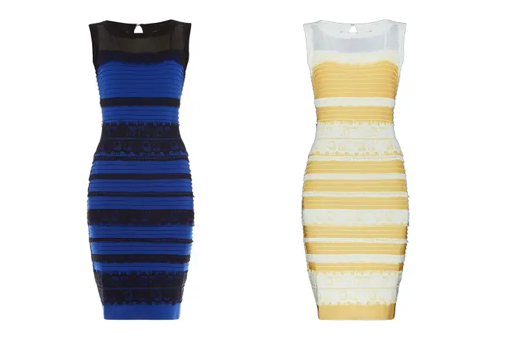
For example, the 2015 dress that divided the nation on whether people saw it as blue or yellow. This makes designers’ jobs harder but also makes it even more important that we get it right.
Much of what humans know today can be traced back to their past. A few theories attempt to explain why color has such a profound effect on our feelings and behavior.
“Color is a power which directly influences the soul.”
– Wassily Kandinsky
Evolution Theory
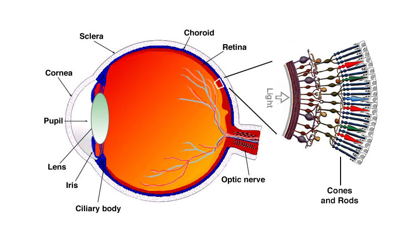
Researchers have theorized that ancient people saw colors differently and over time gradually adapted their vision to identify threats in order to survive. Homo sapien’s eyes developed special retinal cones that fostered the shift to trichromatic vision which is the ability to see different colors derived from the interactions of three different types of cone cells.
Simply put, early human eyes used blue, green, and red wavelengths to see a wide spectrum of color. This helped early humans differentiate between ripe or poisonous fruits and plants as well as identify blood and fire. Language also played a part in how humans perceive color because of the many nuances of identifying objects across cultures. Some cultures don’t even have a term for the word “color”, these groups would describe “color” by utilizing vocabulary referring to a texture, physical sensation and functional purpose.
Ecological Valence Theory
Have you ever eaten a food of a certain color and didn’t like it? Then when faced with another food that’s the same color you’re afraid to eat it? Psychologists Karen B. Schloss and Stephen E. Palmer may have found why that is. In their study, they argue people are attracted to colors associated with positive things or situations from their past.
It’s no coincidence that many brands will use blue as their brand or primary color because blue is abundant in nature, it’s consistent and trustworthy like the sky and ocean. On the flip side, that same color can cause discomfort if someone was affected by seasickness when traveling by boat, or hit by a blue car.
Opponent-process Theory
First theorized by Ewald Hering in 1878, he postulated that three types of cells in the retina respond to pairs of opposite colors: white and black, blue and yellow, and red and green. Current research suggests that the true pairings for these receptor complexes are actually blue-yellow, red-cyan, and green-magenta. Depending on the wavelength, the activation of one type of cone cell leads to the inhibition of the other two which is a great explanation for after images (an image that continues to appear in the eyes after a period of exposure to the original image) and color blindness since cone cells can become permanently fatigued and can’t react to wavelengths.
The plethora of research into color perception and color psychology is nothing short of fascinating and can give designers many insights into how their users will perceive colors.
This is also why choosing color can be so difficult, one must consider cultural implications, psychological and physiological states, and even gender as some studies have found that women are more adept at distinguishing between subtle gradations mainly in the middle of the color spectrum (yellow and green). Utilize the UX designers on your team to act as a bridge between you and the users. Key insights brought forth by research can lead to more informed decisions about color selection.
Here are five tips to consider when selecting color for your design.
1. Consider User’s Cultural Backgrounds
If you’re lucky enough to work on a project where you have to choose a color palette from scratch then this is a great place to start. Recall that language does have an effect on color perception. For example, someone reading this in Dani, a language spoken in Papua New Guinea, wouldn’t describe the color of this text as black – they would say it’s “cool” – which roughly translates to black, blue, and green. In their language, there are only two terms for color: dark and light.
Another example is the symbolism of the color purple in Brazil. The next time you pack for a trip there, leave it out, as wearing the color purple can be seen as disrespectful if you’re not attending a funeral.
The goal of UX and UI designers should be to understand the space we are designing in, so taking the time to understand the cultural significance behind a color palette will help to avoid any implications down the road.
2. Make Sure Your Color Combinations are Accessible
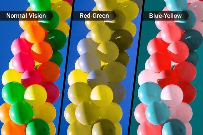
As stated before, 7-8% of the world’s population are affected by color deficiency, the most common being congenital red-green colorblindness (or sometimes called Daltonism).
Considering how common this form of colorblindness is, with the magic of technology it’s easier than ever to adhere to the Web Content Accessibility Guidelines (WCAG) which is the international standard for accessibility on the internet. Simulation tools such as Color Oracle, Coblis, and Toptal color-blind filter are great at simulating color blindness and other color deficiencies so designers know how their design looks to others.
Once you settle on color combinations you can check the contrast to make sure those with deficiencies and even normal vision can read your designs. Tools such as Stark, The A11y project, and Colorsafe all do this very well and even have plugins for most design tools.
Related: Designer’s Toolbox: Create Visually Accessible Experiences Using Stark
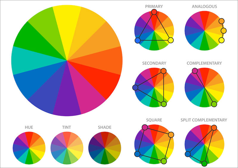
3. Creating a Harmonious Color Palette
Designers nowadays have many superpowers thanks to the advancement of technology. One could just grab a palette generated by a tool like Coolors, however, creating a custom, tailored palette can have a profound impression on your target audience.
You can start simple with a monochromatic color scheme where you start with a base color then extend it using its different tints, shades, and tones. As you learn more about palettes you can spice up your designs by experimenting with more complicated palettes, such as triadic color schemes, where you’ll use three colors that are evenly spaced around the color wheel.
Once you’ve played around with color palettes, adding neutrals is an easy way to harmonize your palette. Neutral colors (black, white, gray, and sometimes brown and beige) will produce a different effect on the palette; they can serve as the background, create options for increasing contrast, and make a design look more sophisticated or friendlier by adding black or white.
4. Consider the Context of Color Usage
In 2012 a study was conducted to explore whether recalling abstract concepts such as good and evil could influence the sensory experience of the brightness of the room. People were asked to recall and describe an “ethical” or “unethical” deed from their past and the emotions they felt associated with it. When asked about how the room was lit people who recalled ethical deeds estimated that the room was brightly lit, they also noted they felt their actions were more visible in a bright room.
Simply put, choosing lighter colors may encourage “good” behavior in contrast to darker colors for “bad” behavior. Designers can use this knowledge when designing a UI, for example, a charity website using lighter colors is seen as good and could correlate to more donations.
Colors can also have weight – darker colors are perceived as heavier and can make nearby elements appear more important, providing additional hierarchy to the design. Designers have a lot of power when it comes to color; if used appropriately and consistently, users can be influenced to convert, pay closer attention, and even stay on a page longer.
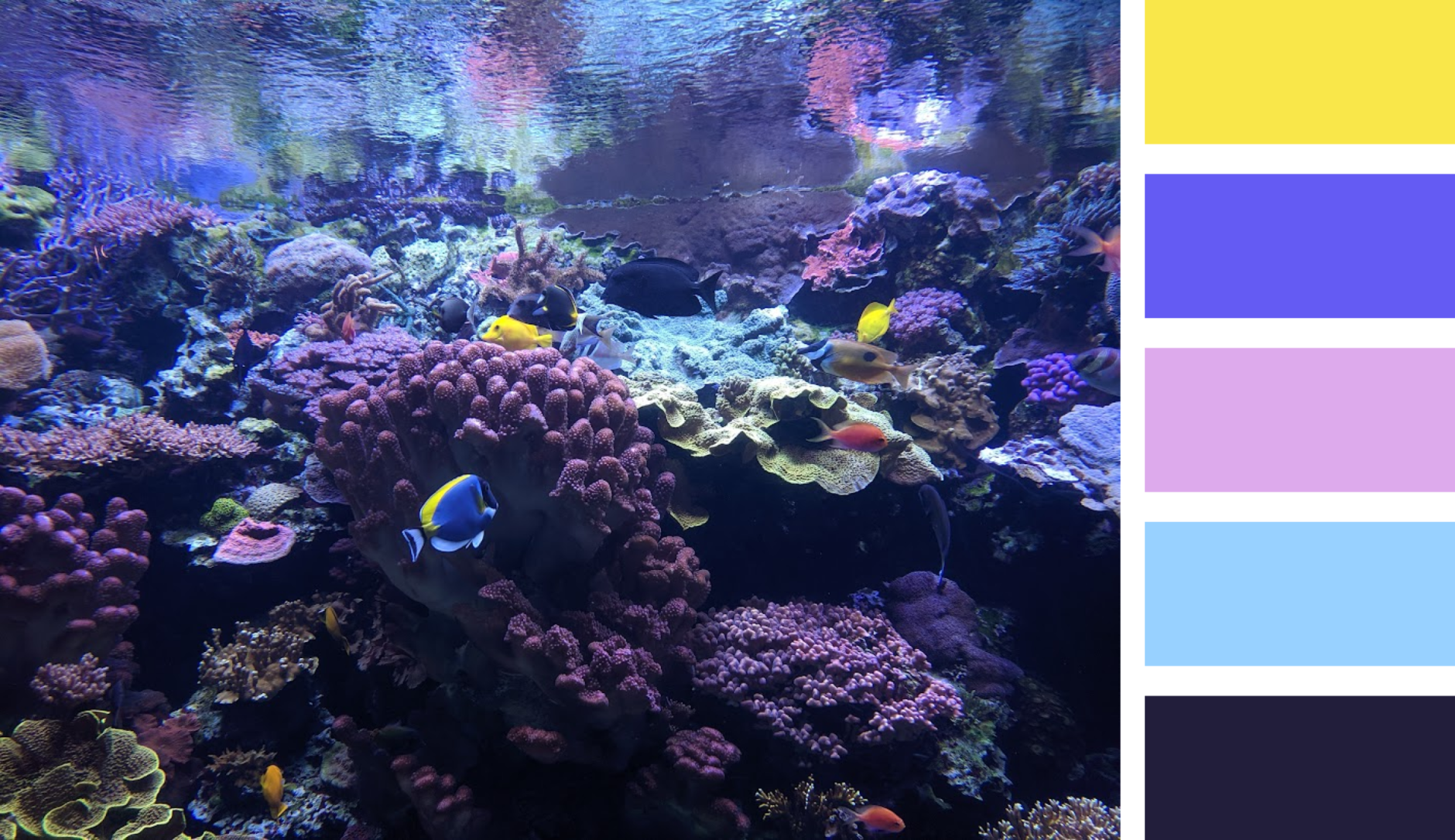
5. Take Inspiration from Nature
Humans like colors that seem natural, and luckily Earth has many natural phenomena to draw inspiration from. Using natural colors can come off as more user-friendly and approachable to people, and there are even studies to suggest people feel happier when they spend more time in nature.
Considering the context of a design, reflect on how colors from a natural setting can be infused in the visuals of the design. If you’re designing a landing page for a sporting event or an app for a local zoo, try to physically go to these places or look at photos of the space or place, being conscious of the colors that you see, and experiment with how they could be used in a UI. The point is to be conscious of the natural world around you and use those colors in a palette relevant to the design’s context to make the design more approachable to users.
Even with all the knowledge and assistive tools designers have at hand, choosing colors is a delicate process that takes many iterations, patience, and empathy for the user. This article only scratches the surface of that process.
The Institute of Color conducted research that found up to 90% of all product assessments that people make are color-influenced on the subconscious level, more proof that choosing a color palette has a high impact and should never be done on a whim or just a hunch. Designers have a responsibility to make sure they are respectful of different cultures and beliefs, their designs are as accessible as possible, and ensure their color selections adhere to universally accepted best practices.
Sources:
- Color Blindness by Clinton Eye Associates
- Color Psychology: Why does color have meaning? What are those meanings? And how can you choose the right colors? By Nick Kolenda
- The way you see colour depends on what language you speak By Aina Casaponsa & Panos Athanasopoulos
- Ecological Valence Theory and the use of color in design By Oliver Heath
- The Opponent Process Theory of Color Vision by Kendra Cherry
- Is it light or dark? Recalling moral behavior changes perception of brightness By Baneerjee, P., Chatterjee, P., & Sinha, J.
- Why Color Matters By Jill Morton
- Creating a Color Palette by Uxcel
Does your company have a web app challenge? We can help.