In the ever-evolving landscape of design, the term design system gained widespread usage in the design community around the mid-2010s and has revolutionized how we approach creating digital products. As the demand for design consistency and scalability continues to surge, we here at Fuzzy Math (FM), a design consultancy, face a unique challenge: delivering tailor-made design systems to clients. This year we took a step back to ponder a vital question: How can we streamline our process for efficiency and client impact? Join us as we walk through the solution to this question and uncover the motivations, strategies, and insights that coalesce to redefine the way we build, create, and deliver design systems.
What Is a Design System
Imagine you’re building your dream house, but instead of figuring out every detail from scratch, you have a blueprint that guides you. This blueprint is like a design system for your house. It tells you exactly where the rooms go, what colors to paint the walls, and even what kinds of furniture to pick. So, just like your blueprint makes sure your house looks awesome and organized, a design system does the same thing for websites and apps. It’s like a handy toolkit that designers and developers use to create digital stuff that has a set of guidelines, rules, and reusable components that ensure everything looks and works harmoniously across different parts of a project. We go more in-depth in our article, What is a UX Design System?
Why Are Design Systems So Popular?
That can be attributed to several key factors:
- Digital experiences: the 2010s marked a significant shift towards digital experiences as businesses were more inclined to cater to evolving user behaviors and preferences as new technologies such as the iPhone were introduced.
- Multi-Platform Consistency: With the proliferation of devices and platforms, maintaining a consistent user experience across various screens and devices became crucial.
- Growing Complexity: As digital products became more intricate, managing design and code became challenging. Design systems provided a structured approach to handling complexity while maintaining a coherent design language.
- User-Centered Design: A focus on user-centered design principles led to the realization that consistent and intuitive experiences improved user satisfaction. Design systems provided a framework to deliver these experiences effectively.
- Collaboration and Efficiency: Design systems streamlined collaboration between designers and developers. By establishing a shared language and reusable components, teams could work more efficiently, reducing redundancies and rework.
In the past ten years, things have remained quite consistent, with many clients pointing to these reasons for their design system needs. Our usual approach to creating these systems involves designing and building components in Figma throughout the project’s visual design phase. As we near the project’s completion, the focus shifts to documenting and handing off the components to our in-house developer where they will deliver a static HTML/CSS file. Our development usually focuses on the presentation layer or the product’s visual aspect, with no involvement with databases. We conclude the project with a clean handoff of the Figma file and code to the client where they can upload it into their workspace, and for a brief time after we are just an email away to answer any questions they might have.
The Need For a Design System Template
Now, imagine you’re not just building one dream house, but many unique ones with different styles and sizes. That’s what it’s like for a design consultancy like Fuzzy Math. While in-house teams have the advantage of established brands and products, deep integration into an organization’s process, and a more developed shared language between designers and developers, consultancies face similar challenges alongside educating clients, adoption of the system, and diverse brands, industries, and user needs.
In earlier projects, our designers frequently found themselves needing to refer back to how previous design systems were constructed and documented. This practice ended up consuming time and leading to discrepancies in both the approach to building components and the documentation process.
This is where things get interesting! The challenge was to create a design system that wasn’t one-size-fits-all but flexible enough to adapt to different projects like a chameleon changing colors. UX designers needed it for wireframes, visual designers needed an easy to customize style guide and components, and finally the client needed it to be easy to understand and use within their organization. We created an internal design system initiative to tackle this challenge, extending an open invitation to all designers interested in participating. Once our team was assembled we proceeded with the kickoff.
Deep Dive Into the Fuzzy Math Design System Template
The project kicked off with the creation of a Notion file. Here, we conducted a component audit of past projects to identify recurring components and how they were documented to come to a consensus on naming conventions, visual styling, and usage. We also spent a lot of time doing research on file structure, looking at other design systems for inspiration, and creating documentation around how projects should approach using the file.
File Setup
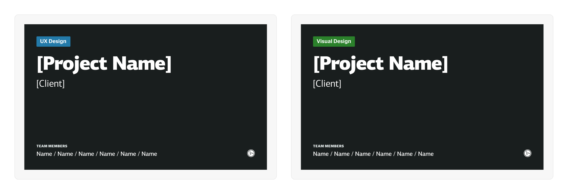
We decided this template was going to be the most effective as a file and not a team library. UX and visual designers would duplicate the files and move them into the project’s team, make any necessary changes for their team’s workflow then begin designing in their respective work files. Below are covers that will serve as thumbnails for the file to help our team find and organize files easier.
In the file we felt it was best to separate the client space, the work space, the style guide, and the components into different sections. These sections were then further divided into subsections with the help of emojis and dividers for better clarity and organization.
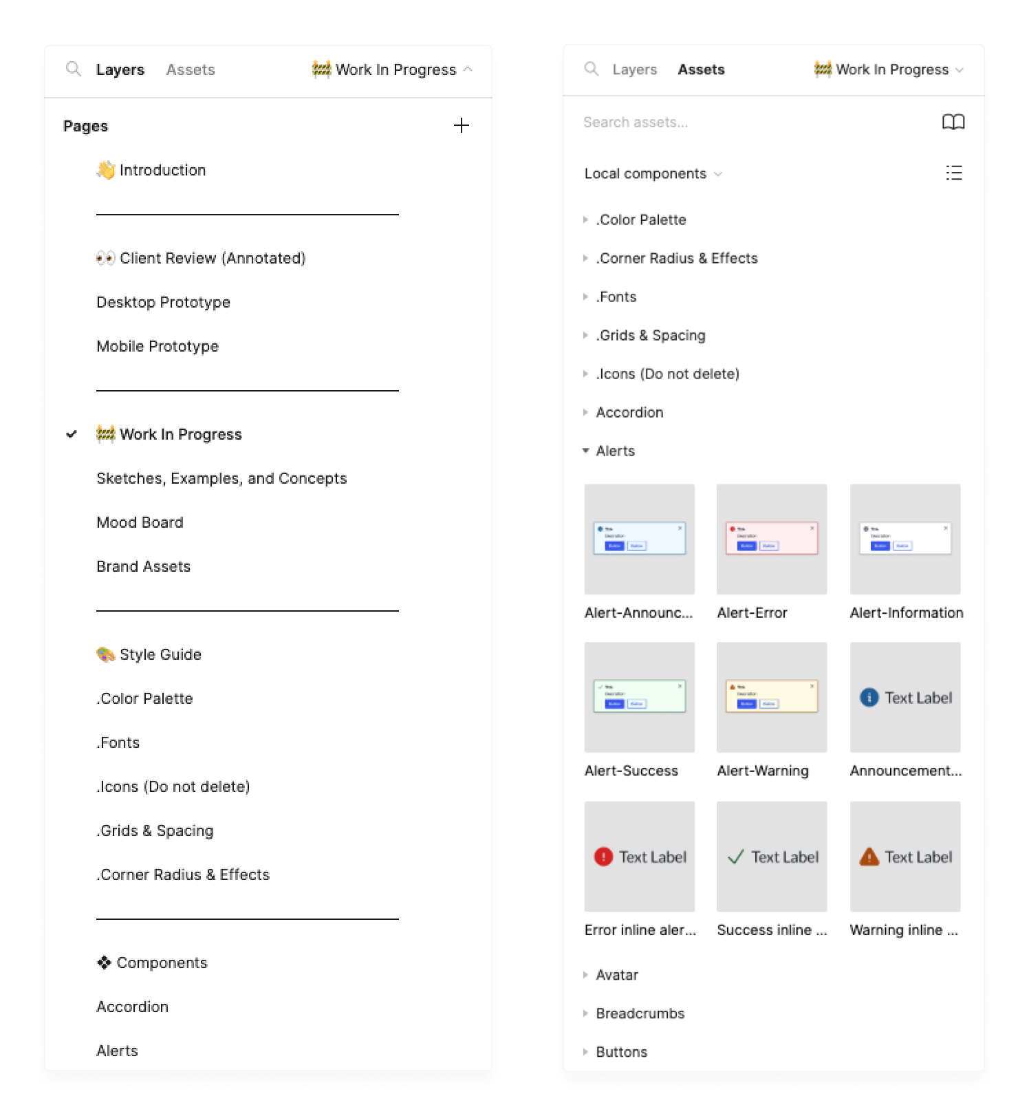
The beginning of the file introduces an informative document that covers various facets of the design system, offering shortcuts to specific sections, and even providing further reading to fully grasp Figma. Drawing from our experience, we recognize that design systems cater to not only designers and developers but also project managers, marketing teams, content writers, and others. Since this won’t be presented as a website like Storybook at this stage, we took care to ensure that the user experience mirrors the functionality of such tools. Users of the system have the option to navigate using the embedded links in the documentation as well as view the entire file fully in prototype mode to mimic a desktop experience to some extent.
![Screenshot of the [Client] Design System getting started page, titled "Using the Design System". The page shows a list of the different components and assets in the design system, as well as instructions on how to use them.](https://fuzzymath.com/wp-content/uploads/2023/09/Intro-Page.png)
Style Guide
After sharing moodboards with a client and coming to an agreement on the direction of the visual aesthetic of a project, visual designers will then move to creating a style guide. This is a crucial step in laying the foundation of the project as this is where typography, color, icons, and grid styling is established. Although this phase is usually done from scratch as each client has their own specifications, the documentation doesn’t have to be and this is where we were able to really optimize our process by making the presentation of documentation consistent and changing the context as needed.
At Fuzzy Math, projects typically involve collaboration between UX and Visual designers. Typically UX designers don’t have to make changes to the style guide since the colors, font, and icons were deliberately chosen to be generic by nature. UX designers focus on functionality, while Visual designers handle the product’s appearance. With our emphasis on mid-fidelity wireframes, UX designers concentrate on user flow and information hierarchy. This approach allows clients to better understand the user experience during presentations, without getting distracted by brand styling or emotional considerations. Our style guide streamlines the wireframing process, providing structure with content and defined interactions while keeping styling minimal.
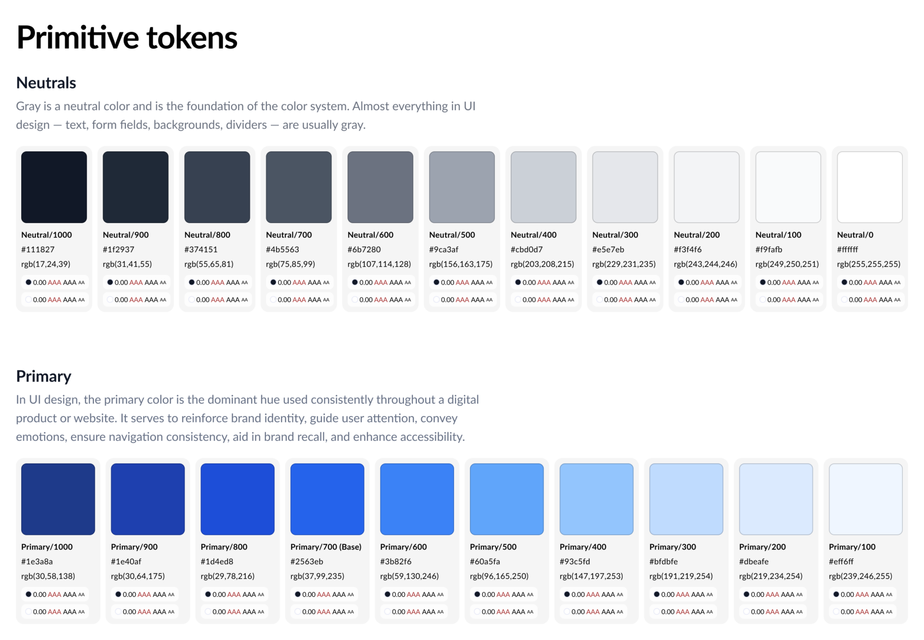
Looking at color we designed the documentation to quickly access the color swatches, token names, hex codes, and accessibility details. We have embraced variables and the power they bring to make design systems more consistent and scalable. Once visual designers have the palette chosen they can run a plugin called Color Variables Style Guide to generate these same cards with the updated hex and rgb codes instead of changing everything manually. Regarding elements such as fonts and drop shadows, their styles are linked within the document. Consequently, when a designer makes updates to the file’s styles, the documentation synchronizes accordingly. This ensures that the design system consistently reflects the client’s branding.
Similar to the introduction page we provide clients with best practices for each style including how to apply color variables and ensuring appropriate line lengths. These updates to our documentation and style guide process have already been praised by FM designers and we are eagerly anticipating client feedback upon final delivery, a topic we’ll delve into later.
Component Build Strategy
We’ve discussed how we evaluated our process from a birds eye view, how we enhanced our documentation, how we crafted the file structure, and our improved style guide. Now we have arrived at the beating heart of our design system journey, components. These building blocks hold the power to shape user experiences. Our approach is all about customization, efficiency, and alignment with the language of HTML and CSS. As previously discussed, our initial component audit gave us insight into our most used components so we began with those and as the system grows we intend to add more while being cautious to not bloat the system with unnecessary components.
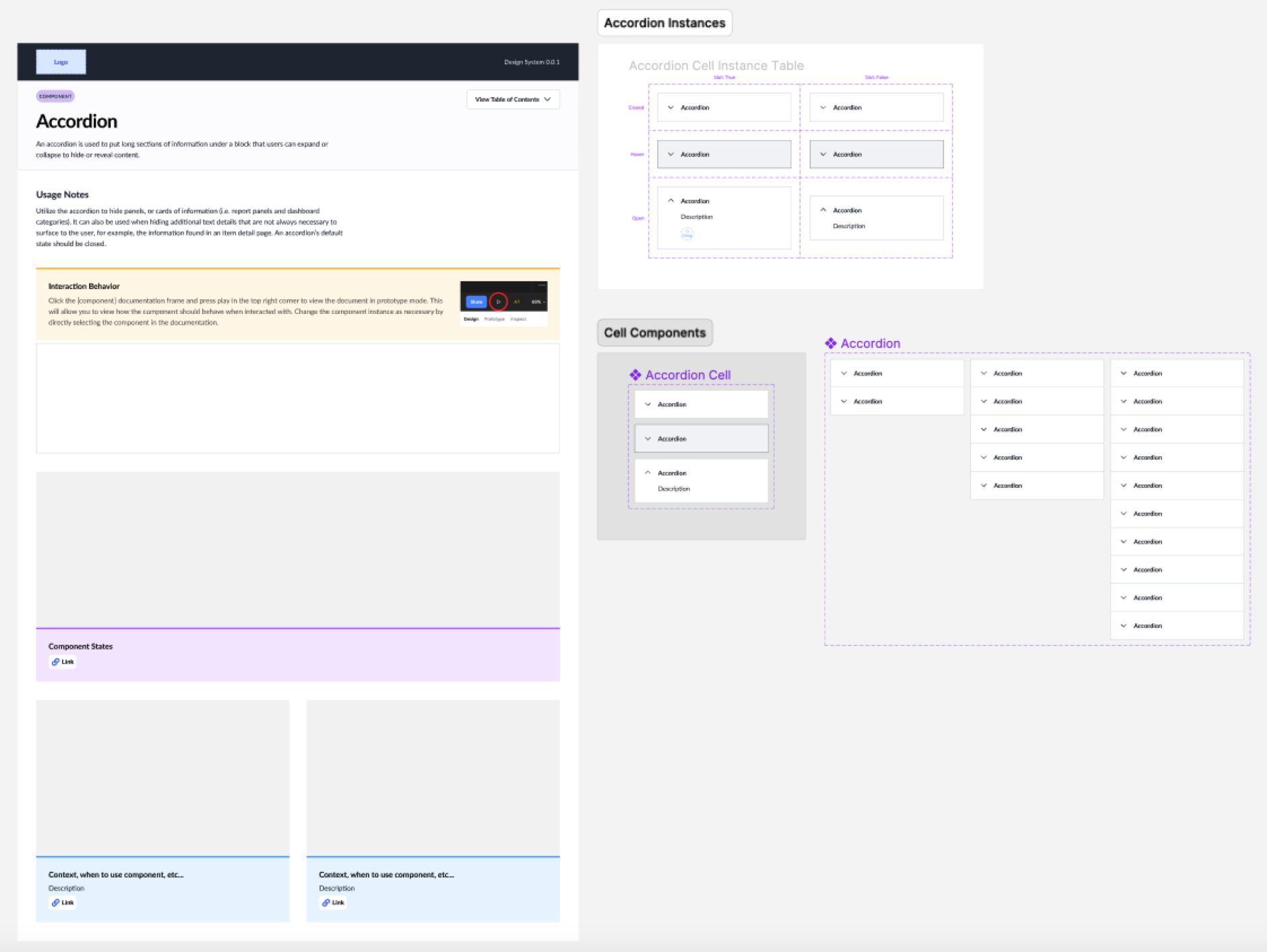
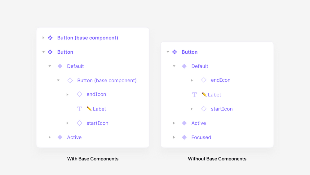
Most component pages will look like this, documentation about what the component is and what it’s used for, a table of instances of the component to inform users of all the permutations of a component (we use a plugin called Propstar for this), and finally the main component. The documentation is a component as well which allows designers to edit the main component to change the layout and add or remove sections as needed for each specific project. Some components such as accordions, tables, and tabs have what we call cell components which serve as the building blocks of the completed component. When we work with these components, we start by making changes to the cell, and these changes automatically apply to the main component. It’s essentially what you may know as a base component, but we’re moving away from using it for every component built.
Why Should You Move Away From Base Components in Figma?
Base components make editing large sets of variants easier — imagine you have hundreds of button variants and one day you decide that you want to change the corner radius or font, making these edits can be time consuming and even worse since you’re a designer you may even change your mind! With a base component its instance will be nested in the variant so when you change the base you change all the variants in one edit.
You may be thinking using them is a no brainer, however there are some potential drawbacks to consider:
- Learning Curve: Considering the bigger layer complexity and how properties are managed, introducing base components requires team members to understand their usage and customization processes, which can lead to a learning curve, especially for new team members.
- Maintenance Challenges: As a design system evolves, updating or modifying base components can become challenging, potentially leading to inconsistencies across instances if not managed carefully. They can also lead to unpredictable overrides and hidden layers may break variants.
- Reduced Performance: Figma expresses in their memory reduction tips that hidden and nested layers, especially in components with a high number of variants affect performance,
We’ve chosen to transition from this approach and embrace Figma’s shift away from base components. Instead, we’re leveraging features like batch edit in component sets, component properties, and variables to construct components more effectively.
Batch Editing
To simplify component editing for both our team and clients we emphasized the importance of consistent layer naming within the system. When layers share the same names, it simplifies the process of selecting multiple layers within a component set by allowing designers to batch edit all layers that are named the same.
Component Properties
“I don’t know about anyone else but my favorite part of using the components in the design system is being able to toggle things on and off… like if I need an icon in this button I can just *boop* turn it on!”
Kelly Cunningham
“I love the design system! As a UX Designer working on wireframes, it frees me up to focus on process & interaction. If I need a button, I just go find it and bring it in, it’s fun!”
Alfreda Kava
Component properties were a powerful update when it was first released in 2021 and two years later it continues to show its value. Almost every component uses at least one property to make it easier for designers to control everything from the design panel instead of clicking into the component layers to make changes. By implementing auto layout we ensure components remain responsive to property changes and resizing as well as ensure alignment with CSS flexbox. Language here was just as important when naming layers since we wanted to align to code as much as possible and we needed users of all skill levels to understand what happens when a property is used. For example, sometimes it would be better for a boolean property to be a dropdown showcasing options instead of a on or off toggle so it was clear what was being selected.
Slot Components
In our quest to build dynamic components, we encountered the challenge of not being able to modify instances. Designers often encounter scenarios where they must transform a modal into a more intricate component or introduce additional data to a table, but solely for a specific instance. The goal is to address these needs without introducing unnecessary variants to the main component. Slot components are essentially components designed for a singular purpose: to be able to be swapped out for other components. Detaching a component instance is typically discouraged, making slots a valuable alternative that not only sidesteps this issue but also enhances component flexibility even further.

Variables
Last but not least, the latest addition, variables, has empowered us to apply values like color and space consistently, reduce the need for numerous variants, and execute large-scale edits to both the file and comps by employing variable modes. After a process of trial and error, we’ve reached a consensus on naming conventions. These conventions are easy to understand and designed to allow clients to readily adopt them initially and then adapt them to suit their specific requirements.
Design progresses swiftly in any domain, but in consultancies, the pace can be exceptionally rapid due to the need for designers to seamlessly transition between diverse client requirements. The culmination of various talents from project management, copywriting, and figma mastery helped foster a design system that will make our process more efficient, consistent, and more enjoyable. Small details matter, such as prototyping component instances for swift client demonstrations of interaction behavior, enhancing the asset panel by segregating variants for improved usability, and more. These refinements empower designers to focus on creative design thinking, reducing the time spent on documentation and component construction for seamless handoff. While this initiative will forever remain a work in progress (design systems are like that pesky never-ending to-do list), we reached a point where a project team could put it to use. However, this victory raised a whole new challenge: internal adoption.
Fuzzy Math Adoption
Change is hard, however change is nothing new for Fuzzy Math. Merely two years ago FM went fully remote, this one huge change challenged the company in a multitude of ways, from adapting to new tools such as Figma in 2021 (read about FM switching from Sketch to Figma in our article, Why We’re Switching to Figma) and processes to onboarding fresh talent and reevaluating our values. Change, though challenging, is an essential catalyst for growth, and it forms the foundation of our ongoing journey to enhance our design process and ensure our clients are delighted with our work.
At this point in the journey most Fuzzy Mathers have heard of the design system template but haven’t seen it in action yet. To foster adoption we began to educate the company by recording 5 minute videos on Loom explaining how to use the file. Subjects covered ranged from changing variables to using more complex components, these videos can be accessed by anyone at the company at any time. As the first project to use the template kicked off, the design system initiative conducted a Zoom meeting to introduce the template to the team. During this session, we showcased practical examples of its usage and provided an opportunity for the team to pose questions. Once the project team became familiar with the template, we organized a company-wide unveiling event. During this presentation, the initiative team guided everyone through the file, addressing questions as they arose, while the project team demonstrated how they were putting it to use.
In addition to video guides, we shared various resources in our internal Slack channels to educate designers on recent features, such as variables. Within the file, we incorporated a change log to keep teams informed about any modifications when they duplicate it. Furthermore, we established a dedicated Notion page for maintenance purposes, enabling designers to log identified issues and propose enhancements. Regarding our clients, as mentioned earlier, we’ve bolstered our documentation, streamlined file navigation, and with comprehensive documentation and component builds, we aim to ensure that the client’s adoption of the design system is a seamless process.
Final Thoughts
As demand for design consistency and scalability continues to grow, Fuzzy Math has embarked on a journey to deliver tailored design systems to diverse clients. Our design system template took us on a journey of optimizing our process and innovating on how we approach using Figma ultimately simplifying the creation of consistent and efficient digital experiences.
In the near future the design system initiative hopes to keep the company engaged with not only the Notion maintenance page but also surveys on how designers are using it and suggestions on how to improve. We’re also excited about the new features Figma will be implementing soon such as variables for text styles as well as our own improvements like dark mode. We are eager to continue to improve upon this first version learning from feedback from both our designers and clients.
Design systems have become an indispensable part of modern design, empowering teams to deliver consistent, user-centric digital experiences. Our journey to optimize our design system process reflects the company’s commitment to excellence, efficiency, and adaptability. As design continues to evolve, we stand ready to embrace change and continue delivering innovative design solutions that delight clients and users alike.