Accessibility is a crucial aspect of design that sometimes can get overlooked when designing products. Although designers and companies alike are becoming more aware of accessibility standards and aim to design more accessible products, the tools available for checking a design’s level of accessibility have not always been the friendliest or the easiest to use.
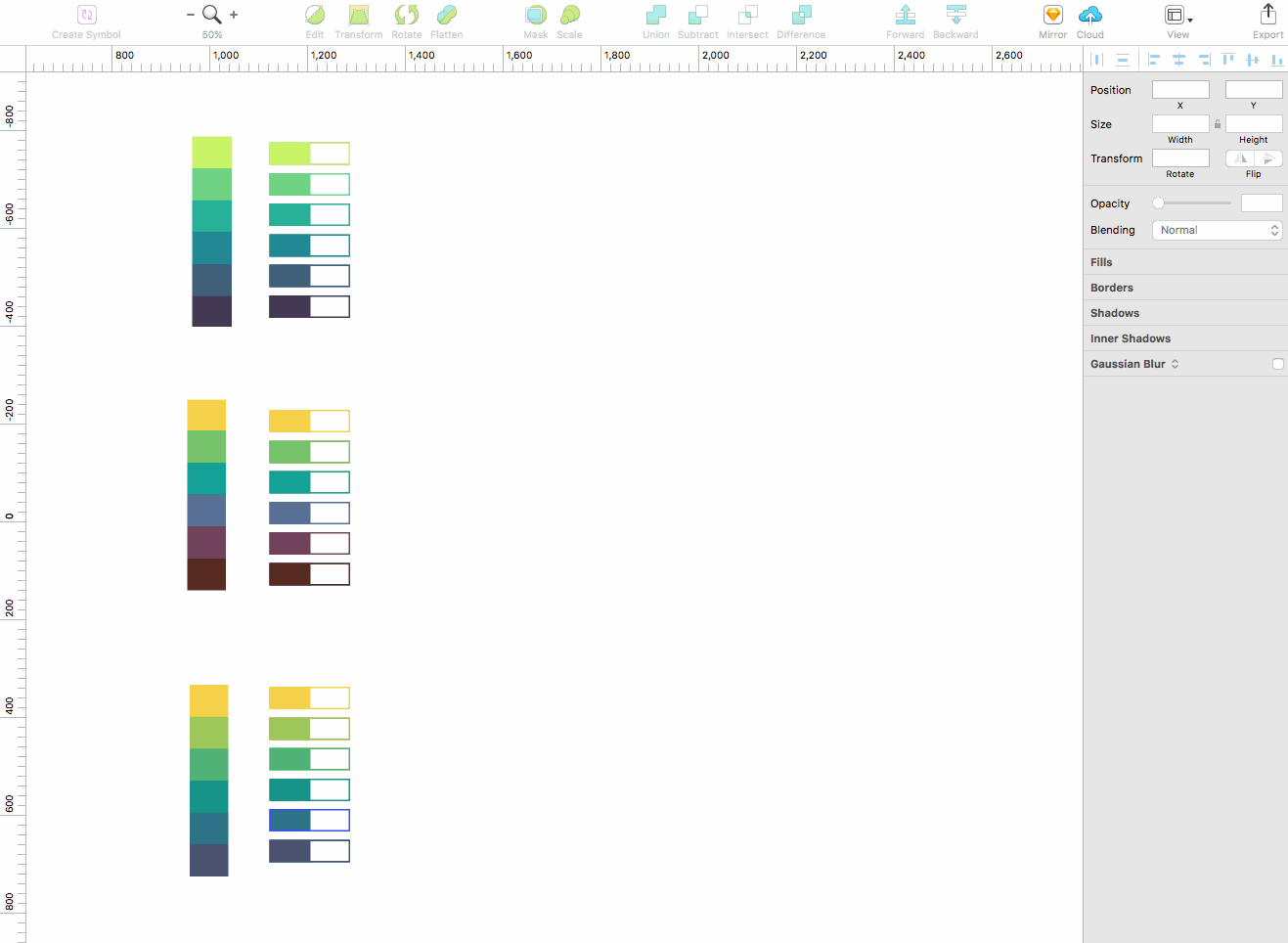
Enter Stark, a free plugin for Sketch that allows designers to easily check readability contrast, simulate color blindness in real time, and then tweak your designs based on that feedback. So far, we’ve found Stark to be especially useful when working on color palettes for data visualization, and for easily checking readability contrast within files.
Stark makes it easy to simulate how work is perceived through the eyes of someone who is colorblind. It allows you to quickly flip between the eight colorblindness profiles while having the freedom to move and resize the Stark window around your file as you compare. You can also easily export these simulations as .png files to share with team members or include in client presentations.
You can also quickly check the contrast between two layers using Stark. To do this, flip to the contrast tab in the window and select two ungrouped layers in your Sketch file that you’d like to compare. Click the ‘check contrast’ button, and Stark analyzes the contrast ratings using WCAG 2.0 standards.
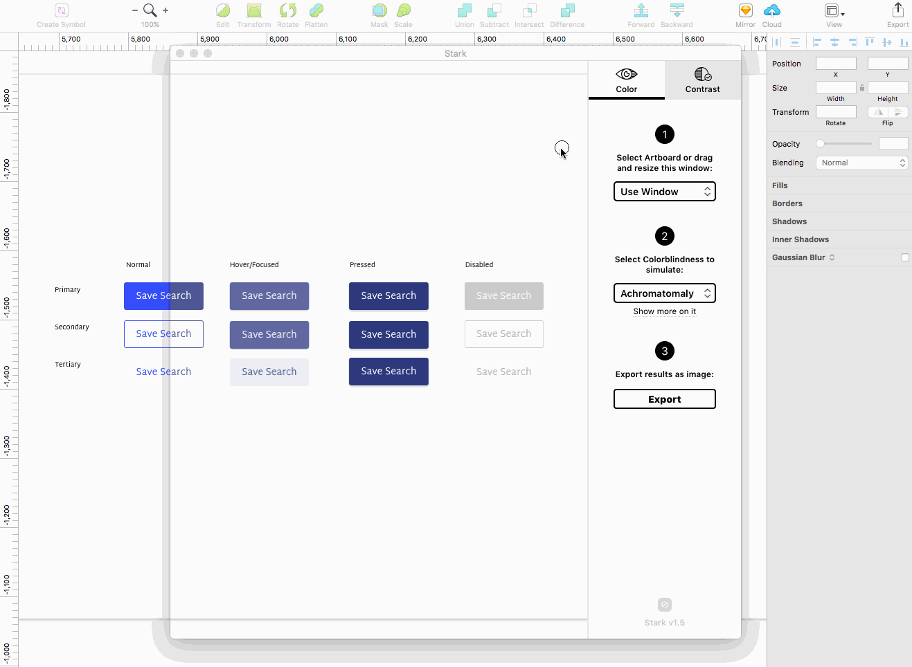
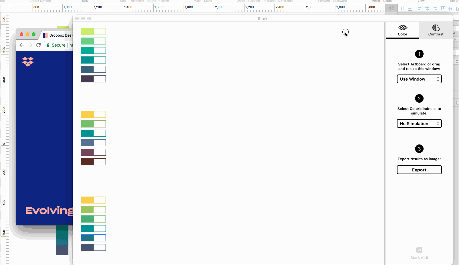
Bonus: Use the Stark window to simulate colorblindness in other applications such as websites and exported files in addition to your Sketch files. This feature makes for easy comparisons of different content, and seems like it could be useful when conducting website or product reviews during the beginning stages of a project redesign.
So far we’ve really enjoyed using Stark and having it readily available when I need it. It’s a clean and lightweight plugin that can truly increase accessibility awareness. I’d recommend Stark to anyone who is looking to create better experiences that aim to be accessible to everyone.
For more on improving accessibility for visually impaired users, check out our in-depth post, “Improve Accessibility for Users Who are Visually Impaired with These 9 Tips”
Downloadable Accessibility Checklist
Web Accessibility Checklist
Get the ChecklistIt’s the role of designers and developers alike to ensure that their tools are built to suit all users.
Check all the boxes on basic web accessibility with our Accessibility Checklist.