The definition of a great, effective user interface (UI) is pretty subjective. Designers often use vague words like “consistency,” “repetition,” and “breathability” when discussing UI (and we’re guilty of doing just that!), but what does any of it really mean? What is it that we need to achieve great UI?
What is User Interface design? Why is it important?
Before we dive into the details, it’s important to have a basic understanding of what it is that we’re talking about. A user interface defines the interaction between user and product. User interface design, therefore, is the act of designing the thing that the user interacts with—whether that’s the shapes on a computer screen, the buttons on a remote control, or some combination of hardware and software.
What is the relationship between UX and UI?
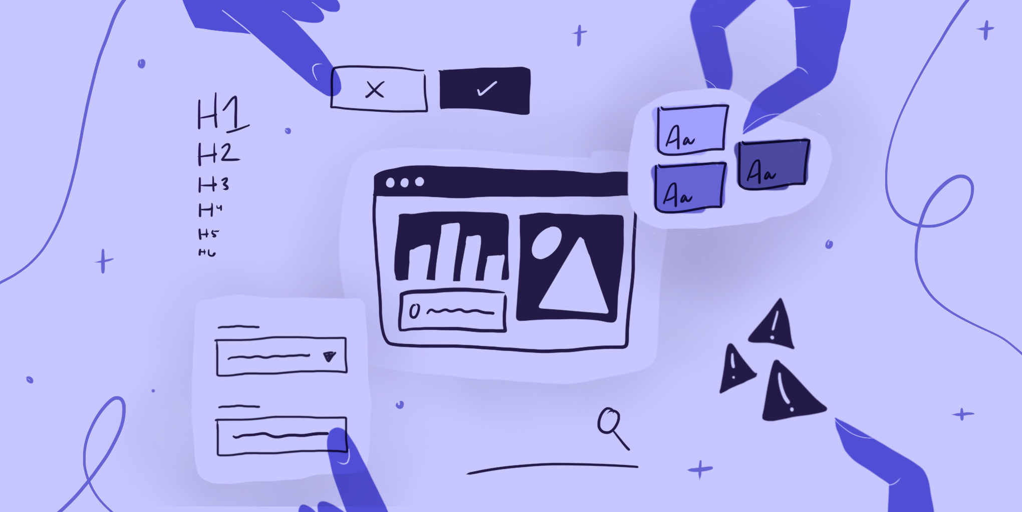
UI design is often placed into its own, separate category of design apart from user experience (UX) because of its tendency to focus on the visuals of a product. However, UI design is, in fact, a major piece of the larger UX design practice. UI should—and does!—take into account the data and conclusions gained from user interviews and research to develop the visual design deliverables. For a software product, UI designers work to develop the visual design language that will be used across the product or product suite, including colors, typography, and iconography. UI designers are also responsible for the creation of the practical components that users interact with, like buttons and text fields, that all help make the product truly usable and enhance the user’s experience.
But what actually makes good UI design? Is it about color choices, layout, or which component to use over another? To help you understand what is needed to create good UI design, we’ve put together this article with guidelines and great UI examples to help you step up your UI design game.
Know your users & understand their context
Great looking user interface that doesn’t have a clear purpose isn’t going to be very useful (although the opposite is true as well). Designing for a specific person doing a specific task or set of tasks is the glue that holds the product together. Make sure that when designing the interface for your next project you have a clear understanding of your users, their goals, and how and when they will likely use the product.
You and your team will have collected a considerable amount of information from user interviews, surveys, and other UX research to understand how the product should function within the context of how and when users are interacting with it. Have another look at all of that research and take it all into account while developing your user interface — don’t let all that work fall to the wayside when it comes time for visuals!
Define practical, easy-to-understand navigation
While it might seem like a no-brainer, ensuring that your user interface design has clearly defined navigation patterns throughout the product is easy to forget. When designing each screen, ask yourself: Can a user tell where they are, where they came from, and where they can go on each page? If not, this can easily be solved by implementing a design pattern like breadcrumb navigation where users see the history of the steps and pages they took to get to where they are now. Additionally, it’s essential to make sure that your top-level navigation clearly indicates the section that the user is in at any given time. These sorts of navigation patterns act as maps so that users can orient themselves within a product. Without a clear map, users can easily get lost and frustrated. They often miss crucial pages and tools, and instead spend more time questioning how they got there in the first place.
Maintain consistency
Consistency is key to UI design as it increases products’ learnability. Good UI design comes from creating a sense of familiarity and ensuring that everything on a screen makes sense and works in ways that the user expects it to work. UI designers achieve this by employing the repetition of component usage, an effective information architecture, and a streamlined look and feel for the product’s branding throughout.
Colors & typography
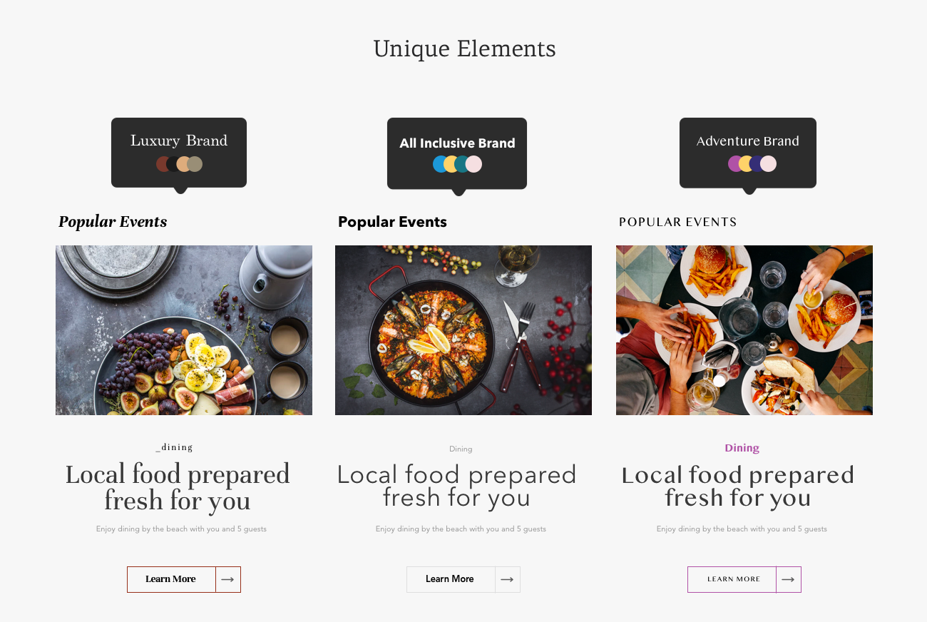
The best UI design examples feature a clear understanding of visual design basics, especially when it comes to color and typography. Ensuring that everything a user sees is “on brand” and accessible will help keep the user focused on the task at hand rather than wondering why, for instance, they are seeing purple body text on one page and nowhere else throughout the application. A lack of consistency and discrepancies like this can confuse users, which is something UI designers want to avoid at all costs. While UI designers should still get creative with their interface designs, the look of a product should never distract users from completing the task at hand. In fact, in the best examples of UI design done right, each visual design decision is made in support of the user’s ability to complete a task or goal. Sometimes, and particularly in the case of enterprise UX, the look and feel of the application is so seamless that it goes unnoticed by the average user.
Additionally, typography decisions should be made with careful consideration of how users will process information. Good UI design examples will show an effective use of hierarchical typography choices to distinguish different levels of headers from body text and button text and ensure typography choices are legible. Essentially, good typography decisions should easily communicate with users what information they should focus on throughout the product.
Buttons & links
Buttons and links are used on every website and application we come across, so it is safe to say that users have expectations for how they should look and function when they are interacting with them. Within a single product alone, there are a number of button and link variations designed to serve different functions. Ensuring consistency among these elements is a crucial way of helping the user correctly predict what will happen when they use one of these elements. It is up to UI designers to establish those distinctions and communicate to users through their designs what each button and link does (and doesn’t do). Pay close attention to these rules as they’re defined to keep them clear and consistent throughout the product.
Interactions
To that point, interactions are another big point of consistency (or inconsistency). Think about how the UI design indicates interactions to users. Do users know what will happen when they interact with a UI element? For instance, if users click on a card, will that interaction take them to another screen or expand the card? Hover states play a big part in interaction design, too. Hover states can be a crucial part of divulging extra information (like hovering over a chart to see extra info about a data point) or purely helpful (like a link changing colors or adding an underline on hover to help users know that they can click on it). Being consistent in how you indicate each of those interactions is imperative to great UI design.
Iconography
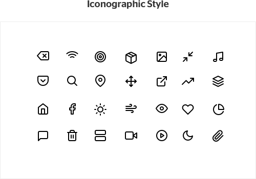
Small details make a big difference in good UI design. Designers use icons as a way to visually communicate certain functions, features, or content of a product with users. Several icons have become so commonplace that they are almost immediately recognized by users (e.g. an icon designed to look like a house means “home” and a magnifying glass icon means “search”). On top of ensuring that icons are recognizable, UI designers also have to be sure that once an icon style and visual language is established, they stick with it.
When creating your own, keep consistency in mind and make sure things like line weight, filled versus unfilled shapes, and other design choices appear across your icon library. Again, visual design choices should not be a distraction for users. As a UI designer, you must make sure that the icons used throughout a product are all part of the same icon family and that if the same icons are used throughout the product, they function in the same way.
Language and terminology
In order to help users easily navigate the interfaces we create, we have to make sure that everything is labeled in ways that help them move freely and confidently from one thing to the next.
Consistency is key here. “Add” and “Create,” for instance, might seem interchangeable. But if your tool always uses “add,” users might fail to understand the action required if they run across “create.” As the UI designer, you can take the lead in establishing the language and terms you want to use throughout the product. Just be sure to stick with your decisions, and be consistent in the terms you and your team choose to label things that have the same functionality.
Increase user control and freedom
Users should feel a sense of ease when they navigate through a product and move freely without fear of making any major, unintended errors. To help prevent this, UI designers implement functions like undo buttons and confirmation messages into their designs.
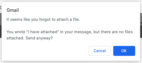
Google has great UI design examples of this error prevention in their Gmail designs. If a user mentions in their email that they have attached a file but clicks “send” without attaching any documents, a pop-up message will appear on screen notifying the user that they may have forgotten to attach a file to their email.
Additionally, Google has integrated a small pop-up message at the bottom of the screen (for both mobile and desktop) after a user has deleted an email. While it only appears on screen for a few seconds, a message notifying users that the message was deleted with an option to ‘undo’ the deletion allows users to not only have a confirmation that a task was completed, but also a way to easily make a change and correct their mistake if the deletion was unintentional. Small considerations and timely interactions like the ones Google has in place can give users a sense of safety when using products.
Apply a “less is more” approach
One of the most important lessons to learn early on with UI design is to not over-design or give users too many options or information at once. It’s easy to let your creative ideas take over when designing a product’s interface, but having too much on screen can result in a lack of efficiency and leave users not knowing what to focus on or what actions to take.
There’s a famous experiment that explores this idea of “choice paralysis” where people are presented in one scenario with 26 options of jam and another scenario where they’re presented with only 6 options. Although it was assumed that people would be more likely to buy a jar of jam when presented with more options, the experiment concluded that people were more likely to buy jam when presented with fewer options. Essentially, the experiment found that when we are presented with too many choices, it is harder for us to be satisfied with finding the best option.
This focus on simplicity is what fuels the successful design of Apple products to this day and that same principle is essential to the UI design of digital products. For each screen designed, strive for simplicity, and make sure that the information presented is helpful for users, not overwhelming.
Offer users system status updates
Things like loading screens and messages of confirmation or error messages make the difference between good and great UI design. It is important to let users know what is going on behind the scenes of a product to reduce user pain points and frustration that will make them not want to use the product.
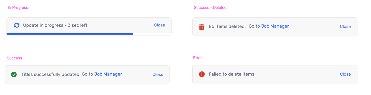
Don’t keep users in the dark! Let them know things like how much time is estimated until their file is fully uploaded, or whether or not their message was successfully sent over to customer service. Interacting with users in these small ways can help develop loyalty to your product.
Make your UI design intuitive
A user interface is successfully intuitive if a user doesn’t need much (or, ideally, any!) training on how to use it. This can be accomplished through following established and understood design patterns, making sure your use of color (particularly status/indicator colors), typography, and iconography is clear and consistent, and that when you do run into an error, the system tells you what’s wrong. An intuitive product allows the user to focus on the problem they’re trying to solve, the question they’re trying to answer, or the task they’re trying to complete, rather than focusing on how to use the system.
Obviously, the human-centered design or goal-oriented design approach both have intuitive products as the end goal. By designing for your specific users and their workflow, your design will be intuitive at the end of the day, but it also requires testing and validation to uncover any unseen issues.
As you can see, good UI design is about more than just making an app or website look nice. It’s taking into account all of the users’ needs and creating an interface that reinforces consistency and helps users accomplish their tasks in the most seamless way possible—it’s all about user experience! Use these tips as guidance for your next project and you’ll be sure to not only deliver a functional product but one that users will enjoy coming back to. Want us to get you or your organization started on developing consistent design components for your product? Reach out to us to get your project off the ground.
Want us to get you or your organization started on developing consistent design components for your product? Reach out to us to get your project off the ground.
Want us to get you or your organization started on developing consistent design components for your product? Reach out to us to get your project off the ground.