
How do you design a product to work effectively for someone completely new to it, as well as someone who’s been using it for hours every day for months or years?
Building in guidance for novices can create unwanted friction for experts, while a purely expert-oriented UI harkens to the days of inches-thick user manuals. As a large chunk of our work at Fuzzy Math is on the sort of complex enterprise tools that require solutions for both users, we’ve found a number of ways to ensure both novices and experts are supported.
Guided pathway, hidden shortcut
One of the most common patterns for supporting high-frequency expert users, while supporting novices and low-frequency users, is to provide two paths: one that provides a slower, guided experience, and one that provides an experience that maximizes efficiency and strips away guidance. To keep the interface simple, and free of unnecessary options, the guided approach is visible, usually with a clearly labeled button or other component that initiates the action. The expert version, however, might not be visible at all, accessible by keyboard shortcut, gesture, etc.
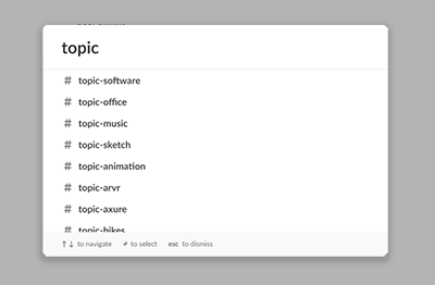
For anyone who’s used Slack for more than a day, the “Quick Switcher” is a great example of this pattern in the wild. Users can navigate using the more guided side rail, and “Channels” search interface, which are visible in the UI, providing targets for unfamiliar users. Once you’re familiar with the tool, and know what channels you want to access, the Quick Switcher — accessible via key command (⌘/Ctrl + K) — provides a far more efficient, if less intuitive, way to navigate. Even simple shortcuts for copy/paste follow this pattern: anyone who’s spent time writing in a word processor has likely worn their ⌘/Ctrl + C/⌘/Ctrl + V keys down, but for new, infrequent computer users, using a Copy/Paste GUI button (as in Word), or the Edit menu (as in virtually any text-based application), is easier to remember than key combinations.
Build up to complexity
In some cases, the most complex features may only be utilized by more experienced users, while simpler features are used by everyone. Viewing a single item, for instance, might be universal, while in-depth reporting functionality might be used only by more advanced users. Where possible, find opportunities to develop patterns utilized in both places, so that users who understand the simpler views can more easily transition to the more complex views — they’ll still need to learn some of the functionality, but the familiar UI will simplify this process.
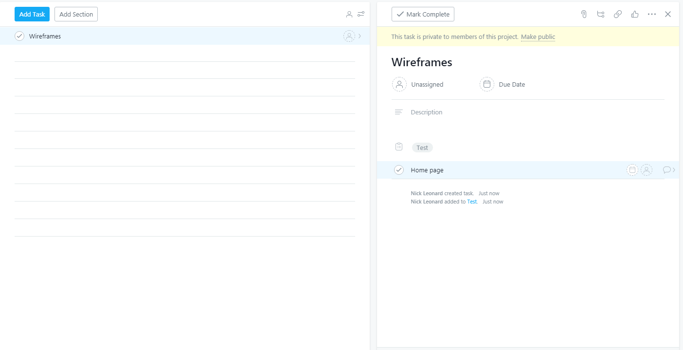
Many project management tools follow this paradigm, both to accommodate a range of needs and to increase approachability. Asana, for instance, allows users to create complex webs of nested tasks and assignments, but no matter how complex you make it, it’s all built on the same foundation of a simple list.
Make prioritization a priority
A common mistake when designing for expert users, especially in data-heavy applications, is to throw lots of information at the user at once — they’re experts, after all, and can surely sift their way through a dense screen. Or perhaps when speaking to these users, they rattled off a laundry list of all the data they want on this screen, asking for an overwhelming density of information that sometimes they might want.
While it may be true that experts need many different types of information, we’ve yet to find the product where everything is truly needed with equal frequency. There’s always some information that’s more important, and information that’s needed less often. And whether you’re using that information once a week, or a hundred times a day, a visual hierarchy of information that creates logical clusters and distinguishes higher priority information will help users orient themselves and find what they need every time.
“A visual hierarchy of information that creates logical clusters and distinguishes higher priority information will help users orient themselves and find what they need every time”
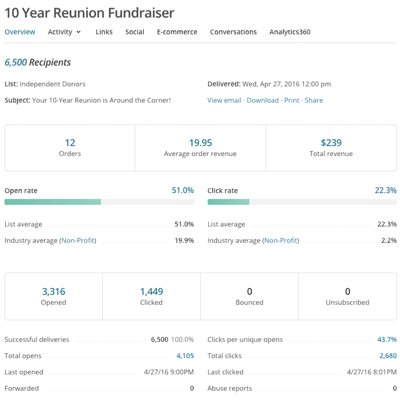
Most e-commerce works this way, appropriately so as approachability is key in e-commerce — start at a list view, with limited product details (e.g. name, photo, price), drill down to a product page with highlighted features (e.g. name, photo, price, description, variations, warranty summary), with lesser used details one step further (e.g. size charts, material composition, full warranty details). Similarly, MailChimp’s Report view starts with a summary that includes clear information priority and easy to scan data points, with more granular detail on child pages, allowing all users to get the big picture without having to having to wade through a deluge of information.
Do your homework
There’s no one way to solve this problem, but there is one method that should always come first: user research. Only through observing new and experienced users can you understand how their goals are similar and different, and what each group needs to succeed. Understanding how users start with the product, what they know coming in, if and how they’re trained, and how they’ll transition from novices to experts will help ensure the product can be designed to meet the user at each step.