Back in 2015, Fuzzy Math wrote an article about Chicago’s new Ventra system and called it ‘Scary UX in the Wild: Ventra’ — I hope to turn this into a series. Why? Because there’s too much scary UX in the wild and it’s useful to shine a light on it to say, “hey, isn’t that scary? let’s not do things like that.”
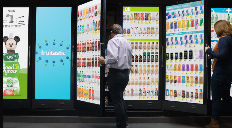
While our article from 2015 was mostly a Chicago issue (though plenty of public transportation infrastructure in the US suffers from similarly bad design flaws), I want to try to highlight a ‘Scary UX’ issue that’s currently frightening people across the country — the digital cooler screens at Walgreens (and some other stores).
Wait, what? “Cooler screens”?
Yes.
If you haven’t seen them yet, many Walgreens locations across the country have installed digital screens on the doors of the coolers in the refrigerated section that show the selection inside the cooler.
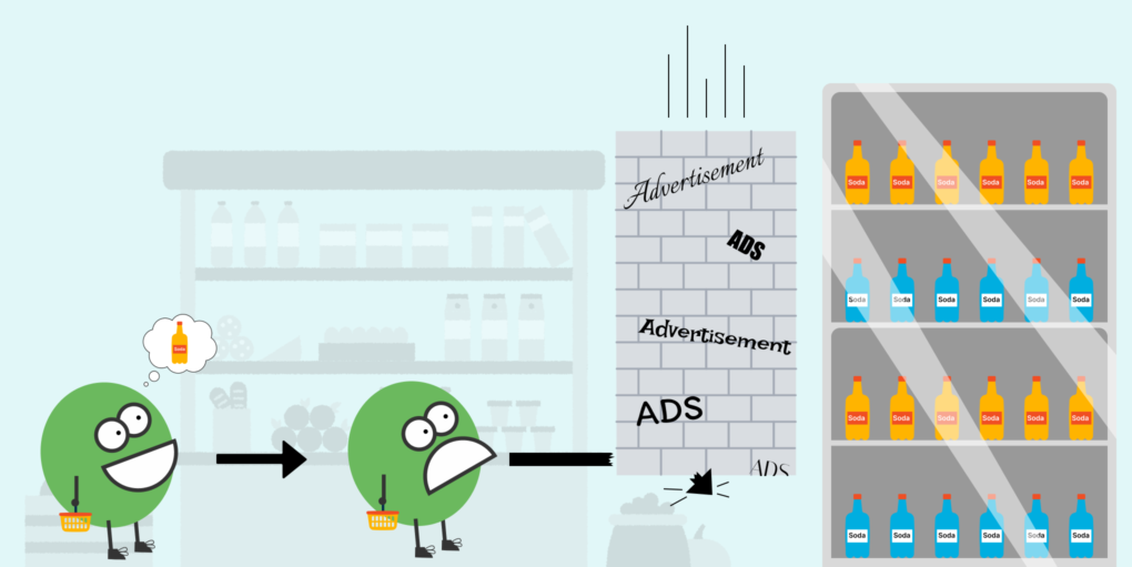
Now, before I dig into these cooler screens and the UX choices they represent — I want to remind the reader of the traditional shopping experience that Walgreens is trying to replace.
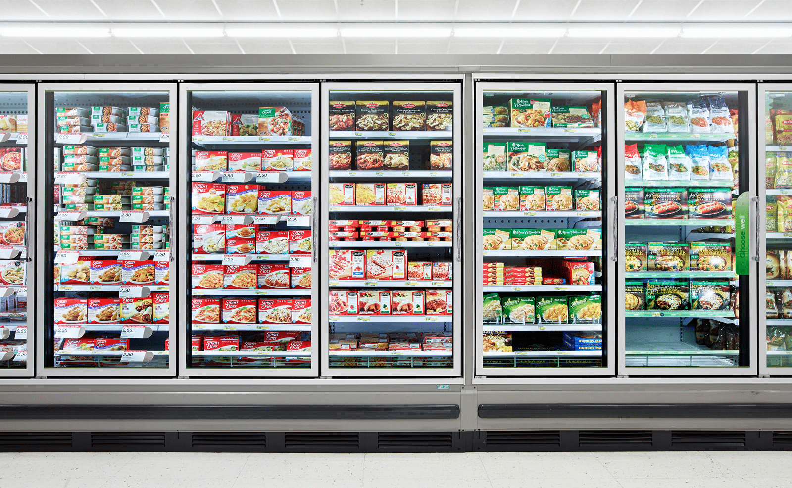
It’s a simple, intuitive two-step process. First, the customer will approach the rows of coolers and see the product they want through the clear glass (glass has the intrinsic property of being see-through, thereby naturally aiding the customer in seeing what is in the cooler). Second, the customer, upon locating the item they’re looking for, will open one of the cooler doors and take the item out.
Done.
Now here is that same process with the new Walgreens Screens.
First, the customer will approach the rows of digital cooler screens — all of which are playing ads. The customer will need to hope that the motion-sensing cameras now placed atop each screen are working properly so the ads will stop and the screen will display what is in the cooler.
Also, don’t forget about the ads and cameras, I’ll get back to them later.
If the motion sensors do work, the customer then sees a digital display of all the items in the cooler they are standing in front of (while the others are still playing ads).
The customer then needs to hope that the displays are accurately showing what is inside — as many have pointed out across the width and breadth of the internet — the coolers do not always correctly show the right items for that particular cooler or are wrong in saying something is or is not out of stock. Alternatively, they’ll only show you what’s fully in the cooler after watching an ad.
Some of the items had a small (digital) sticker on them that said “More coming soon!” meaning that though the display showed nearly every product, behind the door was a mostly empty fridge.”
Of course, you don’t get to see that information until after an ad plays—an ad for a product that may or may not be the one you’re hunting for
The above points are going to either prompt the need for exploration (in a customer who knows that the screens sometimes lie) or disappointment (in a customer who thinks that they are truthful).
Either way, the customer then opens the cooler, and takes out their item, but perhaps a bit more frustrated than they were before.
The UX of It All
A caveat here — I am not on the Walgreens UX team and am not privy to internal decisions that they have made — and I completely understand that many of these decisions may not have come from a design team at all.
We at Fuzzy Math are a User Experience firm, meaning that our job is to try to understand the needs of the person in front of these screens just wanting to get their soda fix.
Walgreens here has made a decision to overhaul an aspect of a shopper’s user experience that likely didn’t need to be tampered with. I have a very hard time imagining Walgreens customers, if asked about their shopping experience in the refrigerated section, saying that they want to see more ads on digital screens (of products that may or may not even be in the aisle or store that they are in) while they shop.
It might be time to ask — “does everything need to be an IoT digital screen?” What benefit is this bringing the person that interacts with this and can we prove it’s a benefit over the older way of doing things?
The next potential issue of this particular implementation is that there are many different failure points. The screens can break down, the internal camera used to track inventory can malfunction, and the external motion sensor can break and keep showing the customer ads instead of what’s in the fridge. The list goes on, and if you explore the comment threads on the various articles, Reddit threads, tweets, and TikToks about the screens, the faults do go on — in the lived frustrations of customers — which is what good UX should be trying to reduce or eliminate.
The Ads
So it’s not hard to see the reasoning behind this decision — the ad space that these screens provide.
According to an article from the Wall Street Journal, a big part of the reason these screens have been installed is the ads.
More than that, though, the main reason for those external cameras mentioned before is that:
“cameras, sensors and digital screens […] can serve ads to consumers who approach, based on variables such as the approximate age the technology believes they are, their gender, and the weather.”
We understand that ads are a part of doing business for consumer brands, and we also understand that targeting ads based on gender, age, or whatever else is an industry standard now. But the thing to consider is — shouldn’t people at least know? Does the average person walking into a retail store with these screens installed know that they’re being watched and used for user testing? My guess is probably not.
The company behind the screens says that the technology is totally identity-blind, which is great, but it doesn’t take into account that consumers in brick and mortar stores aren’t used to being tracked or fed ads in this way. At the risk of sounding like a Luddite, I’d venture to say that it might be better for users if we kept e-commerce practices (many of which have met considerable controversy) restricted to the internet. In the words of Julio Sevilla, a marketing professor at the University of Georgia
“Digital screens can add uncertainty and physical barriers to a simple and literally transparent process: reaching into a glass fridge.”
Can it be better?
In my opinion, the field of UX design is a positive one — and “how can this be better” should be the question in one’s mind after every negative experience.
There are plenty of ways for the cooler screens to be better in my opinion.
For starters, consider turning the cameras away from the customers, and improving the sensors inside the fridges. This will make what’s presented in terms of stock more accurate, and enhance ease of use for the employees doing the restocking, giving them accurate information as to how and when to restock.
Perhaps allow the screens to be more interactable? Displaying health information and other useful things that customers might actually want to see on the screens.
To their credit, Cooler Screens (the company behind the cooler screens) has plans to make the screens voice-activated and more interactable in the future. But again, the voice activation piece has the UX designer in me quaking — I don’t even talk to Siri in public — so I certainly do not want to be shouting at a Walgreens refrigerator to show me the frozen pizza. But as always, other users might be different and it’s something to test.
Lastly, Walgreens and Cooler Screens talk a lot about how innovative this is — but unfortunately — all I see are big digital billboards in front of people trying to shop. Why not try something genuinely innovative like a transparent digital screen? Add some AR into the mix while simultaneously solving many of the issues above like the screen not displaying what’s actually in the case?
We feel like these implementations can be done and can be very innovative, and while we understand the choice to design something around the necessity of ads, perhaps it can be done in a way that brings far more benefit to the people using this on the day to day? We’d advocate for rolling out new changes with smaller-scale testing to really make the shopping experience better for people.
Sources:
- Are Cooler Screens the Fridge of the Future? By Marketing Brew
- Walgreens Finds a New Way to Shove More Ads in Your Face By The Takeout
- Walgreens Tests Digital Cooler Doors With Cameras to Target You With Ads By the Wall Street Journal
- Why would Walgreens do this?’: The store’s latest update is annoying some shoppers By WDSU News
- Credit to icons8.com for some header image art
Does your company have a web app challenge? We can help.