As user experience design consultants, we use a lot of software to communicate with our clients. Whether it’s project management software, like Basecamp or Asana, messaging software, like Slack, or remote meeting software, like WebEx, GoToMeeting, or Zoom, we’ve likely used it on at least one project. Of all the software we’ve ever used, a single screen has lead to more confusion for our team than any other: the WebEx Welcome screen. We have some thoughts about why it’s so confusing and an idea on how it can be fixed.

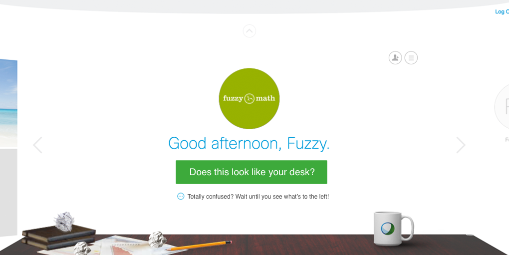
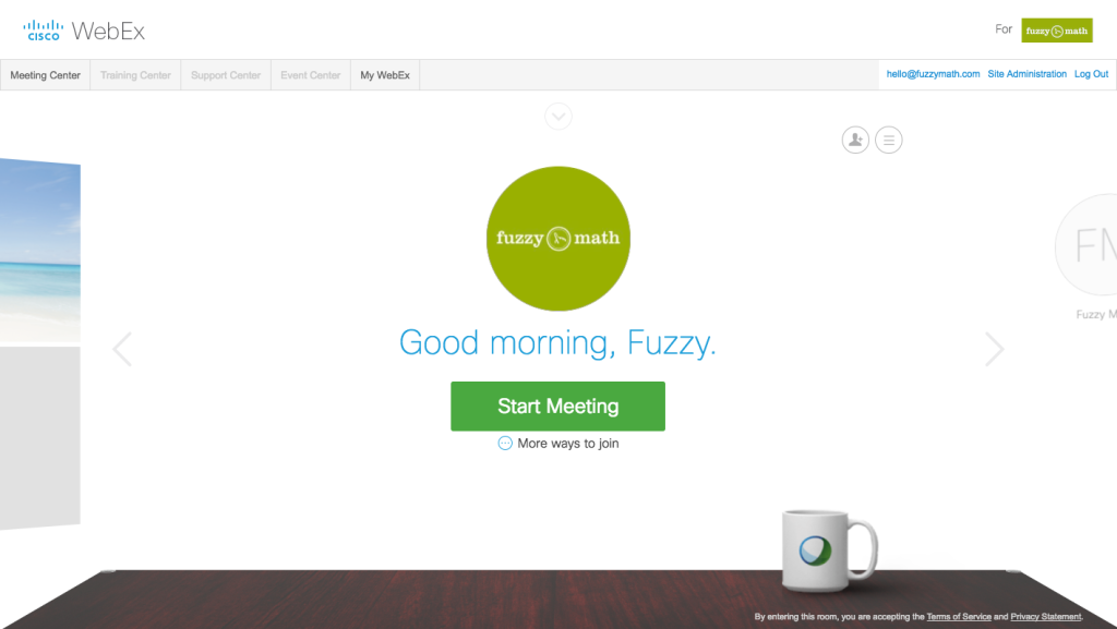
This is the screen that welcomes us to our WebEx account. It seems to be a minimalist office setup, complete with desk, coffee cup, and wall-mounted Fuzzy Math logo. There looks to be a partial window or landscape view to the left, half of an avatar to the right, along with a small handful of controls up top. The common response when giving a new Fuzzy Math employee a walkthrough on how to use WebEx is: “wait, what?”. That’s typically when we show them that they can click on the coffee cup to turn it into a travel mug or click again for a different travel mug. Their response remains the same.
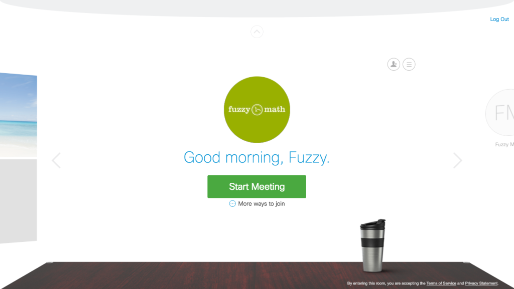
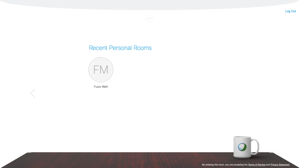
Here are the other easily accessible screens:
We eventually explain that the controls that we need are tucked above the screen, accessible once the small grey arrow at the top of the screen is clicked.
Once we get the nav, we can enter our “Meeting Center” which contains every piece of functionality that we care about: the ability to start a scheduled meeting, view our upcoming meetings, schedule a new meeting, access recordings of previous meetings, etc.
It has always struck us as a little odd that everything we need is hidden behind a tiny little grey arrow at the very top of the page, not to mention the skeuomorphic desk design that conjures memories of Microsoft Bob and other interfaces from a different era. We’ve spent some time thinking about what might have caused this and what we would do differently.
Key challenge
A key challenge all meeting applications face, and surely WebEx is included here, is that they’re going to be used by different types of users in different ways. WebEx is used by internal teams, sales people, consultants working for clients (like us), and likely a slew of others. Each of those users have slightly different needs from software to accomplish their specific goals. There are real challenges facing the software designers when thinking about the default experience:
- Which user type is going to receive priority above the other users?
- What features and functionality will best support them to achieve their goals?
- Will other users be able to easily use the software?
- How much control will other users have to change their experience?
- How will they be able to do so?
In the case of the WebEx Welcome screen, we can safely assume that we are not the primary user they have designed for. The priority of the “Start Meeting” button and quick access to “Recent Personal Room” to the right lead us to believe that they’ve prioritized users that are using more ad hoc meetings over users like us, where nearly everything is a previously scheduled meeting with a specific start time. That’s OK, though, prioritizing one user type over another is something we would almost certainly recommend to a customer of ours.
The problem we see, however, is how specific they’ve chosen to make the default experience to a specific user without giving other user types easy access to customize the experience for themselves. Our preferred experience is quite different from what we’ve been presented with, but there’s no obvious way to customize the experience to meet our needs.
Suggested approach
If we were tasked with redesigning the “Welcome” experience to WebEx, we would take a slightly different approach. Instead of defaulting all users to the experience that promotes ad hoc meetings and recently used contacts, we would explore opportunities to allow for users to be in control of what they see when they login. Through the use of a quick ‘first run experience’ wizard, we could learn more about the user and how they’re going to use WebEx:
- Do they expect to use a handful of previously scheduled meetings each week or a constant stream of ad hoc meetings?
- Do they think they will be connecting with the same people repeatedly (such as an internal team) or an evolving set of contacts (such as a consultant working with a changing set of clients)?
- How important is it to see upcoming meetings?
Depending upon those answers, the experience can be altered to better meet their specific experience. Possibly more importantly, users would always have the ability to easily access their settings to change what they see when they login, a feature we believe to be lacking today.
We don’t take issue with not being the primary user today, but we do have concerns about how locked-in we are to the current experience, which is prioritized for a different type of user than us.
Other issues
While we’re on the topic of WebEx, here are a couple other issues that exist:
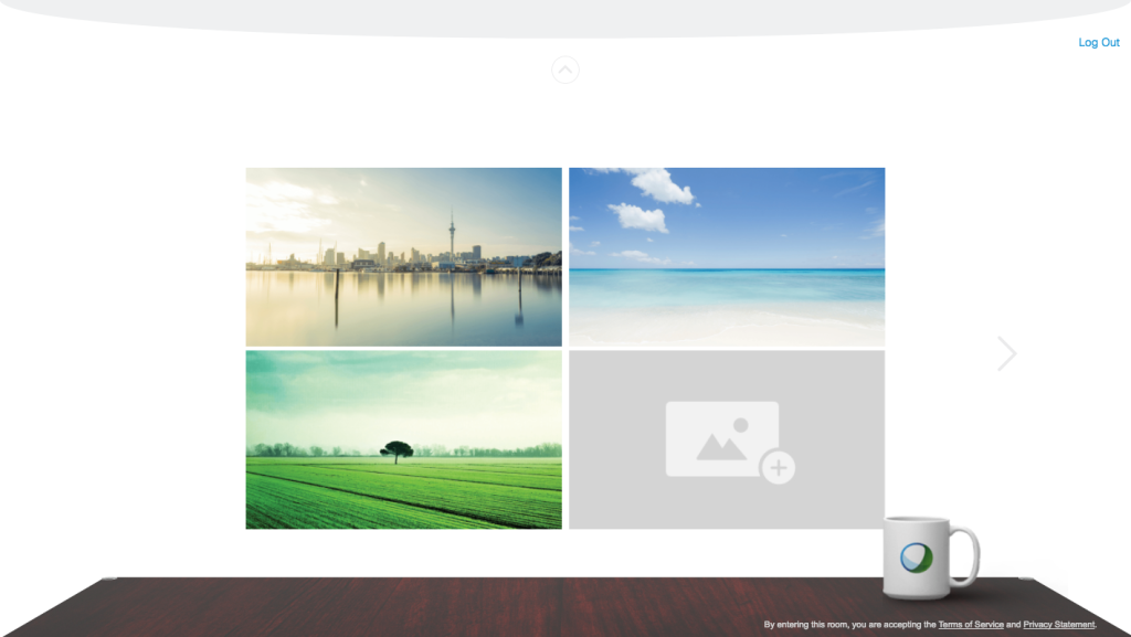
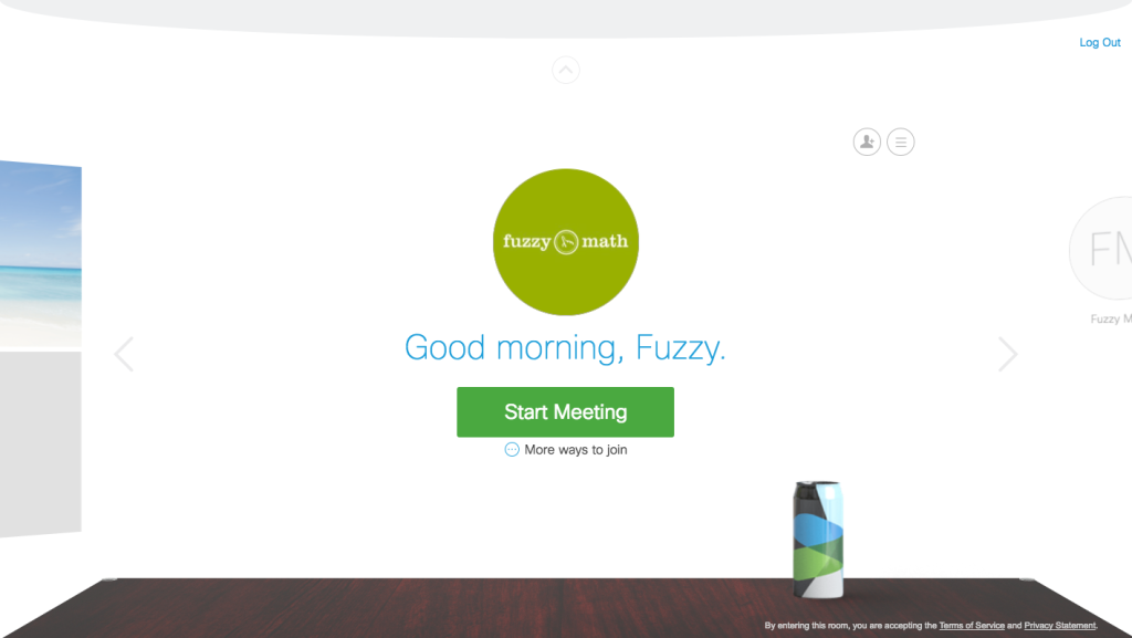
This is one of the three prioritized screens on the Welcome page – the option on the left. This screen allows you to change the background to your desk. Of all the features that WebEx includes, and there are many, this feature has been highlighted alongside starting a meeting and your recent contacts.
The default setting is for WebEx to turn on each users’ camera when joining a meeting. We rarely use this feature and are more often caught off guard by it, than appreciating it. The setting to control this feature by default is again buried is a jumbled section of other global settings.
We strongly believe WebEx is in a tough spot to support a broad range of users with different goals of the software. However, through their decision to have the default experience greatly favor one type of user over the rest, and to limit and/or hide the ability to change this experience, they’ve missed an opportunity to give all users a truly welcoming “Welcome” experience. Additional decisions, such as using a skeuomorphic design that harkens to days long past and prioritizing cosmetic, display functionality over core application functionality, they’ve made an experience that leaves us thinking, “wait, what?” more often than we’d like.