
Design systems are essential for businesses looking to document their design assets and continue building consistent, usable designs. Not only is this beneficial for the designers and developers at a company, but it allows others at the company to see and better understand how and why design decisions are made by having everything in one organized place.
We have helped a number of organizations streamline their designs and develop their own design systems, so we put together some key points and tips to help you understand the importance of design systems and get started developing your own.
What is a design system?
A design system is a documented catalog of components and styles used within a product, including how and why each should be implemented. While design systems are often confused with style guides and pattern libraries, a design system is more strategic and high-reaching. In fact, pattern libraries and style guides are both pieces of the design system!
Design system elements can also extend into other brand touchpoints beyond the actual product. When creating things such as email and social media content, it is common for design system elements to filter through and be used by other teams in ways that the product design team might not have intended. It’s important to remember that while your product team works hard to keep all of these design elements consistent and “on brand”, there are likely going to be times when marketing teams, for instance, might break design protocol for their advertising purposes. It’s a bit of a fuzzy process, but design systems should be able to make room for instances like this. However, when it comes to product design the team knows what rules to follow.
Atomic design
One of the most commonly referred to explanations of how a design system works is with Brad Frost’s atomic design. Through this analogy, Frost breaks down the pieces of a design system using the same framework for understanding the makeup of things found in nature.
Frost’s atomic design starts with an understanding of user interface (UI) components, which he equates with atoms — the building blocks of matter. UI components are elements that can be combined to create the screens of a digital product and, ultimately, can develop a full-fledged design system.
A product’s components come out of conclusions drawn from UX research and are usually identified during the wireframes stage of a project. For example, if you are working on a project for an events ticketing application, it’s safe to say that during the wireframing stage you and your team will note a need for components like a date picker, text fields for payment information, and a small collection of different buttons. It is the job of the UI designer to help make these ideas come to life by taking the product’s branding (either the branding they’ve developed or building from an already existing brand identity) and design components that are consistent, work together, and overall make sense for the product.
UI components include everything from checkboxes and radio buttons to text fields and call-to-action buttons that can all be combined to build products for every industry.
So essentially, combining UI components create molecules and those molecules are then combined to create organisms. Organisms are combined to create templates which then become pages. Finally, a collection of pages is what becomes a website (or any other digital product like mobile and desktop applications).
Frost’s breakdown helps to conceptualize the idea of a design system and how UI components work together in this systematic way to build up to the products that we interact with every day.
What is the purpose of a design system?
Of the bat, creating a design system might sound like more work than it’s worth because not only are you creating all of these assets for a product, but you also have to carefully document them. The truth is, however, having a design system will save you and the businesses you work with more time and effort in the long run.
Better workflow & quality control
Design systems help both designers and developers streamline their workflow by giving them structure and guidance when building out a product. There’s no wondering what dimensions a particular element has to be or confusion about what colors to use because all of the product’s elements, the look and feel, and guidelines are predetermined. This ensures consistency throughout an entire product and helps with quality control. Additionally, when new team members come in to work on a product, they’ll have documentation of everything they need to know about a product, making the onboarding process smoother for everyone involved.
Getting buy-in from higher-ups
Because design systems encompass so much, they can help higher-ups at a company (and other people not working directly on the product’s design) get a strong sense of the product. With the design system, they’ll be able to understand everything from the product’s identity to the best practices the team has implemented. Having a design system keeps everything all in one place and gives clarity as to how and why certain decisions were made.
How to create a design system
Start with a pattern inventory
Whether you’re building a design system for a brand new visual design language or starting with an existing application, start with an audit of all your existing design patterns. Gather all of your already existing buttons, cards, and other patterns and make note of how they’re being used.
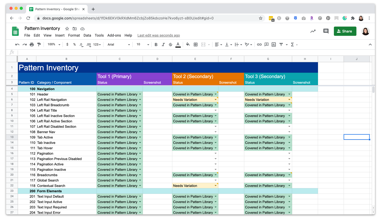
Determine which of your already existing components should be included
Start with the basics. Just think, What components are the most important? Which ones are used most often? These are the primary components that must be included in your design system since they are the ones that your product needs in order to function.
Then, determine which (if any) components require variations. Some standard variations can include things like what a card’s hover state looks like or how a button looks once it’s been clicked. More complicated variations can depend on content or use case. For example, sortable columns, expandable rows, and column-level filters may all be necessary variations on a basic, primary data table. While variations on the primary components are not necessary for a basic design system (and can always be expanded further down the road), they can help to fill in gaps from unexpected data or use cases and create a full and rich design system.
Finally, you’ll want to consolidate any duplicate or overlapping components. Maybe you have multiple components that do the same thing. Is it worth including both in your design system? To help you determine this, ask yourself, Are the use cases different enough? Can I clearly explain when to use one component over another? If the answer to both is yes, it’s worth including both. If not, then do away with the component that is less likely to be used.
What else to include in a design system
Elements & Components
A design system should include any element that you want to be standard across platforms. The best design systems contain both UI elements (a catalog of reusable components), as well as standard brand guides including the color palette, typography, and iconography.
Some other elements to consider:
- Data visualizations
- Illustrations
- Page structure and framework
- Voice and Tone
- Accessibility guidelines
- Design principles
Content & Information
When putting together your design system, it’s important to think about your users and their goals. What information would be helpful for each? For design systems, the primary users are designers (and sometimes developers), so be sure to include content for your users that will help inform them how to use the design system in order to make their jobs easier.
Designers as design system users
When designers use design systems, it’s important to document how and when each component should be used. This frees up designers to spend their brainpower solving unique challenges, rather than reinventing components that are already in use.
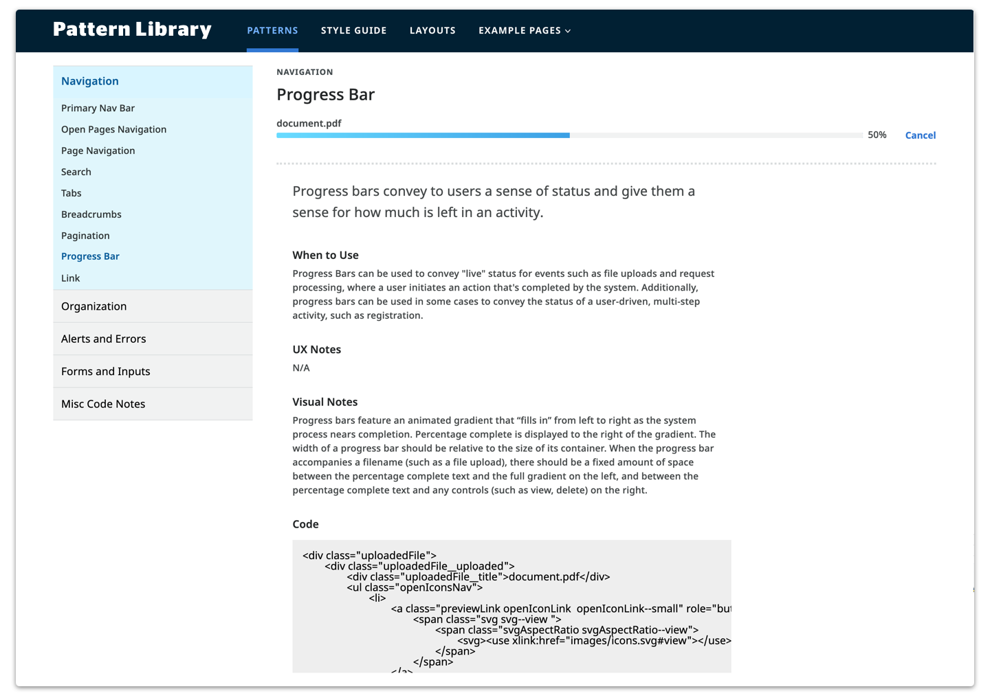
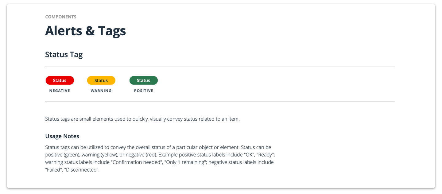
Each element should include the following to help designers understand how to use them:
- Description — What is this element? What is the goal?
- Usage notes — When and where should this element be used?
- Related elements — If this element is similar to another, consider pointing to other related elements. In many cases, it may be helpful to outline when to use one element or another depending on the use case and goal.
- UX or Visual notes (optional) — Additional notes on the interaction or visual design of the element.
- Dev notes (optional, unless developers are also intended users!) — Additional notes on how the component is built.
Developers as design system users
Depending on the goals of the design system, many organizations use their design system to also catalog the code for each UI element. This allows developers to use the design system to pull standard components, rather than building them differently each time. If your design system is intended to also be used for developers, make sure that you are as comprehensive with the code and dev notes included as you are with design elements and help make the developers’ jobs as streamlined as possible.
Building (and maintaining) your design system
Depending on the level of fidelity of your design system, there are a number of different options on how to build and maintain it.
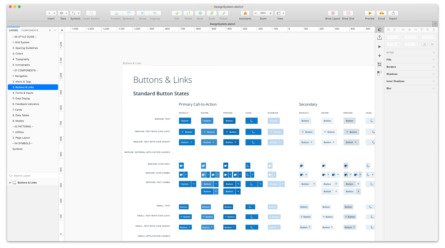
Lightweight Option: A PDF or Design File with Reusable Components
Cataloging your components as a Sketch or Figma library is one of the easiest ways to share your design system. Consider exporting a PDF or other documentation of these files to keep a record of the file at a certain point in time. This option can also be used in conjunction with a more robust method of building your design system.
👍 Pros:
- Easy to get started
- Lightweight
- Best if you’re just including components, not code
❌ Cons:
- Difficult to maintain. It’s very possible to end up with multiple, conflicting copies of a static file
- Does not include code
- May be difficult to share between users
Mid-weight Option: A 3rd-Party Tool
A third-party tool like InVisions Design System Manager (DSM) or Storybook can help manage and organize your content and allow components to be shared between users.
👍 Pros:
- Can share components across users / systems
- Options to include live design files, code, and/or descriptions
❌ Cons:
- Dependent on a third party for maintenance of the tool itself. It might not have all the features you want, and if it breaks, you’re out of luck
Heavy-weight Option: Build Your Own
Build your own design system documentation. This can be as in-depth or lightweight as you need it to be. We often deliver design systems and pattern libraries via a custom-created site. This way, we can share exactly what we want with clients and nothing gets lost in transit. We recommend using this option in conjunction with a third-party tool or a live component file for best results.
👍 Pros:
- Make it exactly what you want it to be
- Can share code
❌ Cons:
- High effort, for sure
- Making sure you have the designer-power to keep it updated
Design System Examples
Design Systems in the Wild
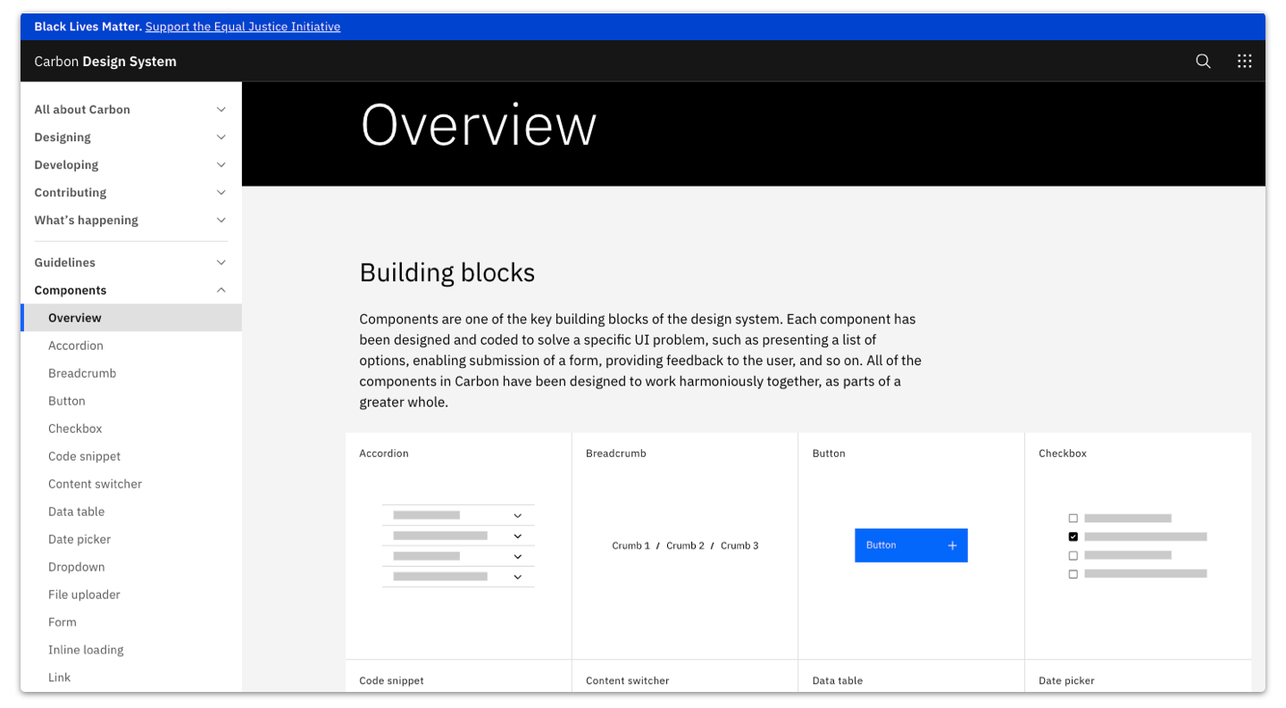
IBM Carbon
Why we like it:
- Overview landing page is concise and easy to scan
- The search is robust — an important feature when you’re looking for something specific!
- Radio toggle for light/dark mode shows different use cases
- Code, usage, and style tabs organize the information in a way that is both helpful and detailed
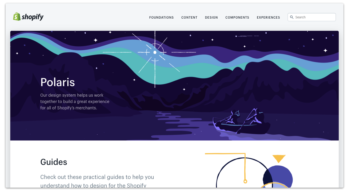
Shopify Polaris
Why we like it:
- Details best practices and content guidelines for each component.
- Shows the different variations for components clearly and concisely.
- Provides pattern-level as well as component-level guidance.
- Provides code as both React and HTML
- Includes design principles and content guidelines
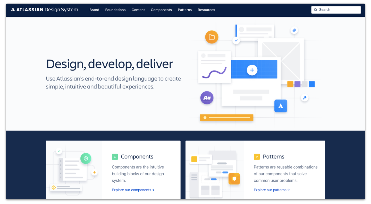
Atlassian Design System
Why we like it:
- One of the most robust and well-organized examples that we’ve found
- Provides detailed, thought-out explanations on why or when to use a component
- Balances multiple users and use cases by including both content available for the public and content specific to Atlassian employees
- Provides pattern-level as well as component-level guidance.
- Includes detailed guidelines on voice and tone, as well as writing style
- Includes links to resources such as fonts, an illustration library, and Sketch and Figma resources
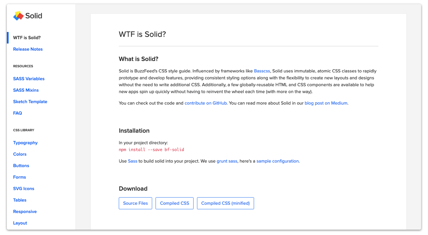
Buzzfeed Solid
A good example of a design system for a content site. Although it’s fairly dev-oriented, there are a few features that we really like:
- Provides SAAS variables upfront and clearly accessible
- Provides a downloadable Sketch template or library for designers looking to use the system
More design systems in the wild
Adele is a repository of publicly available design systems and pattern libraries. Bookmark the website and reference it when you’re looking for more examples!
How we’ve developed design systems
Our work has an enormous impact for designers “on the ground”. Developing design systems has given companies a place for designers to turn to and better understand how a product’s design works while providing them with a resource to easily find the information they need in a clean, organized package. For each of our design system projects, we made sure we were listening to internal teams to understand what they know, how a design system would best benefit them, and then offered our expertise. Essentially, we were there to support in-house design teams since they were our end-users.
Things to keep in mind
If it’s not updated, it’s not worth having
Whether it is changes to the branding or updates that need to be made in order to make the product more accessible, it’s a good bet that the product you’re developing a design system for won’t look or even function the same forever. That’s why having a well-defined process of how a design system gets updated regularly is important. Maintenance of a design system can be a huge undertaking. In fact, many large organizations have a design role (some even have teams!) dedicated just to design system maintenance.
Design systems are living and meant to be updated as changes come to the product or company, so make sure that you have a process for making those updates as regularly as needed. Otherwise, what’s the point of having a design system in the first place?
Economies of scale: small doesn’t always need design systems
Although we are strong advocates of design systems, they may not be necessary for every project. Design systems take a lot of time to develop and if you are working at, say, a small startup that’s just getting off the ground, developing a full-fledged system at the start might be more work than it’s worth. However, having the building blocks in place as the company scales up to eventually need a design system is always a good plan.
There’s a lot that goes into developing a design system for your team, but following these guidelines will get you started on the right path to creating a system that will not only categorize all of your product’s elements but also improve your team’s workflow.
Want some help getting started? Reach out to us and our team will work with you to get your design system up and running.