You can’t effectively design UX products for healthcare companies without understanding the basic needs of healthcare applications. Luckily, the healthcare field is one that we have a lot of experience in! From designing for medical professionals on the front lines in emergency rooms to creating mobile solutions for preventative care, Fuzzy Math designers have tackled all ends of the healthcare UX spectrum.
The healthcare industry must regularly adapt to the demands of an ever-evolving, more technology-forward world. At the same time, new products emerge, attempting to streamline complicated processes while maintaining patient confidentiality. Because of this (and more), we broke down 10 things design teams must keep in mind when designing products for the healthcare industry.
1. Learn how the healthcare industry operates.
The American healthcare system is among the most complex in the world. When it comes to insurance alone, users must navigate different plans and plan types, state-level laws and requirements, and restrictions on which doctors and services are covered by insurance. And accessing healthcare services without insurance is an even more complicated, costly, and seemingly impossible venture.
Understanding the ecosystem is the first crucial step in understanding the healthcare industry as a whole. Keep in mind that healthcare UX products may be designed for any of the following players in the industry:
- Providers — the systems, facilities, and individuals involved in delivering healthcare services. A healthcare provider can be a hospital (including administration of those facilities) or an individual doctor or caregiver. As such, the goals and interests of this group may be split between achieving the best outcomes for patients, and getting paid for their services.
See how we partnered with GE Healthcare to develop 10 new applications built for medical professionals, specialists, and admiinistrators. GE Healthcare Case Study
- Payers — the systems, facilities, and individuals involved in managing healthcare expenses. This category of healthcare players includes insurers like BlueCross as well as government programs like Medicare, whose goals are often centered around profit management through improving population health (minimizing risk), minimizing cost of care (expense reduction), and appropriate price setting (revenue generation).
Working with some of the biggest names in the business to identify problems and strategize functional solutions for enterprise software systems. Digital Product Strategy
- Patients — anyone and everyone seeking healthcare. They often have specific healthcare needs and generally limited healthcare expertise. However, other factors including age, technological-savvy, location, and overall health may play a drastic role in understanding patients’ goals and use cases, as well as the overall usability of healthcare technology.
Learn how our team worked to understand the member experience and developed an online portal for responsive web and native mobile users. Interactive Health Case Study
Related: Create Healthcare Technology by Understanding Users

2. Understand the terminology…
Just as we do in the design world, people in the healthcare industry regularly use shorthand terms and insider language. During your UX research, take note of these terms. Consider developing an in-house glossary so that you and your team can better understand your users and communicate with them more effectively. Here are some terms that we’ve found particularly helpful in navigating healthcare spaces:
- The many types of insurance plans (HMOs, PPOs, HDHP, etc)
- Forms, licenses, and other documentation specific to your users
- EMR (Electronic Medical Record) and EHR (Electronic Health Record)
- Telemedicine and Telehealth — Solutions that connect clinicians and patients remotely to deliver care
- mHealth (or Mobile Health) — A general term for tools that use mobile patient devices to collect data and provide clinical support
As a designer, you are in a unique position as the middle-person between the system and users. The more you understand, the easier it will be for you to relay that knowledge back to users. Use that position to assist healthcare consumers and workers and improve the products that help make their lives easier.
3. … so that your users don’t have to understand the terminology.
You need to understand the medical jargon. But odds are good that your users (especially non-industry users) don’t know or care about the jargon. Use what you’ve learned to relay what they need to know in ways that are simple and easy to understand.
A 2018 survey by PolicyGenius revealed that most Americans (96%) were unable to correctly define common health insurance terms. That’s why it’s so important that designers working on healthcare software take the time to understand the common jargon.
4. Prioritize simplicity and clear functionality.
Healthcare products also tend to be high-stakes. The usability of healthcare products can influence a patient’s treatment, how a patient’s progress is tracked, and more. Even consumer products like wearable fitness trackers have an impact on how people understand, monitor, and report their own health. If an error occurs because your user failed to understand your product or interface, there could be drastic and unintended consequences for a patient’s health.
In our experience, most common UX issues with healthcare IT products fall into one of two categories:
- The first problem we see is that the application is simply too complicated for the average user. According to a recent Deloitte survey, only a small fraction of American healthcare consumers consider themselves “tech-savvy”. These users are typically younger, in better health, and have higher incomes than their non-tech-savvy counterparts. In other words, the users who are most likely to benefit from using preventative healthcare technology, are those who are the least likely to actually use those products. Knowing this, designers must design usable products that make choices easy to decipher. They must also seek out an older and more diverse pool of users during research and testing phases. (More on this a bit later.)

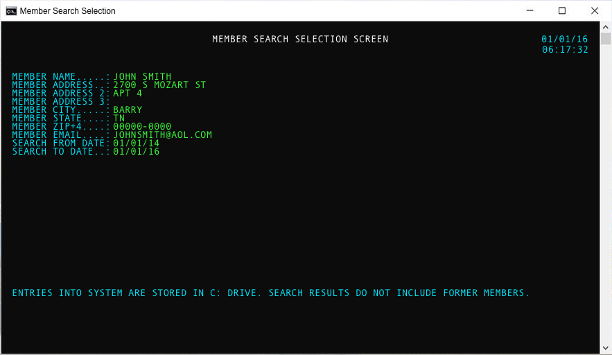
- The second common UX issue with healthcare products is a bloated interface from years of building upon an outdated framework. We see this most often with large enterprise products. Large organizations often struggle with knowing when to rethink frameworks and adopt new technologies. We’ve seen everything from high-dollar insurance claims processed through terminal-style green screens to ER staff sorting through data-dense applications in critical situations. In cases like this, it’s worthwhile to invest in research. Take a step back and evaluate whether or not your current solutions are actually benefitting users. Knowing how users work and what their tasks and goals are can help businesses evaluate current practices. Are your current solutions supporting thoughtful, well-designed experiences?
5. Technological literacy does not equal health literacy.
Even your most tech-savvy users can struggle in the healthcare space. Between confusing terminology and complex ecosystems, this stuff is incredibly complicated. Don’t rely on the assumption that your users’ understanding of technology will help them understand your healthcare UX product.
Everything mentioned above applies to even the most tech-savvy user. And it bears repeating: Avoid using medical jargon, and keep your product simple and straightforward. These steps will help you avoid usability problems down the road, especially when designing healthcare UX for a user who are not healthcare professionals.
6. Cast a wide net when conducting healthcare UX research.
Healthcare UX design affects a wide variety of users and use cases. Therefore, it’s important to be inclusive in all aspects of your research.
Let’s say you’re designing an enterprise healthcare product used in a hospital setting. During research, be sure to consult with people from different departments to gain a more holistic understanding of all your users’ needs. In doing so, we’ve uncovered several insights that affected the ultimate design direction.
For example, you might notice that big touch targets, CTAs, and text fields are necessary in an ER where timely decisions are made and recorded quickly. A user who spends their days behind a desk, on the other hand, may benefit more from a design that allows them to consume more relevant information at once.
Similarly, when designing healthcare technology the general public, be sure to conduct UX research with participants from similar demographics as your target users. Average household income, familiarity with tech, general health, and location are key factors in affecting how (or if) a user interacts with a product. By expanding your pool of participants, you can more easily and readily identify critical pain points for a variety of personas.
Take, for example, a recent product designed to help people living with arthritis assess and monitor their symptoms. During research, we discovered that when users were actively experiencing their arthritis pain, tracking it in an app just wasn’t a priority. But when they were not actively experiencing pain, it was hard for them to remember to go back into the application. As UX designer Mia Villareal put it, “It was essential to engage users living with arthritis pain, since they are the only users of the app. Just like in all our research, talking to the right people is really important in understanding how to design a better product.”
7. Understand that your users’ end goals will drive your design.
What do users need from the product you’re designing for? What is it that they are trying to do? Understanding the context and the actual job or task to be done is the top priority in healthcare UX design.
Let’s look at an example of a user approaching a hospital website for the first time—opening the “digital front door.” What information are they looking for? And what do they need to know right off the bat?
At the start of the COVID-19 pandemic, hospitals needed to respond to widespread concerns and provide patients with accurate, important information about the virus. In response, many hospitals updated their digital front doors with bold banners and directions to newly created resources dedicated to all things COVID-19. Hospitals that did this effectively were able to successfully recognize a user need, then design and apply the best solution to curb misinformation and get patients (the users) access to the resources they wanted.
While the response to a pandemic is an extreme example, the process is the same for any technology solution. Designers must go back to the project goals. Remember why you are designing the product and who you are designing the product for.
8. Match your design to the user’s environment.
So you’ve talked to a wide variety of users and have a good handle on what their goals are. You also need to understand their environment. Are you designing for emergency room staff or for general medical practitioners with regular office hours? Are you designing for patients sitting at home or waiting for an appointment? Consider how each of these environments might affect your design requirements, and investigate how users will interact with the product in these environments.

One of the best ways to gain a more holistic understanding of your users’ environment is by including ethnographic research as part of your UX research plan. By conducting research in-context, you’ll be able to grok a user’s workflow or use case firsthand. You’ll pick up the details of your users’ environment, what devices they’re dealing with, what’s going on around them while they interact with your product, and so much more.
Related: 5 Examples of Ethnographic Research Driving Design (and 8 Tips for Designers)
9. Help your stakeholders and business leaders empathize with your end users.
In addition to research, empathy mapping is another key activity to help align the whole team to your users’ experience. Start by listing what your users are thinking, feeling, seeing, hearing, doing, etc. while using your product. What else is going on that will affect their workflow?
This activity will help you—and your team—understand that your product is just one part of a larger ecosystem of variables. At Fuzzy Math, we often use this activity to facilitate discussion with stakeholders about who they think their users are and who they actually are. Sometimes we find that different stakeholders have drastically different ideas about users. In that case, empathy mapping early in our design process can provide some clarity for the entire team and make sure that everyone is on the same page before any decisions are made.
10. Meet your end users where they are.
The best products develop from a clear understanding of who the users are and what they need to meet their goals. Designers should always plan to meet users where they are. To do this, it’s crucial that you get the most out of your time with users during research. Understand their level of tech-savviness and prioritize simplified, clear designs so your products have a high degree of usability. Use language that is straightforward and consider what they expect in terms of voice and tone for the product. While it makes sense to speak in a professional, matter-of-fact tone with a product designed for physicians to report take notes during their patients’ visits, a more approachable, casual tone might be better suited for a personal wellness tracker. Get to know your end users and what they experience in their environments—empathy is key!
Understanding the healthcare system and the people working in it is crucial to designing successful software solutions. As is often the case, research is the make-or-break factor in understanding what your users need. But if you take the time to understand the larger ecosystem, understand the individual pain points for each player, and design with your users’ goals in mind, you can help both patients and physicians complete their tasks with confidence and clarity.
There’s a lot to know and learn about the world of healthcare. Luckily, we have years of experience to help get you started on your next project!
Are you interested in learning more about how Fuzzy Math can help you or your team design better healthcare products? Contact us today for a free UX consultation.
