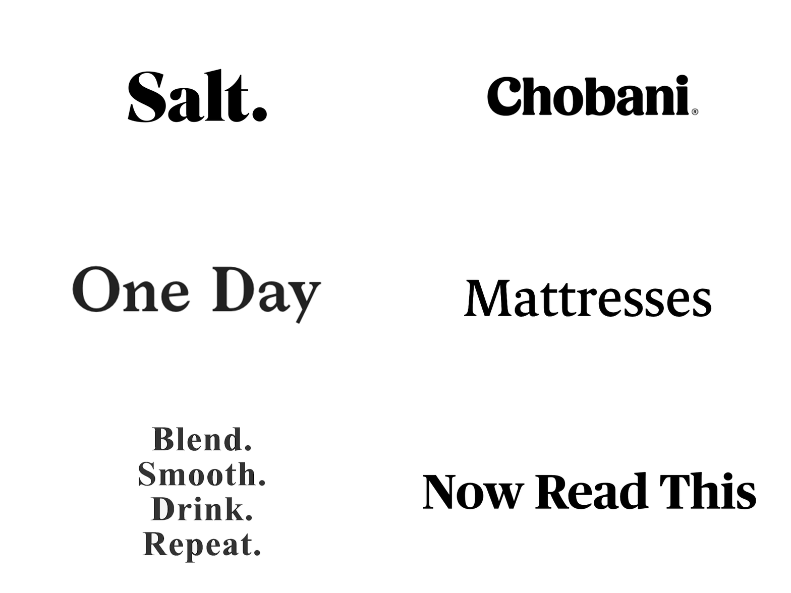
There’s a new serif in town and it’s cropping up everywhere.
I’ve been a visual designer long enough to see my fair share of design trends come and go. But recently I’ve noticed a high saturation of this one specific typeface in use for the web. In the last couple of weeks alone I’ve seen multiple redesigns spanning various industries using similar popular typefaces.
Have you noticed it as well?
Personally, when I first saw this typeface I thought, “This looks nice.” The chunky serif was a look that I hadn’t seen much before and I liked it.
However, as months rolled on I noticed a couple of sparks turn into a veritable forest fire. In the last week alone it seems that every new website redesign is using a similar typeface. It’s friendly and bold style made its way into numerous startups. From there the trajectory seemed to jump into headlines and logo redesigns for more prominent sites.
Just what is it about this popular typeface that has made such an impression on designers recently?
Could this become a problem? Yes and no.

We all dip into the same melting pot
The story of designers gaining inspiration from each other is as old as time! Designers, like most humans, are essentially curious. We like to see what else is going on around us. Trends are inevitable and are a beneficial stepping stone in our design evolution (arguably, flat design influenced the creation of material design, and so on.)
There is nothing wrong with using similar or popular typefaces. After all, dig into any website and you’ll see Georgia and Arial abound.
The majority of us who love design and are aesthetically minded want to feel like our site is fresh and unique. We see something that sparks that feeling of “new” and we want to participate in that same emotion. This sense of participation and recognition transcends all creative fields and is what inspires designers to add their own unique spin.
By showing examples of similar typefaces out in the wild, we can communicate new concepts to clients and stakeholders, who may have an easier time visualizing how the visual language could come together. Not to mention it provides a validation that this “new” combination works well. However, this is not without consequences. As larger companies begin to apply similar type styles eventually the “new” and “unique” typeface become normalized.

Reuse of popular typefaces without reflection is not beneficial
Let me begin by reiterating: There’s nothing wrong with using popular typestyles.
However, a similar typeface reused in multiple different applications through vastly different organizations that now all utilize a similar voice is a cause for concern. What this tells me is that in some instances, the type style’s cachet has led it to become the defacto brand voice for different types of organizations. If all brands speak the same “unique” language, then can we truly say that we’re considering a deliberate voice for our brand?
What I do encourage designers to consider is why they are using a specific typeface.
Prior to looking at a typeface’s newness and popularity, remind yourself of what you’re actually trying to achieve with the brand.
- Does the typeface align with the future state of their brand?
- Does the typeface align with their brand personality?
- Does your client have the ability and desire to redesign their site if your typeface starts to become oversaturated?
- Is the typeface appropriate to display the content of the site and easily read by the user base?
To be honest, I started musing on this subject because of my own interest in using a popular typeface. Prior to suggesting it to my client, I thought long and hard about whether it was truly appropriate to use for the brand in question. I hope that this encourages other designers to remind themselves prior to using what simply looks nice, ask yourself if it’s right for your project.