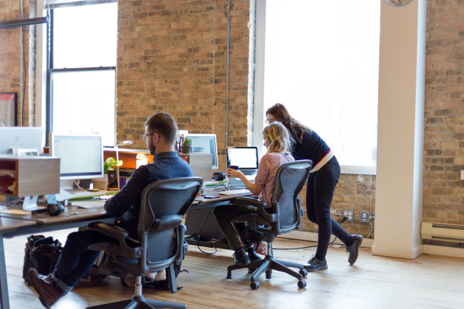
One of the (many) beautiful things about UX design is that it draws people from so many fields and experiences. We’ve got backgrounds galore at Fuzzy Math, so today, we’re taking the time to shine some light on our beginnings. From modest first steps and awkwardness of finding your way in the industry, we rounded up some of our designers’ most memorable first projects that brought them (and us) to where we are now:
Developer’s First Web Form
Nick Leonard, UX Design
Working as a developer at the tail end of my time as an undergraduate student, I was asked to build a simple web form to capture a very limited set of data. This was over a decade ago so what these fields were, or even what the purpose of this form was, has been lost to time — but likely wasn’t considered deeply by me to begin with. I was a developer, primarily working on back-end projects but also responsible for the corresponding front-ends, who happened to have some print design experience. This was an opportunity to combine those skills and… completely overdesign this simple form, adding little to no real value to the users (but so many lines of CSS). One or two similar projects later and it was obvious to me that I was both in the wrong role as the full-stack developer, but also obvious that while I could recognize problems with some of the requests I received, I had no idea how to pinpoint or properly address those problems (and so began the journey into HCI and UX).
Penguin Shoes
Mia Frasca, UX Designer
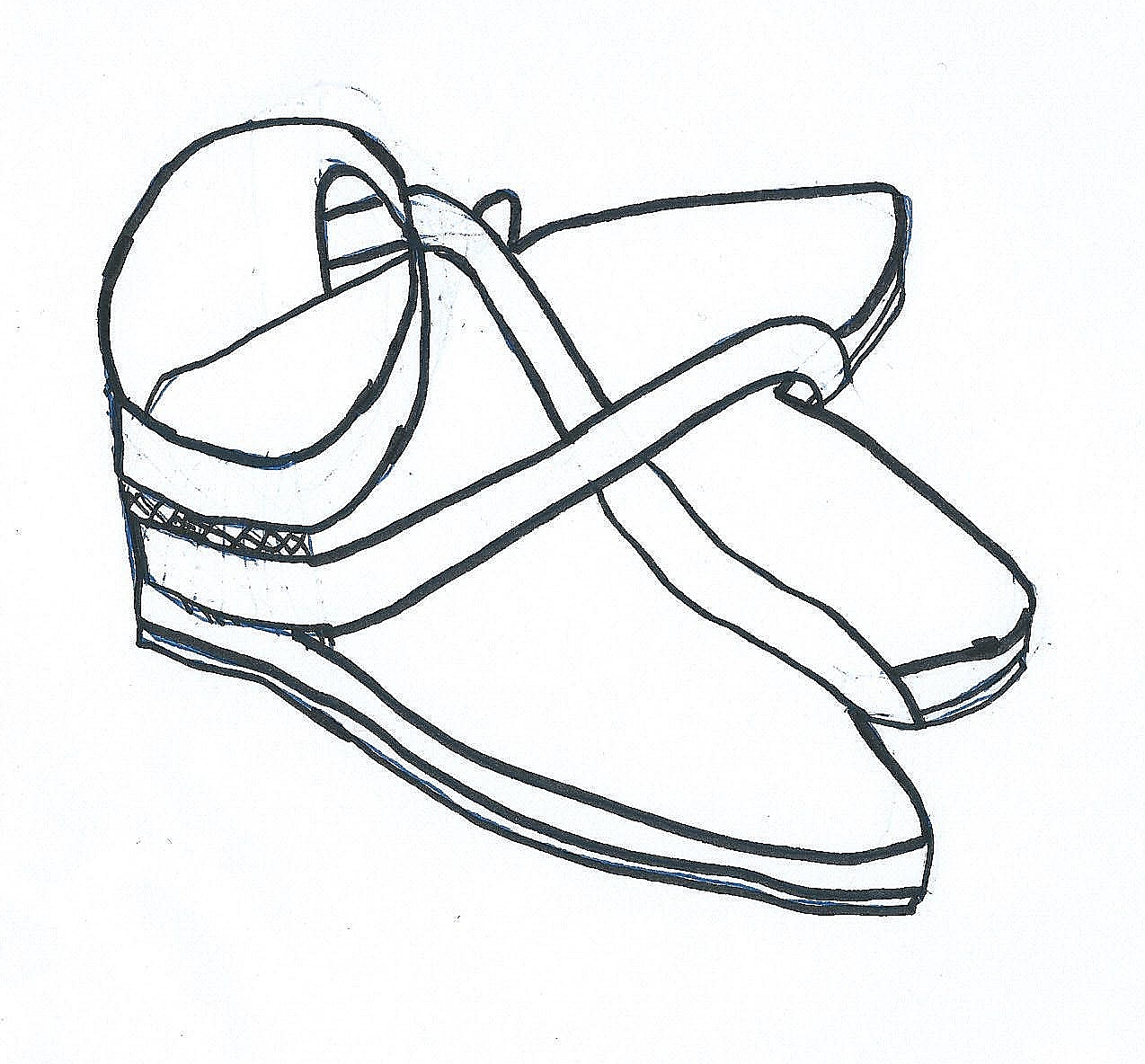
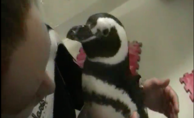
My first engineering project at school was for a very interesting user group—penguins! We were challenged to design a protective foot covering for the animals who were dealing with an uncomfortable disease called bumblefoot. It was a project full of detours and mistakes, which taught me to be open to iterations and how to let go of an original idea in lieu of a better solution. Although my design work at Fuzzy Math vastly differs from this penguin project, the idea behind empathizing with a user much different than me is something that continues to be important to my work. It introduced me to the UX mindset of solving a design problem by taking a walk in someone else’s shoes (get it?)
Most Likely to Design the Yearbook
Rachel Vorm, Visual Designer
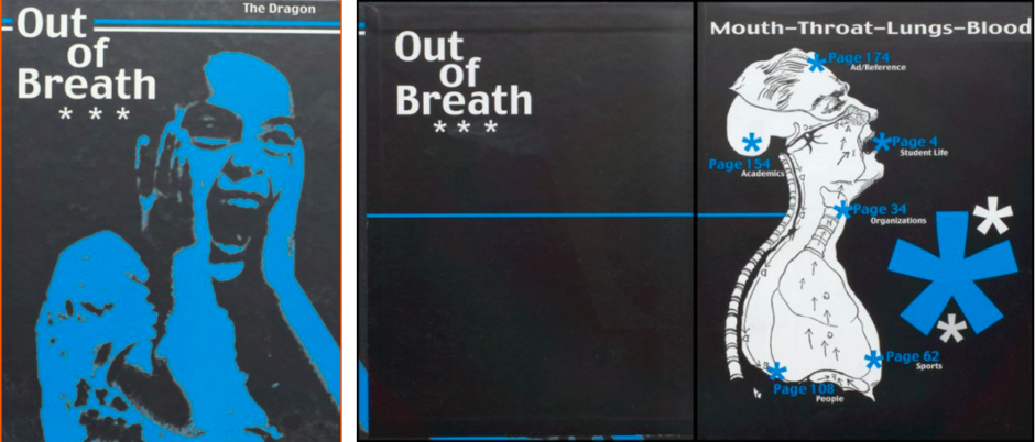
This is a cover for my high school yearbook my senior year, that I designed.
I believe it was made in photoshop and a program called PageMaker, that I am not sure still exists. I thought it was pretty clever if I do say so myself. I thought of the theme which was ‘out of breath.’ which was inspired based on the problem that our school was too full (of students) and it would be the last year with freshman. All I remember about making that cover is hacking at different settings in photoshop and adding fills and messing with contrast until I came out with the final result. I treated it like a painting, no going back, only forward.
Pop Quiz
Rose Tarullo, UX Designer
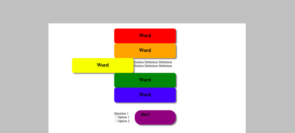
I began my professional career as a middle school mathematics teacher and introduced coding into one of our units. A small group of students stayed with me after school to keep practicing throughout the year, and we designed this pop quiz template together. We had a million wild ideas, but this is all we could figure out how to implement in the code. I love looking back on this ridiculous page and remembering the collaboration, persistence, and laughs that went into it.
A Trade: Design for Coffee
Josh Berman, UX Designer

This isn’t the first thing I ever designed, but it’s a pretty funny project to look back at!
I was looking for opportunities to make digital designs and build some Illustrator skills. At the time, I worked remotely out of a cafe in Lakeview (shoutout to Lakeview Rewired!) and it just so happened the owner wanted some new stuff. He asked me to make food & drink menus and a complimentary drink card. We struck up a bargain—coffee for design—and I got to work. The only issue here was that I really didn’t know what I was doing.
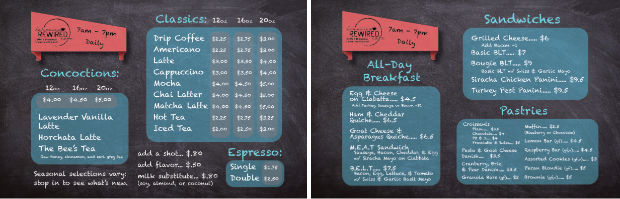
Food & Drink Menu
Now, the food & drink menu is not bad (if I do say so myself). The owner was pretty adamant about wanting the chalkboard style, so that’s the direction we went. The red banner flag on the top left is a little heavy-handed, I’ve got a few consistency issues with font size, and some not so great spacing, but overall it’s a readable sign that matches the owner’s vision. Weird choice to go with the semi-opaque grey rounded boxes on the drink menu, but overall this is promising for an aspiring designer.
Complimentary Drink Cards
These drink cards are interesting. I’m still a fan of the text transformation over the coffee mug—I think that’s a fun touch, and it was a lot of fun to learn. I do have to say though, that’s about the only thing I still like on this design. It’s really tough to read that grey text (2.21:1 contrast ratio and I needed 7:1 for it to be readable—that hurts) and the front side is crazy noisy with all the typefaces. I clearly did not yet understand that less can, in fact, be more.
I’m very grateful to the owner Daniel for putting up with my learning curve at the beginning of my design career! It was a great project to start building digital skills and thinking about print vs digital. I had also never thought much about typography before, and while I’d be the first to admit what I produced was a little bit weird, it was a great opportunity to start playing with typeface pairings and working with different font weights and sizes.
The project helped inspire me to pursue a creative career path and not long after I started my design education!
Learning the Process
Wren Overesch, Visual Designer

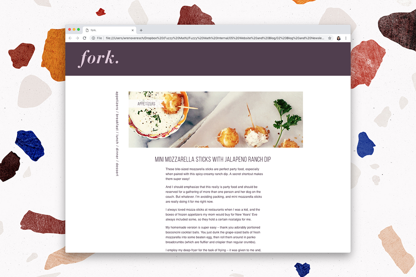
The first thing I ever designed for the web was my first project in my first web design course in college. I can’t really remember what the brief was exactly, but this course was where I learned the most about the design process: sketching, “wireframing” (low, low fidelity), designing comps, and coding with basic HTML/CSS. We went through each of these phases in this first project and I remember being quite impressed/proud with what I came up with some sort of food blogger site called “Fork.” 😊
Engineering Design at a Large Scale
Philip Miller, UX Designer
So I’m going for “first full-scale design project,” which was my senior project as an undergrad. It’s different because it was engineering design as opposed to visual or UX design.
In a nutshell, I was in a group with 4 other students, and together we designed a chemical plant. The plant would take in seawater with genetically modified algae that produced ethanol as it grew, and output purified fuel-grade ethanol. It also would take the actual algae biomass to make bio-oil which could also be used as a (dirtier-burning) fuel.
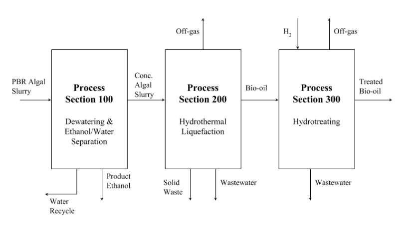
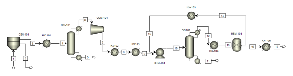
Pricing materials like equipment in the plant, fertilizer to help algae grow, etc etc, utilities such as cooling water and electricity, and other resources like land and labor were included in the overall project scope. I was specifically responsible for everything in the ethanol purification process.
It was a beast of a project. Including appendices and documentation generated by engineering software, the final report stretched to around 130 pages.
UX-ing a First UX Project
Kelly Cunningham, UX Designer
I was still in undergrad when I applied for a UX internship without actually knowing anything about UX. In my smallish Iowa school, that was fine, even expected. The application process included a sample UX project, which I, of course, dove right into it without any knowledge or experience. In it, we were asked to design an interface to monitor an autonomous riding mower as it worked the cornfield. I remember imagining it like a Roomba, but without the running into walls or furniture. If it ran where it wasn’t supposed to, your crop would be lost.
Coming from more of a visual design background, I put way too much thought into the final aesthetics of it all. I think I even came up with a logo for the farm that I slapped on my “wireframes” (actually a Balsamiq mockup). I definitely didn’t know what wireframes were at that point, or why they were important. It was all so grey and “blah”. Research (beyond a quick Google search for a cursory “competitive analysis”) was not something I knew to do either. But I did know enough to know that they cared more about my thought process than the fidelity of the design. And who knows, maybe it was the bright red “stop” button that made them take a chance on me.
Student Projects
Julia Jouravel, Visual Designer
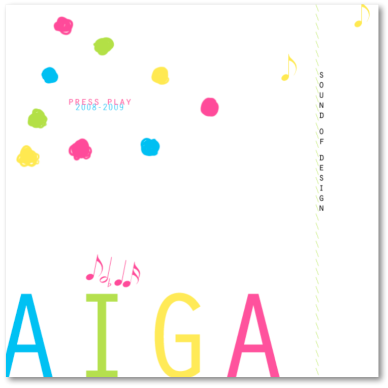
CD Cover
During my first year in AIGA, I created a little mix CD of crowdsourced songs from the group that inspired us when we were working on design.
I found it funny that after 10 years, I still find joy in using familiar design elements such as squiggle motifs.
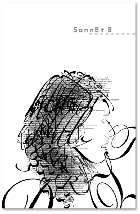
Self-Portrait
I did this self-portrait assignment in high school for an intro to graphic arts class. We were tasked with creating a self-portrait using only lyrics from a song or a poem set in one typeface. I can’t quite remember which typeface I chose but I intentionally used a serif to allow for softer curves and texture in my hair.
Related: