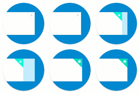
How Fuzzy Math overcomes communication obstacles when designing animated interactions:
Here at Fuzzy Math, we conduct product and interface design with a vision of how the details are supposed to work. This could include interaction design for components as large-scale as page transitions and parallax scrolling throughout a page or as small-scale as microinteractions. We craft our wireframes and comps with these interactive elements in mind. We also talk to each other during the design process to validate that what we have in mind makes sense to everyone involved. Things proceed relatively smoothly while we translate our ideas onto a screen.
Then we present to stakeholders.
Naturally, there’s a certain amount of detail that needs clarification when sharing designs with a new group of people. This is why we’re big proponents of both annotating our wireframes and presenting our designs to the client in a meeting, as opposed to simply lobbing them over the fence with little-to-no context. After all, though a client is often involved in concepting and requirements, they weren’t in the room when the details were being hammered out.
But we can’t expect stakeholders to think the way designers do. Sometimes our words aren’t enough when it comes to depicting those finer interactions. Our clients can’t always visualize what we’re trying to describe, especially if they have less experience with interaction design. Therefore, we’ve found that showing is more effective than telling. Or, to modify the common saying, an animation is worth a thousand words.
We primarily use InVision to share our designs with clients, which though perfect for communicating quick links between pages, severely limits the bells and whistles we can add to demonstrate more robust interactions. When we need to communicate those interactions, we have to take a different approach.
A different approach to communicating interactions
As design consultants, our work doesn’t end with creating designs. It ends when we deliver something our stakeholders feel confident moving forward with. Our problem turns from, “how do I solve the problems in this system?” to, “how can I communicate differently to convey this solution?”

A single animated component might be enough to convey what you need for a microinteraction
The Fuzzy Math team has tried out a few different solutions to the challenge of a UX project presentation, but at the end of the day, the takeaway is the same: branch out and learn new skills that help you communicate in ways that make more sense to stakeholders. Most of the time, this means learning a more complicated tool but designing only one component or interaction with it — you don’t need to create a whole new prototype to convey a single idea. Other times, it may mean designing larger portions of a page or even an entire page.

Sometimes larger scale animations or interactive pages are more helpful to clients
The Fuzzy Math team likes to ask what the minimum additional effort required is to convey the concept, then evaluate what software is available to decide on the best one for the task.
4 tools we’ve used to present interaction design
Sketch and the Craft plugin
Like we mentioned above, Sketch and the Craft plugin are great to build out basic prototypes and upload to InVision Classic; they allow for flat screens and some basic page and state linking, but are their limited transition and animation capabilities enough to communicate with clients?
InVision Studio
InVision Studio provides a few more bells and whistles than the basic Sketch/Craft and InVision combo. Is the interaction trigger we want to use included in the limited list included in Studio?
Principle
Principle is more versatile, allowing for just about any trigger or transition type we could want, but it can’t upload to InVision. Will we be able to share designs with stakeholders and developers in an accessible way?
Framer X
Framer X can do almost anything you need it to and should make handoff easy, but is it in our team’s best interest to invest in a new tool where we still have to learn how to code to make elements interactive?
Most recently, our office has mostly used InVision Studio for basic animations, like swiping through photo galleries, and Principle for work that needs more versatility, but we regularly try to explore other options to see if they solve the problems we’re encountering and are feasible alternatives for our team.
Results with clients
You might be wondering, how has this approach to communicating interaction design on a case-by-case basis gone over with our clients? There are a few limitations to this approach. Primarily for us, project budget is a large concern — are we able to assess which tool will be best, refresh our skills within that tool, and create animated mockups of the components or sections we need to show to a client within the hours we’re allotted for the project? And will that process fit within the project timeline? If the answer to either of these questions is no, can we change the scope of what we animate in a way that is more feasible? As of right now, these animations aren’t part of Fuzzy Math’s standard UX design process so we tend to have to find ways to optimize what animations we deliver to provide the most value with the budget we have left – not necessarily an ideal process, but still much more valuable than verbally describing to clients what our designers were envisioning and hoping they can figure it out.
But, back to how clients receive this kind of work. Generally, it’s received well! Having a more literal visualization of what’s in our designers’ heads to show clients makes the process much more smooth and unambiguous so that stakeholders and developers are all on the same page as the Fuzzy Math team. At the end of the day, this means a more straightforward handoff and more clarity when developers take over to implement our designs, which is a win for everyone.
