At Fuzzy Math, one of our design process goals is to ensure that accessibility is considered and implemented in the final design. We always aim to create an experience that is consistent and benefits all users. To ensure that we are following best practices on this topic, we have used our checklist, created an accessibility scorecard for site reviews, and continue to keep our internal #topic-accessibility Slack channel up to date with the most recent articles and webinars. But a recent project gave us the chance to collaborate with an accessibility consultant, which challenged our assumptions and understanding of accessibility in new ways.
Here are some of our biggest takeaways from the process, and knowledge we’re looking forward to bringing into all of our projects moving forward:
Our Collaboration Process
Going into this collaboration experience, we were expecting to see a focus on color, contrast, type hierarchy, aspects of accessibility that we were familiar with. However, this experience really exposed us to what more is out there to consider, and with these consultants being experts in their field, we really learned quite a lot. In our collaboration process, we had to be very deliberate and thorough while planning. This involved utilizing an InVision file to share the prototype with and an Excel spreadsheet that linked to certain InVision pages. This way we were able to receive feedback based on initial designs before they are coded onto the website. However, any wireframes uploaded to InVision are basically pictures linked together via clickable hotspots, so it’s unreadable by a screen reader. In order to provide feedback on our work, the accessibility consultancy works alongside a sighted employee who then collaborates with one that utilizes a screen reader. From there, changes were highlighted that we then used to pivot our designs. We were surprised that this was the process since it seems like it would take longer to analyze the wireframes. There were some challenges to working this way, but it forced us to work our own process in new and interesting ways to accommodate.
How Screen Readers Work
During our process with the accessibility consultant, we were able to receive insight on how screen readers navigate a web page. Utilizing keyboard commands to move through a page, users are able to navigate through headers, content, and lists. The system moves left to right, and top to bottom. Users can utilize shortcuts by only going through the headers and skipping the content so that they can get to the information they care about faster. Another shortcut is that the screen reader can tell the user that what they tabbed to is a list, and in that list, there are eight items. This gives the user enough information so they can decide if it is worth going down that list or if they should keep moving on. Screen readers can also read incredibly fast, and while not all users will set theirs to the same words per minute (wpm) rate, the one user we talked to had theirs set at 700wpm. Compare this to the average sighted adult, who will read at about 300 wpm!
Through this engagement, we also learned that Mac has its own version of a screen reader called VoiceOver, which can be turned on by using CMD+F5 or CMD+Fn+F5 (depending on your keyboard and setup settings). This is a good way to test out screen reader navigation on websites to check for accessibility.
Designing for a Screen Reader
Designing for a screen reader is completely different than designing for a mouse. When everything is read out loud, the web page becomes pure content. This means no images, no colors, and no good way to visually draw someone’s attention to a particular area of the screen. Instead, it’s all about priority and hierarchy of content — an important consideration when trying to make the user experience equitable for both sighted users and those using screen readers.
Another wrinkle in this process: Due to privacy concerns, there is no way to know whether or not someone is using a screen reader. Therefore, there is no way to create a separate experience for someone who utilizes one. Screen readers use a virtual cursor which is undetectable by a browser so there is no way for a company to take advantage of that user when they are navigating around that page.
However, there are ways to indicate to a screen reader user that their experience is important and was considered within the design of the page. Utilizing consistent semantic code across the entire website (not just an individual page) and clear headings can show them this. Designers and devs can also take advantage of “invisible” code — code that is not seen by a sighted user but will have a bit more details for screen readers to utilize.
Accessible does not always mean equitable
The concept of accessible versus equitable experience was a huge turning point for our team for our understanding of accessibility. During our sessions with the consultant, we talked about how just because something is accessible does not mean it’s equitable, or a good experience. A certain part of the website may be accessible, but it could be a terrible experience for the screen reader user. When designing for these users, it is important to consider the intent of that design — what are you actually trying to express for that user. Based on the responses we gave to the accessibility consultant during our design phase, they were able to give recommendations for what would be the right thing to do in terms of accessibility.
Intent in Design
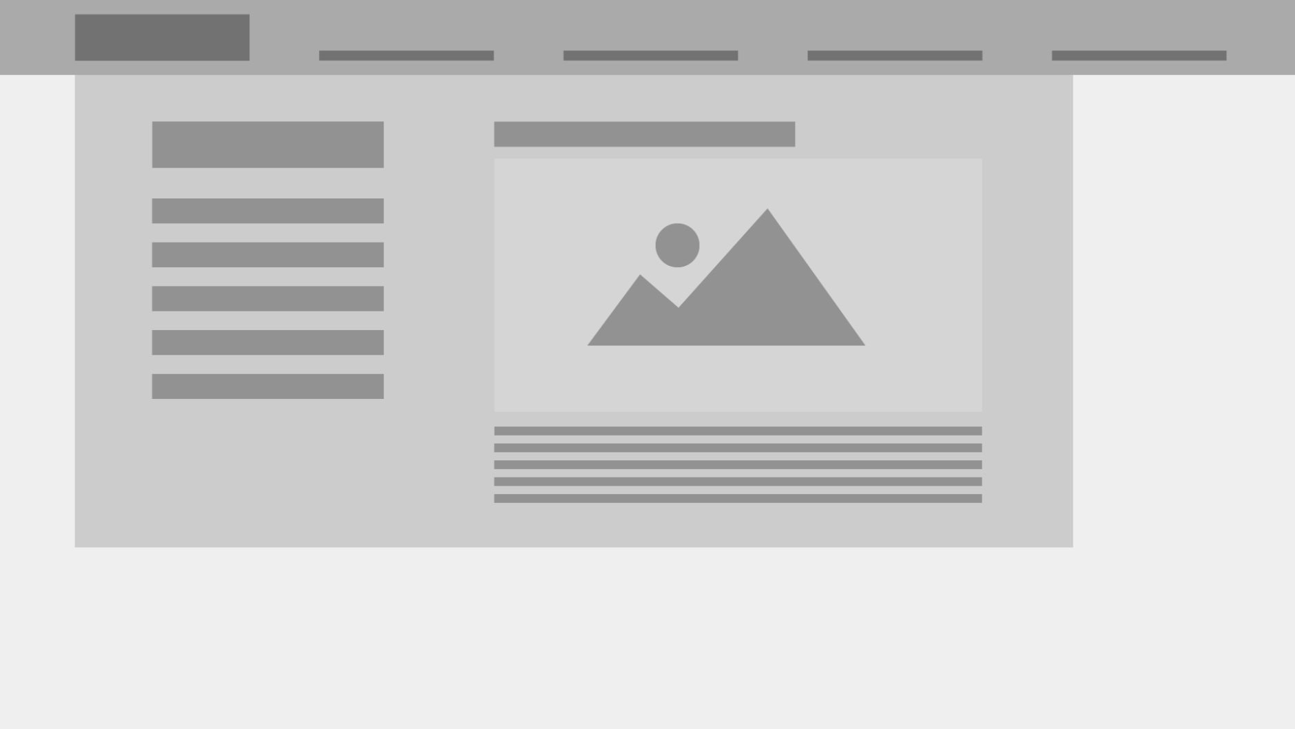
For example, if designing a mega navigation, you have to be aware of how a user is going to navigate through it. In the above image, there is a section on the left with a main header and a list of other navigation items, and then there is a section on the right that consists of a highlight with a header, hero image, and supporting text. Consider the intent of this design pattern. What is the point of this mega navigation? From the size and placement of that image, it’s likely that the user is trying to draw the users’ eye there, to ensure that users go to that highlight. For screen reader users, though, it is very unlikely that they would get to that highlight in the first place. Instead, they are most likely to go through the navigation items first and click to a separate page in order to find the content they are actually looking for. After all, they’ve opened the navigation menu, intending to dive deeper into the website. A better alternative would be to move the highlight to the home page or another content page so that users would be able to find it when they are actually searching for content rather than trying to navigate to another page.
Data Visualization
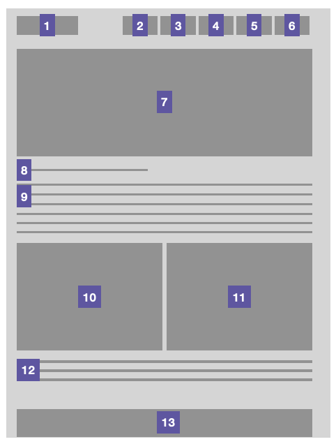
Another area where intent is vital is when designing data visualizations. Visualizations can have ranging levels of complexity, so for screen reader users, you have to think about what is important to the story — which data points are actually necessary to share with the user and which ones are not. With a lot of visualizations, it’s not important to showcase every single point that was found during research. This creates unnecessary clutter in the ALT text that will leave the user feeling confused or overwhelmed by the amount of data that was read to them. A few examples of how to tell the story of visualizations are below:

In this example that is the “Losses in each Zip code from major natural disasters from the years 2002 – 2017”, it is not important to the user to know what every single dot of data represents. To better communicate the story, it would be more meaningful to explain that there is a vast difference between the southeast states and the west coast when it comes to major natural disasters. In complex examples like these, showcasing the overall story to get the message across of what the overall findings were is going to be a priority.
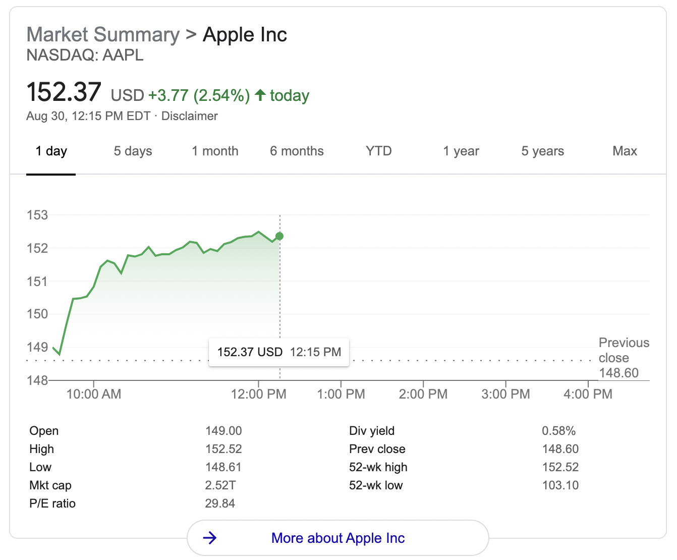
In this example of Apple’s stock status, it is important here to not tell the user what to do but instead to explain the data objectively so the user can come to their own conclusions. We don’t want to convince a user to buy or sell a certain stock, so we can give them the information on the rise and fall of the stock, as well as the minimum, maximum, and median. This will provide them with enough information to come to a well-informed decision.
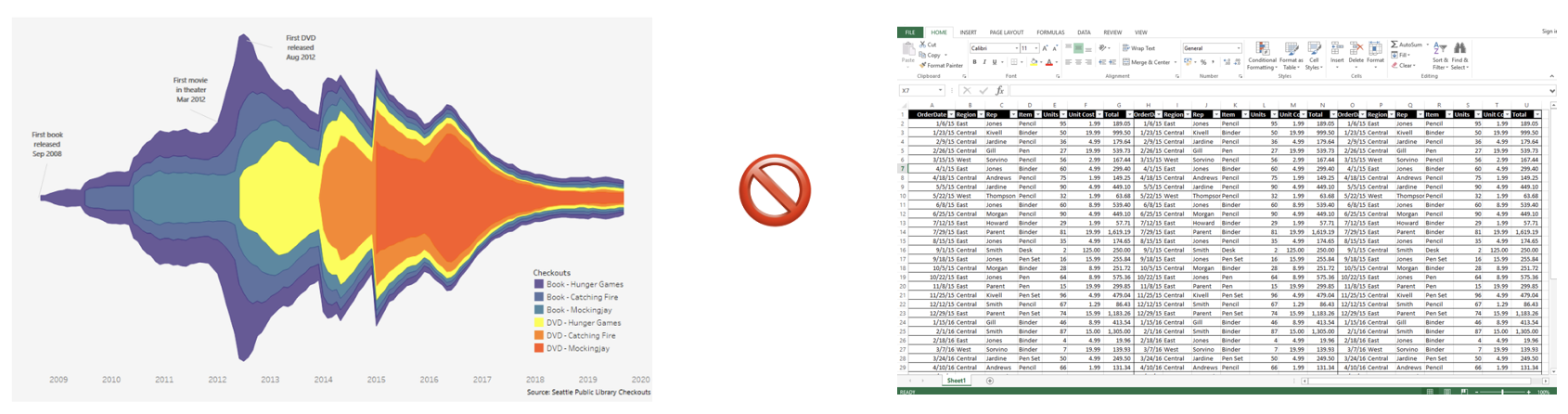
In other complicated graphs, it is fine to provide alternative ways to access the data (like tables or spreadsheets) but this cannot be the only way that the data is made accessible. A chart that is missing alt text or an explanation is not the same experience as a 1000+ row spreadsheet. Providing a beautiful, interesting graphic for sighted users and then only giving a screen reader user a firehose of spreadsheet information, forcing them to do their own work to see patterns in the data is not equitable. This is where utilizing the power of SVGs can come in handy.
SVGs and Sonification
There’s a lot of power when it comes to using SVGs for data visualization. SVGs contain built in code, that on first glance, can be a bit overwhelming. However, there are ways to power up the code with a lot of rich information to create a more robust experience. There are also some advanced ways to showcase data for people that are interacting with it in different ways, either through a screen reader or other assistive technology, and that is through sonification. We took a look at what Apple is doing with sonification that can be seen in this video. One example the accessibility consultancy team walked us had to do with the rise and fall of a stock. Imagine a stock that has a medium point and a line that surpasses and falls below that medium point. When the stock line surpasses the medium, a certain sonic texture can be laid over the graph to symbolize that. Vice versa, when the stock falls below that medium point, a different sonic texture can be layered over. So then as the user is tabbing through the graph, they will be able to hear the rise and fall of the graph based on the layers of background noise or silence.
In Conclusion
Our team learned so much from the accessibility consultant that it’s hard to cover it all in one blog post. Learning how to create equitable experiences for all users is a valuable skill for all UX designers, and we’re excited to apply what we’ve learned to future products, to create an experience that is beneficial and exciting for all.
Interested in learning how Fuzzy Math’s UX expertise can help improve your product’s accessibility? Drop us a line to start the conversation.