One of the key steps in the Fuzzy Math design process is an expert UX review of the client’s website: what is currently working well, what needs improvements, and how their site feels and functions as a whole. We do this to understand not only where we can identify opportunities but also to have a base understanding to support user research and UI/UX design.
As tools continue to evolve, the way we evaluate them needs to evolve as well. And although we’ve always based our reviews on industry-standard heuristics, we’ve begun to codify a new review method to ensure consistency across projects and teams. Enter, the UX Scorecards.
Our New Process with Scorecards
Think, then do.
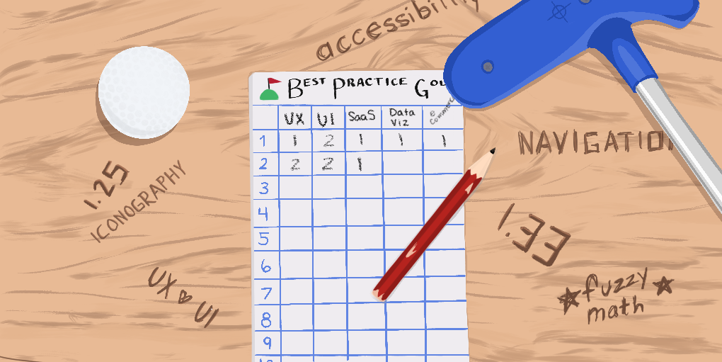
Using industry best practices and heuristics as well as our own deep UX expertise, we developed scorecards across 6 different areas (so far!):
- UX Design
- Visual Design
- eCommerce
- SaaS
- Accessibility
- Data Visualization
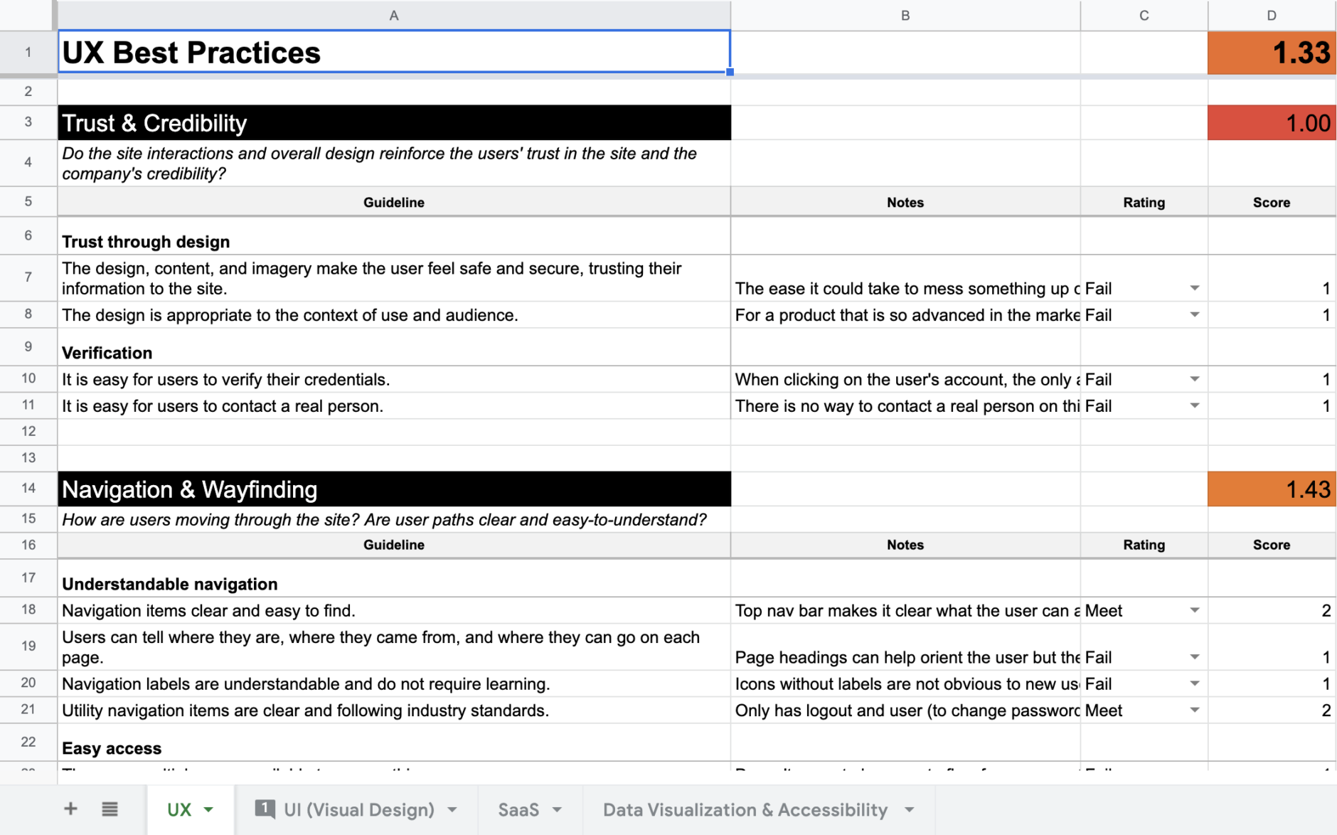
The first two are standard; we run through our UX Design and Visual Design Scorecards on every existing client product or website. The others, however, are very much dependent on the product itself and the goals of the project—you wouldn’t evaluate a content site based on the eCommerce Scorecard! We work closely with our clients to identify the areas that make sense for their product and evaluate accordingly. Our goal is to make sure our team understands the specific successes and challenges of the product, organize our thoughts and feedback to be more precise, and look out for specific best practices consistently across all Fuzzy Math projects.
Once we determine which areas to dive into, we run through the best practice checklist, evaluating across several categories on a three-point fails/meets/exceeds scale. Scores for individual categories are rolled up into category averages, which then in turn roll up into an overall area score.
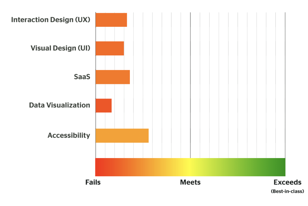
We don’t expect our clients to “Exceed” or even “Meet” in these areas: that’s why they hired us! Scores like these are consistent with the types of projects that we take on, whether it’s a smart B2B app that needs a bit of UX help or an enterprise tool that’s outgrown its current framework.
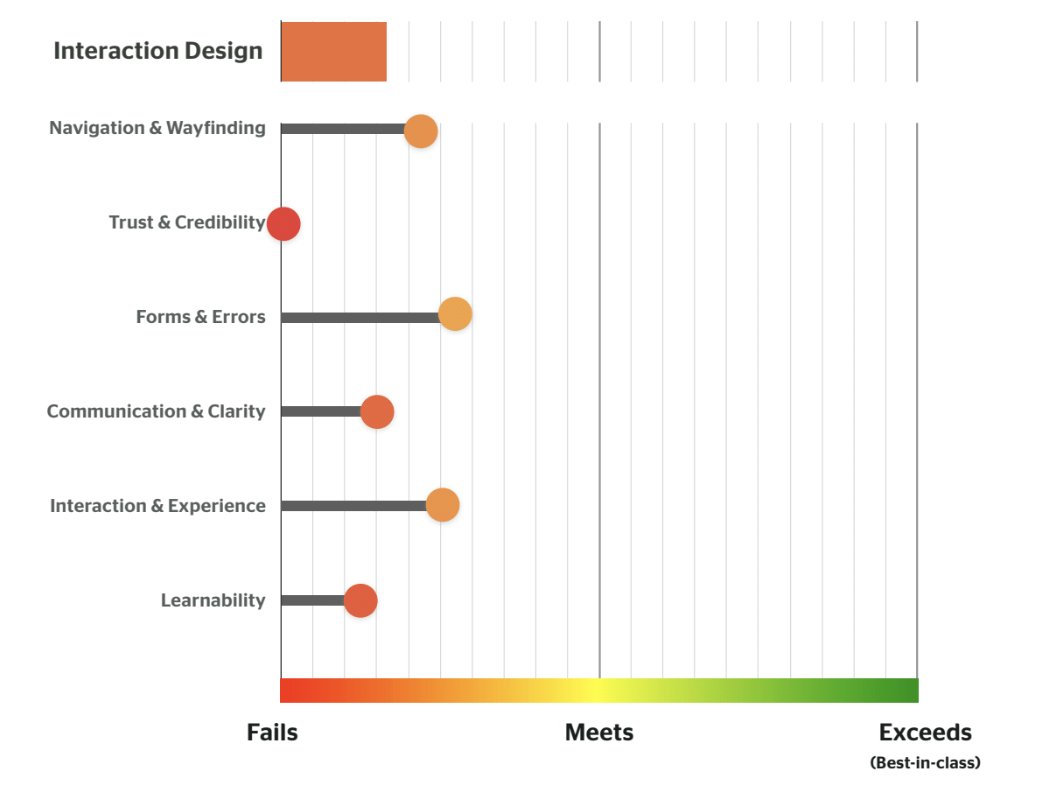
After showing overall scores, we break it down per section to show our client teams how their product stacked up in each category, and dive into the details of each category in our thorough UX review deliverable.
These scorecards serve as a guiding light throughout the project and give us clear direction for improvement. They help us identify where gaps exist between current design and best practice and identify where design improvements may have the greatest impact.
Plus, once we’ve completed our redesign, we can go back and use the scorecards again to measure improvements. This keeps us accountable, and ensures that our new design meets best practices, by utilizing the same metrics as what we originally judged the website on.
Related: Beyond End User Experience Monitoring: The Value of UX Reviews
Why the Fuzzy Math Team Likes Scorecards

They helped me to wrap my brain around being able to analyze the site. It provided more guidance and I liked that it was interactive. Being able to leave comments that we could then use in presentations to clients is a plus.

They help the team analyze tools in a consistent way and help us all start codifying a unified lens of how we should evaluate tools and products. It also is nice to be able to put some metrics to the analysis to see how we measure up after the redesign.

I haven’t done a ton of site reviews, but there was a huge difference in my approach when using the scorecards versus when I didn’t. The scorecards helped guide me in a more objective/ standardized way while I looked through the site. Plus, it helped me stay on track while doing it because I was able to focus in on one section at a time.
I also like that we only use a three-point scale for these. The lack of ambiguity between a 1, 2, and 3 helped me justify giving it the score I did and can help the client clearly see where there are significant opportunities for improvement. Plus, it’s just easier to explain why something gets a score of 2 and not a 3 one a three-point scale but not nearly as simple to explain why something would get scored a 3 and not a 4 on a five-point scale.

Using the scorecard helped me make sure I was addressing all the important categories and paying enough attention to the different criteria we try to evaluate in every site review. Rather than just latching on to the stuff that bugs me most personally, or scooping up all (or only) the low-hanging fruit. Helped keep me focused and make sure nothing was missed.
In Conclusion
Our team is always looking for better ways to move through our process. Fast forward a year, and we may find an even better solution for website reviews. That’s the great thing about the UX field – it is constantly changing to adapt to current climates and what clients need. We already have plans to make the scorecards even better and we will make sure to share those updates when we do!
Ready to learn how your product, website, or app stacks up? Drop us a line!