Tracking the impact of your designs and your decisions is a crucial aspect of being design consultants. Yet many companies don’t have a method of tracking metrics and even fewer know where to start. We often get asked “how do you even measure something mysterious and intangible, like user satisfaction, especially for enterprise tools or applications?” Conversion rates, time-on-site, and other Google Analytics-type metrics will only get you part of the picture (or none at all, in the case of enterprise products).
The quickest and easiest way to track a user’s satisfaction with a product or service it to capture their feelings while they’re using that product or service. That’s why we use the SUPR-Q questionnaire as a user satisfaction metric to track your progress and prove the ROI of UX Design.
What is the SUPR-Q?
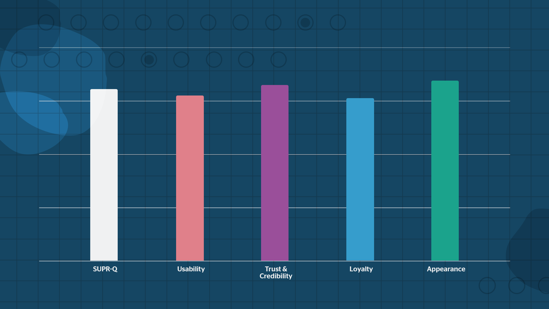
The SUPR-Q (Standardized User Experience Percentile Rank Questionnaire) is a set of 8 standardized questions that measure users’ perceptions around several components of a website including, usability, trust and credibility, appearance, and loyalty.
There are two ways that the SUPR-Q is scored. The first is a raw score on a scale of 1-5, with 5 being the highest, averaged across each of the four categories. The second is a percentile rank score that can tell you how your site compares to hundreds of other websites in the SUPR-Q database.
The SUPR-Q also includes an NPS (Net Promoter Score) measurement. The NPS is a separate score that many companies use to measure the likelihood of a user to recommend the website or service. Although the official NPS is scored a bit differently, you can use the data from the SUPR-Q to calculate your NPS.
How Does SUPR-Q work?
The SUPR-Q is a reliable measure of a website’s perceived quality because it is so widespread in the industry. This also means that you can use SUPR-Q results to compare your website not just to your own previous numbers, but also to hundreds of sites across the web.
Using SUPR-Q to Compare to Other Companies
The creators of the SUPR-Q offer access to a database that you can use to compare your score to other similar websites. Access to the database is expensive, but depending on your industry and use case, it can provide key insights into your competitive landscape.
Using SUPR-Q to Track Internal Progress
It’s also important to understand that the SUPR-Q is not meant to diagnose problems, as the simple questionnaire is just not specific enough to tell you what to fix and why. Instead, you should always rely on more in-depth discovery research, contextual inquiries and ethnographic studies to identify the why and how of a particular problem. This is why we recommend using the SUPR-Q as a benchmarking measure to determine a design’s (or redesign’s) impact.
Our favorite use of the SUPR-Q questionnaire, and the easiest one to implement, is as a trackable internal design metric. By running the test early in the lifecycle of your project, you can gather a baseline measurement of your user’s satisfaction. Use this number as a benchmark, and continue tracking how your design decisions influence that metric over time. This is a crucial strategy that allows you to see firsthand the impact of your design decisions, proves the ROI of design, and acts as supporting evidence in advocating for user experience across your institution.
Read: Design Metrics and KPIs for Your Design Department: A How-to Guide
SUPR-Q Questions
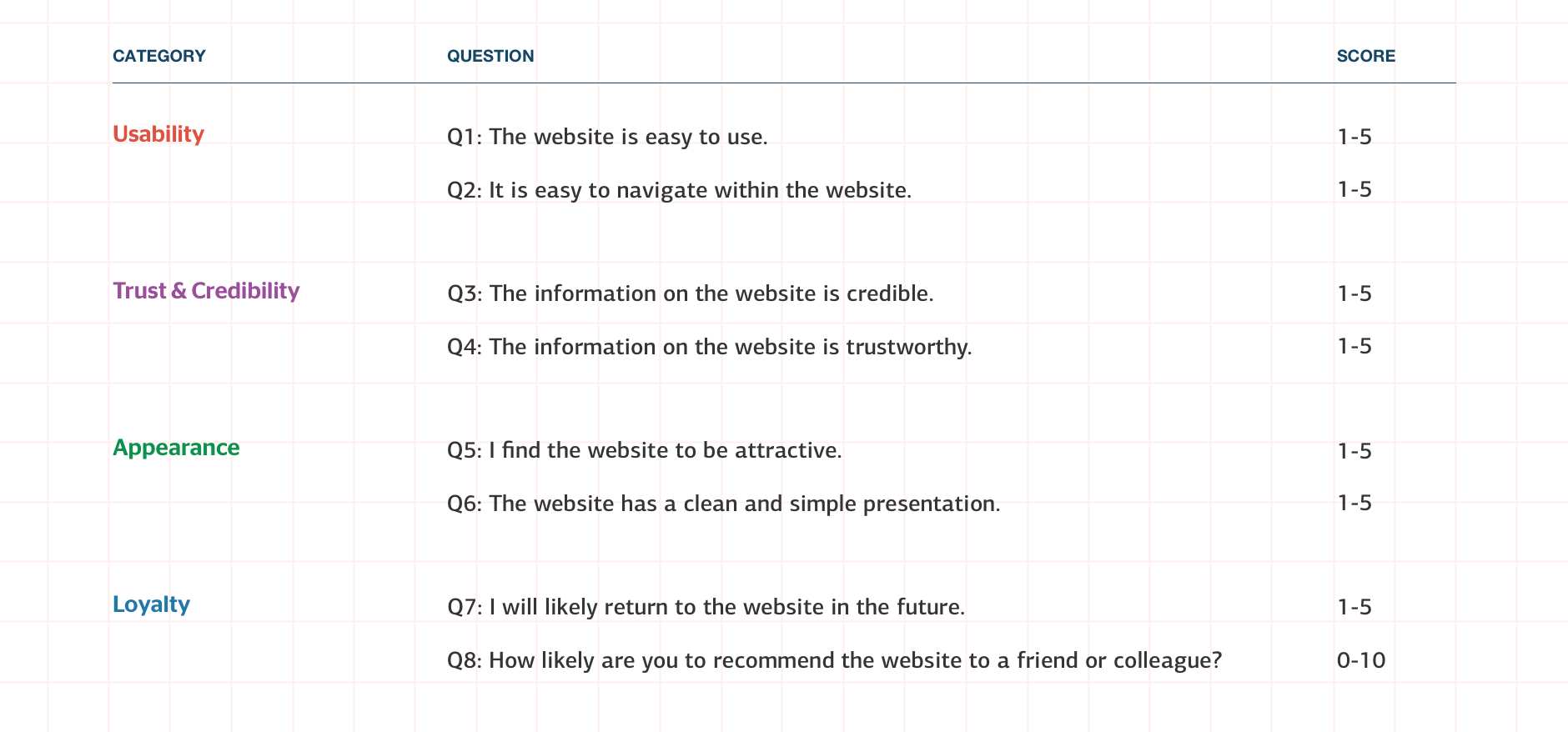
The SUPR-Q questionnaire consists of 8 questions designed to measure 4 categories, with a few alternates designed specifically for e-commerce sites.
Usability
- The website is easy to use.
- It is easy to navigate within the website.
Credibility
- The information on the website is credible. (E-commerce variation: I feel comfortable purchasing from the website.)
- The information on the website is trustworthy. (E-commerce variation: I feel confident conducting business on the website.)
Appearance
- I find the website to be attractive.
- The website has a clean and simple presentation.
Loyalty
- I will likely return to the website in the future.
- How likely are you to recommend the website to a friend or colleague?
Read: 3 Reasons to Create KPIs for Your Design Department
How is the SUPR-Q Calculated?
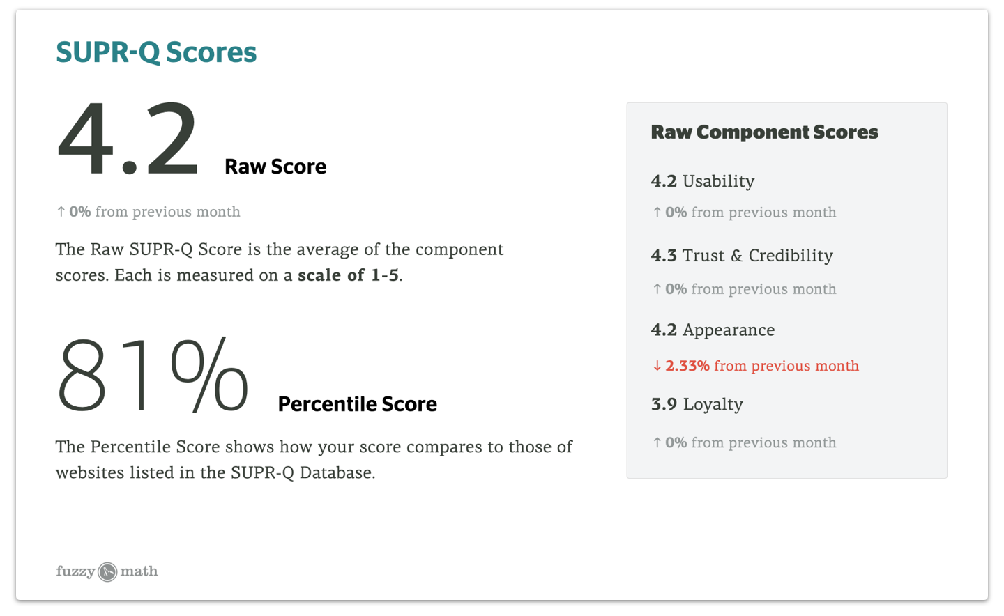
There are two scores that are important when reviewing the results of the SUPR-Q: the percentile score, and the raw SUPR-Q and component scores.
Raw SUPR-Q and Component Scores
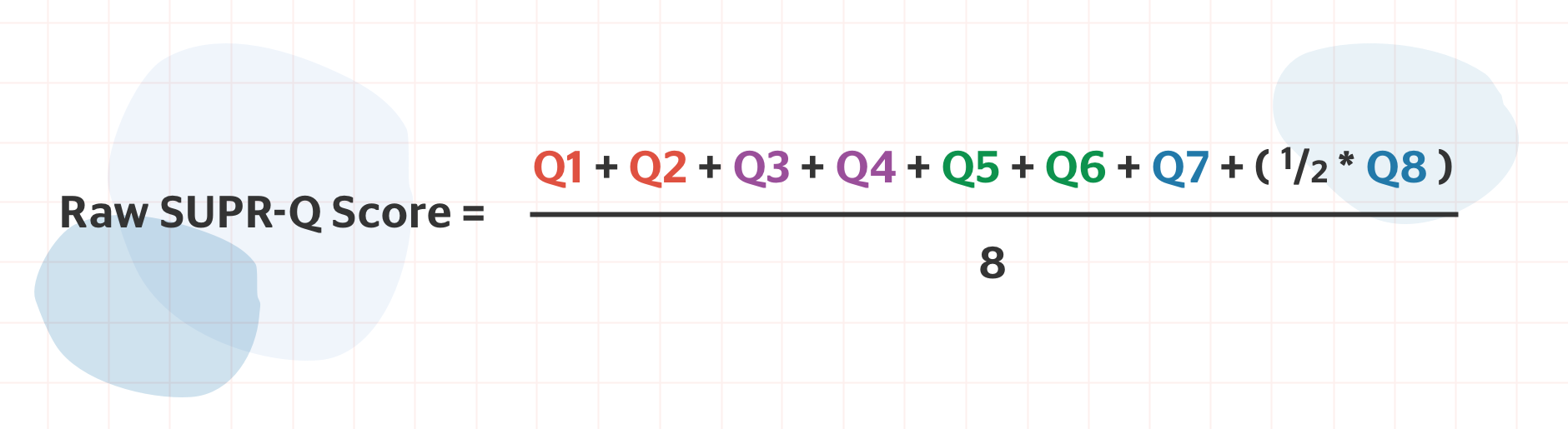
The first seven questions in the SUPR-Q is scored on a 5-point Likert scale from Strongly Disagree to Strongly Agree. The standard NPS question “How likely are you to recommend…?” is scored on a scale of 0-10.
To calculate the raw component scores, average your scores for each category. For the loyalty category, divide your score for the NPS question by 2 to convert to the same Likert scale before finding the average for the category. To calculate your raw SUPR-Q score, simply find the average of the component scores.
Your result will be a score from 1-5 for each category, as well as a 1-5 total SUPR-Q score.
Percentile Rank Score
The percentile rank score compares your raw scores to those of websites listed in the SUPR-Q database. This is calculated on a scale of 0-100, with 50 being the average.
Interpreting Your SUPR-Q Results
The SUPR-Q questionnaire takes the pulse of your users’ experiences and perceptions at a given point in time, but it’s important to take into consideration that other factors may be affecting the results of your survey.
Account for bias in testing. If you’re planning to capture participants via a website intercept, remember that your participants are self-selecting. This type of recruitment is notorious for capturing users who are either really happy or really unhappy with their experience, but may miss some of the more neutral users. (When was the last time that you took a followup survey for a service or product that was just “okay”?) Consider what you know of your users from other discovery research. Say, for example, your current user base falls on the “really happy” end of this spectrum, but you’re looking to grow your presence into new markets. You may expect to see a slightly elevated SUPR-Q score as you begin running your test, and some leveling out as new users begin to interact with your site.
We also see time and time again that launching a redesign (or any design change, really) can have an unexpected impact on SUPR-Q results. Humans tend to be naturally averse to change, so anytime a redesign launches, we expect to see a slight dip in scores as the users adjust and any bugs are worked out. In the few months following a big update, however, we typically see steady increases across the board. This is why it’s important to run your test on regular intervals, and track changes over time.
Other factors that may influence your results include:
- What UI or functional updates were made between tests?
- If you’re testing an e-commerce website, was there a promotion or deal that might affect how users feel?
- Be sure to note any new or different user groups on your site.
With the SUPR-Q, it’s often impossible to get fully unbiased results, so noting these factors can help you build a better picture of what’s really going on. And, as always, there may be a need for additional qualitative research to really get at the root of usability issues or other pain points.
Tracking Your SUPR-Q Metrics
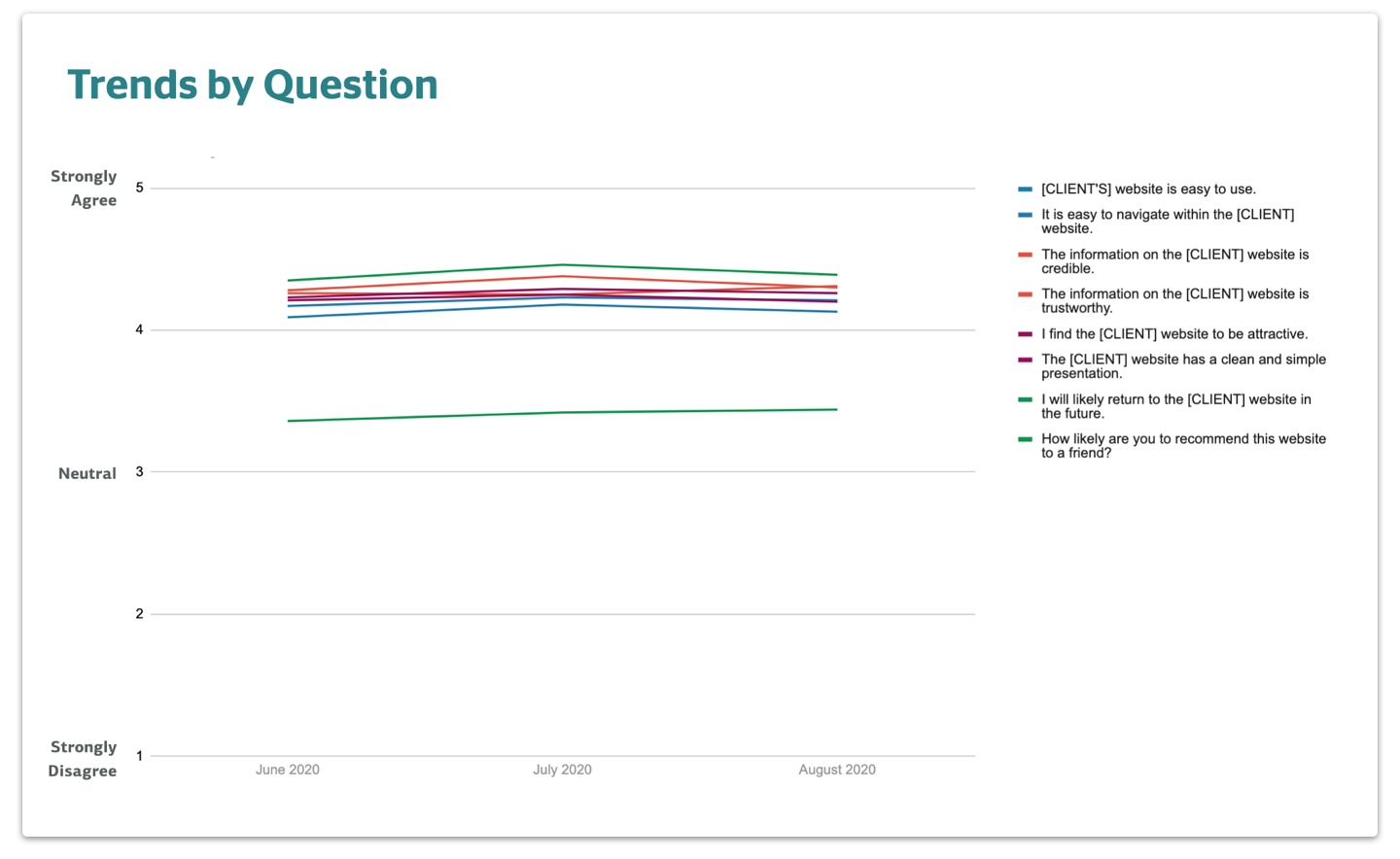
If you plan to track changes in your website’s score over time, the raw scores provide a great metric. You’re able to track the total SUPR-Q score, as well as a breakdown by category and by question. This breakdown is especially useful in showing you greater insight into any issues that your users perceive in your site.
By using these baseline metrics combined with your more in-depth user research, you can pinpoint a metric that you would like to shift and target your design decisions accordingly.
We did just that on a recent redesign of an e-commerce platform. Our original heuristic analysis and user research showed us that navigation and wayfinding were a key pain point. When we ran a SUPR-Q, the data backed us up: “It is easy to navigate within the website” had the lowest individual score, hovering just around 3.5. Our redesign addressed this issue, and we continue to monitor this metric specifically to prove that our redesign helped solve this usability issue.
For most of our clients, we recommend running the SUPR-Q at least every quarter, if not every month, and plot the changes over time.
Download the SUPR-Q Tracker Template
SUPR-Q Pros and Cons
Pros
- Easy for UX researchers and product teams to implement
- Quick and easy for participants to take
- Provides a quick and reliable metric, especially as a design metric tracking you site or product’s progress over time
- Provides both usability data as well as NPS data
- The survey can be run and can still provide value without licensing the full SUPR-Q database.
Cons
- A full license is costly, and may not provide statistics relevant to your industry. This is why we typically recommend the SUPR-Q as an internal design metric, rather than a comparative measure.
- The SUPR-Q benefits designers most when run on a customer-facing website. This is especially true if you’re relying on the percentile rank score generated by the comparative data. Because most of the companies measured are customer-facing websites, you may be comparing apples to oranges if you’re trying to gauge the score for an app or B2B tool. (Again, this is why we always look at the raw scores and track their movement over time!)
The SUPR-Q is a short, low-effort way to begin tracking design metrics at your organization. Even if you don’t want to compare your results against the SUPR-Q database, the raw scores alone can give you a quick and fair estimate of your users’ perception of four key areas of user experience: usability, loyalty, appearance, and credibility. But it doesn’t exist in a vacuum. Remember to take into account the users you source, UI changes, product promotions, and other external factors that may affect your score.
Tracking your UX changes over time helps to prove the value of UX design and monitor the impact your design decisions have on user satisfaction.
Want more on the ROI of UX Design? Catch Mark Baldino on a recent episode of The UI Breakfast Podcast!