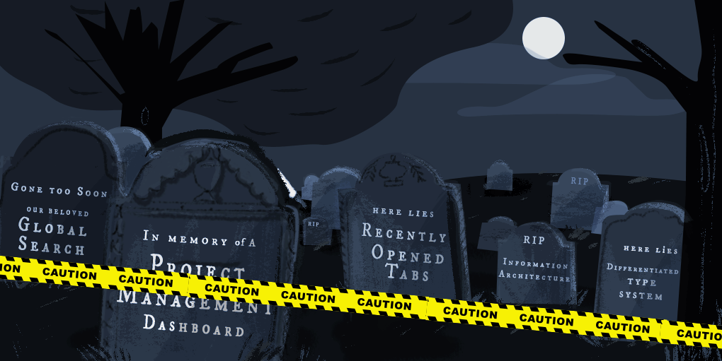
We’re going back to the cemetery for our second installment of the Fuzzy Math Design Graveyard, where dead ideas from UX projects past come back to haunt us.
Like we did a few years ago, we dug up past project ideas to describe what they were, what we initially liked about them, and why we ended up burying the ideas instead. It’s not always easy to put good design ideas to rest, so join us in honoring their short lives by remembering them here.
Note: Some names have been excluded to protect the deceased. 👻
Project Management Dashboard
It’s often the case when we design enterprise-level tools that some features get brainstormed, thought through, and designed. Then, as your scope narrows and we start tackling what can actually be built in MVP, some of the more exciting features fall away and are never built. This is one of those times.
The Project
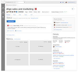
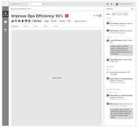
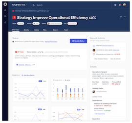
A Project Management tool for a Private Equity company
What died?
Our initial vision for this tool—a vision informed by and backed by research, I might add—was heavy on project management. We imagined a tool where company employees could track their own to-dos and understand how their efforts lead to the improvement of the strategy as a whole. These efforts would then, in turn, roll up into a dashboard where project managers could easily measure the pulse of their ongoing programs, understand tracked metrics, and share progress with the people who hold the purse strings.
Due to some technical limitations, strong executive opinions, and tight timelines, the MVP of this tool ended up looking very different. Instead of a collaborative hub, it became a tool solely for a single user type. As a result, the dashboard lost most of its features, and instead became a simple rollup view of outcomes in terms of dollars and cents.
Thankfully, the story doesn’t end there! We’re still working closely with this client to test MVP features with a group of beta users, and will continue to push for additional users and use cases based on the usability of the tool. It’s been about a year since our initial project, and we’re now slowly backing our way into something more closely resembling our original vision!
Takeaway
Iteration and testing are sometimes crucial steps in getting executive buy-in. By having usability data and actual user feedback in our back pocket when it comes to proving the value of our designs, we can make a stronger case for investing in experience across the board!
Information Architecture
The Project
Redesign for a news publisher’s website
What died?
As with many website redesign projects, this one included taking a look at their information architecture to see whether or not the already existing structure was user friendly. To test this, we conducted card sort activities with users to figure out how they might arrange and categorize the website’s content. After conducting this research, we presented our clients with a proposed information architecture structure to which they offered feedback in order for us to make revisions. However, this resulted in more rounds of revisions than expected.
We later came to find out that restructuring this client’s website would mean a real-life restructuring of the teams within the company. This resulted in lots of back and forth with our client in order to find the best solution to meet the needs of the client’s users and the company. This ended with us killing our initial information architecture proposal (along with several more iterations) before coming to our final structure.
Takeaway
Clients hire us for expertise and recommendations, but, at the end of the day, clients often have wants and needs that don’t necessarily align with users.
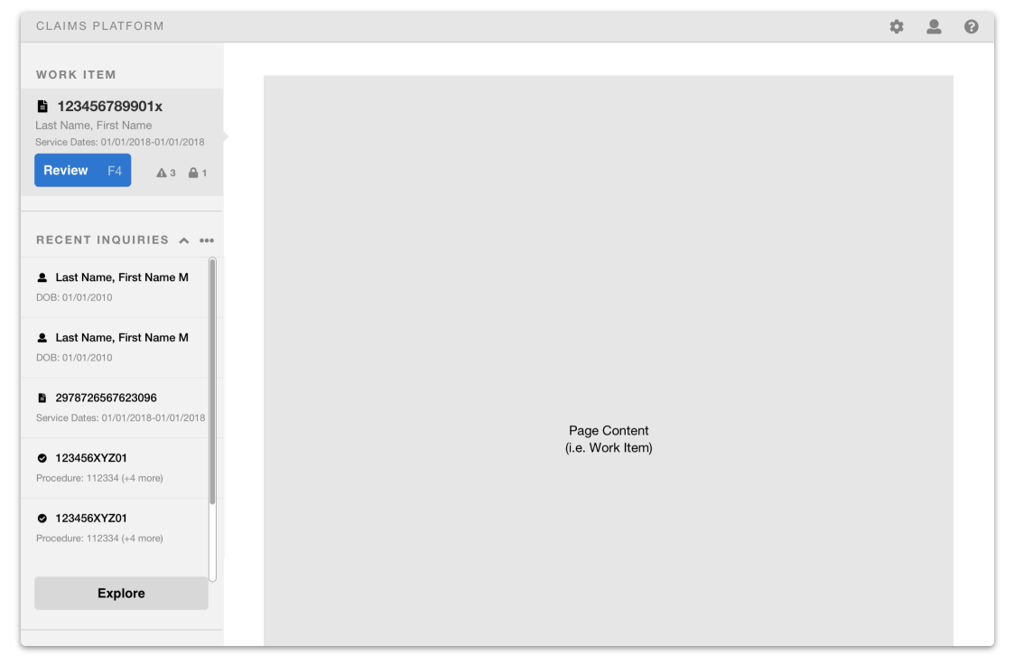
Recently Opened Tabs
The Project
Claims Processing Platform for a large insurance company
What died?
Based on research and the fact that we observed users bouncing between tools and windows to get all the info needed on a patient, our updated platform design included a side panel that highlighted the current work item and allowed the user to switch between recently opened artifacts.
When it came to building the platform, however, this feature didn’t make it into the MVP and had to be laid to rest. Here’s hoping it will be resurrected in the future!
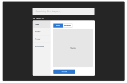
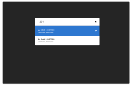
Global Search
The Project
Claims Processing Platform for a large insurance company
What died?
Here’s another one for the claims processing project, and very related to the idea of opening tabs. During our contextual research, we watched users open multiple tools only to paste the same ID number into the search bar. To solve that issue, we imagined a master search that was smart enough to allow users to search by any ID or keyword and see matching results from across multiple systems or types of results. From a user perspective, this would have been a huge win! From a development or back-end architecture perspective, there were a number of issues that caused this concept to end up in the design graveyard. RIP.
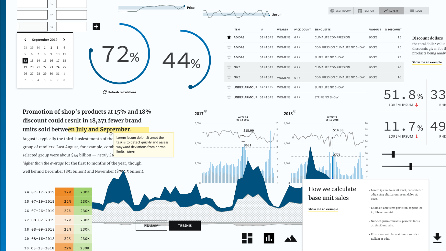
Differentiated Type System
The Project
Pricing analytics tool for a market research company
What died?
An important part of our visual design process is establishing a direction for the look and feel of the product or tool we’re designing. To do this, we take what we’ve learned in our early research and discussions with project stakeholders around the brand and positioning to create mood boards, collections of visual elements (like type samples), color palettes, and sample interface components that help us align with our clients on a visual direction before we dive deep into fully-baked comps.
Every client and project is different in terms of how well developed their brand guidelines are. Whether or not they have guidance on how their branding elements translate to digital products, rules around how the logo is used, and so on are all things that we have to consider when working with new clients.
For this client, we knew that they used one brand font and one Microsoft system font. In order to create a type hierarchy for more diversity in their tool that would include both narrative text and complex data visualisations, we suggested pairing two additional fonts. We felt that this would convey an academic feel which was reflective of the advanced analytics happening that power the tool. When we presented this type system, the project team we worked directly with throughout the project loved what we came up with. However, when the brand managers were presented with this design choice, it was met with swift demise.
Takeaway
Bring brand managers in as early as possible if they’re not on the project team already. Getting a feel for how firm the rules are, where they can bend or be broken for specific applications is helpful to know early on in order to save time and resources.
Want to know more about some of the projects we’ve completed here at Fuzzy Math? Take a look at our UX Design Portfolio and Project Case Studies.