We recently finished a project on data visualization for the fine folks at Cancer Treatment Centers of America in which we redesigned the display of health and wellness data. The challenge was providing a compelling story through the display data instead of just slapping on a new coat of paint.
Two data visualizations from two very different sources caught my eye in Google Reader yesterday because they both told stories through a simple visualization.
#1 The illustrated guide to a Ph.D.
by Professor Matt Might
via Andrew Sullivan
His visualizations and simple one-liners not only tell a complex story but motivate his students with a real purpose.
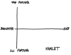
#2 Kurt Vonnegut explains storytelling using graphs
via SwissMiss
The second is a bit meta since it’s a graph about storytelling which itself tells a story. But through the use of simple graphs makes a powerful insight concerning truth in storytelling.
Here at Fuzzy Math we’re big on storytelling in UX design. We stitch user scenarios together based on personas and tasks in order to produce a realistic user story. We believe these stories can better aid our clients in understanding their users and their users’ needs and build consensus among their team.
But it’s a lot of work and in no way do I want to imply that the above examples are easy to create. In fact that’s the beauty of a great visualizations, they explain something complex in a way that makes it seem effortless. There’s a lot of power in that ability.

