Given the global pandemic, hospitals’ and healthcare providers’ digital front doors are more important than ever. With lower volumes of routine visits and exponential increases in hospital website traffic and call center activity, serving patients digitally is a must. Unfortunately, the digital experience on the websites of many world-class institutions doesn’t match the level of care and expertise you might experience if you actually visited the hospital.
What’s the impact?
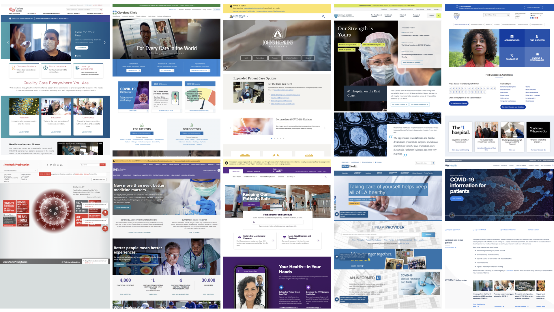
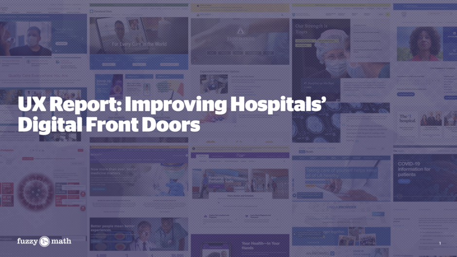
We ranked the user experience of 10 top hospitals’ digital front doors from 1 to 5 stars. Wherever you currently rank, Fuzzy Math can help you build a 5-star digital presence.
Download the Report
World-class digital front doors are crucial to success.
While hospital buildings and lobbies have gotten nicer and more patient-friendly in recent years, many hospital websites haven’t. The positive, user-friendly experience that a potential patient has when entering a world-class hospital isn’t matched in the user experience of visiting these same institutions’ websites.
Over the past several years, the physical experience of visiting a hospital has improved drastically, shifting from cramped lobbies with collections of chairs and a few old magazines to spacious waiting experiences with art, interactive experiences, and higher quality finishes. These investments in the physical space are part of broader shifts toward consumer-friendly models and patient-centered healthcare.
Hospitals Then & Now


In the age of COVID-19, digital spaces are an even more crucial complement to these physical spaces, and the investment lag is evident. The positive patient experience needs to start before ever arriving at the facility — almost as a set of stand-alone services.
Step back and consider this: every dollar you have spent on digital in recent years is worth more now that digital is our only (or nearly only) touchpoint. And every dollar you spend now will be worth exponentially more moving forward.
Take it from the healthcare executives.
In talking to healthcare executives, we’ve heard a number of trends:
- Web traffic increases of >3000% and higher call center activity, but lower volume of patients at hospitals
- Digital front door (website) experience is not as nice nor heavily invested in as the actual front door (hospital)
- New services, information, and/or procedures, particularly during times of rapid change like COVID-19, aren’t integrated nor consistent
- Usability problems abound as search and information findings solutions are insufficient to meet users needs.
Do any of these resonate? Have one to add? We welcome your comments.
Inside the Report
Fuzzy Math’s 5-star UX Rating
We applied our expert UX audit and review process to the websites for the top 10 hospitals in the country (according to the US News and World Report) and ranked each on a scale of 1 to 5 stars. In particular, we focused on the following questions: Are they able to provide timely information in a consistent and usable format? How are they handling changes to address the COVID-19 crisis?
Who is world-class? Who has room to improve?
We found some digital front doors that have risen to the challenge and some with room for improvement.
World Class
Johns Hopkins Medicine (★★★★★)

What’s working well:
- COVID-19 update banner with direct links to important information
- Landing page for COVID-19 with a separate navigational menu
Integrated COVID-19 information throughout the rest of the site - Highlighted expanded options for patient care including video visits
Room For Improvement
Cedars-Sinai (★★)

Pain points:
- No easy singular way to find COVID-19 information
- No ability to schedule video visits despite mention on the COVID-19 landing page
- There are no additional direct ways to contact anyone through the website besides a phone number
How do you compare? Fuzzy Math can get you to 5 stars.
Our assessment found that the average rating was 3 stars. How do you think your site rates?
By analyzing how each website has changed over the past few months, we were able to uncover key trends and best practices for improving hospitals’ digital front doors. Here’s a preview of what’s inside:
Key trends including…
- Only 3 out of 10 included updated COVID-19 information that was well-integrated within the entire site
- 6 out of 10 had a readily accessible landing page that grouped all COVID-19 information
UX improvement recommendations including…
- Be consistent to avoid confusion — Providing consistent information throughout your site can be difficult, especially during a time where news, policies, and other regulations are constantly changing. However, it can be jarring and frustrating for a user if they are seeing contradicting messages. Organizations can provide clarity by consistently updating each aspect of their site to include the most up-to-date information and remove information that is no longer accurate.
Fuzzy Math Can Help
Fuzzy Math has a proven 2-phase approach to rapidly make your digital front door a world-class 5-star experience.
Phase 1: Analyze
We review your current state, understand your strengths and weaknesses, and identify opportunities for improvement. This includes:
- Front door assessment
- Journey mapping to identify opportunities
- Co-create engagement concepts
Phase 2: Ideate & Test
Next, we generate ideas to fill in gaps and pain points, implement changes, and test with real users. This includes:
- A/B test concepts
- Monitor results
- Revise and finalize
Does your digital front door need improving?
Let's Get Started
About Fuzzy Math
Fuzzy Math is a user experience design, strategy, and innovation consultancy with deep expertise in healthcare. We work at the intersection of people and technology, and apply our proven user-centered design process that embraces complexity, makes room for the creative, and delivers satisfying user experiences.

