
Mobile data consumption has surged over the past decade. As of March 2020, over 50% of global web traffic now comes through mobile devices. With that statistic in mind, it’s hard to discount the importance of designing for mobile experiences. Think about the last time you tried to read a data table on your phone, for example. Did it involve a lot of scrolling back and forth, losing your place, and losing track of which rows or columns you’re looking at?
Mobile UX design is more than just translating a desktop design to mobile. It’s about figuring out what information will be most useful on mobile devices, and the different contexts someone might be in while they’re using a mobile device as opposed to a desktop computer. It’s sort of like downsizing apartments: if your old couch doesn’t fit into the smaller space, you have to figure out a different seating solution for that space. (Maybe a loveseat? Or some stools at the bar instead?)
Good UX design will always improve user satisfaction and retention, but it becomes especially important on mobile, where screen real estate is much more limited. Taking this into account, many designers have adopted a “mobile-first” design approach which says to start with the smallest screens to determine information priority. There are certainly cases where that methodology works well—for instance, when designing a native application. However, there are also cases where a designer must rethink existing desktop patterns for a mobile environment.
Whether you’re building a native app or a responsive website, there are a number of design elements that must be reconsidered when designing for mobile applications. Read on for useful tips on how to apply user experience design to mobile applications.
1. Rethink hover states
On desktop, hover states can be an easy and powerful way to indicate interactivity, show tooltips, when elements are interactive, and even integrate navigation bars to show secondary categories (see the next section for more on this!). On mobile, however, hovering your cursor isn’t an option—so how should you account for those affordances and user interactions?
First things first, it’s important to note that not all hover states are essential to the overall function and design of a page. Affordances, like underlining a link or slightly raising a card, may indicate that an element is clickable but should be designed as “nice-to-haves” rather than an integral part of a page. This simplification is necessary when designing for mobile.
When it comes to tooltips, a good rule of thumb to keep in mind (for both desktop and mobile) is to consider whether or not the information in the tooltip is necessary for users to accomplish a task. If it is, the information should not be hidden in the first place; it should be available, right on the screen and easily accessible to users. Keeping this in mind may force you as the designer to get creative with where to put this information, but makes for a better user experience. However, if “nice to have” hidden tooltips are still in play on a desktop design that needs to be translated to mobile, you have 2 options: either eliminate tooltips in the mobile version all together, or design the tooltip to be exposed on tap. Each situation calls for its own particular solution, but how each of these situations is accounted for can make or break the overall user experience.
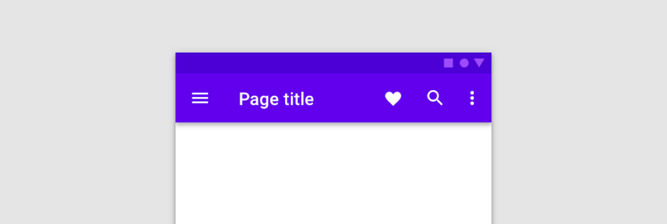
2. Reposition your navigation
Navigation is one of the biggest changes UX designers need to account for when translating desktop designs into mobile. There’s likely not going to be enough horizontal space on a mobile screen to maintain the top navigation menu that we’re so used to seeing on desktop, plus, even if there were enough space, forcing the user to stretch their fingers to the top of the screen does not make for good usability. Two of the most popular design patterns that have emerged to address navigation on mobile screens are hamburger menus and bottom navigation bars.
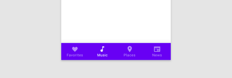
Hamburger menus, in particular, have taken over mobile navigation in recent years and peaked in popularity when Google introduced the use of this navigation solution in 2014 as part of their Material Design language. Hamburger menus are a simplified solution that allows navigation menus to hide away in a neatly stacked container when not needed and are revealed by users in one tap. However, it didn’t take long for designers to realize that hamburger menus may not always be the best solution for mobile navigation. The main reason being that hamburger menus hide information that is essential to the user’s understanding of how to navigate the app or website. Plus, since they’re usually located at the top of the screen, they are harder for users to reach with their thumbs.
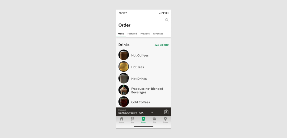
Bottom navigation menus tend to be a better solution for mobile screens because of their simplicity and easy usability. This design pattern has become the norm for mobile applications, however, mobile websites that are translated down to mobile screen sizes still haven’t fully adopted this approach.
3. Expand touch targets
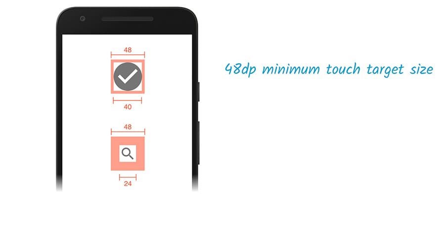
Cursors allow users to be really precise with what they’re clicking on. Touch targets can be (relatively) small on desktops and laptops without causing too much pain for the user. On mobile and other touchscreen devices, however, that just isn’t the case. Not only is using a finger less precise, but it also obscures the screen around where it taps. To account for this, designers must be sure that touch targets, like buttons and icons, aren’t too small or clustered too close together on a mobile screen. If users have to struggle to tap the right target or accidentally tap the wrong one, they’ll quickly become frustrated.
Google developers have a recommended set of guidelines when designing for mobile screens and suggest designing a minimum touch target size of 48 x 48 pixels, which equals out to approximately the 9mm size of a person’s finger pad. However, this doesn’t mean that all buttons, icons, and other touch targets have to actually be 48 pixels around. This just means that a 24 x 24 pixel icon has to also have padding or clickable space around it to equal 48 pixels so that when a user goes to tap it, they won’t miss.
4. Simplify form fields
Typing on a mobile device can be a slow and error-filled process. Therefore, when designing forms on mobile, it’s best to minimize the amount of typing required and provide quick and easy ways for the user to input their data.
First, keep the forms short and simple. Ask only what is needed, and use predictive text integrations, like the Google Address autocomplete API, to streamline the process.
If your form is particularly long, consider breaking it into multiple steps to reduce the amount of scrolling, and use a “next” button (preferably a sticky one) at the bottom of the screen to take the user through to the next set of fields to fill out. Just make sure to have some sort of indicator for users to know how many steps there are in total, and which step they’re at throughout the process to avoid any frustration.
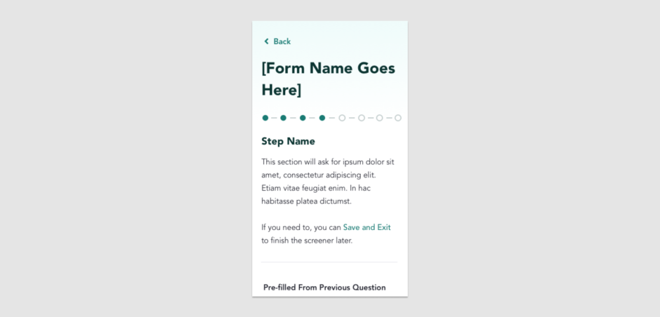
Make data entry as efficient as possible. It’s easier for a user to select from a dropdown or list of options than it is to type a response. And if you do provide a list of options, try to prefill the field with the most likely value on default to minimize the decision that a user must make.
Additionally, if users are asked to fill in any sensitive or hidden data like a password, offer a control to either show or hide the data they’ve entered. Typing on a smaller, less accurate keyboard on a mobile device makes it easy for typos to sneak in, and having this feature allows users to avoid unnecessary mistakes.
In general, it’s essential that the mobile design for forms are simplified and laid out in a way that encourages a user’s interaction with an app rather than getting frustrated.
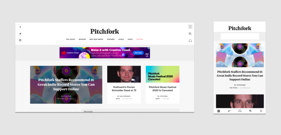
5. Optimize data tables
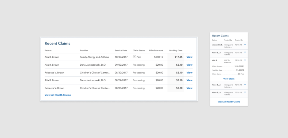
Well-designed data tables allow users to scan, compare, and analyze complex information to take action. On desktop, these tables of information are fairly easy to read. There’s plenty of space for multiple rows and columns, including labels at the edge of the table that explain what information you’re looking at. Translating these complex, data-heavy tables into a mobile-friendly format, however, can be a challenge.
In order to take advantage of the limited space, you’ll need to get creative. One option is to cut the table down to include only the most essential information. Another is to create “sticky” columns or headers in order to compare one set of information with another.
But before you go diving into solutions, it’s important to consider the user intent and need behind the table. Are they comparing information across columns? Across rows? Or do they only need to access one set of data at a time? Understanding how your users are interacting with the table is a crucial step in applying your UX design for mobile screens and can help you determine what the best approach and execution might be.
6. Consider the user’s environment
Finally, because mobile devices are, well, mobile it’s important to pay attention to how someone might use the mobile app or responsive website while they are on the go. User research will tell you that users prefer the simplest navigation possible in any case, but it’s an even more important consideration if they’re not stationary. For instance, apps designed for use while shopping or in transit, should maximize the size of touch targets and pare down navigation to the most critical options. They should also allow users to accomplish essential tasks quickly and efficiently since it’s possible that they’re doing more than one thing at a time, like paying a bill while waiting to hear for their stop on the bus.
As with desktop products, research is imperative to the UX design process for mobile. It’s necessary not only at the start of a project but also throughout the course of a project in order to evaluate new design patterns to make adjustments to a design as needed. Research is the best way for you as a designer to understand the people who will be using your product and what you can do to ensure that they can use it efficiently.
See how improving the user experience of your mobile application or responsive website design can help move the needle. Download our case study to see how we helped a health benefits management platform increase usability by using UX design and research to develop an updated, responsive design for their member platform.