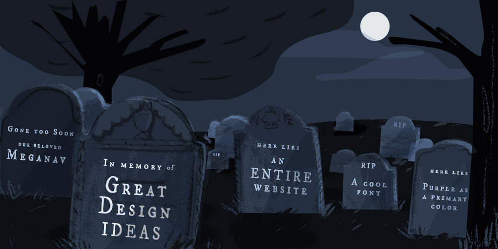
Grab a shovel! We’re digging into the Fuzzy Math Design Graveyard, where dead ideas from UX projects past come back to haunt us. For each design idea we’ll describe what it was, what we liked about it, and how (and why) it ended up buried. Some for the better, some for the worse, but it’s all part of the job.
Note: Some names have been excluded to protect the deceased. 👻
Pushing for purple
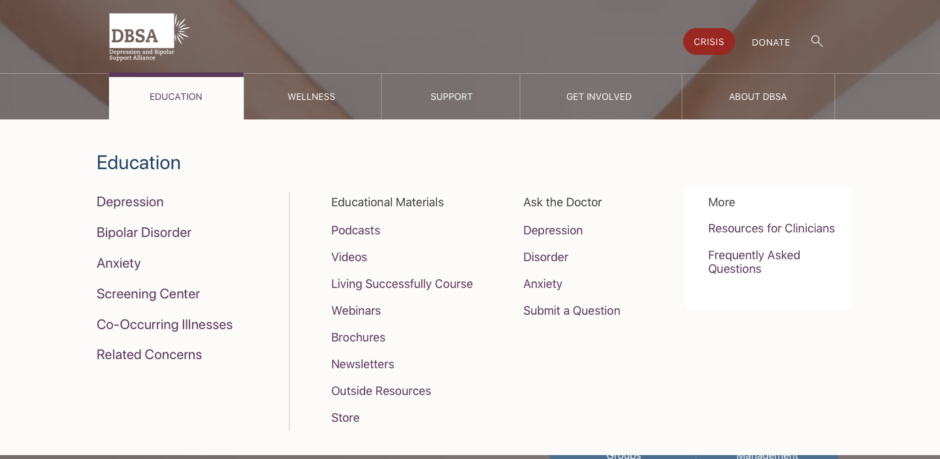
Project: Website redesign for the Depression and Bipolar Support Alliance (DBSA)
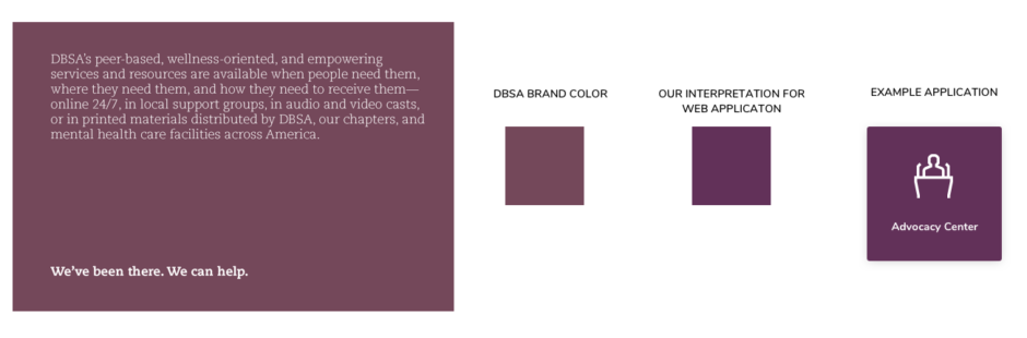
As part of our current pro-bono project, we designed a new visual foundation based on the client’s existing color palette. We pushed for a new primary color for the website: a strong primary purple for background and links that worked well with other neutral, beige colors used on the site.
However, it ended up feeling like we were leaning too heavily on a color that wasn’t in the client’s logo. Even though we really liked the new direction (which is why we’re bringing it back from the dead here), the client also described the website as feeling “too collegiate,” since purple is used generously in a lot of .edu websites. Another idea, buried.
°°°
The “mad libs approach”
Project: A revised search pattern for a travel and entertainment tech company
We conducted thorough UX design research to back up our (innovative but intuitive) design for a revised search pattern on this site. It was well aligned with the overall strategy of the company while also keeping in mind the kinds of users our client wanted to target in the future. Overall, we were really excited about the direction this was going.
Unfortunately, the design never made it to full implementation. Initially, we were unable to secure proper buy-in from key stakeholder to undertake this significant of a change. Years later, the client redesigned their website and included much of this design pattern! It’s nice to know that the research and concepts lived on, even if the original design… didn’t. There were a lot of lessons on this project, including how UX designers and content strategies can detach Information Architecture from UI.
°°°
An entire redesign lost?
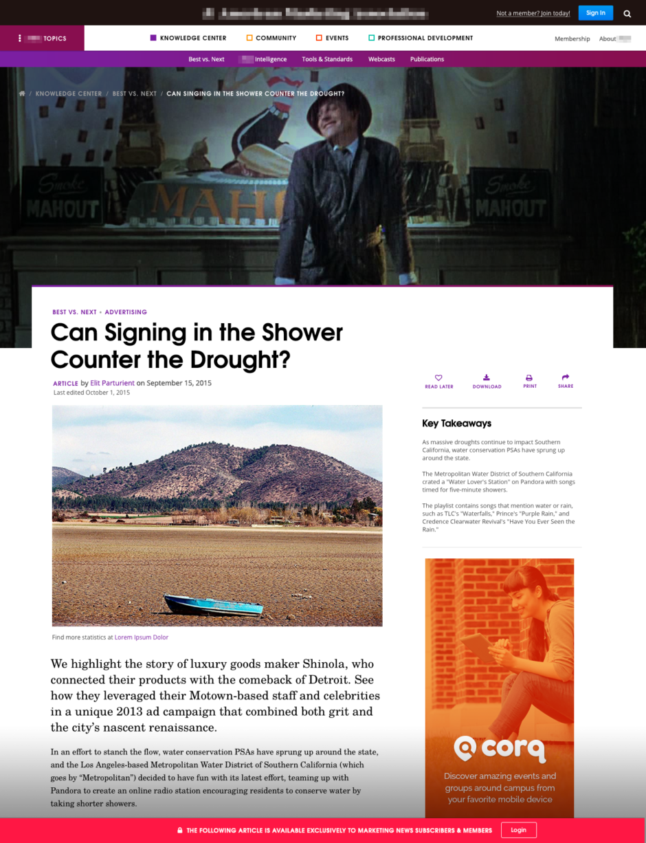
Project: A UX content strategy and information architecture redesign, including content paywalls
Sometimes it happens and entire projects meet an untimely end or are indefinitely “paused”. Fuzzy Math redesigned an entire content and member website for a professional marketing organization including UX research, content strategy, information hierarchy, and visual design. After delivering the initial designs, the client was pleased, and everything was approved. From a visual perspective, they agreed that the design “felt more modern and of the times” than their current design. It also aligned with their goal of attracting a younger audience.
However, a major challenge to this project was that the client had large organizational changes that were being made at the same time and were concerned that they did not have had the technical infrastructure in place to support a whole new web redesign. Ultimately, nothing Fuzzy Math produced has been used to date, and these designs were (hopefully only temporarily) laid to rest. Learn more about how good UX and strong content strategy are the foundation for SEO.
°°°
Comparing multiple documents
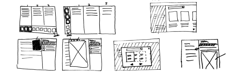
Project: A data-heavy internal management system for a large health insurance provider
During the concepting phase of this project, we iterated on some different ideas about how to view multiple documents or pieces of data at one time. Drawing some inspiration from a variety of tools with similar features, we started concepting a split-screen feature, where the user could click and drag between two different windows to control how much of the screen each document took up.
We liked this pattern because it is repeatable, easy-to-use, and allows users access to a lot of information at once. However, the client felt there was too much content and not enough screen real estate to support the amount of data entry and review on the project. Thus, this idea entered the graveyard.
°°°
Scheduling and timelines
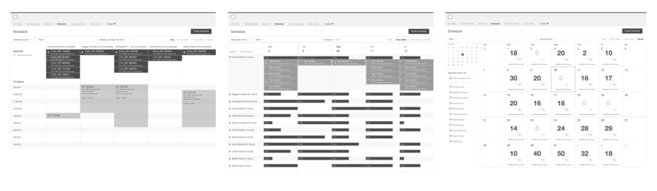
Project: UX design for a tasks scheduling and employee timeline tool for MyTaskit
For this client, we were building a scheduling tool that would show a maintenance shop’s daily tasks and a timeline of work to be done that day. The information displayed would be a high-level view of all hours with the ability to drill down into individuals’ schedules. The idea was a unique request that pulled a lot of concepts and functions of the tool into one single place. We designed an elegant solution to a tricky requirement.
Unfortunately, this one entered the graveyard because it wasn’t feasible for the framework used by the client’s development team. Even though this was the case, Fuzzy Math feels strongly that sometimes pushing clients to be more innovative is extremely important (don’t give up the good fight UXers!).
°°°
Plus one idea we killed…
Carousels (of doom?)
Project: A landing page redesign for a large hotel chain
This client was keen on a carousel of images in place of the masthead image. Not only did the client team want the carousel, but they wanted it to complete a cycle every 10 seconds! Their argument was that this was necessary for discoverability. We hear this a lot; people want to insert as much content as possible “above the fold,” and carousels are a pretty popular way to do that. Unfortunately, we know from lots of UX research over the years that a carousel that changes without user input is tough on the user, who often loses their place while they were in the middle of reading the text laid over the images. Add that to the fact that the carousel was not conducive to our user’s journey at this point, and we were able to successfully make our case. The carousel was placed 6 feet under.
°°°
… And one that wouldn’t die
Warning signs!
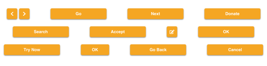
Project: A data reporting tool for an enterprise labor management company
Fuzzy Math designs a lot of Enterprise UX applications. In this case, the client’s brand color is orange. So it was important to them that on their website the buttons, the greatest calls-to-action, were also orange. Fuzzy Math advised that orange and red are considered “reserved colors” and are normally used to indicate errors. We know from experience that pushing against marketing color schemes can produce better user experiences. A great example is that use orange for a primary action tends to distract and confuse users. Fuzzy Math lost the fight on this one, and the orange buttons are still out there… somewhere… 🎃⚰️
Want to know more about some of the projects we’ve completed here at Fuzzy Math? Take a look at our UX Design Portfolio and Project Case Studies.