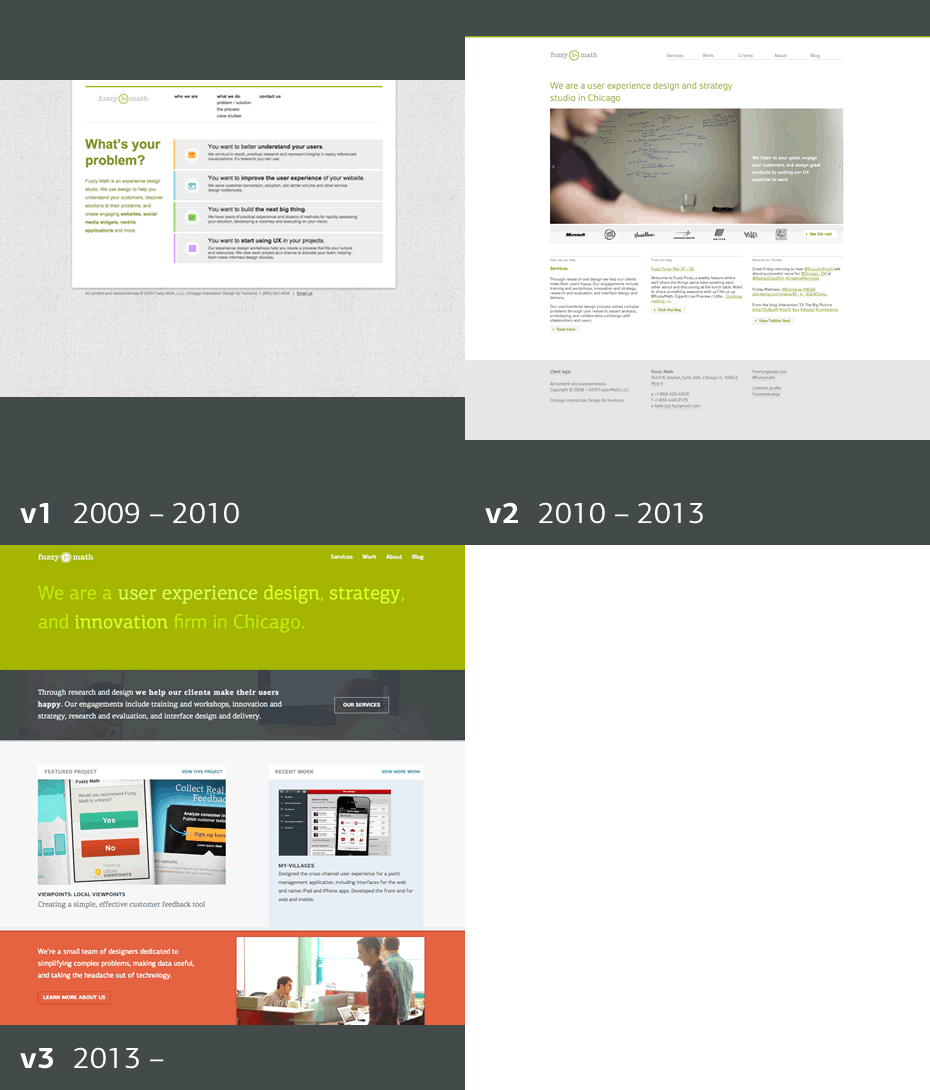
Fuzzy Math turns 4 years old this month, and to celebrate we’ve completely redesigned our website!
As with any project we work on, we identified a few key goals going in:
Service + Process Stories
We wanted to better talk about the expanding array of services we offer, and the flexibility we provide to meet the needs of a diverse set of clients and projects. To do so, we cleaned up our Services page and wrote a series of Process Stories – for Startups, Product Owners, and Strategy and Innovation – to help communicate how we approach different types of projects for different target audiences.
Our Work
Of course we also wanted to showcase some of our more recent work, so we completely revamped our portfolio to show how some of our work came to be. None of our projects start and end with final deliverables, so we made sure to illuminate some of the initial work that helped build the groundwork for what came later. Finally, we wanted to ensure that our breadth of projects is shown, so we built in tabs to let users drill in to some of our areas of core expertise, such as user experience for healthcare, startups, and mobile.
Responsive
We’ve been working a lot recently with responsive design, and wanted to trade our distinct mobile website for a fully responsive layout that looks good at any resolution. We incorporated one of our favorite tools from recent projects, Bootstrap, to quickly iterate on different responsive layout ideas and create our final design.
While we’re still making a few tweaks and implementing new ideas as we think of them, we believe this site serves as a great tool for communicating what Fuzzy Math is all about. What do you think? Find any bugs? We’re all ears.
