
This year has been a year, hasn’t it? So we here at Fuzzy Math wanted to take a little time to reflect both on what’s been going on this year in the design world, and what might be going on in the year 2024. We’ve got a lot of musings about things, including what UI trends are coming, a dose of UX thoughts, and of course: what we think about all this AI stuff going around!
So please, stick around so we can dig into all the year 2023 has brought us, and think about what might be coming next!
The tools we use!
2023 was a big year for a lot of the tools that designers use everyday – from figma updates, to the continuing improvement of ‘no code tools’, to AI support – this year felt like we were getting updates to our toolkit every month.
Starting with Figma!

I’m really excited by all of the new updates Figma released in the past year – from Dev mode to Variants – I think there is a lot of potential to make the hand off process even easier when moving between teams.

I also found the Figma updates really impactful as variables are a huge part of our design system!
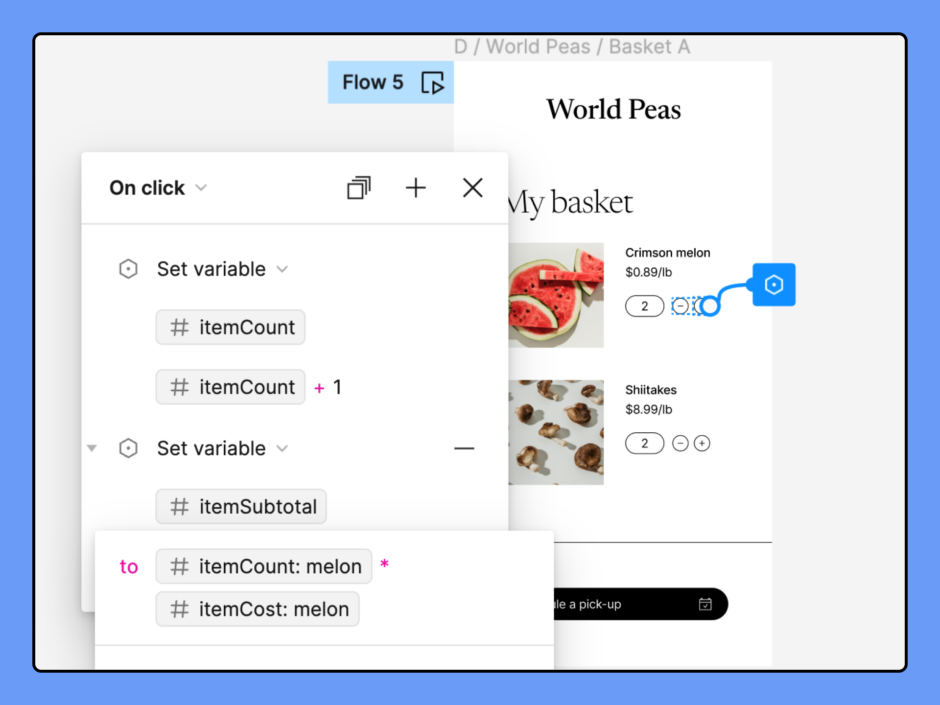
If you haven’t read about it, this year was also the year we unveiled our brand new design system and began using it to make our work for our clients far more efficient and streamlined! The introduction of a lot of the new Figma updates were implemented in the creation of the design system and they’re working wonderfully for us already!
Beyond Figma, there are other tools that are beginning to improve in some big ways that are going to help our workstream:

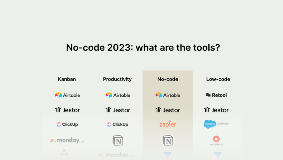
I noticed 2023 was a big year for no-code tools and that excites me because there may be opportunity in the near future for us as a company to leverage these tools to create components in a code base for our design system that can then be handed off to clients. In other words the gap between design and code seems to be closing rapidly which is super exciting.
AI
AI was such a big deal this year, that I wanted to make sure it got it’s own header. We here at FM have been working pretty hard to discuss and explore ways that AI can be implemented into our workstreams (which we have some articles about), and we’ve also been talking about what it means for the future.

- Writing (more) realistic placeholder copy for designs
- Generating the framework for user interview guides and surveys
- Generating schedules for research and key design deliverables based on target dates
- Analyzing user data
- Generally helping me get out of “paralysis mode” and get something on a page so that I can start iterating
- Crafting user scenarios
AI is great at generating something, anything, to help you get started. It’s also pretty good at sorting through quantitative data. Understandably, though, it’s not so good as the “human” part of human-centered design, so it’s worth experimenting with.

I’m curious where AI will take us in the new year especially as an industry. I think there are a lot of benefits to AI but there is also a worry that there will be shortcuts taken to automatically design websites / platforms only using AI. There needs to be a human element in designs so it doesn’t have that robotic feel that AI tends to generate. I’m hopeful that there will be a successful intertwining of how we can use AI as designers to make our workflow more efficient without AI taking over too much of the conversation.

Related to AI, I am both excited and terrified of Google’s Gemini 😅 from the little amount that I’ve seen, it’s going to be wiiiiild.

But in addition to thinking about how we as a company can utilize AI to better our workstreams, and help us in our day to day, there is the all important discussion of how AI should be used responsibly. At Fuzzy Math, I think I can confidently say that we are all about ethics – and that means making sure that the work we produce and how it’s produced is ethical and for a good purpose.
Kelly, who is one of our designers at the forefront of working with AI tools, says it best:

Outside of my own processes, I’m also interested in seeing AI pop up in other industries — the potential for what it can do is great, and I’m excited to be able to leverage AI’s capabilities in strategic product development for our clients.
Of course, integrating AI responsibly and transparently is a key aspect of the AI trend that I would like to see continue to grow and take hold in 2024. There have been great conversations around the ethical challenges of AI and how to use the technology responsibly. Like the Stanford policy brief on AI ethics, UNESCO recommendations on AI, and the AI ethics council.
Setting the precedent for that early is key in making sure that AI adapts well to the mainstream.
Design Observations
What did our team think of any UI or UX considerations this year? Or our thoughts for next year?

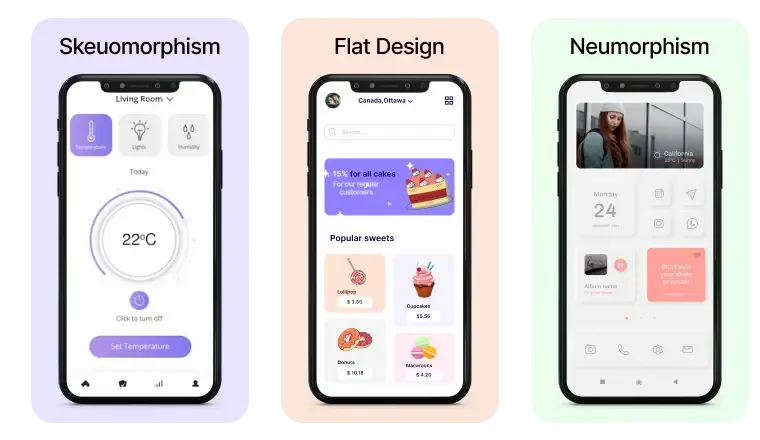
I think in 2024 skeuomorphism is going to make a major comeback. We heard it everywhere in 2023, “Flat design is dead”, personally I don’t think its completely dead but I’m starting to see a lot of trendsetters and popular apps/design systems like Shopify’s design system and Airbnb push for more skeuomorphic visual design. I think it helps with affordances and makes products more engaging which is a big win for usability and visual interest.

I can’t help but agree with Tré here. When I was in school for design, I definitely noticed that skeuomorphism and it’s cousin neumorphism had been slightly trendy but were rapidly falling out of favor and being replaced everywhere with flat designs, but I really like them and hope they make a big comeback.
Not everything in designland can be doves and roses though. There are definitely some things our team doesn’t want to see continuing in 2024 and beyond:

There’s been a lot of layoffs across the tech space in all companies – small to large. It has been a stressful time but I’m hopeful that we are able to shift as designers to be looked at as a strategic partner. I think some of these companies doing larger layoffs are going to feel the effects of not having a design team to research and design based on the voice of the user. I hope that once companies start hiring in masses again (which they will), they’ll have design as a larger piece of the strategic direction of the product rather than a team that just completes requests without research. But also we are back in ✨ unprecedented ✨ times when it comes to the economy so I’m just hopeful for an upswing again.

While we’re talking about things that we would like to see not continue in 2024 and beyond, I’d like to make my yearly, useless complaint about ads and how they’re used on the internet.
I truly long for the day when I can open up and article and I am not bombarded by 4 different popups coming from all sides of my phones screen offering me 15% off if I just give my email address out.
Now I know this isn’t necessarily designs fault. But I really hope all of us in tech can try to rally and say “hey, this stuff is ineffective, frustrating, and overwhelming for users”.
A guy can dream, right?

I’ve also been noticing an uptick again in dark patterns based off of applications I’ve used. One I even saw online where they automatically added a custom tip in the checkout flow when it was an online store without letting the user verify the tip amount. I’m hopeful that with social platforms, more companies will be called out for doing that sort of thing but it is worrying to see it becoming more common.
That’s all folks! As we at FM are about to head out for our end of year break, we want to wish everyone out there a great holiday season, and a happy new year! We’ll see you back in 2024!