
As Fuzzy Math is winding down for our holiday break, we’ve reflected on some of the good and bad experiences we’ve seen over the course of 2018. A lot of interesting things have happened in the digital world, so we put together a list of what we thought was Naughty and what was Nice.
Naughty
Spotify’s Search
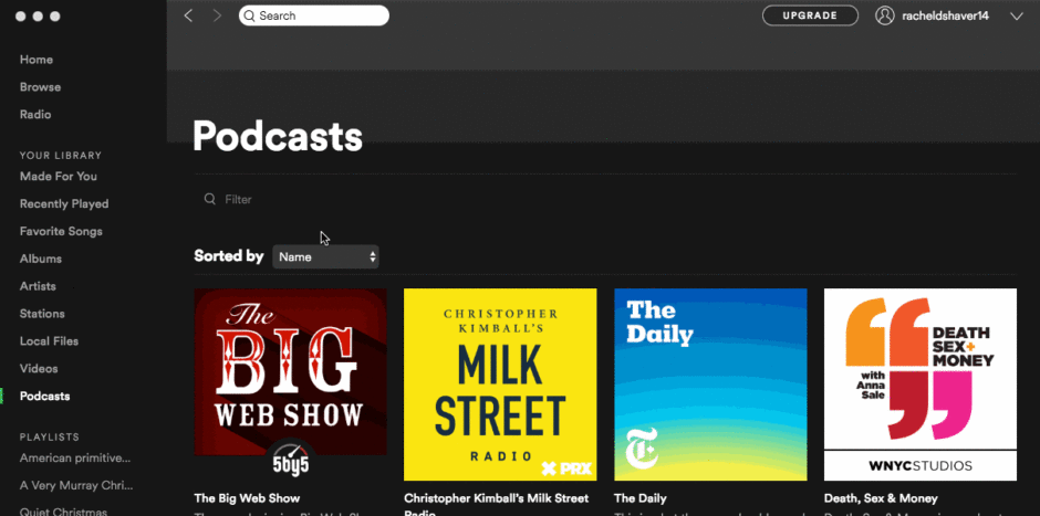

Spotify’s search is on my naughty list this year. There’s no contextual search, so I’m constantly having to sift through songs, artists, and podcasts when I’m looking for a specific album, or vice-versa. Extra mischief: the mixed metaphor of the magnifying glass icon (widely used to represent search) with a Filter label. Tsk-tsk.
Venmo’s Privacy Settings
Read More: A Researcher Studied a Year of Public Venmo Transactions.

Venmo justifies having all your transactions public by default “because it’s fun,” despite coming under fire for the privacy concerns they’re raising.
Robinhood
Read More: Robinhood Checking Moved Fast and Broke

I’m all about making financial services more accessible, but you shouldn’t have to deceive regulators and your users in order to get your product in the market. That’s why I’m putting Robinhood on the Naughty List for their recent, sketchy launch of a “Checkings & Savings” account.
Popups

Every site that still loads a popup if you scroll, move toward closing the tab, or try to click on any major call to action.
Jumping through hoops to cancel a monthly subscription

Any company that will let me start a monthly subscription through their app, but won’t let me unsubscribe through their app. You have to go to their website or make a request to customer service instead. Looking at you, Showtime.
The loss of Inbox

Google shuttering Inbox — while many of the nice features of this app have made their way to GMail, GMail lacks the simple focus on emails as tasks to be completed that makes Inbox so powerful.
Misleading surveys

Emails that lead you to believe that you’re submitting a short survey and then take you to a page with 10 more questions.
Nice
Venmo’s Onboarding
Looks like Venmo made both lists this year!
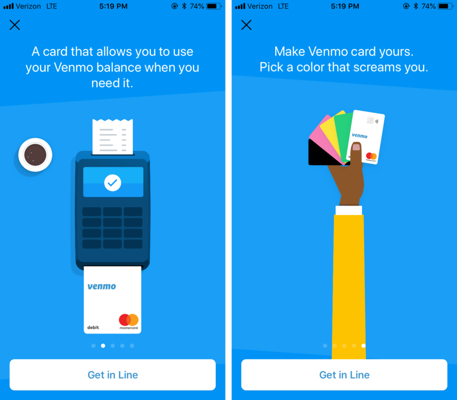
Venmo’s in-app walkthrough introducing their new debit card in June was nicely done. The illustrations were delightful, the content clear and to-the-point — and so effective that I got the gist of the new product in just a few swipes. It was clear where to navigate to learn more, and most importantly, easy to dismiss.
Apple & Google for encouraging screentime mindfulness
Read More: Apple’s new ‘digital wellbeing’ tools aim to help reduce screen time
This year seemed big for screentime mindfulness, and both Apple and Google released features/apps for their phones to help people monitor and set limits for their daily phone usage
Yahoo Fantasy Sports

The Yahoo Fantasy Sports App. I think the app handles all the data it needs to have accessible really well. There is sooo much data in such a small amount of space! Especially when I think about how high traffic this app is and how diverse the audience base is, it is pretty impressive. There is definitely confusing parts about the app or things I just ignore because I don’t understand what they are (this also is probably a function of me not really understanding fantasy football).
Babbel for Apple Watch
Read More: Babbel launches on Apple Watch
Also really liked the babbel app for apple watch. It is a context based learning idea, that I think could use improvement, but I love the idea behind it. It is basically a vocab learning game based on related words to businesses near your location
Updated Google Calendar
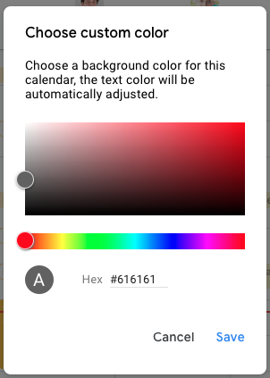
Google’s update to Calendar – creating a more unified look and feel across it’s products. REALLY NICE how calendar will automatically choose the proper text color depending on the color you choose for your calendar.
High-contrast accessibility

Potbelly’s high-contrast toggle at the bottom of the screen to ensure the page is accessible by all visitors
Car2Go

More of company with a supporting digital app, Car2Go just launched in Chicago and has changed the way you can get around this city. It’s now even easier and more affordable to not own a car. And, believe it or not, at times it’s easier and more affordable than Lyft. The onboarding and customer service experience falls into the *Naughty* category, but the app does exactly what it should. It’s a simple map of the (surprisingly large number of) cars near you. Reserve in advance or walk up to a car, get the code off the digital read-out on the dashboard, and you can unlock the car automatically. No need for keys or Fobs. Park the car, get out, and 10 seconds late it ends the session. One small improvement would be to help drivers find legal parking spots but otherwise, they executed a complicated offering very well in a big city.
Book of the Month
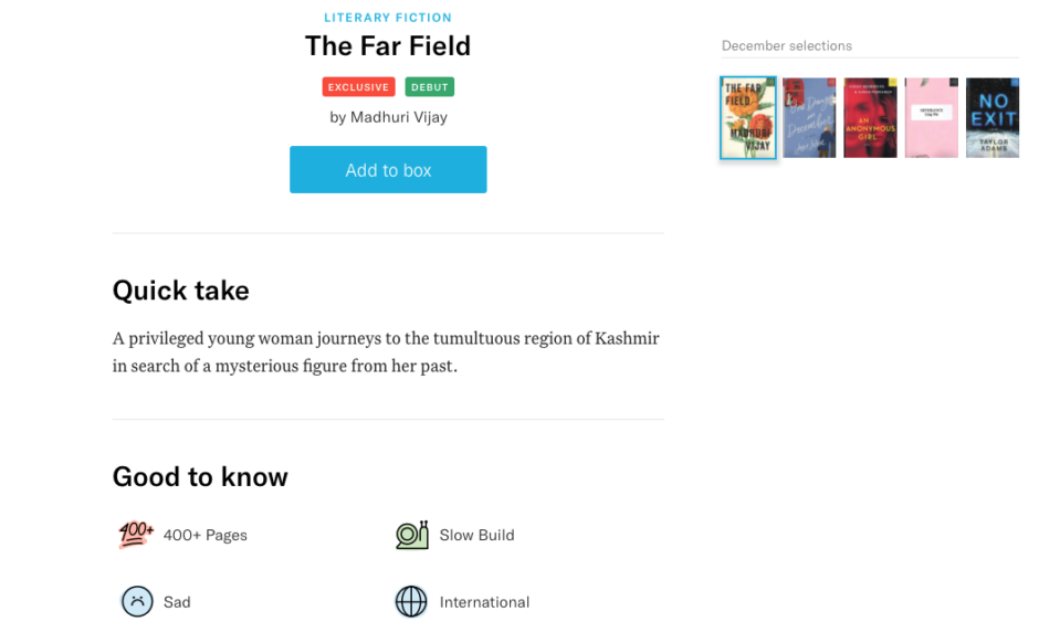

Book of the Month Website. They just do a really great job helping you choose a book with the help of tags and digestible sections that give you both a high-level overview and more details about a book. They also add delight to the experience with graphics and animations that are clear and friendly
Apple & Google, fighting phone spam

While the surge in phone spam is surely on the naughty list, Apple and Google (plus numerous third party app developers) building solutions to help combat that spam has, if not eliminated the issue, at least made it more manageable.
Slack’s In-App Search
Read More: Slack is making its in-app search less awful

About halfway through the year, Slack revamped it’s in-app search and, let me tell you, it’s totally changed my life. (Never thought that I’d say that about a search feature before.) The new search is smart, contextual, and has all the filters that I didn’t know I needed. I can’t even imagine going back to how it was before. Kudos to you, Slack!
And one that’s up for debate…
Google Smart Compose
Google Smart compose. Not sure if that’s naughty or nice… it’s kinda cool, but I find it creepy and my latent luddite side thinks it’s going to ruin my ability to think/write for myself 😂
I’m happy to argue that Google smart compose is nice. Sometimes I overthink what I’m writing, so it helps to see where Google thinks I’m going with a specific sentence. I also really like the three reply options it gives you, because they’re so beautifully simple, and they help me remember that sometimes the answer can be as simple as 2-3 words.
Where do you stand? What other apps or tools have been naughty or nice to you this year? Tweet us @fuzzymath to join the conversation!
Related: