
Now more than ever, we’re designing products (and enterprise web applications) for folks with a shrinking capacity to focus, and connected devices are demanding more and more of our attention.
As designers, we aim to create impactful, valuable user experiences by understanding our users. We adhere to heuristics and principles that prioritize usability and efficiency, and we try to elicit joy and delight through micro-interactions and cute animations. The context in which users interact with technology is evolving though, and our priorities and methods need to evolve as well.
What can we do to create better products and experiences?
Fortunately, there’s a solution. The concept of Calm Technology was originated by three PARC researchers in 1995, before we were inundated with smartwatches and talking speakers, and it has been discussed and written about at length by researcher and author, Amber Case. Calm Technology is the idea that technology should reduce complexity in the world. Digital products should exist in our periphery in order to help us focus on what’s important. Technology should make itself present and useful when we need it and get out of our way when we don’t.
Why should we talk about Calm Technology in UI design?
Designing products to be efficient or delightful is still worthwhile, but in focusing too much on those qualities, we forget that users are people — people with plenty of other things to do. Too many products rely on disruptive interaction patterns. There are of course workarounds, but the responsibility is usually on the user to change their settings or set up hacks. It can feel like a chore. Notification fatigue is real, and I think we all feel it. As designers, we should be the change we want to see!
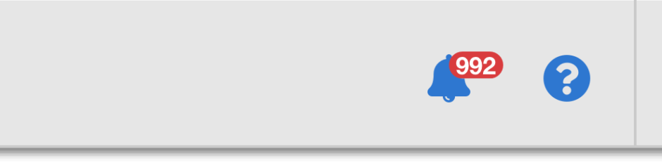
“Notification fatigue is real, and I think we all feel it. As designers, we should be the change we want to see!”
Of course, there are competing values when we’re designing in the real world, and making the case for a product to exist in the background may not resonate with business interests. At Fuzzy Math, we design a lot of complex products for enterprise UX users, and incorporating Calm Technology into a digital product strategy for an enterprise web application goes beyond just the ability to silence notifications. It’s also important to consider when looking at embedded technology and connected devices. We can build effective products and UI designs that help users accomplish their task while contributing to their overall well-being if we start to understand the principles of Calm Technology.
So what are the principles of Calm Technology?
You can find the principles of Calm Technology outlined at calmtech.com or in Amber Case’s books, Calm Technology: Principles and Patterns for Non-Intrusive Design. Since we’re already talking about it though, let’s take a look here.
1. Technology should require the smallest possible amount of attention
- Technology can communicate but doesn’t need to speak.
- Create ambient awareness through different senses.
- Communicate information without taking the wearer out of their environment or task.
2. Technology should inform and create calm
- A person’s primary task should not be computing but being human.
- Give people what they need to solve their problem and nothing more.
3. Technology should make use of the periphery
- A calm technology will move easily from the periphery of our attention to the center and back.
- The periphery is informing without overburdening.
4. Technology should amplify the best of technology and the best of humanity
- Design for people first.
- Machines shouldn’t act like humans.
- Humans shouldn’t act like machines.
- Amplify the best part of each.
5. Technology can communicate but doesn’t need to speak
- Does your product need to rely on voice, or can it use a different communication method?
- Consider how your technology communicates status.
6. Technology should work even when it fails
- Think about what happens if your technology fails.
- Does it default to a usable state or does it break down completely?
7. The right amount of technology is the minimum needed to solve the problem
- What is the minimum amount of technology needed to solve the problem?
- Slim the feature set down so that the product does what it needs to do and no more.
8. Technology should respect social norms
- Technology takes time to introduce to humanity.
- What social norms exist that your technology might violate or cause stress?
- Slowly introduce features so that people have time to get accustomed to the product.
This all seems straightforward, right? Think about some products you use regularly though. Do you ever feel they demand too much attention? Do the enterprise products you use at work consistently make your job easier? Are you able to get in and out of a tool to complete a task without the interference of notifications or information overload?
Designing calm products isn’t as easy as it sounds, and applying these principles to enterprise web applications and UI design presents even greater challenges. So let’s look at a few of these concepts in more depth to understand how to make sense of this when designing for enterprise users.
Technology should make use of the periphery
This is what Calm Technology is all about. Products and tools should ask for our attention only when necessary. A good example of this might be the indicator on my water pitcher that tells me when I should replace the filter. There could be an app that updates me every day about the quality of my water, or it could show me trends about how much water I consume. I really just need it to tell me when to replace the filter though. It does so with a small light that blinks in one of three locations each time I pick it up. The information I need moves into my central focus only when it’s relevant.
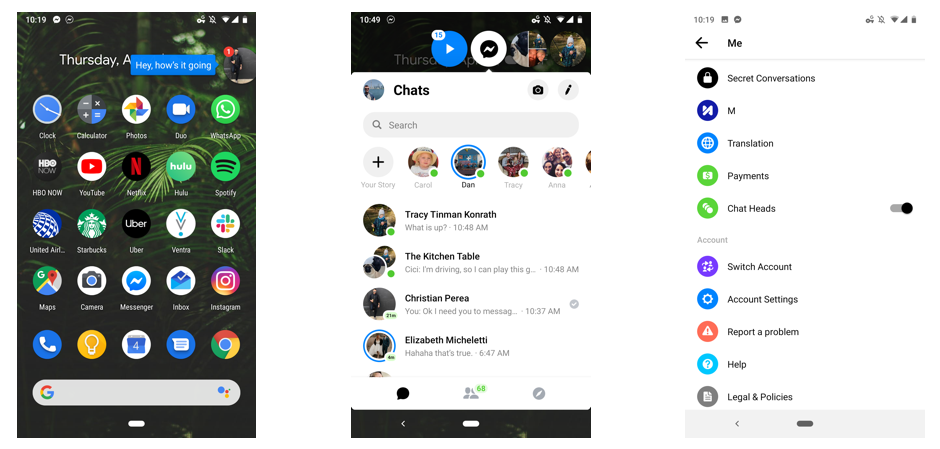
Consider now the Facebook Messenger Chat Heads bubble on Android devices. The Chat Heads bubble appear by default, floating around your screen above everything else. To hide it you’d have to dig through your settings. With that feature, Facebook went above and beyond even traditional push notifications to disrupt users.
In thinking about how this applies to enterprise web applications, we have to remember that most enterprise users are experts, and we have to trust them to do their job. Enterprise tools should help guide user’s decision making. Interacting with a piece of software is not the core responsibility of folks in healthcare or finance, for example. The tools they use can be of value though if they exist in the periphery, surface crucial information only when necessary, and function as a useful supplement to their work, and applying enterprise UX design to the tools in question can help make that happen.
Technology should amplify the best of technology and the best of humanity
At the core of the human-centered design is the idea that we’re building technology to solve peoples’ problems. Being able to identify problems and knowing how to apply technology as a solution is the intersection at which great design happens. It’s important to understand the limits of a technological solution though. Technology is great, and digital products can outperform us in certain areas, but when there’s a task best left for a human, don’t try to overengineer something that a person could do better on their own.
“Being able to identify people’s problems and knowing how to apply technology as a solution is the intersection at which great design happens.”
Humans have the unique ability to make sense of abstract information. We can not, however, calculate large datasets as fast as our software. Think about tools like Tableau or any other reporting dashboards on enterprise web applications. Those tools are really effective at ingesting data and outputting visualizations, summaries, and trends. There’s an additional layer of contextualizing that information, and for the time being, we’re still the experts. We can rely on these data tools to do the heavy lifting, but it’s still best for us to interpret the data in order to make informed decisions.
Even as the line between humanity and technology starts to blur with advancements in AI, it’s important to consider this principle. Yes, we can make our technology feel more human, but should we? At what point of the process do our tools stop being useful and start becoming a nuisance?
“Yes, we can make our technology feel more human, but should we? At what point of the process do our tools stop being useful and start becoming a nuisance?”
Technology should work even when it fails
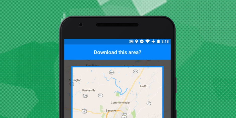
Another important concept behind Calm Technology is the idea that a product should work even when it fails. What does that mean exactly? Well, this could mean something different depending on the context. In the simplest form, think about an escalator. When an escalator stops working, it still functions as stairs. Or think of Google Maps in an area with no network connectivity. You have the option to download offline maps if you plan ahead, or you can view a version of the map as it was last loaded.
These are instances where technology remains useful even when it’s not working to its full capacity, and this is particularly important when designing enterprise applications. At Fuzzy Math, we’ve worked on a number of products that are used in less than optimal conditions. If you think about an application used by folks in a warehouse, you have to ask about the quality of their connection. Is WiFi even available? Will the user be collecting information out on the floor and uploading data at a connected kiosk? You may have thought through a brilliant tool that works when connected, but how does it function in a more realistic context?
This also applies to products designed for international audiences. How will your page render in a market that has lower connectivity speeds? If you’re designing a content site, for instance, have you designed what your site will look like if rich media doesn’t load? It’s crucial that you understand the context in which your user is interacting with your product.
The right amount of technology is the minimum needed to solve the problem
Related to this last principle is the idea that only the minimum amount of technology needed to solve the problem is the right amount of technology. Anything more than that is a distraction. Some consumer products might be able to get away with extra features, but at the end of the day, the best products do a small number of things, and they do them well.
Bloated products are frustrating to use, and that’s especially true for enterprise web applications. Where does that bloat come from though? In my experience, it comes from a misunderstanding of the user. If you understand the users’ needs, you’re better able to define an MVP (Minimum Viable Product). Defining an MVP can be difficult though – especially when there are competing interests within your team. That’s why it’s so important for the entire team to be bought into the process of human-centered design. Having a cohesive approach to solving your users’ problems will allow you to build more efficient and effective tools that solve problems with fewer distractions, leading to better UI design and a better enterprise web application overall.
Some final thoughts and helpful resources
So where do you go from here? Start with the products you’ve already built. Amber Case has created this extensive scorecard (still in beta) to help you gauge whether your product is Calm. Microsoft has also put together this handy guide for respecting focus as part of its inclusive design initiative. Wherever you go from here though, it’s more important than ever to focus on the mental cost of UI design and digital products. As Mark Weiser says, “the scarce resource of the 21st century will not be technology; it will be attention.”