Who are your users? Why are they using your product? What’s the context of use?
The answers to these questions drive design decisions, but at times the answers can be extremely elusive. When a product or service can be transformed any which way to serve any number of potential goals, where do you even start?
Recently we were tasked with designing a modular white-labeled product, meaning the components we would design were the output for a product… that builds products. The components could be placed in any context and filled with any content, and neither we nor our client would have much control over implementation.
Consider Squarespace
When a Squarespace user drags a text box out into their website builder, they can make text big or small or italic or bold. You know certain things that the user building their website will probably want to do—like make text bold or italics—but are there other components or customizations they need in order to help the end user (whoever visits the website) have a successful experience? Maybe more importantly, are there certain things that the website builder definitely shouldn’t be able to do?
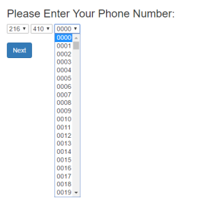
How much control over a component do you give this intermediary user (the person building the website), knowing full well they might not be a web designer? If you give them total control, you might end up with a website like this.
Is it amazing? Yes. (You’re welcome).
Is it a UX train wreck? Yes.
The Tactical Approach
As we began to design the most common individual components, certain realities became clear. It was basically a given that the person dragging and dropping our well-designed default component would override a lot of our decisions. Frankly, they should customize the components to a certain extent, because we didn’t design specifically for what makes their user or product unique. We were making best guesses at what default settings should be for different components with limited information and strong attention to best-practices.
We had some insight into potential use-cases and a heck of a lot of heuristics to consider, but all with a pretty big caveat—”Yea it’s probably mainly used for Product A in Industry B, but it could also be used in Industry C and D for Product X, Y, or Z.”
It’s enough to make a designer’s head spin. Well, at least that’s what I was thinking while my head was spinning. So we went ahead and designed clean components around the limited information we had on users, products, and use cases, all based solidly in UX best practices.
But I couldn’t stop thinking about my nightmare scenario: a Frankenstein component. A component customized in some wild way to be something it is not. Something so horrific, it’s almost beautifully creative.
The Strategic Challenge
As the example above clearly illustrates, unlimited customization isn’t always good. The more customizable a product, the more expertise a user needs to have. Given that the person building the product probably wouldn’t have design expertise (not their job), we wanted to reduce the need for customization as much as possible without restricting their access to the components they’d need.
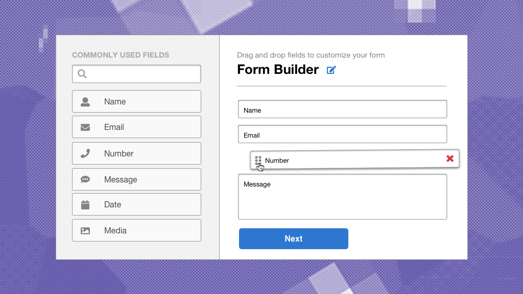
The Component Library
The crux of the issue was this: how could we ensure that thoughtfully designed components would stay thoughtfully designed? As I dug into the project, I realized this could be done in two ways:
- Design a robust component for the majority of cases and a set of features that could be added individually to serve the remaining edge cases.
- Design refined components specific to as many use cases as can be identified. Instead of 1 component, design 6 with slight variations serving specific contexts.
There’s a long list of pros and cons associated with each approach, and to decide on an appropriate direction you need to consider all of these in addition to other variables specific to your product.
In the end, the direction you choose has to tie back to what will provide the most successful overall experience to your end users. If intermediary users are constantly working within your product and want to implement many simple aesthetic or functionality customizations, a more flexible component might serve them better. However, if components are complex and customizations could easily break the product, it might be worth restricting customization a little bit more or at least setting some guide rails to protect against a broken product.
The following questions might help you make a decision:
- What level of expertise will your intermediary users have with your product? Will using your product be most of their job, or something they just do once a year?
- How complicated are the individual components themselves?
- How different do the end products even need to be in order to be successful? What would be the impact if a certain customization wasn’t available?
- Can an intermediary user actually break a component by customizing it incorrectly?
- Are the consequences of a mistake by an intermediary user high (substantial impacts on revenue) or low (aesthetically unpleasant email)?
The answers to some of these questions might even change from component to component, so consider that your solution might include varying degrees of each approach. Whichever direction you and your team choose, you’ll also want to consider how you can support the intermediary user.
Beyond Components
We’re hardly the first designers to run into this challenge, and there are a number of analogous competitors successfully operating in their respective industries. SurveyMonkey and MailChimp are two modular products that we think are leveraging effective strategies to help intermediary users choose the right components for the right cases.
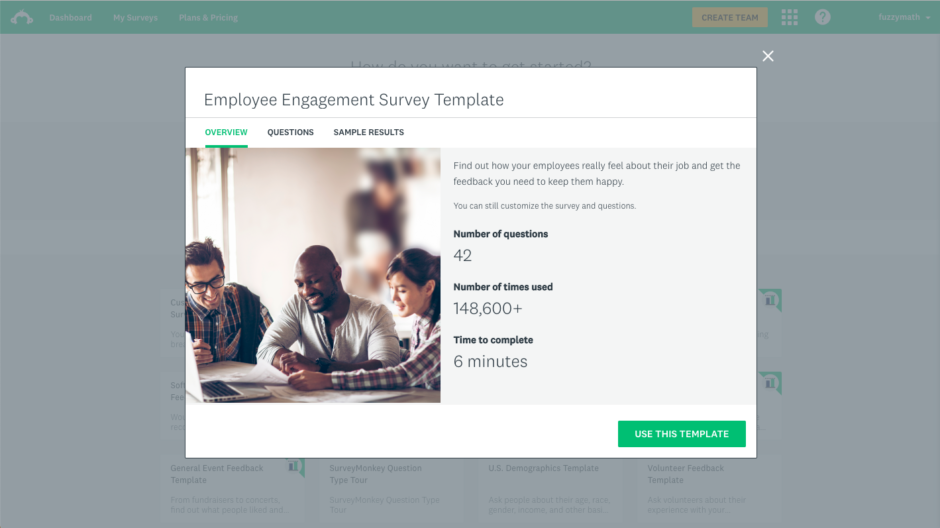
SurveyMonkey templates provide the user pre-built (but still customizable) and thoughtfully designed survey templates for the most common use-cases. These templates are super helpful to the intermediary user, especially one that doesn’t often use the service.

MailChimp, in addition to their own templates, provides users an entire Email Design Guide to cover higher level topics, like color palettes and font choice. Email marketers can spend vast amounts of time working to create and analyze their email campaigns. The Design Guide is a tool that captures and aggregates design best practices in one place, supporting newer users but also providing a greater depth for the more expert users.
Whatever strategies you choose to put in place, a multi-faceted approach to empower and support the intermediary user not only improves the user experience for that user but also raise the quality of the product they’re actually able to create.
At the end of the day, each modular product presents its own challenges. As designers, we have to determine (with the help of research, of course) how best to balance prescription and customization so that all of a product’s unique user sets can achieve their goals.