UCAN Chicago is a local nonprofit organization aiding at-risk youth by advocating for and providing opportunities for those who have suffered trauma.
Fuzzy Math partnered with UCAN to provide a pro-bono website redesign that would help increase engagement and online donations for the organization. In order to accomplish this, we set out to incorporate the following into our new design:
- Add a clear and elegant visual hierarchy
- Encourage donations by providing multiple calls-to-action and visually prominent entry points to the “donate” page
- Create an intuitive and cohesive IA structure
- Quickly and easily tell the story of UCAN and give the user confidence to explore the site further
- Leverage personal stories and photography to create a personal connection between UCAN and the user
The old UCAN site
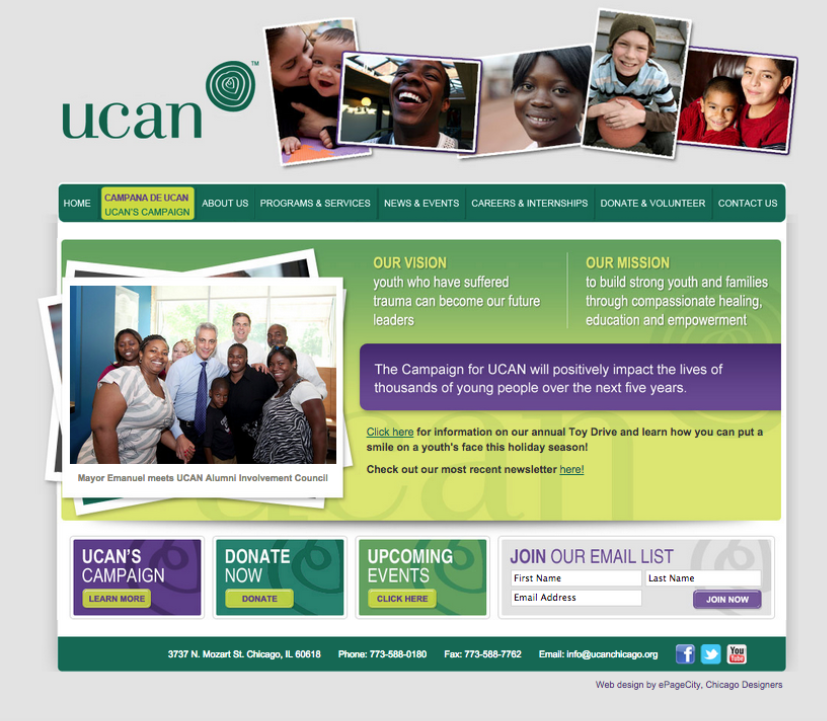
UCAN’s existing website was dense and content-heavy. In order to create a lighter, more concise (yet still effective!) site, the Fuzzy Math team had to make sure our taxonomy and information architecture were sound.
We began by reorganizing the existing site content, paying special attention to ensure that we weren’t burying important information or discouraging users from donating to UCAN.
Our Process
Without primary research to drive this project, we had to rely on our primary stakeholders, secondary research, and our design expertise to create a new design and structure that met both the users’ and UCAN’s needs.
Design Principles
Using stakeholder information, we created a set of 6 design principles to keep project objectives front-and-center.
- Be Clear – Copy and design must be clear and straightforward, pointing the user down the proper path. Reduce confusion and propensity for getting lost in site content.
- Create a Personal Connection – Use visual content, clear copy, and success stories of clients to create a personal connection and show the impact of UCAN on the community it serves.
- Make an Impact – The UCAN site must be easy to interact with. It seeks to show the effect of UCAN’s programming on Chicago youth and motivate the visitor to become a donor and facilitate change in the local community.
- “Get it” – At a glance, the user should understand the purpose of UCAN, as well as the importance of the program to the community it serves. The site should convert visitors into program advocates and be easily digestible and approachable for everyone.
- Enable exploration – Common process and desired action path should each be clearly marked every step of the way. If the user wants to go further, additional content should be well organized, accessible, and enjoyable.
- Be consistent – Strengthen the relationship between print and web materials, form design, style, and tone.
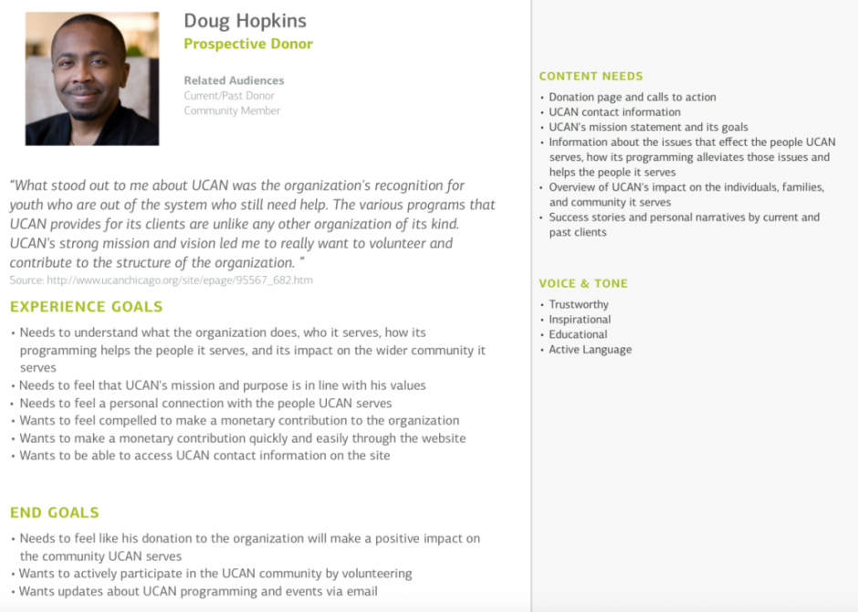
Personas
Personas enable us to make design decisions with a particular point of view in mind. We created 4 personas, including the Prospective Donor, the Prospective Funder, the Job Seeker, and the Media.
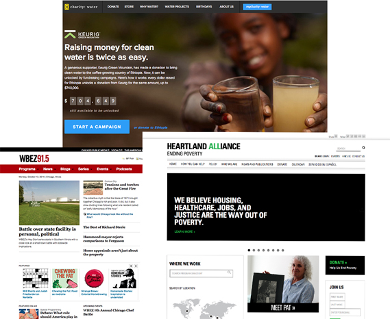
Competitive Analysis
We then used our design principles to do a comprehensive evaluation of competitor websites, including websites for non-profits, local NGOs, and for-profit companies. Our aim for the competitive analysis was to identify opportunities such as design patterns and navigation structures that we could potentially use to inform the new design.
When we analyzed all our findings, we realized that getting as many prospective donors to pledge to the organization wasn’t just about making the website visually appealing and easy to navigate. We needed the website to create a personal connection with the user and elicit empathy, trust, and a sense of social responsibility. There was a clear opportunity for UCAN to use anecdotes, compelling photography, and personal stories to better tell the story of the organization and its impact on youth and the community it serves.
In order to achieve this, we worked closely with Fuzzy Math visual designer Rachel Vorm to come up with a strategy for creating a personal connection with users straight out the gate.
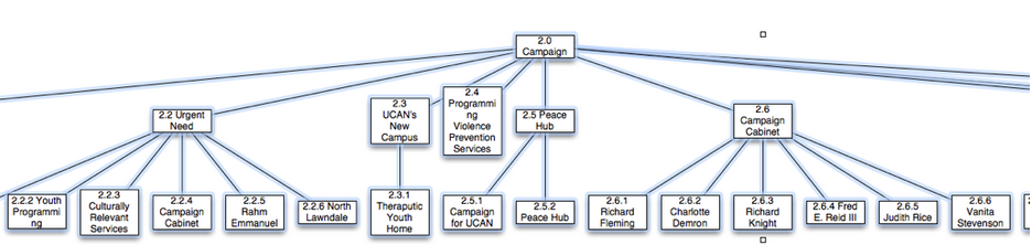
Furthermore, we analyzed data about the existing site’s traffic using Google Analytics in order to understand how UCAN’s users were navigating through the existing site. Based on data from Google Analytics, personas, and insights divined from the competitive analysis, we created a new taxonomy that we now feel will best accomplish the client’s goals.
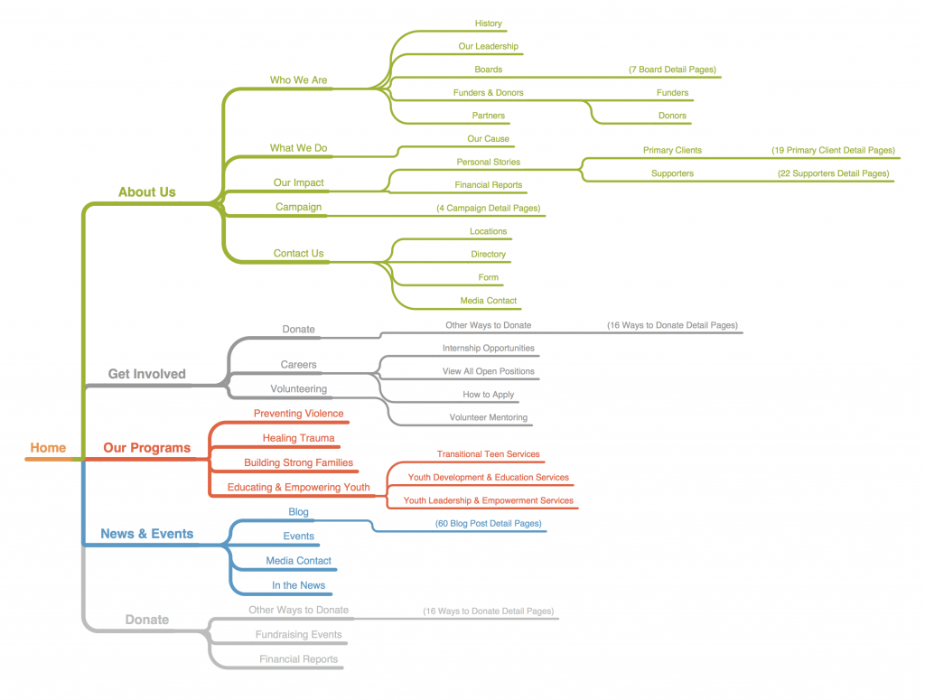
Ultimately, we came up with a taxonomy and information structure that covers a wide breadth of UCAN’s content, without being overwhelmingly dense. The new structure still gives the user the opportunity to explore UCAN in great detail, while preventing the user from getting lost in the site content.
The Solution
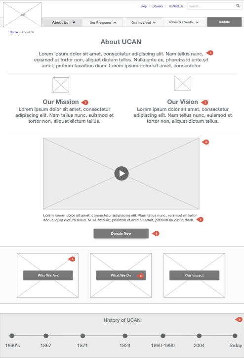
Given the immense scale of the current website, we defined a set of page templates to inform and focus our designs moving forward. Fuzzy Math UX designers created a set of sketches individually for our initial designs for top-level pages. Then, after internal and client reviews, we consolidated our individual designs into one glorious set of wireframes.
ICAN + UCAN = WECAN
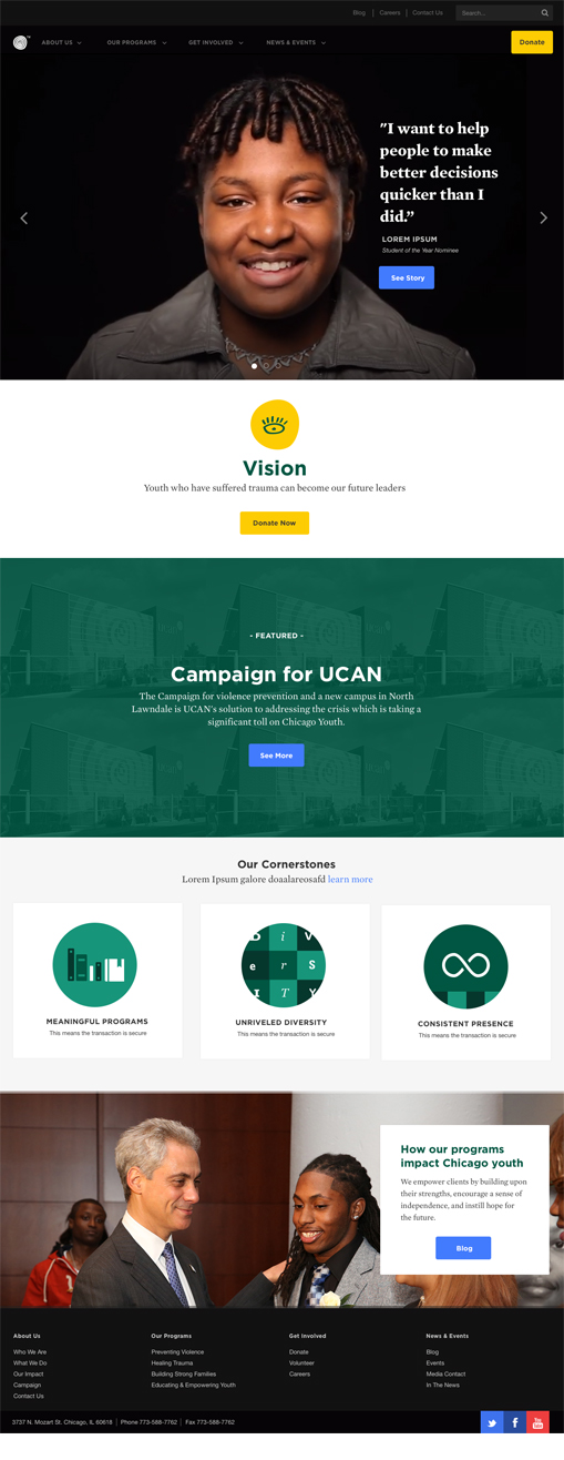
After UCAN reviewed and approved a full set of wireframes, the UX team handed our wireframes over to Rachel to create a set of high-fidelity mockups using carefully considered type and a customized color scheme that visually articulates an approachable, optimistic, and inspiring, yet serious tone.
Now, the UCAN site tells a clear story of the organization, creates a personal connection with the users, and showcases the importance of the organization to the Chicago community.
UX Design for Nonprofit Organizations
When designers apply their skills and experience to pressing social and environmental issues, everyone wins. That’s why Fuzzy Math is proud to team up with mission-driven organizations to design solutions and spark change.
See how Fuzzy Math has partnered with nonprofits, enterprise companies, and B2B organizations to transform complex problems into easy decisions.