Information architecture in UX design is about creating systems of information that are easy to understand. For instance, UX designers want to create websites that are organized so that users don’t get lost easily. Or if in the event that they do get lost, we want them to be able to quickly find help resources to fix the problem. But information architecture in UX design has influence outside of the scope of design and digital products. It’s something human beings intrinsically understand as we grow up learning to organize the things around us. In some ways it’s easier to understand the philosophy of IA from a real world perspective and then apply it back to design.
User experience and information architecture are related insofar that UX designers are concerned with organizing information for users. A UX designer becomes an information architect. The focus on these best practices sets quality products apart from others. IA can be split into three components which build off each other. Understanding the whole thing requires understanding the relationships between components. Information architecture in UX can really be thought of as a way of thinking of complex situations from a psychological, cultural, and empathetic perspective.
Ontology
An ontology is the meaning behind any single idea. In metaphysics—a branch of philosophy—ontology is the study of the nature of being. Ontology defines what it means for something to be the thing it is. Because ontologies for a single concept can vary widely among different people, they are highly dependent on context.
In the real world, ontologies affect how different people may consider the same “thing” in different ways. Because of our various cultures, societies, languages, and personal backgrounds, there’s going to be a ton of variation in what a certain “thing” means from person to person across space and time. For UX designers, it’s especially important to be cognizant of who are users are outside of the context of the product they are using which may influence their interactions with it.
Real-world example: dinner vs supper in the United States
In the U.S. there is a distinction made between “dinner” and “supper” but the line of that distinction isn’t always very clear. The term supper is often associated with old people or people from the south in the U.S. popular culture. But even then there doesn’t seem to be a consensus on what the terms mean. Dinner is actually defined as a main meal eaten at the end of the day and it is usually formal, while supper is supposed to be a light informal meal eaten in the evening or late afternoon. But it’s even unclear today with the difference is and whether anyone is thinking about it during conversation.
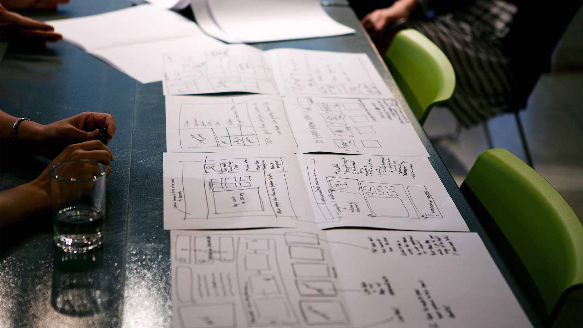
Design example: cardsorting, iconography
Designers use card sorting to help ourselves (and our users) get our ontologies in order as we move forward in designing systems for our products. We also use icons to attempt to communicate information to users based on what we assume they think about certain things. For instance, car dashboard icons are some of the strangest you can find, but only because they are often trying to communicate complex ideas about the state of the car as simply as possible. Still, the results can lead to some funny common interpretations from users.
Taxonomy
Taxonomy is the organized structure in which something exists that allows us to more deeply understand its function. We use taxonomies to derive meaning from the connections between things. Department stores are an easy example of taxonomy at work. Let’s say you go into a department store looking for a pillow. Even if you’ve never been in that particular store before, you likely think of pillows as a form of bedding that will be organized in a section of other bedding items. However, you may also think of pillows as something to sit on as a form of seating in your home. A department store would need to recognize the ways users can think about pillows and organize those items in the “proper” sections in their stores. Taxonomies are more than the sum of their parts. A well-designed taxonomy is a wayfinding system.
Taxonomies in digital products are affected by users mental models. Designers shouldn’t structure products all willy-nilly. We strive to do this as defined by common taxonomies and user mental models.
Real-world example: Organizing “crossover” clothes such as jorts or barefoot shoes in a department store
In the wild world of clothing there are a lot of examples of things that are one thing and potentially also another thing. How should a department store categorize these items based on what people perceive them to be? Where would you think to find these items in Macy’s?
Design example: mental models, workflows
UX designers can use mental models and workflows to understand how users think of certain things based on the context in which they use them. Those structures are based on their ontologies. Mental models and workflows aren’t based on some prescribed “right” way of going about something, but on beliefs people have about the world. What the heck are facts anyway?
Choreography
Choreography is the flow between ontology and taxonomy. It describes how well the meaning and structure behind the system work together to delight the user and help them reach their goals without distracting them. Choreography should follow despite changing circumstances and should lead to users’ success and satisfaction. Developing good user experience is, in part, about appealing to the ontologies mental models of your users. Designers use their understanding to make recommendations for an appropriate taxonomy. The resulting choreographies should guide users to their goals. The whole dance requires empathy, research, and a strategic mind.
Real-world example: Pixar edits veggies in the movie Inside Out
In the Pixar film Inside Out, the main character is shown refusing to eat vegetables as a little girl. For U.S. audiences broccoli was the vegetable she didn’t like. But for Japanese audiences, green peppers were the disliked veggie. This is because Japanese food traditionally features broccoli and children there grow up eating it. Since kids aren’t exposed to green peppers as much, the veggie carries a stigma similar to that of broccoli in the United States. Pixar took into consideration this difference and changed their movie around it.
Design example: designing responsive websites
One common way designers deal with choreography is when designing the same screens for desktop and tablet. If you’ve ever done this you understand the struggle of making sure interactions, tables, colors, images, etc. translate from one device to the next. It’s a challenge that we face as we attempt to maintain sense-making in digital products.
Want to learn more? Here are some helpful readings from around the web on information architecture in UX design: