When any UX design project gets underway at Fuzzy Math, one of the first things our team does is take a look at the competitors to analyze how each approaches the market. This process is called a competitive analysis, and it’s one of the discovery methods used in UX research. A competitive analysis helps us understand the wider ecosystem for the product we are working on and how other products in the same market are solving similar goals.
In order to help give you the tools you need to conduct your own competitive analysis, here is a step-by-step guide of the competitive analysis process for UX design that we followed when we updated the Fuzzy Math website.
Step 1: Determine your competitors
This process began with a team brainstorm where we assembled a list of 21 competitors who provide a similar set of UX design services. We then started to dive deeper, looking at how these competitors organized their website content. By auditing patterns across competitors, we took note of what other companies in our market were doing and could decide whether or not to include those same patterns on our own website.
Direct Competitors vs. Indirect Competitors
Naturally, there are easily identifiable direct competitors for every company. These are companies that do the same work in the same market with little discernible differences in the actual product or service they provide (think, Walgreens and CVS). However, indirect competitors are also important to consider and may be less obvious to identify. Indirect competitors are companies solving similar problems in a different space or from a different angle.
For us, direct competitors would include other small design firms with a focus on UX and user-centered design. However, an indirect competitor would be a larger company that offers UX design services but also development and marketing services to clients.
Step 2: Investigate & analyze
Once the competitors are identified, it’s time to really get into the weeds and figure out what each competitor is and isn’t doing. This portion of the process takes the longest but gives us tons of information about our next steps.
Investigate your competitors’ products
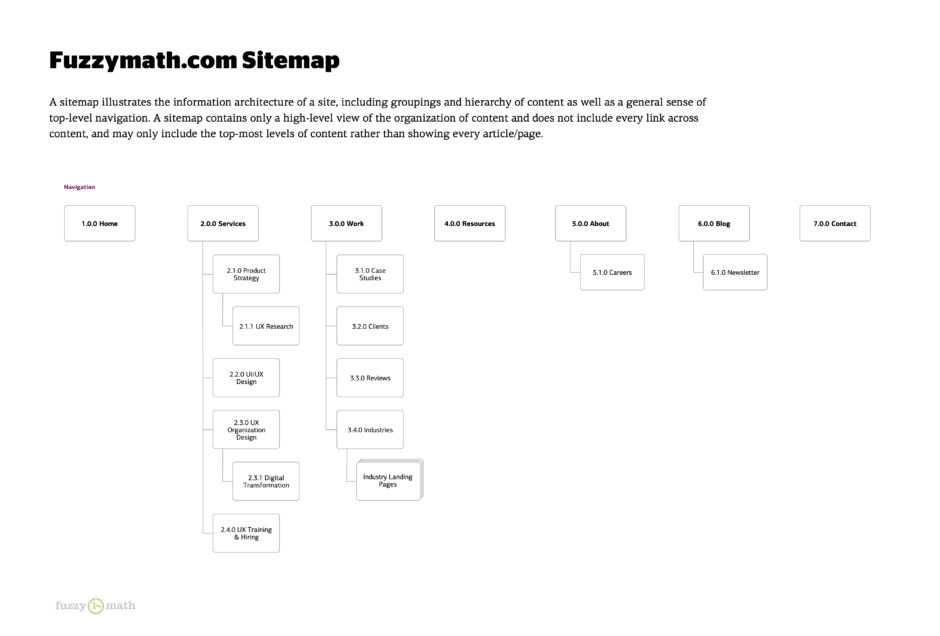
In order to gain an understanding of what competitors feature on their site, what they were talking about, what they offered, and, more importantly, how they presented all their information, we needed to analyze our competitors’ websites. We did this by creating site maps—diagrams that show how pages of a website are organized— for each of our competitors’ websites. This allowed us to see each website as purely an outline of information without the distraction of the content on each of the pages.

Analyze your findings with a visualization
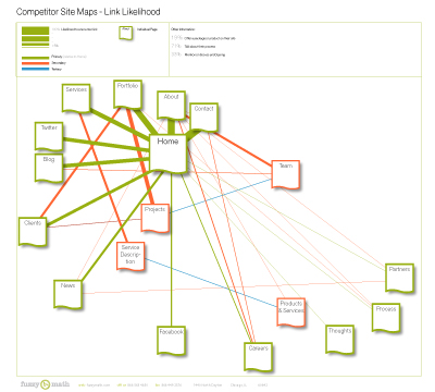
After developing each sitemap, we needed a way to display the findings in some meaningful way so they were easier to compare against each other. Sure, we had the 21 site maps, but looking at 21 different diagrams to try to discern their meaning as a whole is not very effective. Also, it wasn’t really about what specific competitors were doing on their site that was important, but what the competition in general was doing, represented in a single diagram. Knowing that we decided that the most useful information at this stage was to see what kinds of information our competitor sites were linking to from their home pages. In order to do this, we created a visualization with this question in mind: What is the likelihood a competitor’s home page will link to a certain page on their website? With the help of our summer intern, this ended up being a link likelihood visualization. With this, we could quickly see what the most and least commonly linked pages from competitor home pages were, all in one place.
This diagram does not get into super fine detail, nor did the site maps, but the goal was not to map out the site to the point you could build it. Instead, it was about getting a general understanding of what type of information is on the competitor sites and how they are structuring it. The purpose of this diagram is merely to inform and it is up to the viewer to draw their own conclusions.
Step 3: Identify opportunities
After gaining a better understanding of high-level features that the competition offers, it’s time to decide how to proceed. In our case, you can see that the strongest and most common links straight from the home page among competitors’ websites were ‘Contact’, ‘About’, and ‘Portfolio’. Not too far behind, links to ‘Services’, ‘Blog’, ‘Twitter’, and ‘Clients’ from the home page were also quite strong. Seeing this information visualized can help you easily decide what opportunities to go after. In this case, it was clear that structuring the top-level navigation of the website based on what competitors were already doing was the way to go. These navigation items were what a new user coming to the site would be used to seeing, so there’s no point in making their website experience unfamiliar at this level. However, there was an opportunity to develop more specific secondary navigation items that reflect the work being done at Fuzzy Math, since the link likelihood visualization did not show a lot of strong connections at the second level.
Step 4: Start finding the direction of your product or design
Once you’ve noted a few areas of opportunity, it’s time to start finding solutions. This is the point in the process where lots of brainstorming and concepting comes into play in order to figure out what the final product could look like and how it might function. So, get your team together and have a conversation with the client (although in our example, our “client” was us) to talk about the possible directions of the product or design and discuss how you could solve for the opportunities identified in step 3.
After following these steps, your competitive analysis is complete! For us, we used this information to help inform the next steps of our research, and, ultimately, the rest of the UX design process before finalizing the creation of our new website.
If you’re interested in learning more about how to integrate UX design at your company or want to know more about how Fuzzy Math can help you better understand competitive research, sign up for our UX newsletter and we’ll send you resources straight to your inbox!
