As we march closer toward a day when some of the far-fetched interfaces popping up in movies are even more likely to become a reality, we wanted to evaluate them with some of the very tools we have at hand and use every day. This month, we’re taking a closer look at the feasibility — and more importantly, usability — of the futuristic interface design in the movie Oblivion.
Why & How?
When we evaluate an interface design, we make sure to look at key areas such as navigation, information clarity, trust, interaction, and errors. Informed by heuristics (well established rules of thumb, ideally rooted in research) from experts such as Jakob Nielsen, as well as industry best practices such as the Stanford Credibility Project, we evaluate interfaces across these key areas to ensure a solid user experience. While some of these may not always apply to an interface, they are a good baseline for us to start from. With more and more movies taking on the sci-fi genre, we wanted to determine just how usable the futuristic interfaces we see on the big screen actually are.
Evaluating the Interfaces of Oblivion
Oblivion is a fantastic interface-laden look at the not-so-distant future, where drone tech Jack (Tom Cruise) and his communications officer Victoria (Andrea Riseborough) are wrapping up their mission on Earth after a war with aliens. In a world where little is left, the interface design in Oblivion takes center stage. Below, we examine three of the frequently used interfaces in the movie: the light table, the bubble ship heads up display, and the motorcycle speedometer.
Light Table
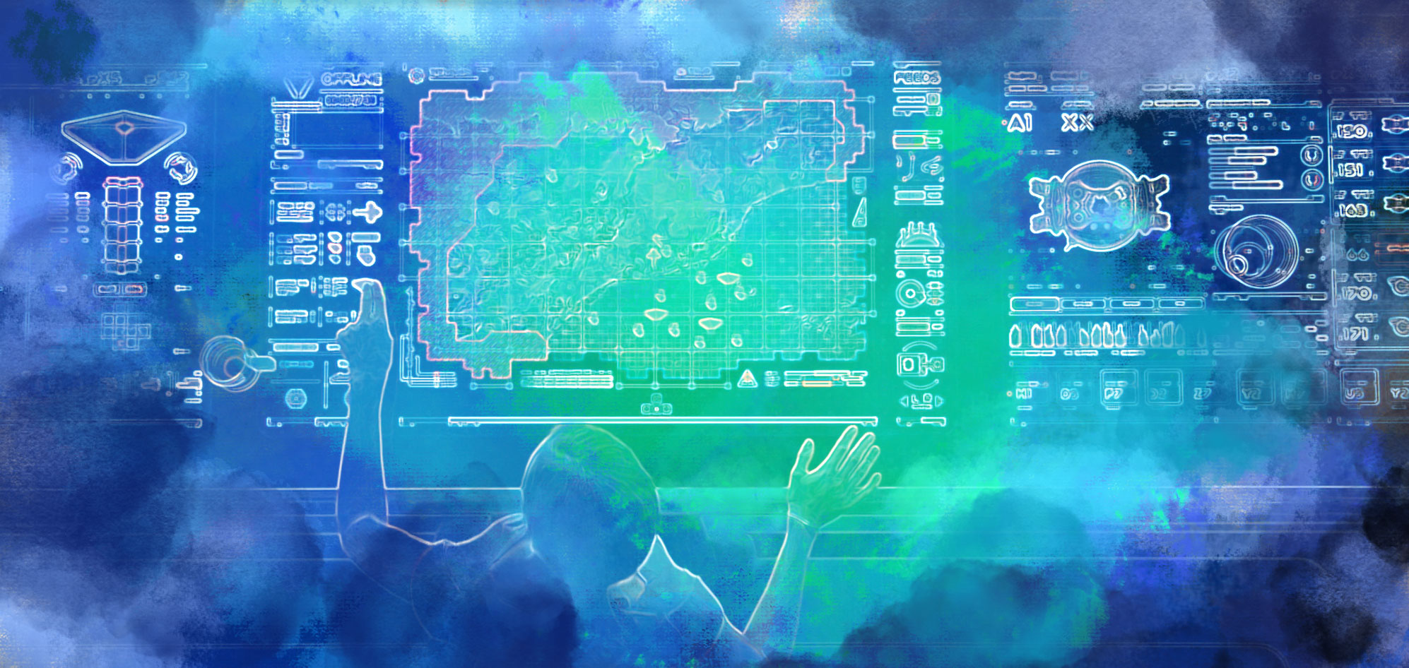
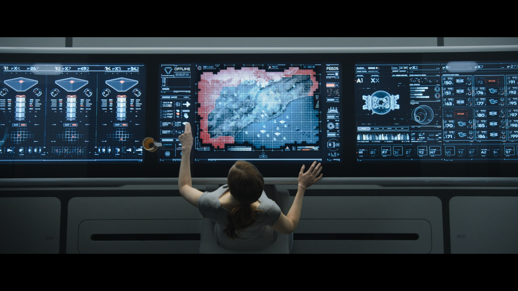
 The light table, which fills much of the space (and wall) in the control room, is featured prominently throughout the movie, as it is the main control center and tool Victoria uses to communicate with Jack and mission control (the TET).
As a large touch-based interface, the light table is impressive; powered on simply by a quick tap to the middle of the table. Victoria grabs icons representing drones and drags them to the area where they should go, and off they fly! Mirroring current touch interfaces, the interaction is pretty clear, not to mention intuitive. Want a drone to go over there? Find its icon, drag, done.
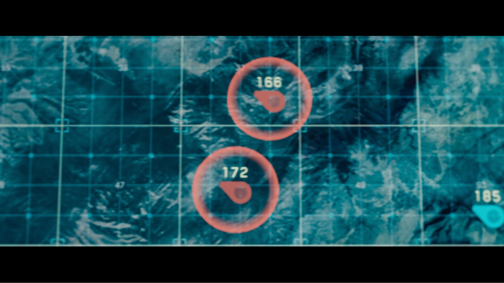
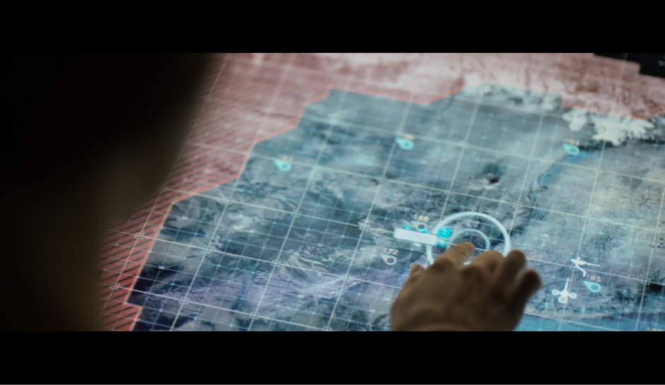
The table itself appears to be separated into four areas — the first being some sort of data display on the wall, then some hydro-rig data, the main control/communication “bar” and map, and finally details on the fleet of drones. Breaking up the table into three distinct parts rather than putting it all in one area seems logical and supports ease of use as well as allowing an expert user like Victoria to focus on specific information when needed. Alerts (drones that are out of commission) and warnings (radiation zones) are clearly shown through strategic use of the color red.
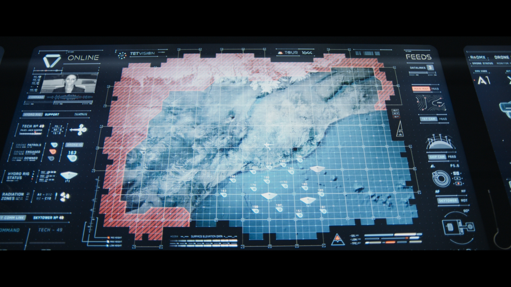
Initially, the placement of interface design in Oblivion — specifically the placement of a touch interface on the wall — seemed like a very bad idea, but in practice it looks like that space is used as a display-only area, which makes more sense. Throughout the movie, it appears as though only the control/communication bar and map are used. Providing equal space for each section is aesthetically pleasing, but providing more space for the primary control bar and work area would better support the primary workflow, at least as seen in the movie.
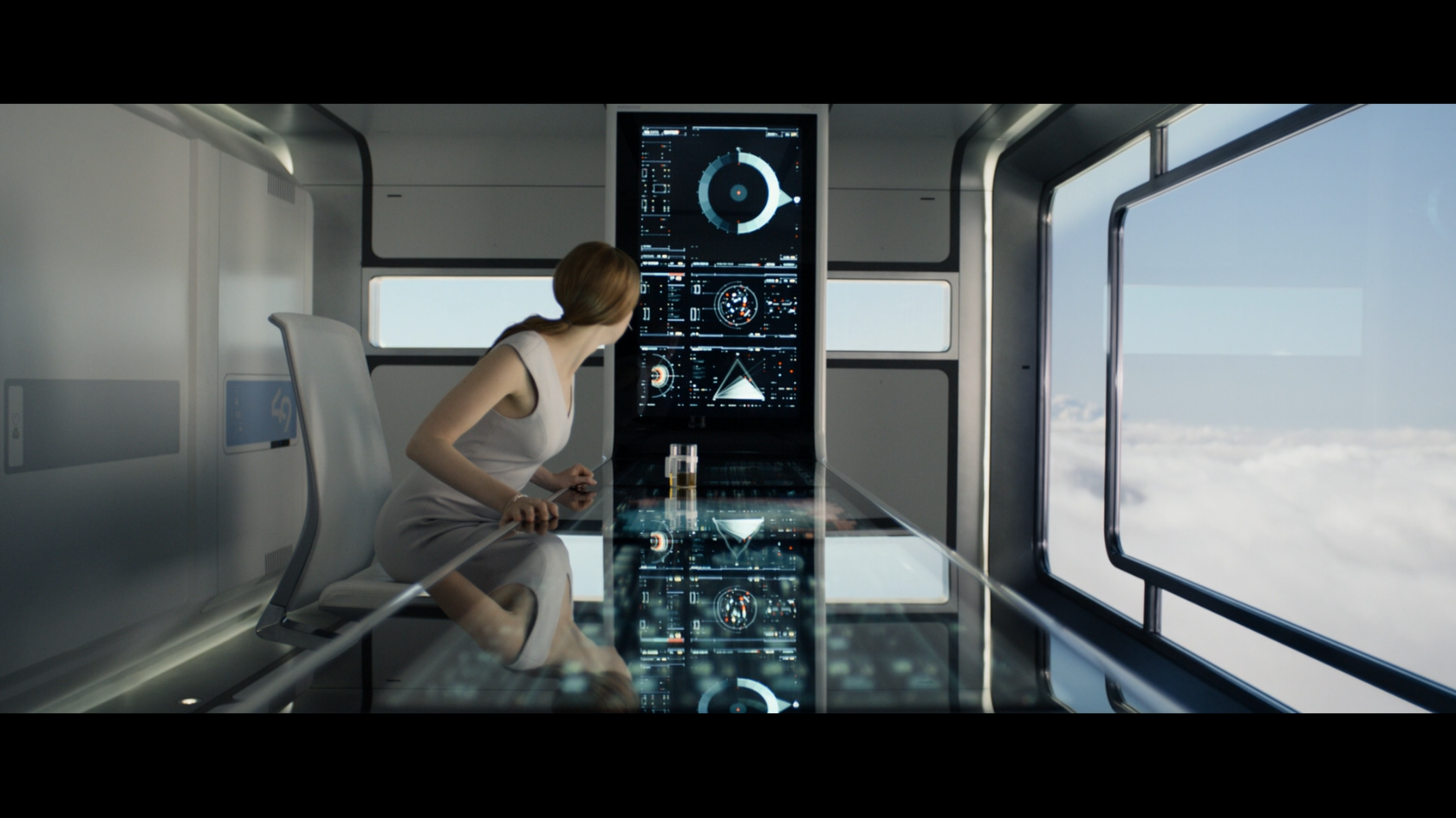
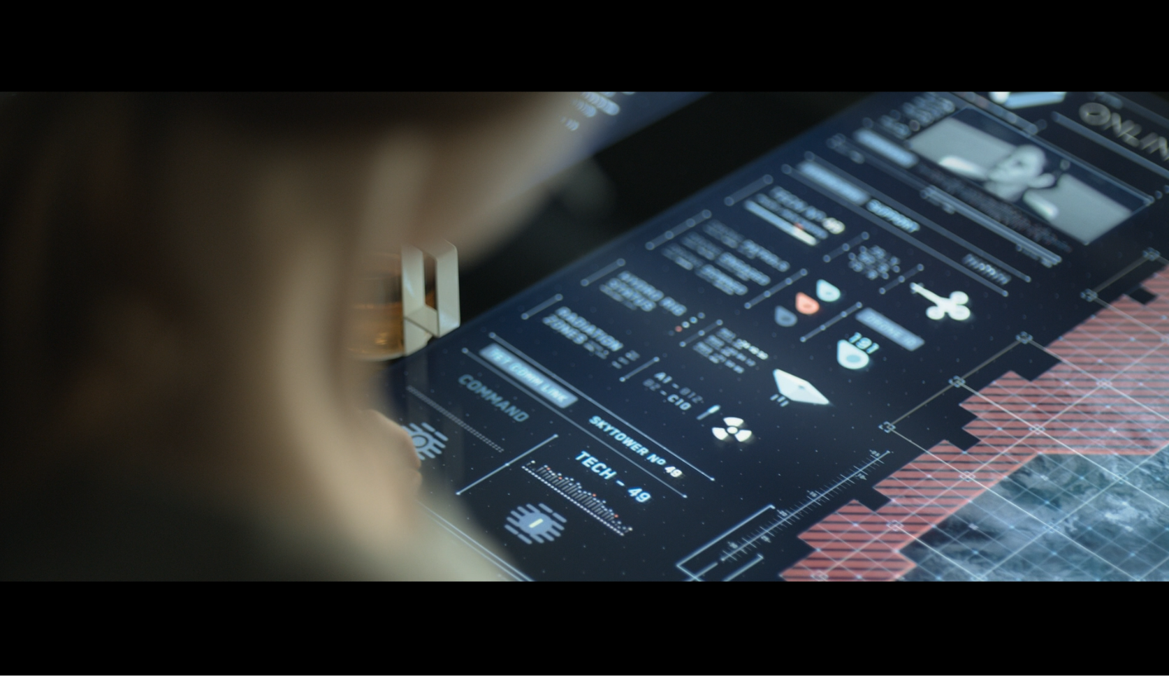
In the scene pictured below, Victoria places her tea directly on the light table, which at first glance seems problematic since she might be covering up pertinent information. After a closer look, it appears that there is a small break between each section, which still allows the table to function as an actual table. Adding the break in each section is a subtle element that supports a pretty realistic view of how someone would use the light table.
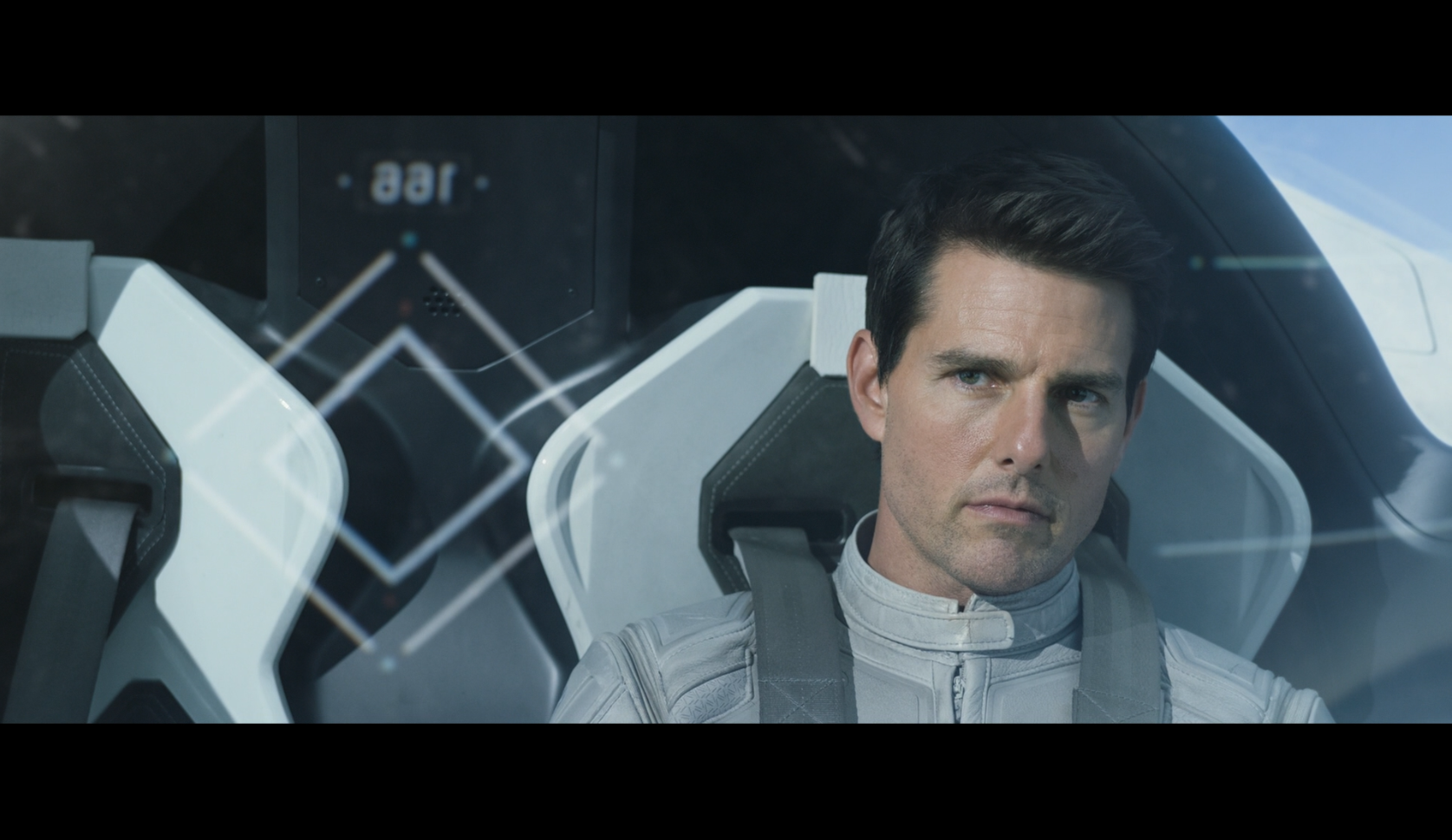
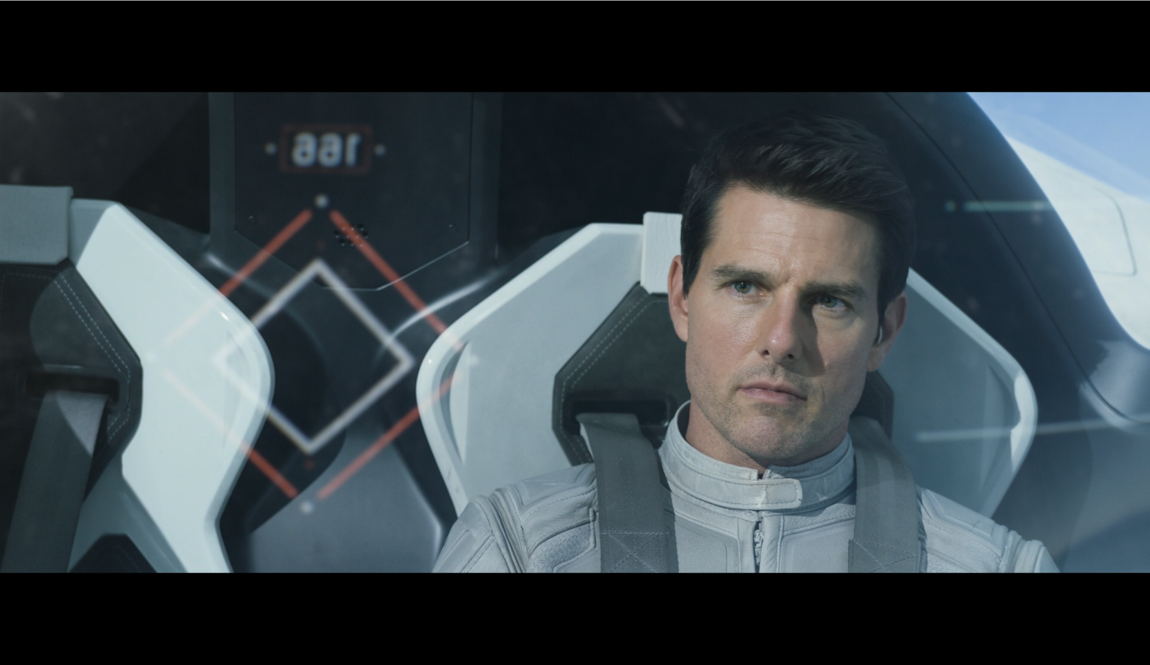
Bubble Ship
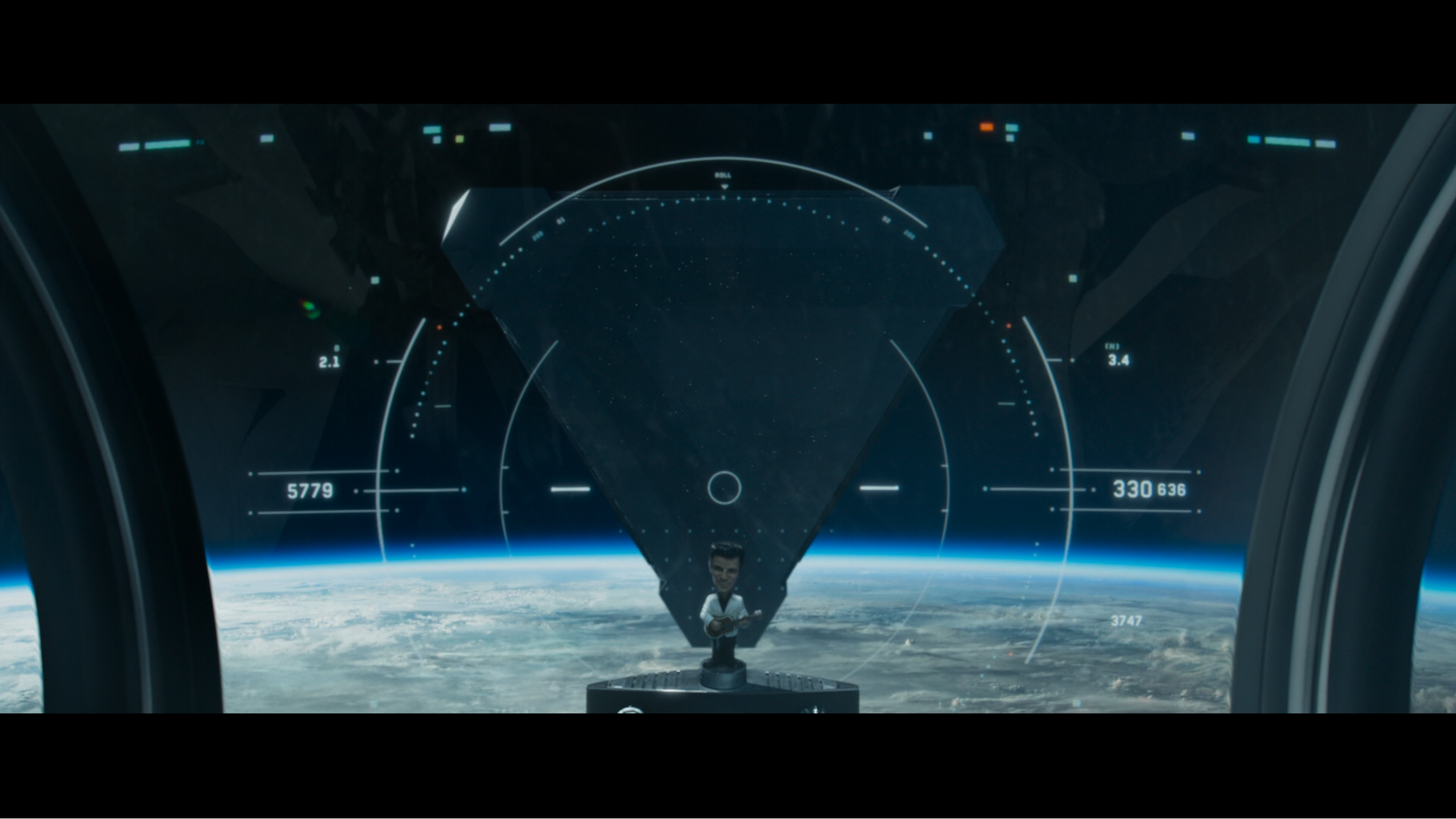
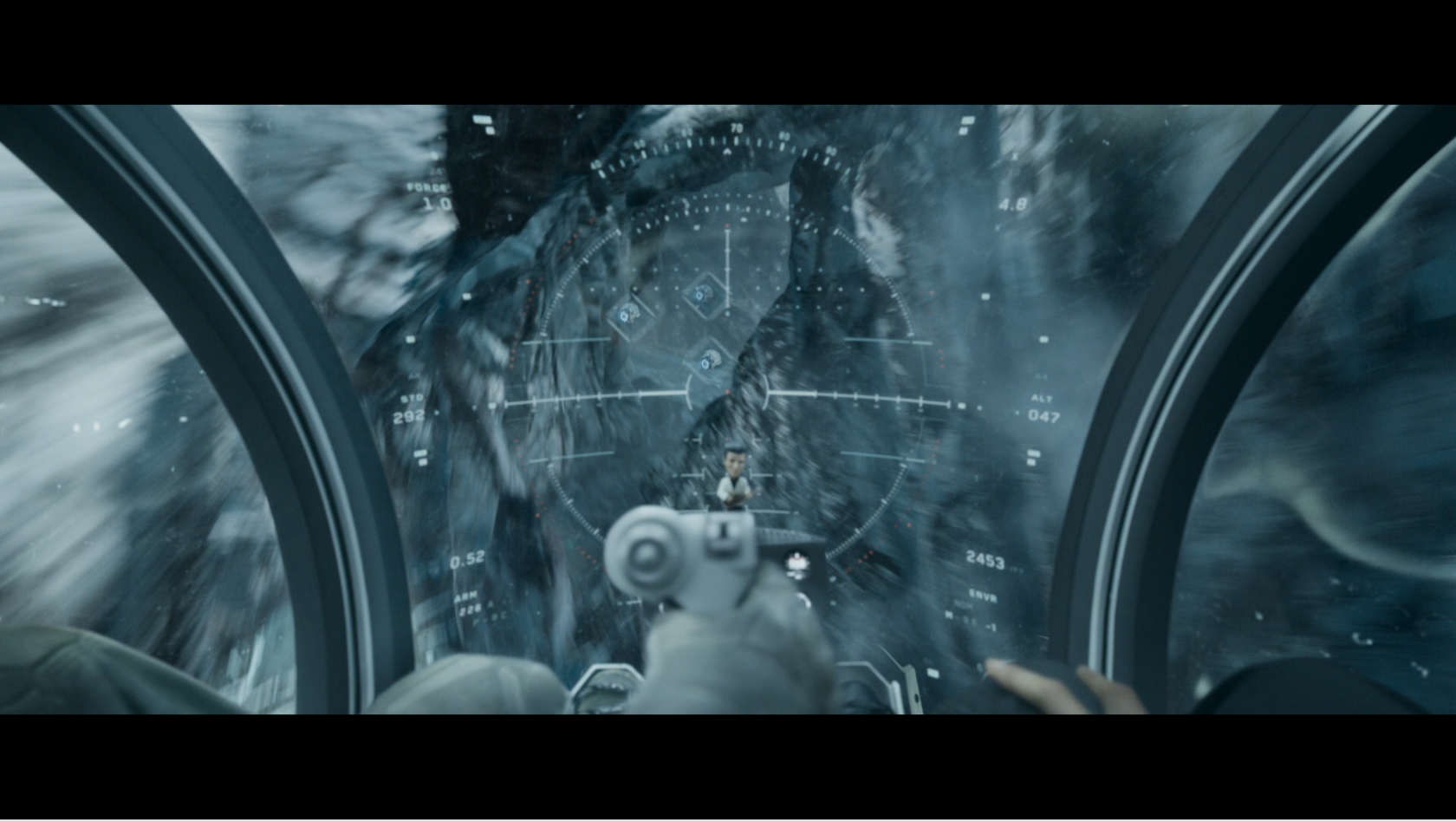
Jack’s primary means of transportation, the bubble ship (yes, that’s what it’s called), has a heads-up display (HUD) on the front window that provides him with all sorts of useful information while he’s flying around looking for drones to repair.
Victoria is able to send information directly to the heads-up display, ensuring Jack doesn’t need to take his eyes off what he’s doing (piloting the bubble ship). With a simple drag and drop on the light table, Jack is able to get information on a drone he needs to find, as well as its last known location, all without looking away. While the movie conveniently shows the HUD with decent contrast to the background, the use of white as the HUD color could pose a potential accessibility issue with not being able to see what’s there on super bright days or against a light background.
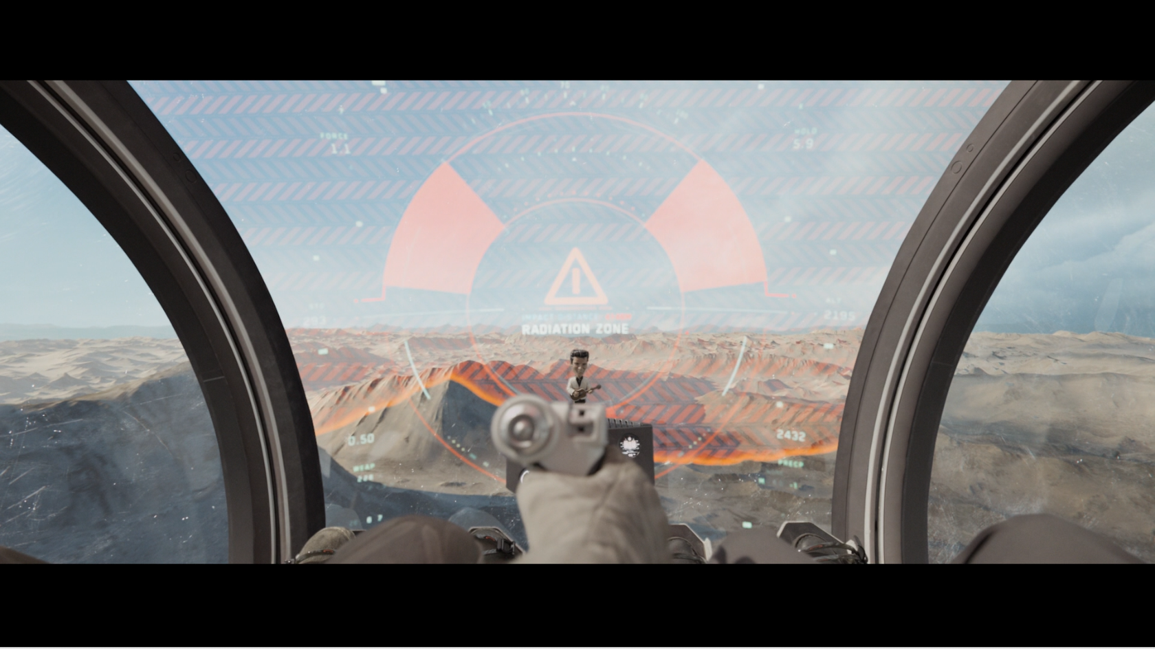
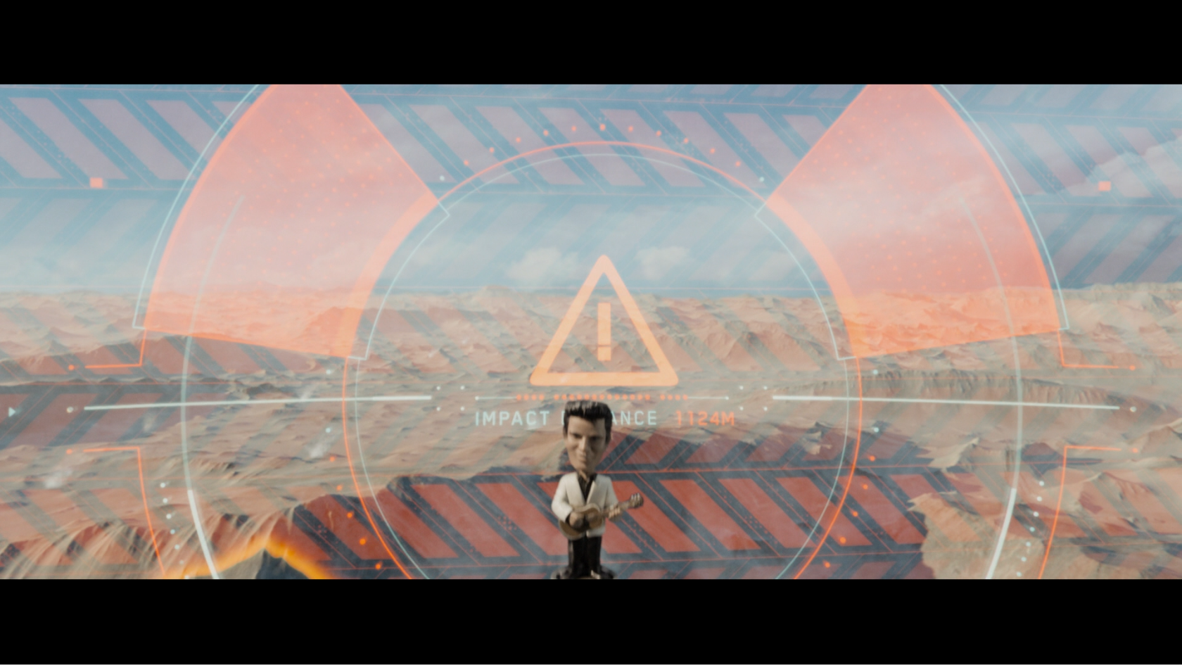
Jack is also able to use the HUD on his windshield for identifying how far away he is from an object, as well as for aiming his weapons. It appears a similar presentation is used for both, with the key change being at the center of the HUD, where a red dot is visible to Jack when he switches to firing mode. The assumption here is that the subtle change triggered by the flip of a physical switch would be enough for a pilot who would have likely gone through a fair amount of training.
The HUD interface design in Oblivion also does a great job indicating alerts, such as when Jack gets too close to the radiation zone. The distance also gets promoted to the center of the HUD in that situation, which seems especially useful for someone to know at a glance, rather than needing to find it in the bottom right-hand corner of the display.
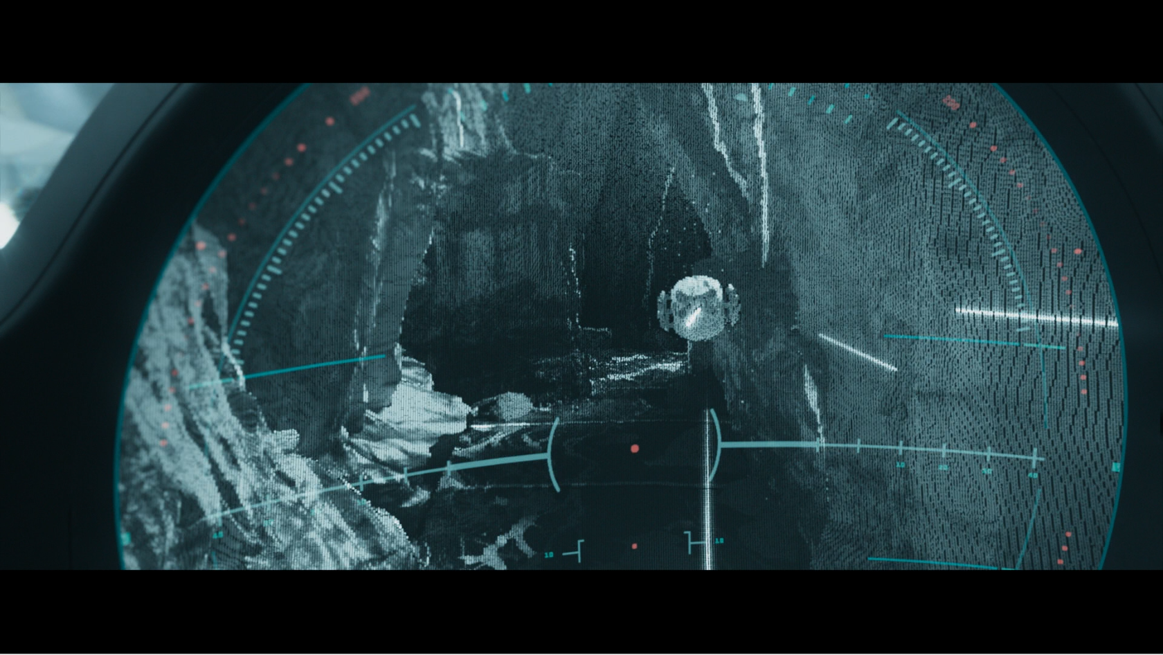
One of the coolest (and craziest) features of the bubble ship is the ability for Jack to fly it with the cockpit facing backward! Once he spins the cockpit around, he’s able to see a digital representation of the view behind the bubble ship on his heads-up display. The most problematic aspect of this view (aside from trying to fly it correctly) is that Jack loses key information on altitude and speed, which seems even more important while flying with the cockpit facing the wrong direction.
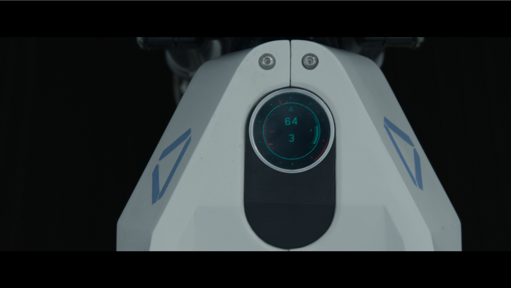
Motorcycle Speedometer
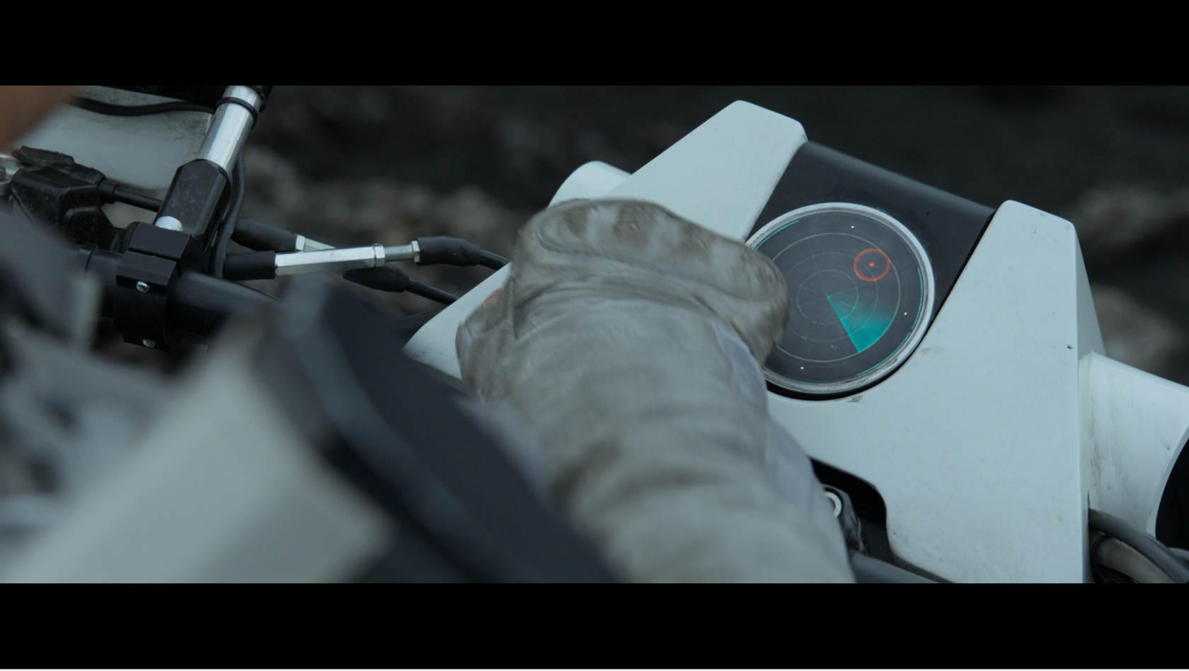
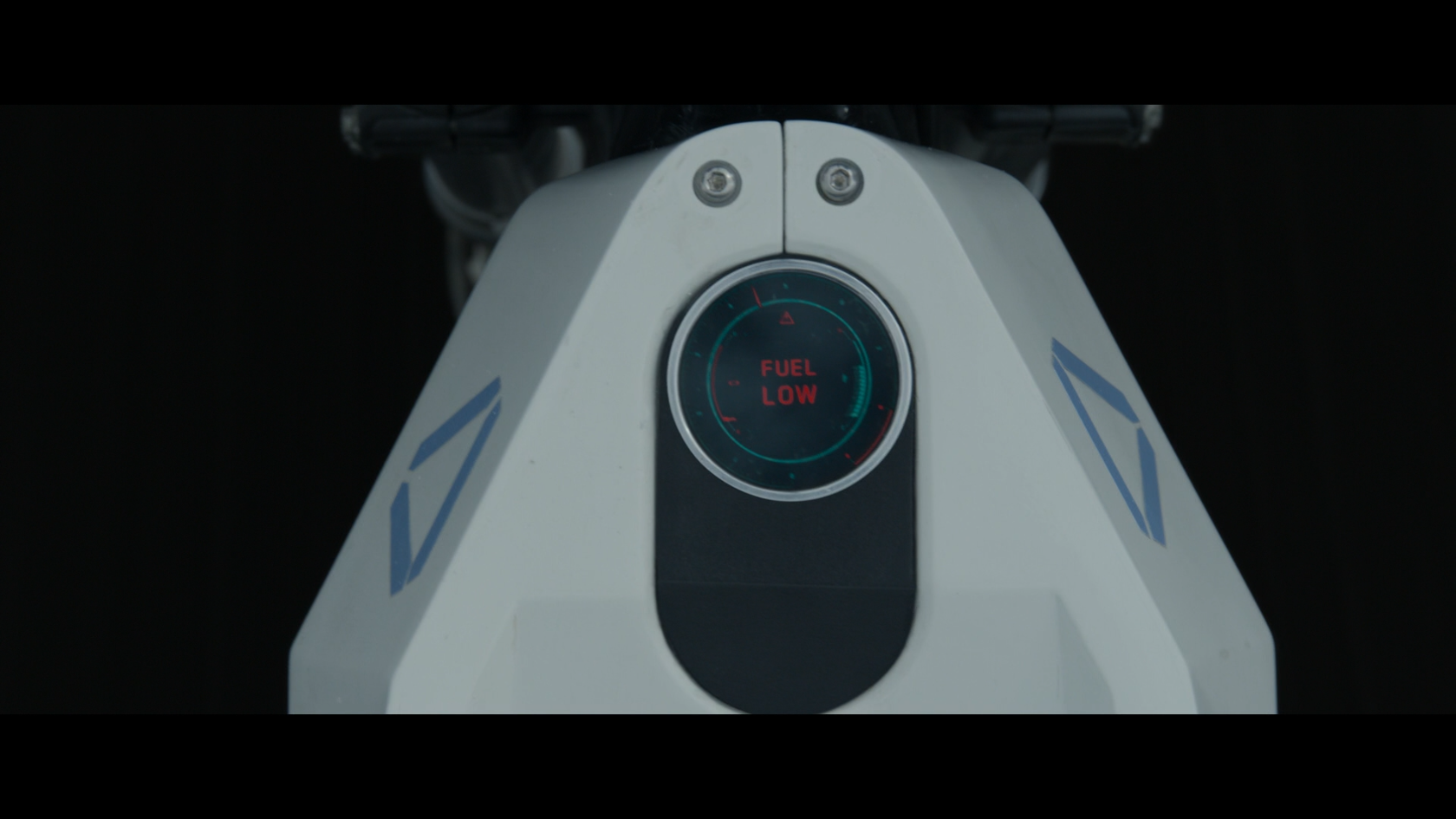
Jack’s secondary mode of transportation — a motorcycle — has a multi-functional speedometer to get him all of the information he needs while he’s out popping wheelies and tracking drones.
Just like the light table and the bubble ship, the warning state on Jack’s motorcycle when he is running low on fuel is super clear — again due to the strategic use of red on his display. The fact that the alert alternates with the speed and gear is a great way to ensure that Jack doesn’t lose visibility of two important details while still providing him visibility on a critical message. Red is also used as the target on the radar, which could confuse the locator a bit due to red being used as a non-alert color.
Usable Future?
Staying true to being an action film, physical inputs (buttons, switches, levers, etc.) were used so as not to bore the audience with touchscreens everywhere. Inadvertently, Oblivion ends up painting one of the more realistic views of the future when it comes to interfaces and how we interact with them. Most of the interface design in Oblivion seem totally plausible in relation to the context of the scenes they are presented in. Even better, it’s not entirely far-fetched to imagine using the interfaces in Oblivion, of course with a bit of training and a slight learning curve. When most sci-fi movies greet audiences with holograms and gesture based interfaces, the not-so-distant future presented in Oblivion respects the most common interface element of all, the user.