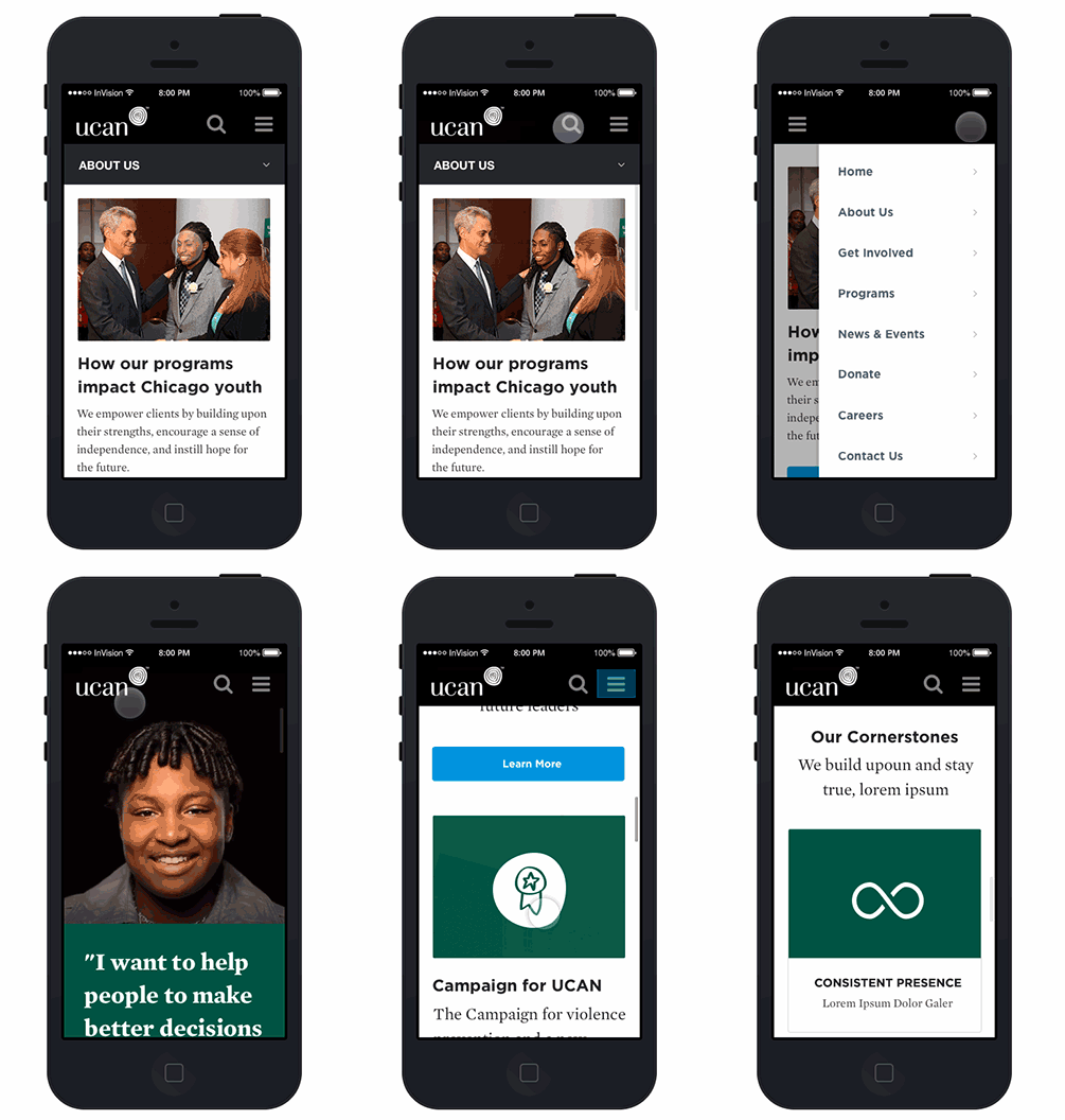
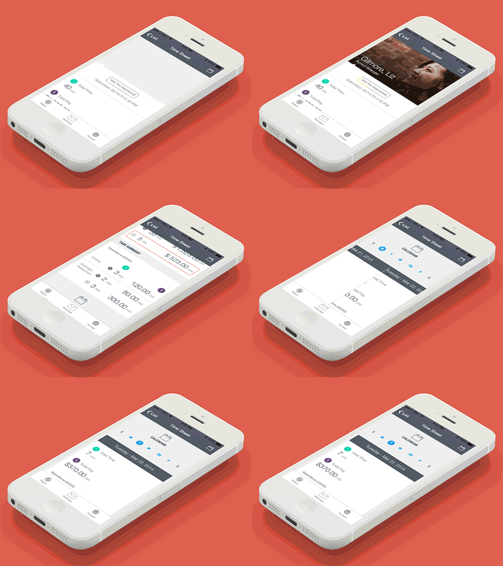
Wireframes and Photoshop comps are invaluable tools when designing mobile apps, but they miss critical components: interaction and animation. Clickable, usable mobile prototypes help bridge this gap, and are essential tools when designing, testing, and validating mobile systems. Today, there are two primary categories of mobile prototyping tools—those focusing on screen flows, and those focusing on animations.
“Screen Flow” Prototypes
Many tools out there today focus on what we’ll call “screen flow” prototypes: prototypes that are built around a series of screens connected by interactions. You’ll sometimes see these called “click through” prototyping tools, though most offer more interactions than just clicks. As a designer, these types of prototypes are invaluable for validating that the flow from Screen A to Screen Z is logically mapped out and easy to follow. They can also be a great resource for testing states, by simply treating each state as a new screen in the flow. Finally, because these prototypes are both quick to build and can be built from at any level of fidelity, screen flow prototypes can be a useful tool for testing with users—either to test usability, or to validate the underlying functionality—and for validating concepts and features with stakeholders. Because of the varying levels of fidelity these prototypes can be built from, screen flow prototypes can fit early in your workflow, built from sketches; early in your workflow, built from wireframes; or at the tail-end of your workflow, built from fully-formed design comps.
Best for: Evaluating overall system flows, usability testing, validation testing
Pros: Quick to setup, low learning curve
Cons: Generally can’t handle complex animations
InVision
One of the more mature products in the constantly growing mobile prototyping arena, InVision provides robust functionality for mapping out screen flows across multiple devices including mobile and desktop web. Like most mobile prototyping tools, InVision relies on importing screens from other software (i.e. as PNGs), rather than building your design within their app. InVision’s prototyping capabilities are driven primarily by hotspots, which are drawn on top of a screen to define interactive areas. Each hotspot can then be linked to an action, which will typically mean transitioning to another screen. InVision includes a number of useful transitions, such as Slide and Flip, though it’s important to note that these transitions can only be applied to a whole screen (you can’t, for instance, slide in just a part of a screen). While this limits the utility when it comes to prototyping animated content, the true focus of InVision seems to be on evaluating screen flows, and it accomplishes this task very effectively. In addition to transition effects, InVision can also handle sticky headers and footers which can greatly help when evaluating screens that rely on fixed elements. InVision also includes a suite of collaboration tools, which allow you to share designs with colleagues to get feedback directly on the screens themselves.

Flinto
Flinto operates very similarly to InVision, focusing on building screen flows by tying hotspots to actions. Flinto offers a similar suite of transition effects and sticky header/footer functionality as can be found in InVision. While InVision is architected around a list/detail model, where hotspots can only be defined from a single-screen detail page, Flinto provides a more holistic view of the system. You can see all your screens in a grid, define hotspots across multiple screens without changing views, and even apply sticky headers/footers across multiple screens simultaneously. Connections between hotspots and screens are made by dragging from screen to screen. This approach can be a bit harder to manage when dealing with a larger number of screens, but might be preferable for people working on smaller sets or who like managing all screens at once. Flinto designs can be easily shared via URL or text, but do not feature built in collaboration or commenting.
Animation Prototypes
Unlike screen flow prototypes, which focus on how the whole system comes together, animation prototypes tend to focus more narrowly on granular interactions with complex transitions and animations. These are the tools you turn to when designing precisely how the on-screen objects move and scale within the app, such as when expanding a view or swiping through cards. Whereas screen flow prototypes typically rely on transitions between entire screens, animation prototypes eschew screens to instead focus on objects. What shows up within the viewport is driven by objects and their properties, with those properties being manipulated to create animations. While most screen flow tools have a low learning curve (they’re basically slideshows), building an animation prototype may feel much less familiar, especially if you’ve never worked with animation before. That said, these two classes of tools are very complementary, and can both find a place in your prototyping toolbelt. Great animations within a confusing workflow will still result in a poor experience, and a great workflow without great animations may miss opportunities to transcend from “functional” to “delightful.” Because animation prototypes are typically higher fidelity, and may take longer to produce, they make the most sense to fit in the mid-to-late stages of a project, when you’re either testing different, complex interaction concepts and transitions, or defining final design specs.
Best for: Defining animations and complex transitions
Pros: Granular control, very high fidelity
Cons: Substantial learning curve
Pixate
Pixate, publicly launched in October 2014, is the youngest tool discussed here, but quickly gaining traction in the design industry. Pixate provides a GUI interface for arranging layers, setting properties, and defining interactions. Animations are tied to interactions. For instance, you can apply an interaction of “Long Press” to a layer, then define animations such as “Scale” to both that layer and others to be triggered on long press. One particularly interesting feature of Pixate is its native app, which syncs with your workspace to provide a live preview. The downside, however, is that this is currently the only way to interact with your prototype; there is no way to test interactions through the tool itself. Similarly, you can share your prototype with others, but at least in the current version they will have to download the Pixate mobile app to view it.
Framer
Framer is built on Javascript, providing a code-oriented tool for building animation prototypes. Like Pixate, Framer is architected around layers, though while Pixate manipulates these layers in the GUI, Frame relies on code (the Framer Studio app partially bridges this gap, but still relies predominantly on Javascript or Coffeescript). Framer can also work directly with Photoshop, Sketch, or After Effects to automatically import layers. While I’ve only tested this with Photoshop, the import works pretty well if you have your PSD setup correctly; every layer that you want to have accessible in Framer must be within a visible, uniquely named layer group in your PSD. Interactions and animations are defined through events and functions, much as you would in any other Javascript application. Because Framer is built on Javascript, you can preview your prototype in any browser, making it a bit more portable than Pixate.

Adobe After Effects
A staple of the film production industry, After Effects has in recent years become a valuable tool for designers as well. The core of After Effects is a GUI interface where animations are defined using the timeline. For example, if you have a layer at (0,0) at 0s, you can shift the timeline to 2s and move the layer to (100,100), and tween the resulting movement as needed. Unlike Pixate or FramerJS, After Effects won’t create interactive prototypes—it simply produces videos of animations. The sort of animated comps produced with After Effects can be very powerful in showcasing, at a high level, how an app feels, but lack the sort of tactile experience provided by a more interactive prototype. That said, the upside of After Effects is that, on the whole, its GUI interface can be slightly easier to work with, especially since it comes packaged with a bunch of built-in animations, with many more available for download online. After Effects also has by far the largest user base of any of these tools, resulting in a much deeper pool of learning materials available, though few are specific to interface design.

HTML5
HTML, perhaps the ultimate digital prototyping tool, is capable of producing usable content for just about any context. Even if you’re prototyping an app that will be built completely in native code, HTML can still be used to build a functioning interactive prototype. Animations can be built using CSS3 and/or Javascript, and should work on any modern browser, allowing for testing on desktop, tablet, or web. There are even tools emerging to give HTML a more native feel, such as Ionic. To get this working with mobile interactions (swipes, pinches, etc.) may require some additional code, though there are a number of libraries such as Hammer.js which provide hooks into this functionality. While the learning curve is low for anyone already familiar with HTML, building animation prototypes in HTML can still be time consuming given the amount of object management that may be required.
Also Consider: Quartz (+ Origami), Proto.io
Conclusion
So, what’s best? As with most design tools, it depends. If you’re focusing on screen-to-screen flows and functionality, it will almost always make sense to find a “screen flow” tool like InVision, which will provide a fast and approachable method of creating and sharing prototypes with simple transitions. When you reach the point where you need to define more complex animations, a more focused tool like Pixate or Framer.js will give you the flexibility to tackle just about any animation. Choosing specific tools should fall to existing knowledge (are you comfortable in Javascript?), preference (GUI vs. code), and presentation needs (do you need to allow many people to interact with it, or just demo in a presentation?). In many cases, it will be pertinent to use multiple tools to validate, test, and refine the flow within your system, and then to generate tight animation specs to be used within that flow.