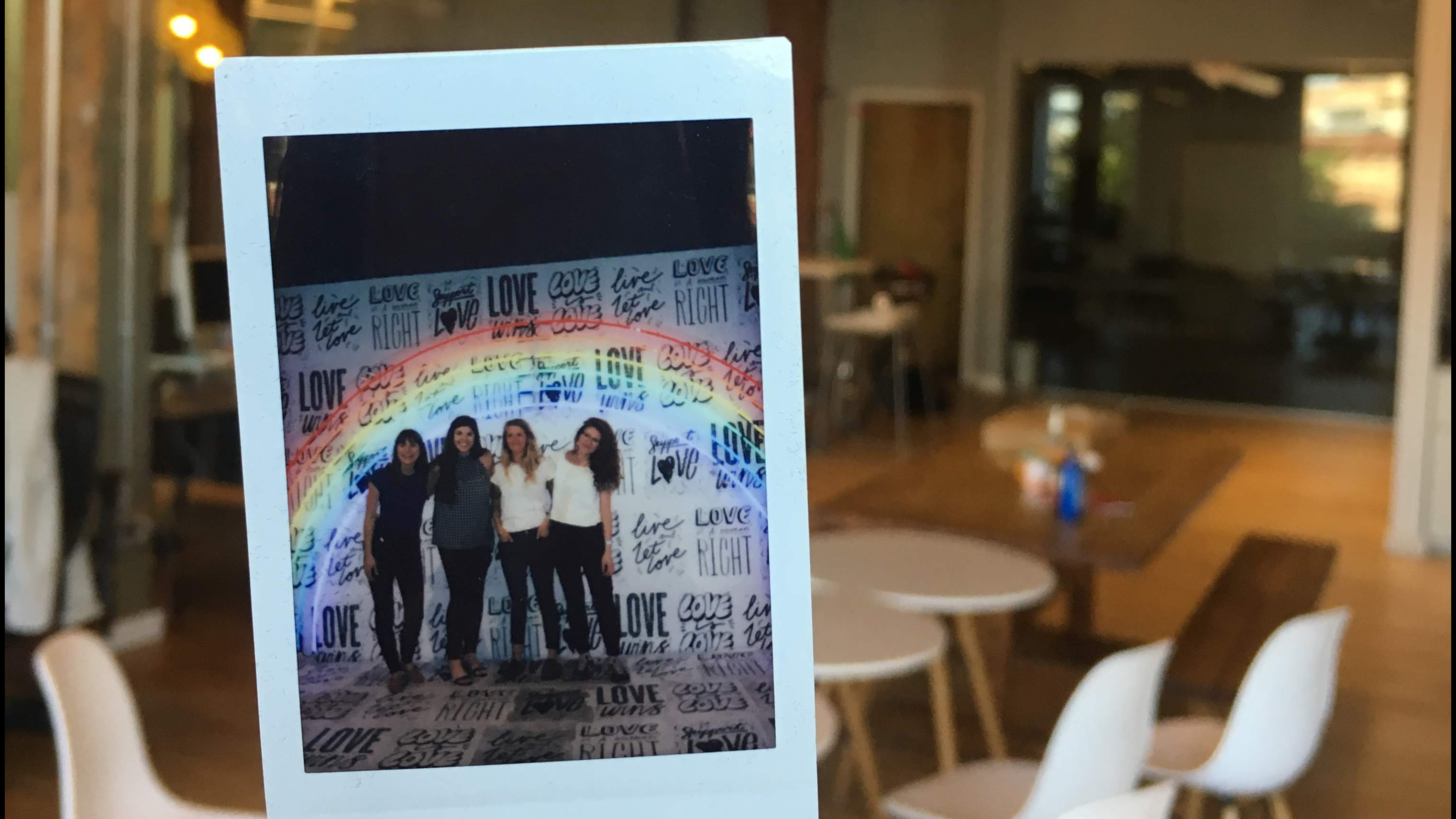
A couple of months ago, our four visual designers attended Refinery29’s 29Rooms, a traveling tour that touts to be “an interactive funhouse of style, culture, and creativity — brought to life by a group of global artists and visionaries across mediums,” in the format of “individually curated rooms that are packed with magic and brimming with inspiration.”
1. Here’s what we thought the event would be like beforehand:

According to my messages in our Slack channel, I thought 29Rooms would be “a big creative pop up” where we could “come look at this stuff and be inspired.” Ha! So I guess I was kind of right? In my mind I was imagining really large curated rooms that were all connected in some (mainly linear) fashion. Maybe even maze- or museum-like, where you’re entering one room to the next. Rooms would be themed differently but would (hopefully) relate to one unifying theme. And of course, each room would be executed brilliantly, aimed at evoking some kind of inspiration for us as designers.

Prior to attending I thought the event was going to be like a selfie factory. The whole concept just being to go to have choose-your-own-adventure backdrops for an Instagram post or Facebook profile image.

Before we showed up to 29Rooms, I was expecting more or less a free-for all. Words in the advertising like “immersive,” “multi-sensory,” “funhouse” and “play” had me expecting a sort of indestructible environment where you could touch whatever you wanted and sort of just bounce off the walls — but literally.

I was super excited to attend 29 Rooms. It was always one of those events that I saw on Instagram and everyone always looked like they were having a good time.
I envisioned 29 Rooms to be like one giant art exhibition space where the visitor would be guided through 29 connected Rooms with different themes. Kind of like a haunted house situation, but with art, design, and great photo ops.
2. Then, we went to the event, and it was *very* different from our preconceived expectations.
And now, from our collective perspective, we give you our observations of 29Rooms Chicago and the related discussions we’ve been having:
3. We felt both overwhelmed and underwhelmed at the same time, and definitely confused the entire time.
The layout and number of people were chaotic, yet the rooms were not all that engaging…
4. Crowd Control 🔥
In general, the maximum number of people allowed into the event during each 3-hour session exceeded the acceptable limit in our minds. The lines for rooms were long (some up to 30-45 minutes!), and housing this in a warehouse in late-July wasn’t super ideal. Think hundreds of studio lights, plus hundreds of people, equaling a lot of uncomfortable sweating. Sure, that’s the nature of it, but the quality of the experience definitely diminished as a result. Because who wants to stick their hands into a sweaty boxing glove after hundreds of other people? Not us, but we did it anyway.
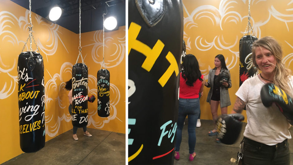
5. Interactivity was a plus (and kind of the whole point).
The rooms with more interactive features felt much more engaging. After all, that’s the whole point of going to one of these things, right? Our favorites were:
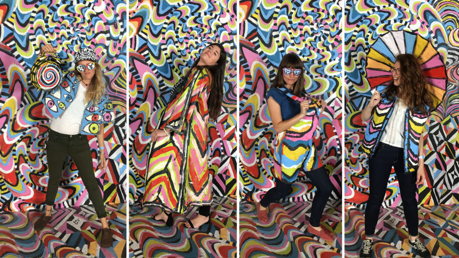
Room #01: “Become the Masterpiece”
A large abstract backdrop where participants could put on matching clothes and props to become camouflage against the art.
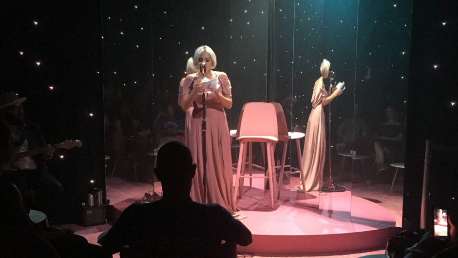
Room #18: “Dreamer’s Den”
Where a lounge singer improvised songs based on dreams audience members submitted on pieces of paper prior to going into the room.
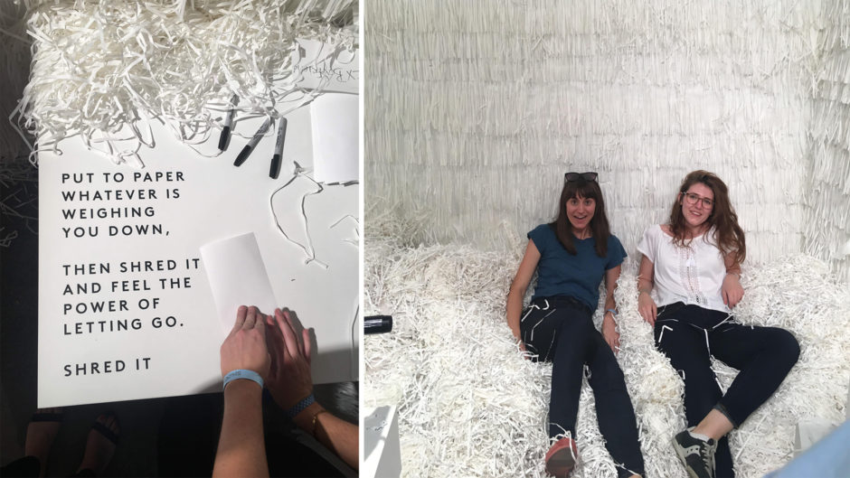
Room #04: “Shred It”
Where participants could write down whatever was “weighing [them] down” and then manually shred it and add it to the room to “feel the power of letting go”.
6. Laaaaadiessss
The event effectively promoted and supported women’s issues and accurately reflected the values and vision of Refinery29, a lifestyle media website geared towards the “modern woman”.
7. Growing Pains
The event started in 2015 and has experienced success in regards to visitor turn out. However, it is evident that 29Rooms is still trying to find their footing in regards to what they would like to represent. This combination of photo opportunities alongside art pieces seems to remove the focus on the art’s message. Which brings us to our next point…
8. Some Rooms were not rooms at all and/or not interactive.
What was the real theme or purpose of these rooms? Was it to interact with? Take photos with? Sit and consider? As respectful visitors, we were trying to answer these same questions. There seemed to be a lack of curation around how visitors would be interacting (or not interacting) with certain rooms.
9. Dystopian FOMO
This phenomenon could be attributed to more than just 29Rooms. But there was something thought-provoking about watching humans, who had grumpy faces after waiting in long lines suddenly burst into ecstatic joy when the cameras turned on. With the Instagram component, it seemed that everyone was more focused on making it seem like they were having a blast, when the actual experience consisted more of waiting for your 30 seconds of rushed joy.
10. It’s not you, it’s me!
Like the new Nebraska traveling campaign: “Honestly, it’s not for everyone.”
11. Art vs. Design vs. Advertising?
There were a lot of sneaky advertisements all over the place. It took a while, but after we realized almost every room was sponsored by a product or organization, we couldn’t not see the ads, and it became a huge distraction. Sponsors would make sense if this event were free, but paying for a ticket and being offered a Larabar® every 20 minutes? No thanks.
12. Celebrity collaborations – what’s the point?
In a similar vein, we’re not sure it was totally necessary to have celebrities design rooms. This contributed to the overall commercial/consumer drive of the event and took away from supporting artists opportunity to contribute.
13. “You’ve got two minutes”
Was what we were told when we finally approached our first “room”. Two minutes to get in, snap your pictures, feel rushed, and not even fully take in and appreciate the room. Then repeat it all over again, 28 more times! We understand why they needed to say this to everyone, but with the lines to some rooms already averaging around 30+ minutes long, it only added on to the rushed and chaotic feeling.
14. Contemporary issues were addressed, and that’s great!
We enjoyed seeing the presence of certain issues expressed through art to raise awareness and help support causes.
15. But, these issues were difficult to fully appreciate in their setting.
The layout of the rooms did not provide enough reflective space to fully immerse yourself in the themes of each piece. The juxtaposition of a room dedicated to victims of gun violence and a room with rows of pastel desk fans blowing your hair around was quite jarring.
16. A general lack of purpose lurked in the air. 👻
What were we supposed to rally around? What was supposed to be bringing us together as a collective audience?
17. Loose parameters do not make for a cohesive, unified event.
Rooms that encouraged audience participation lacked substantial guidance or reason.
18. Where’s the UX?
It quickly became quite apparent that taking the (quite literally) user’s experience into consideration was not a primary concern at 29Rooms. The method of getting to different rooms was rather disjointed and cumbersome, as we jumped around to different long lines and felt rushed when we finally got to experience a room. The event felt less like curated space, and more like a free-for-all theme park.
19. Everyone for themselves.
Probably the oddest observation we made while at 29Rooms was that people had almost zero interaction with other strangers. Seriously! While waiting in lines for rooms, we either saw groups of friends chatting with each other or people who came alone heads down looking at their phone. For an event that is trying to promote “the transformative and healing power of creativity,” it felt awfully lonesome in there.
20. Say Cheese
The cycle of people’s expressions was absolutely fascinating. A blank face or frown while in line almost instantaneously morphed into a fake grin as soon as a phone was pointed in their direction. Then as quick as it came, all the smiles and “happy” expressions were swapped out with blank stares as a new cycle began.
21. Getting the shot vs. getting inspired
Rooms were blatantly catered toward being an “Instagram lovers’ paradise” and less about being directly inspired from each space. This left us wondering who and what R29’s target audience and goals actually were.
22. Is this what art is becoming?
Will audiences demand interactivity in all exhibits in the future?
23. Has social media transformed our perception and digestion of art?

When I think of social media and art, the first word that comes to mind is prevalence. Back in the time before social media, you could find new art for inspiration or enjoyment but at what seemed a slower pace. Social media has mobilized artists in a way that has never been done before.
There are seemingly endless styles and other artists that consume that start feeling influenced by the prevalence.
Another effect that social media has had on art is the encouragement of consumption vs creation. The act of creating art is full of fulfilment and challenges. Scrolling through Instagram (for instance) provides a unending stream of content to consume.
This combination of an overwhelming amount of content, along with the ease of exploring has seemed to create what I’ve found to be a higher level of anxiety around the creative community. This anxiety feeds into consuming and not making because “Everything has already been done.”
I find there are many positives to social media and eager to see how it evolves and changes how we interact with art in the long run.

This question reminds me of Walker Percy’s essay The Loss of the Creature. In it, Percy suggests that it’s impossible for a modern person to have a truly unique and intimate experience of something already digested and recorded by others. Once we’ve seen and heard of a thing through another’s perspective, we build a whole set of beliefs and expectations around that thing.
When we finally set out to discover the thing for ourselves, our experience isn’t a true experience but instead a measuring-up of what’s in front of us to the idea we had in our heads.
I think that’s part of where the breakdown was for me. The whole event was promoted as this genuine, unbridled experience — but in the end it felt more about going and doing what others had gone and done so you, too, could say (and show) you went and did.

Every new way to communicate and share information affects how we understand and relate to the content being presented to us. In current digital times we are presented with so much stimulation and content (art included) that it makes it really easy to not give content a thorough thoughtful consideration, because we can always move on to the next thing if it doesn’t seem engaging from the get go. We also can and do end up having very narrow echochamber-esque situations with content being presented to us, giving us a very limited idea of what else may exist in the world. On top of that, most art will not be most effective via social media’s limitations. So yes.

Can social media help artists gain exposure and expose work to folks who are across the globe? Yes. Can the never-ending content feed social media provides to us dilute our intake and consumption of art, almost to the point where we are desensitized to what we are looking at? Also yes.
This question is difficult to answer personally because social media is truly a double-edged sword when it comes to our perception and digestion of the things around (and far away) from us. I find that I end up despising social media at the same time that I am enveloped in it, and I assume others tend to feel the same as well. What I struggle with most is that with this style of immersive art, experience tends to push art to the background rather than the forefront of people’s attention. We saw this happening a lot 29Rooms, where only a fraction of the time was spent truly looking at the installations versus facing away from the art in order to take a selfie in front of it.
24. What were we supposed to get out of attending this thing?
To snap a great picture to post on Instagram, or to gain a deeper reflection that makes you think about something in new ways? We’re not sure if we totally achieved either…
25. As creatives, we were expecting more, and that’s OK.
Perhaps we were taking the mysterious hype too seriously and building this event up too much in our minds. Or maybe, other designers who attended the event feel the same way as us?
26. “Room” to Improve
We brainstormed a few ideas that could improve similar experience immersion events like 29Rooms in the future:

29Rooms Chicago needed more of a guided experience for their users, in my opinion. What lacked was serious wayfinding – even though the part of the idea of this event is to be ‘free flowing’ in some ways, the lack of guidance severely distracted from each room. Providing more of a linear flow, more similar to a museum layout, with larger and more closed off rooms would help make 29Rooms feel more like an immersive experience and less like booths at a conference

More funneled or tunneled experience… Or more guided. I didn’t like that you had to wait in line for different rooms and that it was just sporadic. I think it would have been more interesting if they weaved the rooms together to create a story as you go through each room. More like a giant house that you are exploring.

I agree with Rachel. It was overwhelming to walk in to the giant warehouse space with no clear path to follow for experiencing the different rooms, long lines for rooms, and hundreds of people milling around in between. With the time spent waiting in lines, there was no way to experience all 29 rooms and no way to even know what you were missing — at least until you looked up the hashtag on Instagram.
A clear path through the rooms and an opportunity to go through with just your party or a more limited number of people would have made for a more enjoyable experience for me personally.

I feel like 29 Rooms would have been more successful had there been more curation around the exhibition spaces. In and of themselves, the “rooms” had interesting themes and design. However, the experience of waiting in line just to take a photo, being rushed after taking said photo, along with the anxiety to jump to another space was not ideal. Mix that hectic atmosphere with a lack of air conditioning and you’ve got a less than enjoyable experience.
27. Or, maybe we’re just overreacting?
Is something like 29Rooms just the nature of where immersive experience events are heading? One thing is for certain – this type of “thing” is becoming more of a “thing”. Similar events like Museum of Ice Cream, Color Factory, Happy Place, and wndr are all sourcing inspiration from past trendsetting exhibitions like MoMA’s Rain Room and SAAM’s Wonder. Recently even bigger brands like IKEA are jumping into the scene by creating similar popups to promote their company and gain exposure. What will come next?
28. Problems aside, we enjoyed getting out of the office as a group.
We laughed, we sweat, and we were generally confused — together! 29Rooms was a nice break from the work week and served as an interesting team-bonding activity for #team-ui here at Fuzzy Math.
29. What did you think?
Did you also attend 29Rooms Chicago? We’d love to hear your thoughts! Tweet us @fuzzymath, or find us on Medium to connect.
Related: Selfie Factories: The Rise of the Made-for-Instagram Museum