Cybersecurity is a persistent topic in the news these days, with high profile hacks of both individual accounts and entire organizations. Security depends on both the system and the user — the former to lock down data and entry points, the latter to control passwords and other personal keys to access. Design applies to both systems and users, but it plays an especially significant role in security from the end user’s side.
Security relies heavily on human components, which, if ignored, can undermine even the most sophisticated technical security systems. Often, security is a burden — rarely if ever the user’s primary goal, but extra steps ahead of that goal. As a result, it’s imperative that security measures take usability into account and minimize intrusiveness in the overarching process the user is engaged in. This relationship naturally leads to tension between safer products and usable products; however, it’s not a zero-sum proposal — security must work hand in hand with usability to achieve its goals.
While there are many useful user solutions out there for helping ensure security while maintaining usability, such as password managers, designers can rarely assume users will rely on such shortcuts. Here are some helpful hints for designing for typical users of products requiring what we’d consider “standard” security, or even a bit higher, to help ensure that security solutions are easy enough that users don’t feel forced to find insecure workarounds.
Password Creation
Nearly every account, whether in the cloud or in a local application, is tied to a password, and it’s almost always up to the user to define their individual password. This process of account and password creation is broadly familiar, yet still often frustrating, due to onerous password rules, lack of transparency, or poor implementation. When passwords are overly complex, users resort to insecure methods to aid memory, such as Post-Its around their desk, or forget the passwords, resulting in further frustration and potential abandonment of the product.
How do you make the password creation process more usable?
1. Make password rules completely transparent
Nothing is more frustrating than having to guess and check when you don’t know the complete password requirements. Ensure any error messages related to password requirements are clear and direct, allowing users to easily understand what they’re missing and correct the problem.
2. Provide a password meter
Password meters, which provide real-time feedback on the quality of an entered password, have been shown to result in users creating more secure passwords.
3. Prioritize length over complexity
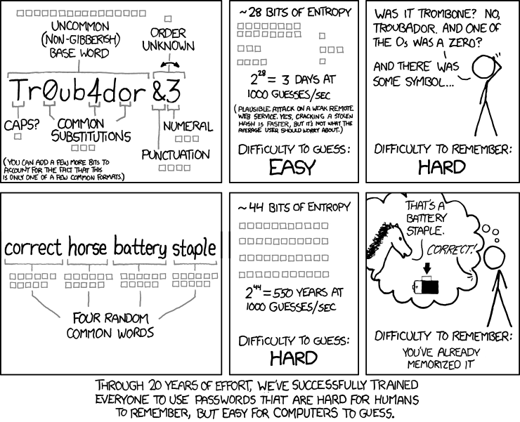
Longer passwords, regardless of complexity, are more secure than shorter but more complex passwords — and easier to remember. While it can be worth still implementing a “blacklist” of banned passwords (i.e. no “passwordpassword”), this means that enforcing other rules around combinations of password case, numbers, and special characters may be less necessary.
4. Make the password visible
Password fields, by default, typically hide the characters as a user types. As a result, most sites require a confirmation password; otherwise, users could mistype, saving the wrong password without realizing their mistake. Offering a way for users to view their password, especially on mobile devices where mistypes are very common, can help ensure users get it right on the first try. This applies when entering the password at the authentication stage, as well!

Relevant insight from xkcd.com
Authentication
Once the password has been established, users typically must utilize it at least occasionally, and sometimes on every entry into the system. While the basic elements of authentication, such as entering a password, are universally familiar, additional security measures such as captchas, Two-Factor Authentication (2FA), and other secondary identifiers have become increasingly common, adding complexity to a once-simple mechanism. In the not-too-distant past, most users had one computer that they always used to access their accounts — today, users likely have multiple devices, including laptops and mobile devices, from which they expect universal access. Anyone who’s ever tried to enter very complex passwords on a mobile keyboard has experienced the painful difference between typing a password with varying cases and special characters on a full-sized keyboard, and doing the same on a mobile keyboard.
How do you improve usability at the point of authentication?
5. Provide alternatives for mobile users
When feasible, provide mobile-focused solutions in place of password entry. Such solutions can include using the phone’s native security features, such as fingerprint scanners; PINs that users create separate from their password which can be used for secure re-entry without requiring the full password each time; or “magic links”, which can provide “one tap” entry into the account via email.
6. When using 2FA, be clear about what’s needed
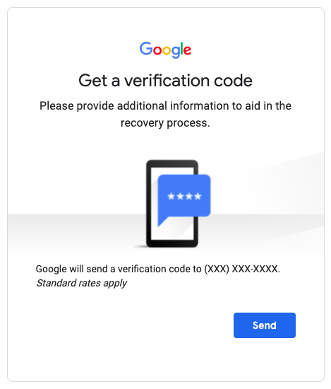
While there are a number of ways 2FA is implemented, included text codes, authentication apps, and physical devices that generate codes, the process is typically the same: a user initiates the authentication process, usually by entering their password successfully, and then is prompted to either enter a code or take an action in the authentication app or device. Explain clearly to users what action they need to take, and whether that needs to happen in their current context or somewhere else, such as the app/device.

7. Show the password requirements
Especially if there are complex password requirements (read above for why we don’t recommend such requirements!), listing the requirements when authenticating can help users remember which password they used for this system.
8. Streamline the “Forgot Password” experience
There are a number of effective processes for recovering forgotten passwords, including security questions and email links. Whichever route is implemented, make the corresponding process of choosing a new password and accessing the system as seamless as possible. And avoid to the greatest extent possible requiring people to contact support for password recovery — this is a sure way to generate frustration, or worse, cause users to avoid using the system altogether.
9. Return the user to their original context
When prompting the user to log in, take them back where they were and persist anything that was left “open” before logging in. Few things are more frustrating — and more likely to lead to missed transactions — than a user with a full shopping cart logging in to complete the transaction, only to find their cart empty after they’ve authenticated.
Security Questions
Many systems rely on security questions to either provide an additional layer of security, such as when accessing from a new device, and/or to provide verification during password recovery. Beyond the myriad issues with common security questions which have little to do with users themselves (i.e. how easily can their answers be found on social media), the questions chosen and how they’re handled can be affected by usability issues.
How do you incorporate security questions effectively?
10. Provide a broad enough range of widely applicable questions
Many common security questions have limited applicability, asking either about experiences that may not be universal (model of first car, or first child’s name, for instance) or about things which may be specific to the U.S. and therefore exclude international users. While not every question need be universally applicable, if users are allowed to choose from a list of questions, sifting through a long list of narrowly applicable questions is a poor experience.
11. Minimize questions around favorites and other factors that change over time
Relying on temporal data points is tricky, and can increase cognitive load both at the time a user inputs their answer, since there may not be a fixed answer, and when they have to later try to remember what their answer would’ve been.
12. Avoid using security questions altogether
Alternate solutions, such as email or SMS validation, are generally going to offer a more usable solution, as they require no memorization and are universally applicable.
Conclusion
By looking beyond the technical requirements of security to the human experience of the security process, engineers and product designers can actually increase security by reducing insecure workarounds. Moreover, a more usable security experience means a more positive overall product experience, and a reduction in abandonment due to frustrating account setup rules or forgotten passwords. We’re heartened by recent explorations of alternate approaches to security, and excited to see how the field continues to evolve to accommodate changes in technology and behavior.