The Depression and Bipolar Support Alliance (DBSA) is a non-profit organization that provides peer-based, wellness-oriented support for people with depression or bipolar disorder. Fuzzy Math partnered with DBSA to give their brand a refresh, create a modern and responsive website for their visitors, and unearth and streamline all of their beneficial resources previously buried under a confusing navigational structure in order to increase engagement with their site and other services.
The Challenge
DBSA provides a wealth of information for those living with depression or bipolar disorder by facilitating both face-to-face and remote support groups and distributing nearly 20,000 educational materials free of charge every month. Through these outreach efforts, DBSA reaches nearly five million people looking for information on mood disorders.
DBSA already had the audience and the content. However, it was clear that as content was added to the website over the years, its original structure grew to the point that it collapsed under its own weight. As a result, the content that is the driving force of DBSA’s impact on the mental health community—including educational resources, peer stories, and support communities—was buried under confusing and inconsistent navigation. Finding the right information at the right time was a challenge. Fuzzy Math worked with DBSA to restructure the site in a way that allowed visitors to find pertinent information and access the help they needed in a straightforward and simple way.
Industry
Healthcare
Nonprofit
B2C
Our Expertise
Digital Product Strategy
UI/UX Design
UX Research
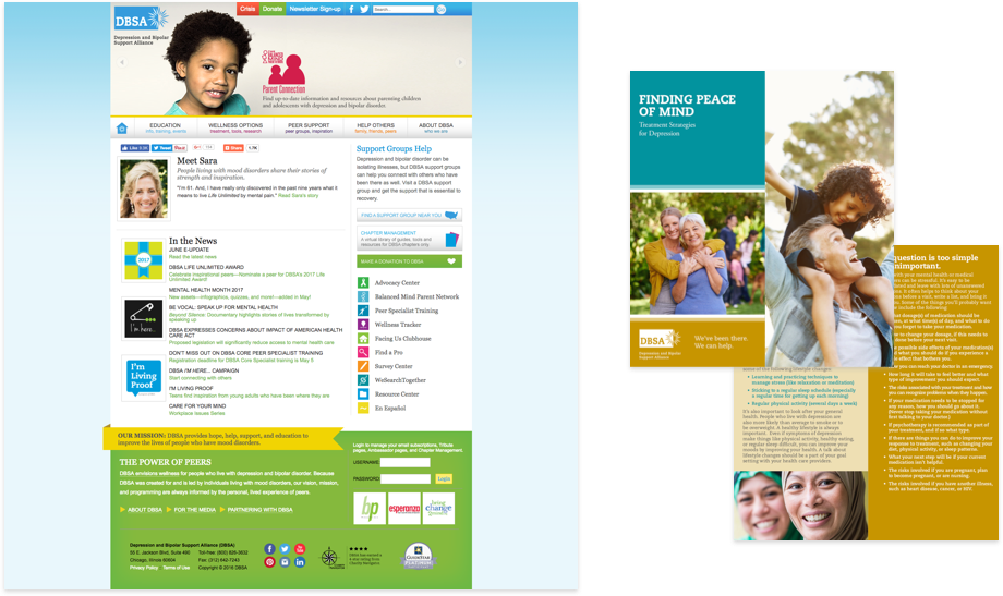
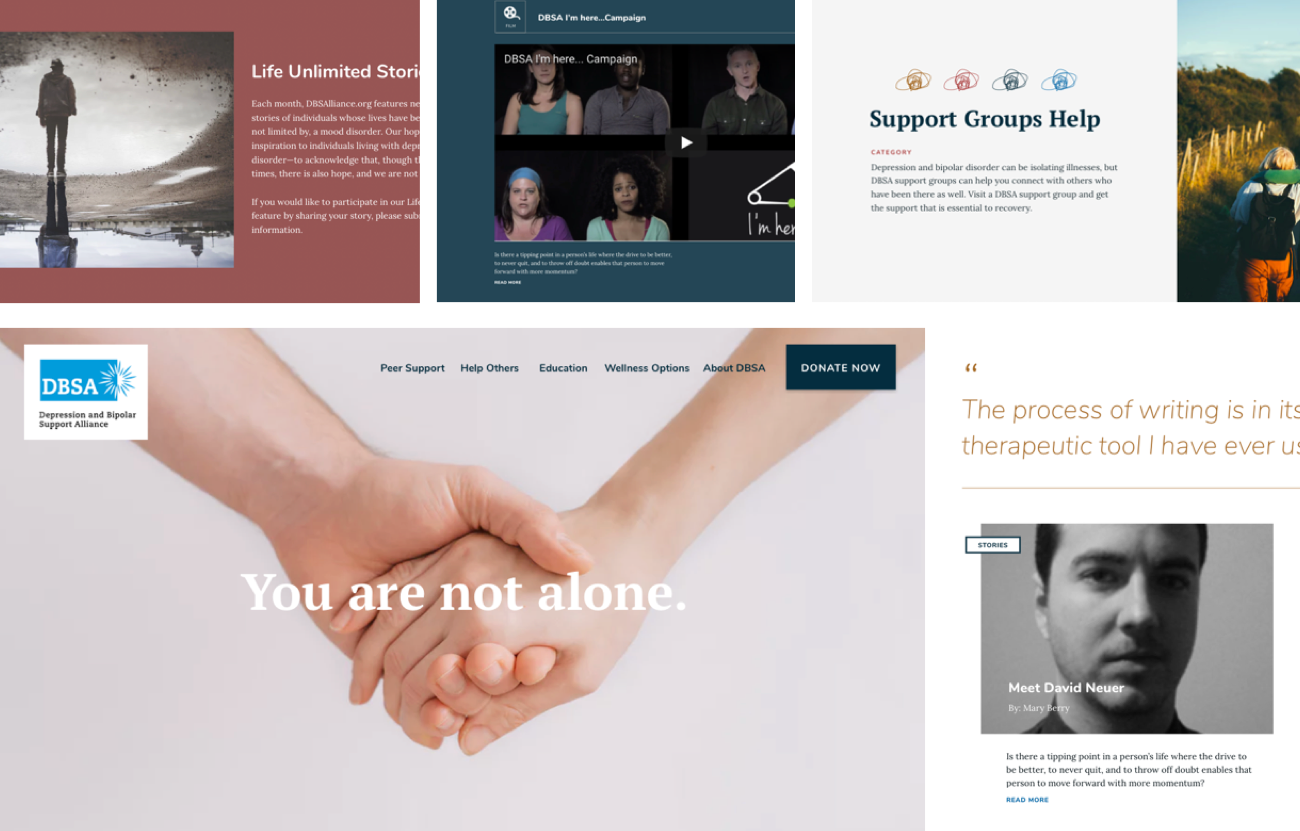
The old DBSA site and materials
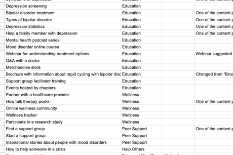
In order to understand how DBSA was currently exposing content, Fuzzy Math performed a content audit on over 280 pages of DBSA’s current site, identifying every content item and documenting all existing modules (e.g., external links, internal links, video, images, audio) and how they related to one another. This audit was especially important for DBSA’s content-heavy site, which had grown unwieldy over the past several years. Our review found that though the site contained a wealth of useful information, the two primary challenges from a usability standpoint were in inconsistent navigation and duplicate content.
DBSA’s mission is to provide hope, help, support, and education to improve the lives of people who have mood disorders. Fuzzy Math created a mission-focused design and navigation structure so that our constituents can find the resources and support when they need it most.
Discovery
Once we had a grasp on the vast amount of content, we reviewed DBSA’s web analytics to identify individual pages with the most views in the past month as well as the percentage of entrances and exits from these pages. These metrics help us identify the content that is most highly-trafficked and that provides the most value to users.
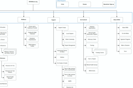
We also conducted research with current users of DBSA’s site, including a card sort to better understand how users related information on the site and a survey to add depth and detail to the analytics data about what types of content is most important to users. Put together, the analytics and research data allowed us to create a site map and landing page-level content hierarchy for the entire redesigned site.
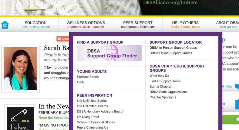
Cluttered and confusing navigation.
Design Principles
In addition to reworking the information architecture, we recognized the need for a new visual approach. Prior to our engagement, the website was last redesigned in 2013, and we identified multiple opportunities to update aspects of DBSA’s current brand and create a truly responsive website with separate desktop and mobile experiences.
Accessibility
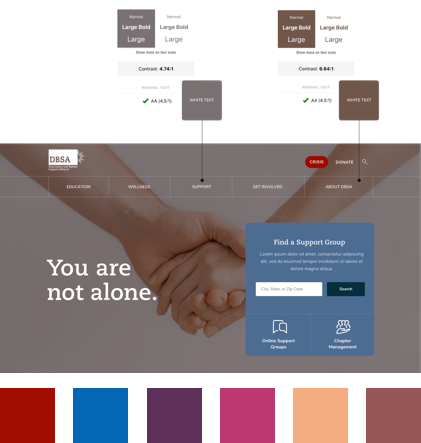
It was important to us to consider color contrast ratios when designing image overlays. We took care to ensure that there was an appropriate amount of contrast between elements for legibility.
Visual System
Through our research, we began to understand the mindset of DBSA’s current audience. With this information, we worked through a couple of directions, sourcing colors from DBSA’s current brand identity while updating and expanding on their application. Our goal was to ensure that the DBSA website aligned with their internal philosophy of support and advocacy.
Ultimately, DBSA had all of the resources already at hand. Through our work on the information architecture, we were able to organize their extensive database of articles and present it to their visitors in a digestible format. Our visual design efforts helped refresh DBSA’s brand voice and reposition the organization as a place of comfort and support.
Increase access to educational resources
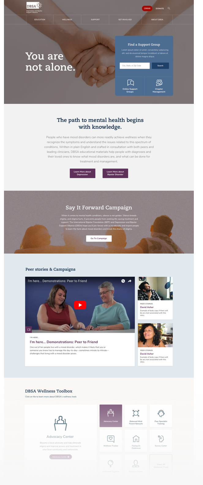
We created landing pages for sections to create a more organized layout to access educational resources.

Amplify the voice of those with a mood disorder
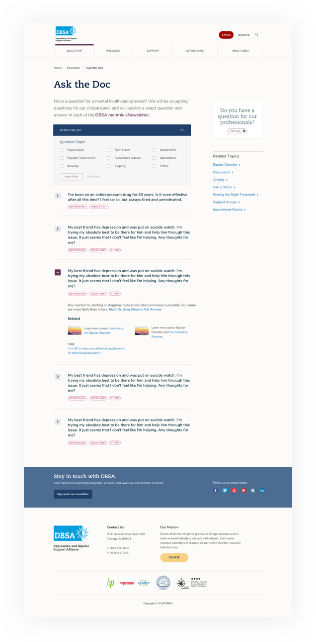
Through clarifying and consolidating the Ask the Doc page, we were able to provide quick access to a user looking for information about their mood disorders.
Increase access to peer support by prioritizing content
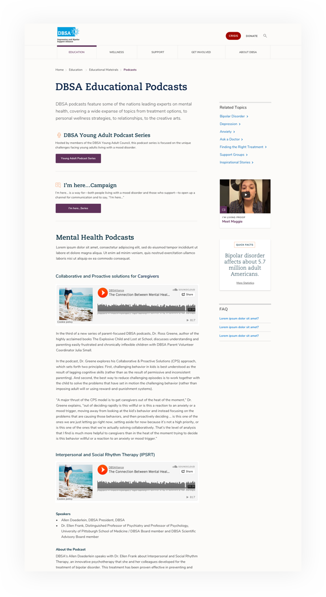
By piroritizing Podcasts and other content on internal pages, we were able to bubble up related content.
Live at dbsalliance.org
The site launched in April 2019 with positive feedback from our stakeholders and their users.
We launched last week! I can’t even begin to tell you how many compliments we’ve already received. We can’t thank you enough for all you and your team did for us.
Have a project you'd like to discuss?
We'd love to speak with you about your project and how our user experience services can help.
Contact Us
