The Challenge
In an era where data breaches and cyber threats loom large, data security is a vital and booming industry. Designing for data security presents a unique set of challenges due to the sensitive and complex nature of the domain. These challenges often revolve around balancing security requirements, usability, and user trust. Navigating these challenges, in addition to the traditional UI and UX considerations, takes skill, care, and a design team with the right experience.
Read more about The Challenges of Designing for Data Security.
Industry
Enterprise
Business Applications (B2B)
Our Expertise
Digital Product Strategy
Digital Transformation
UI/UX Design
UX Research
The Solution
Our client, a pioneering cybersecurity solutions provider, came to the Fuzzy Math team looking to modernize their legacy data security platform. The platform’s primary function was to scan for vulnerabilities within a company’s data infrastructure and assist security officers and engineers in making informed decisions about prioritizing and addressing these vulnerabilities. Aside from the standard UI and UX considerations of designing within the data security industry, this project presented several unique hurdles related to data interpretation and custom reporting. Our design team skillfully navigated these design challenges, ultimately delivering a user-friendly, intuitive, and highly effective solution.
Interpreting Data for All User Levels
Problem
The legacy platform displayed complex data in a way that was often inaccessible to both non-experts and executive leadership. This created a communication gap between experienced users and stakeholders who needed to understand security status and risks.
Solution
- Conducted user interviews and workshops with security officers, infrastructure engineers, and executives to understand their distinct needs.
- Identified key personas to account for the differences between different users and use cases — Business execs needed to grasp the full picture of their company’s risk and vulnerability, while asset owners and patch implementation teams needed to know exactly what to do and when to do it.
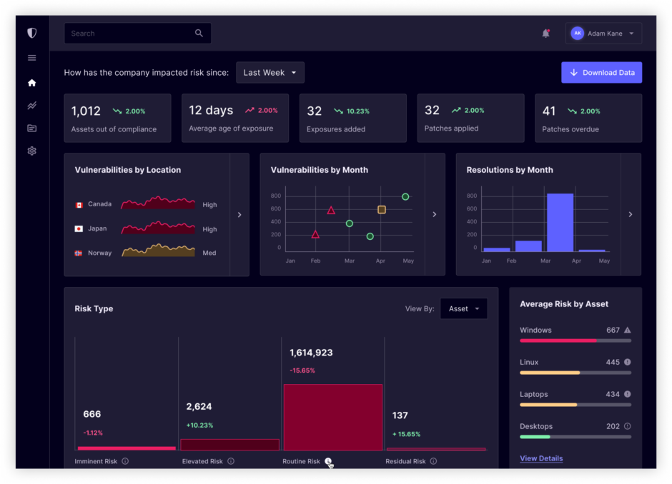
- Reimagined the platform’s information architecture, organizing data hierarchically to accommodate both novice and expert users.
- Developed a customizable dashboard with role-based access control to allow different user groups to see the data most relevant to their roles.
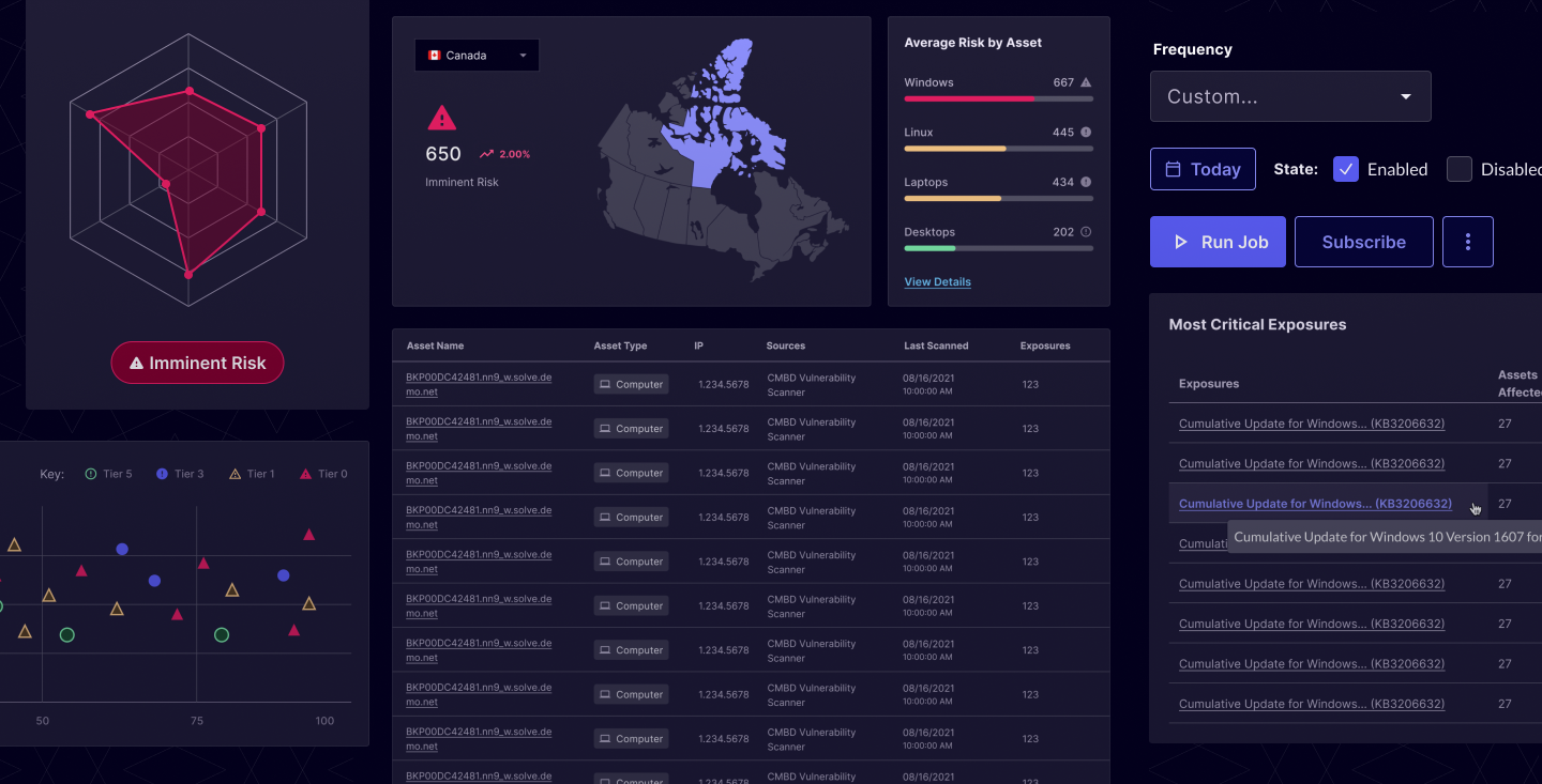
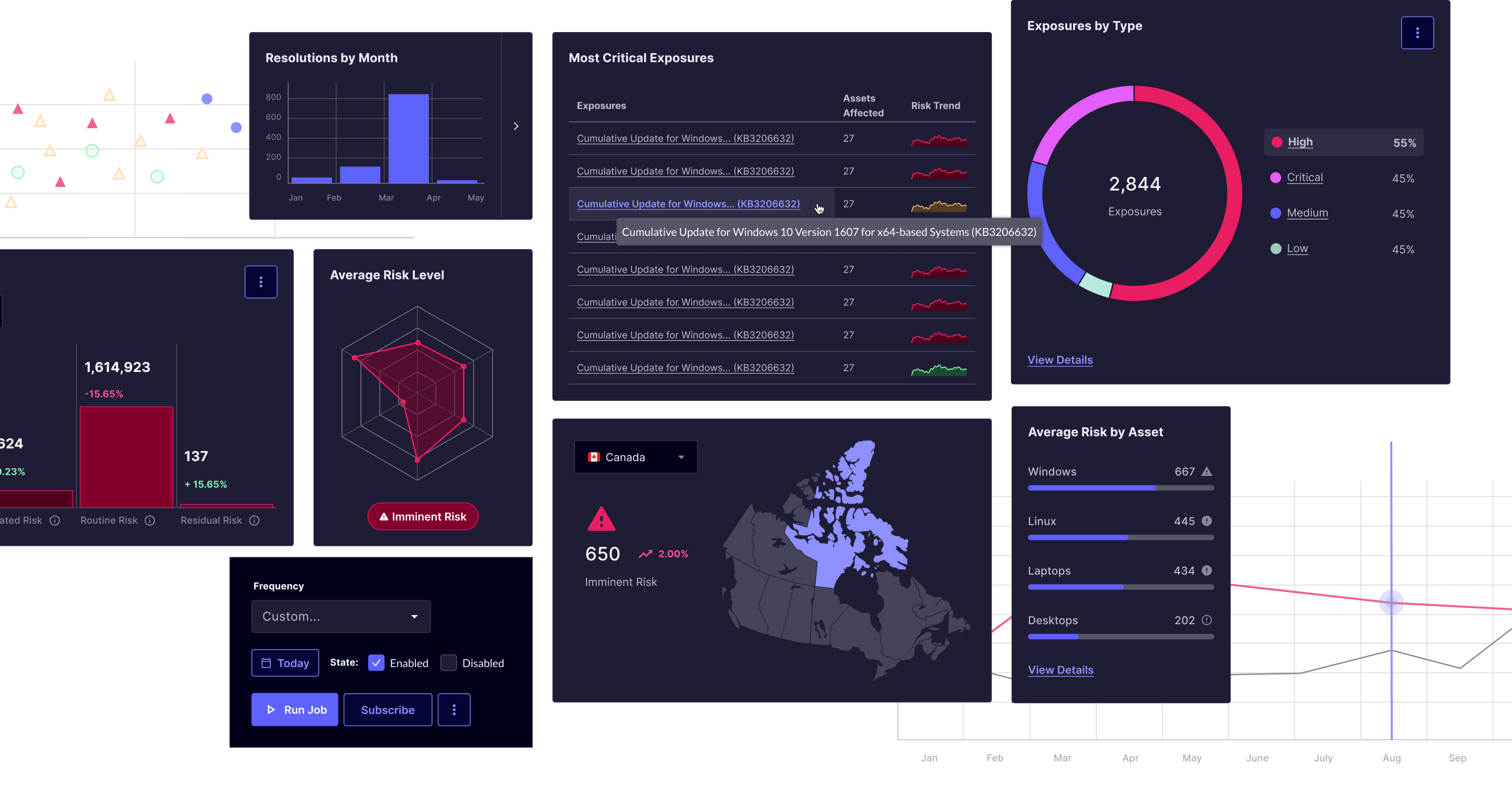
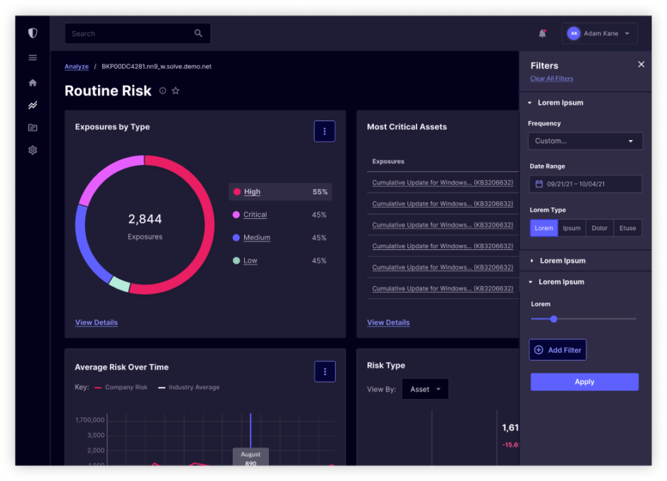
- Implemented data visualization techniques such as heatmaps, charts, and color coding to provide at-a-glance insights without overwhelming users with data.

Admin
In charge of implementing and maintaining the product. The Admin typically has a high technical understanding

Business Executive
Uses the reports to understand overall risk and to help guide business decisions

End User
Uses the information provided to guide their work and take action
Data Visualization Toolbox for Admins
Problem
Our client knew that their users needed to consolidate data in one place. Having this data in front of them allowed users to be proactive, rather than reactive, and make confident decisions based on accurate asset and vulnerability data.
Admins needed a versatile set of tools to create custom reports and dashboards tailored to their organization’s unique security needs. The existing platform lacked flexibility in this regard.
In order to accommodate so many distinct viewpoints, we knew that we needed to restructure and represent the data in a way that made it more accessible to all.
Solution
- Collaborated with administrators and data experts to identify essential data points and requirements for custom reporting.
- Developed a robust toolbox of data visualization widgets, including charts, graphs, tables, and widgets for real-time data streaming.
- Implemented a drag-and-drop interface, allowing admins to effortlessly arrange and customize their dashboards.
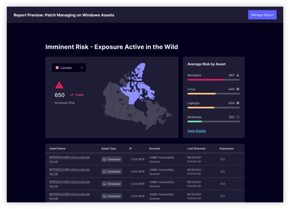
- Introduced a ‘Preview’ mode for administrators to see how their dashboards would appear to end-users before deployment.
Design Process
Research & Discovery
- Conducted extensive user research to understand pain points, user workflows, and requirements.
- Created user personas to guide design decisions.
- Performed a competitive analysis of similar platforms to identify industry best practices.
Information Architecture & Wireframing
- Redesigned the platform’s information architecture for improved data accessibility.
- Developed low-fidelity wireframes to outline the new layout and features.
Prototyping & User Testing
- Built interactive prototypes to simulate the platform’s functionality.
- Conducted iterative user testing sessions with real users to gather feedback and make refinements.
High-Fidelity UI & Visual Design
- Ran visual design workshops with the client to identify the key elements of their brand and the look and feel that they best encompassed their company and their product.
- Created a modern, visually appealing design that aligns with the client’s branding, while aligning to UI and interface best practices.
- Ensured a responsive design to accommodate various screen sizes and devices.
Implementation & Future Roadmapping
- Worked closely with the development team to provide implementation support and ensure that the end product solved both user and business needs, while still being built in the desired timeframe.
- Identified key metrics and implemented a tracking plan to ensure the platform’s performance, security, and usability.
- Crafted a future roadmap alongside the development team to outline future opportunities and improvements that didn’t make the first release.
Results
The revamped data security platform successfully addressed the challenges presented by the client. Users across different levels of expertise could now access and interpret data efficiently. The introduction of a customizable dashboard empowered administrators to create tailored reports and dashboards, enhancing the platform’s flexibility and user satisfaction.
Key results included:
- A 20% increase in user engagement within the first six months post-launch.
- A 15% reduction in the time required to address critical vulnerabilities.
- Positive feedback from executives, who now had a clearer view of their organization’s security posture.
By tackling the challenges of data interpretation and providing a robust toolbox of data visualizations for administrators, our design team successfully modernized the legacy data security platform. The revamped platform not only improved user accessibility but also enabled organizations to make data-driven decisions to enhance their security postures. This project exemplifies the transformative power of user-centered design in revitalizing legacy systems to meet the evolving needs of today’s cybersecurity landscape.
Have a project you'd like to discuss?
We'd love to speak with you about your project and how our user experience services can help.
Contact Us