The Challenge
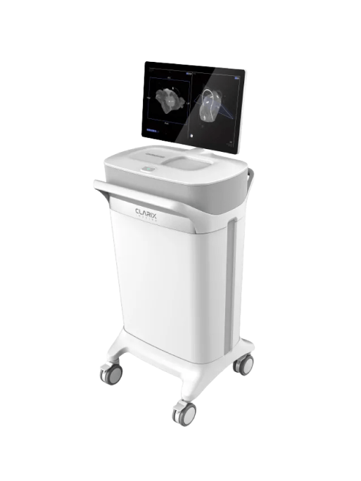
Clarix is a medical device startup that was in the very early stages of bringing their first product to market: a kiosk that could provide fast 3D image scans from within the operating room. Their team knew the technology and had an idea of the use cases, but needed help delivering cohesive experiences that fit within a fast-paced surgical workflow.
The Solution
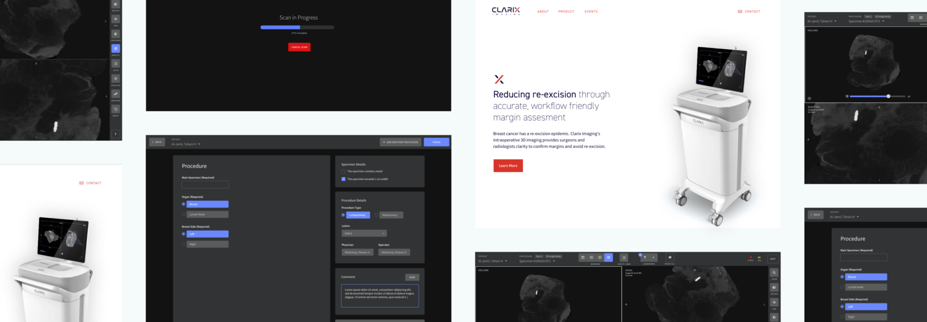
Fuzzy Math worked with Clarix to develop clear and effective branding, design their first public website, and to design the product UI for use on their touchscreen kiosk and as a desktop application for use outside of the kiosk. Research with surgeons and radiologists informed the workflow strategy to help ensure this transformative technology would elevate the surgical workflow and empower clinicians to make more informed decisions and achieve better patient outcomes.
Initial product design and branding were tied to a timely go-to-market strategy tied to a medical conference. Fuzzy Math helped Clarix launch their brand and their kiosk product with embedded UI at RSNA 2019.
We have a very complex workflow, but Fuzzy Math was able to understand the workflow immediately and even make suggestions to improve it. [...] They’re experts in UX design.
STRATEGY
Embedded application design
Clarix’s initial product was a radiology kiosk for scanning and viewing samples, intended to be used by surgeons in the operating room. Historically, imaging products were too slow, or lacked useful clarity, for intraoperative use — the product needed to support users and workflows not currently accustomed to imaging. This application additionally had to support radiologists in separate radiology viewing rooms, who would be accessing the UI from their computers, and who unlike surgeons are steeped in radiology software conventions. Fuzzy Math worked with Clarix and their partner surgeons and radiologists to understand the existing workflows, and how they differ in various hospital scenarios, such as a larger hospital with radiology support and a smaller hospital without an available radiologist.
Key Takeaway
Clarix entered the market with an interface ready for the operating room and unique branding, blending modern UX with their advanced imaging technology.
Touchscreen workflow
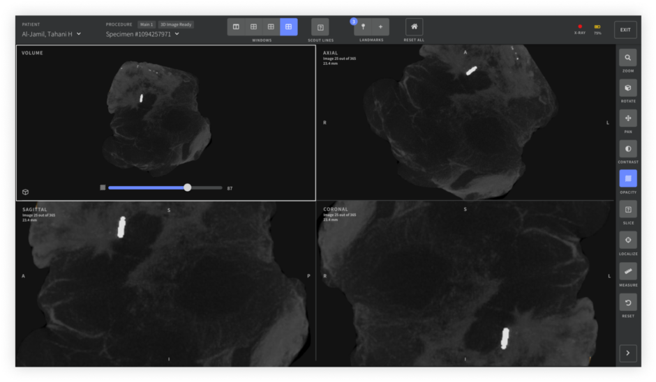
The embedded kiosk UI needed to be simple to pick up and use. In the OR, imaging would often happen while patients were still anesthetized, many times with an incision still open. Time, and attention, would be at a premium. We focused the UI around basic goals, removing barriers and additional actions wherever possible.
Knowing that users would typically be wearing gloves (often multiple pairs), providing large, distinct touch targets was crucial. While multi-touch capable touchscreens bring a lot of potential interaction methods, keeping things simple and familiar ensured unfamiliar users would be able to orient themselves to the imaging functionality even in a high-pressure surgical setting.
A partnership between design and development
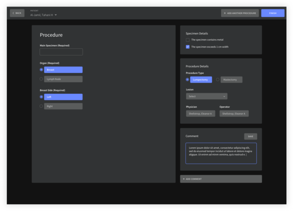
Fuzzy Math served as Clarix’s design team in crafting v1 of their product, taking the prototype they developed to test functionality and reconfiguring the workflow and UI to support the various users and scenarios without impeding the critical surgical work happening steps away from the machine.
Throughout the product design process, we worked alongside Clarix’s team to expedite implementation and hit initial product release milestones. Our design workflow fed directly into the development of the viewer UI, built in QT, through software integrations that provided further efficiency as their team built out the initial product.
Developing an identity
As an early-stage startup, Clarix’s team had been focused on the innovative technology, and hadn’t yet developed a visual identity or communications strategy. Fuzzy Math worked with the Clarix team to understand how they viewed their product and how they saw their approach to the market, and developed a comprehensive brand identity suited to those goals.
Brand identity for Clarix included a from-scratch logo, a brand system defining color and type for both marketing applications and application UI, and an initial marketing website to help connect with prospective customers.
Have a project you'd like to discuss?
We'd love to speak with you about your project and how our user experience services can help.
Contact Us