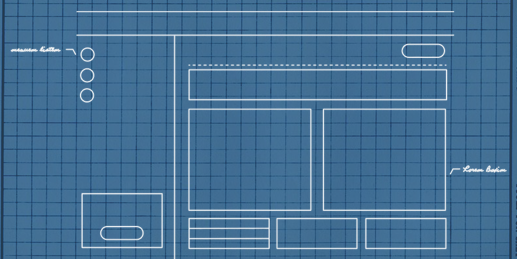
You wouldn’t build a house without a blueprint, so why would you build a digital product without wireframes?
Architects create blueprints to align everyone in one direction, and they provide exact specifications for the structure of the building. They’re the starting point from which everyone on the team bases their work. The same can be said about wireframes for digital products.
Although some designers are opposed to wireframes, we believe that wireframes are an essential step in the UX design process and make the case why you should make wireframing a part of your product strategy.
Wireframes force teams to focus on function
Wireframes are great for a number of reasons, but most importantly they force designers and stakeholders to focus on the functionality and usability of a product before even considering the visual design. To use the architecture analogy again, when building a house you wouldn’t start thinking about paint color until the walls are up. And you wouldn’t order your doors and windows until you know how many doors and windows the house will need. Wireframes allow you to see the “rooms” and the “doorways” of the digital product in as simple a way as possible to make sure that it will work well for users. By focusing on function first, you make sure that your product is addressing user needs.

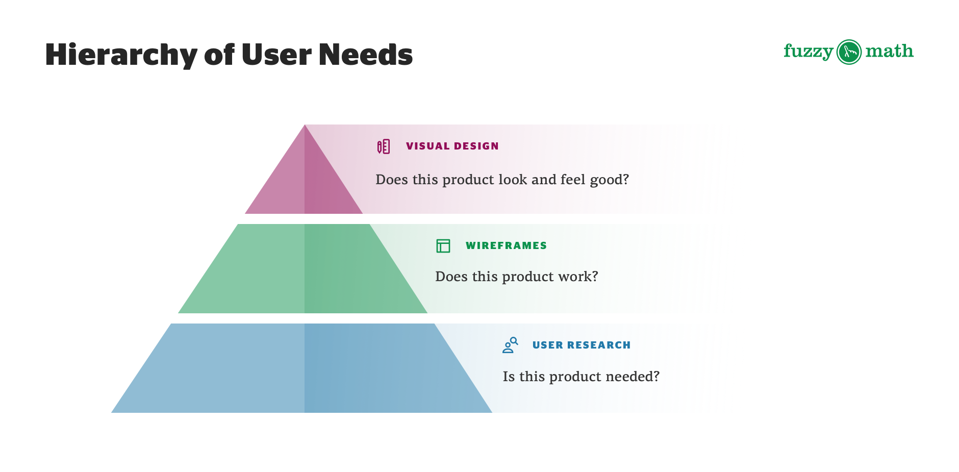
Think about Maslow’s hierarchy of needs. If we used that same framework but for product design our pyramid might start with the question “Is it needed?” at the base, “Does it work?” would be the second level, and “Does it look and feel good?” would be at the top. The research addresses the “Is it needed?” question, wireframes primarily help the team address the “Does it Work?” part of the pyramid, and visual designs help the team fine-tune the answer to “Does it look and feel good?”.
Wireframes allow for rapid, efficient iteration
Whether it’s due to feedback from other designers, from clients, or from users, designs require a few rounds of iteration before they’re final. This is especially true when deciding what elements to include and what layouts to consider for a product. Since these are bigger, structural decisions, it’s easier to make those types of updates during the wireframe stage of a project rather than during the visual design stage when attention to visual detail is the main priority.
Producing wireframes
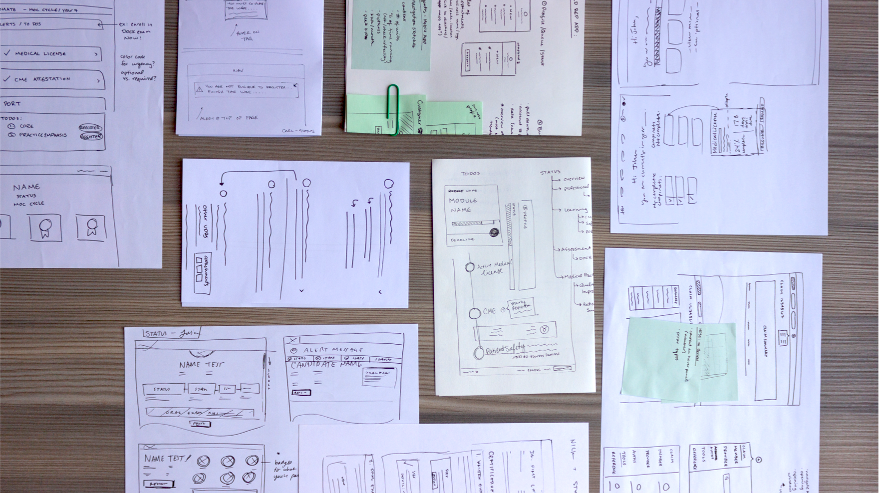
Most commonly, the wireframe process begins with putting pen to paper (or whiteboard) as designers quickly draw up sketches of features and screens (e.g. home screen, account profile page, etc.). Starting at this level of low-fidelity allows UX designers to get out a lot of ideas in a short amount of time. They’re also able to explore any and all solutions quickly and efficiently. As designers brainstorm and work through design challenges, they have the chance to iterate even before building wireframes in a digital format. But the iteration doesn’t stop there. Whether it’s client feedback or evaluative research and feedback from users, it’s important to test designs at this stage of the process.

Because wireframes are quicker and easier to produce than full-on visual comps, good UX designers often go through several rounds of wireframe iterations. And it’s important to remember that wireframes are never meant to be perfect mockups of the final product. Save the fine-tuning and the pixel-perfect details for the visual design phase.
Wireframes save time and money
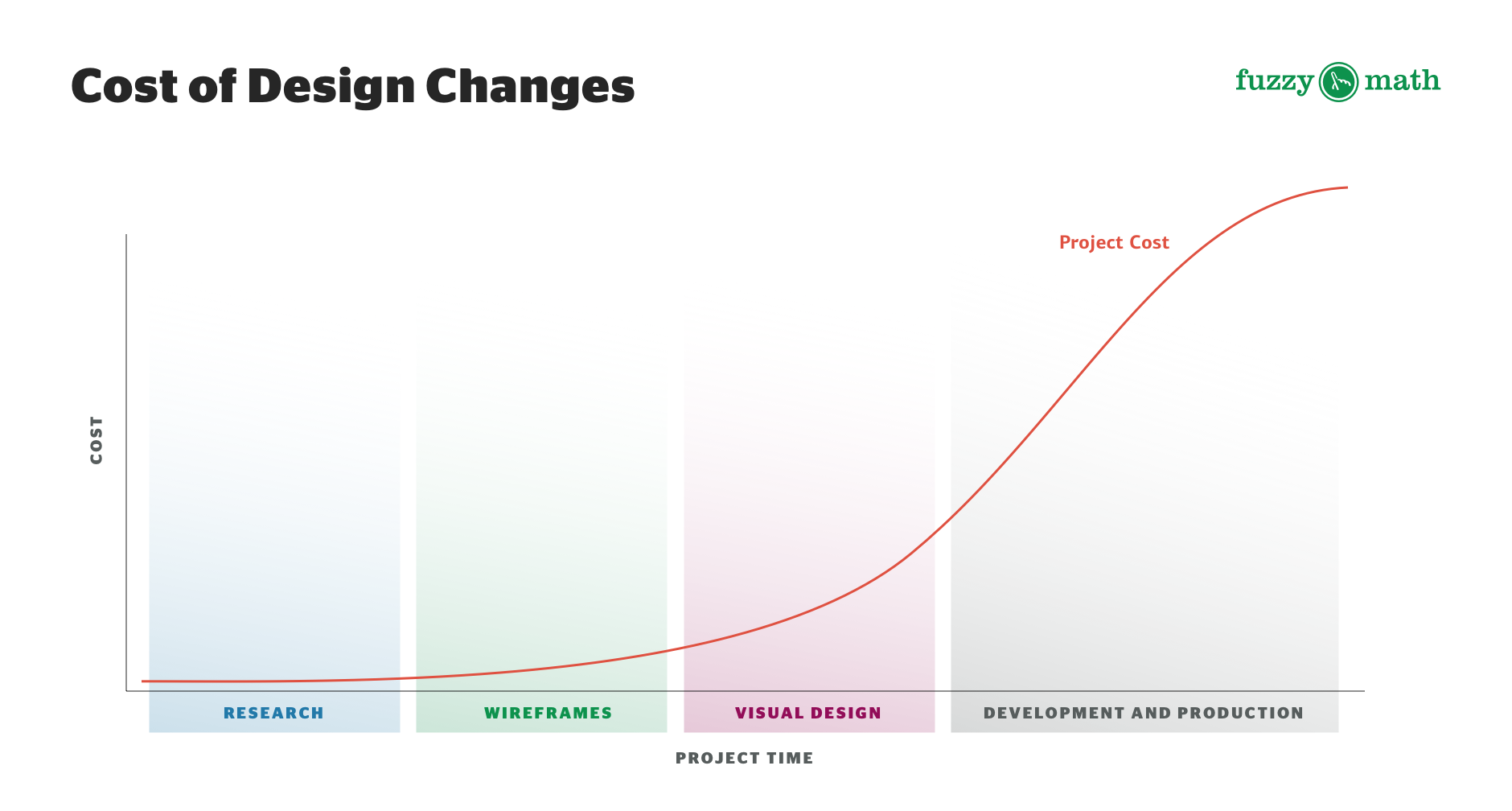
You may be thinking that wireframing is an extra step in the process that you don’t have time for. Why spend your valuable time on low-fidelity iterations? Well, in the long run, wireframing can save your team both time and money.
Wireframes set an outline for the project by forming a blueprint of the final product. This way everyone, from developers to visual designers, understands the features and functionality requirements across the entire project before beginning their phase of work. Developers read a wireframe to understand the architecture and foundational features that they’ll have to build out. And visual designers can take stock of the visual components that will need to be accounted for while also thinking about the look and feel of the end product.

If a project were to, instead, go straight from research to visual design, things could easily go off the rails. You need a strong foundation when designing digital products. Seeing a feature in its simplest form will help you focus on what matters most — whether or not the product actually works.
In the grand scheme of things, wireframes help everyone working on the development of a digital product. They help you start broad and work your way into the details, and force designers to invest time upfront figuring out the basics. This way, your team can focus on the finer details as the project progresses — making sure everything falls into place easily. Think — measure twice, cut once.
Our wireframe process can help save you and your team time and money. Connect with us to get started on your next big project!