In the 24th century spaceships equipped with the Epstein Fusion Drive have allowed Humans to travel across the solar system and foster civilization as far as Jupiter’s moons with relative ease. The critically acclaimed show The Expanse is one of the most riveting and scientifically accurate sci-fi shows of the past decade. A fascinating aspect of the show is its set design and attention to detail regarding spaceship’s interfaces and how characters interact with them and other technologies. This piece is going to focus on three beloved spaceships, the Rocinante, Agatha King, and the Razorback, and explore how their user interfaces (UI) were designed to be as intuitive as possible and what The Expanse can tell us about the future of human computer interaction.
Disclaimer: This post will only focus on the television show
An unfortunate truth about science fiction movies and shows is that most interfaces and interactions between a human and an artificial intelligence (A.I.) are designed lazily. This means the A.I. is usually extremely intelligent and can perform almost any task it’s given without much explanation and interfaces are poorly designed and don’t account for things such as ergonomics, learnability, best UX practices, and so on. When it comes to spaceships most sci-fi tries to impress audiences with faster than light travel, profound power, and incredible scale, looking at you Super Star Destroyer. The difference between spaceships from most blockbusters and The Expanse can be summed up into two words, intuitive and functional. Everything from their UI to the ship’s layout serves a purpose for their occupants.
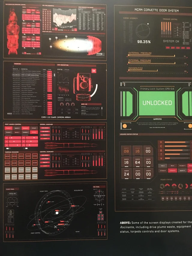
“The great thing about the Expanse was that the Production Designer, Toni Ianni, was keen on having real interfaces for the actors to interact with as much as possible. This meant that we had the opportunity to build functional interactive screens as well as screens that were triggered by on-set playback.”
Rhys Yorke – Motion Graphics Designer for The Expanse (seasons 3-5)
Agatha King
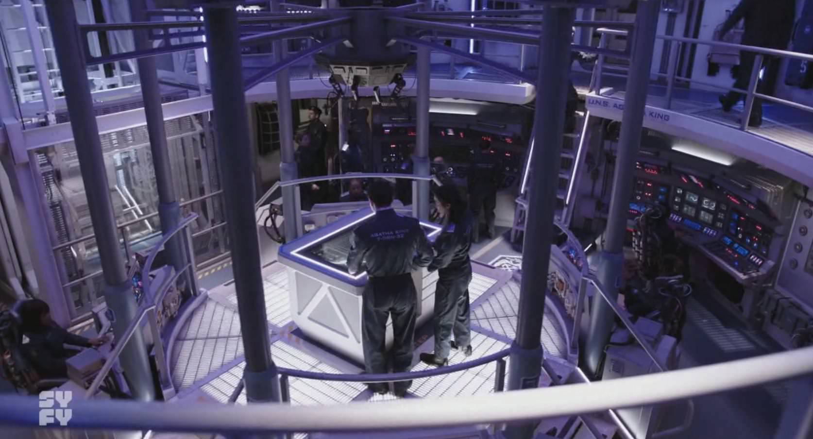
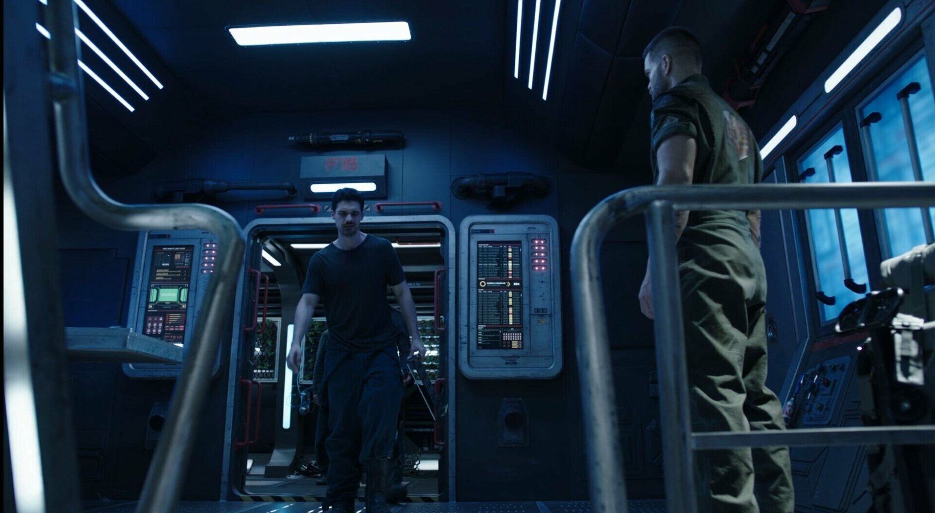
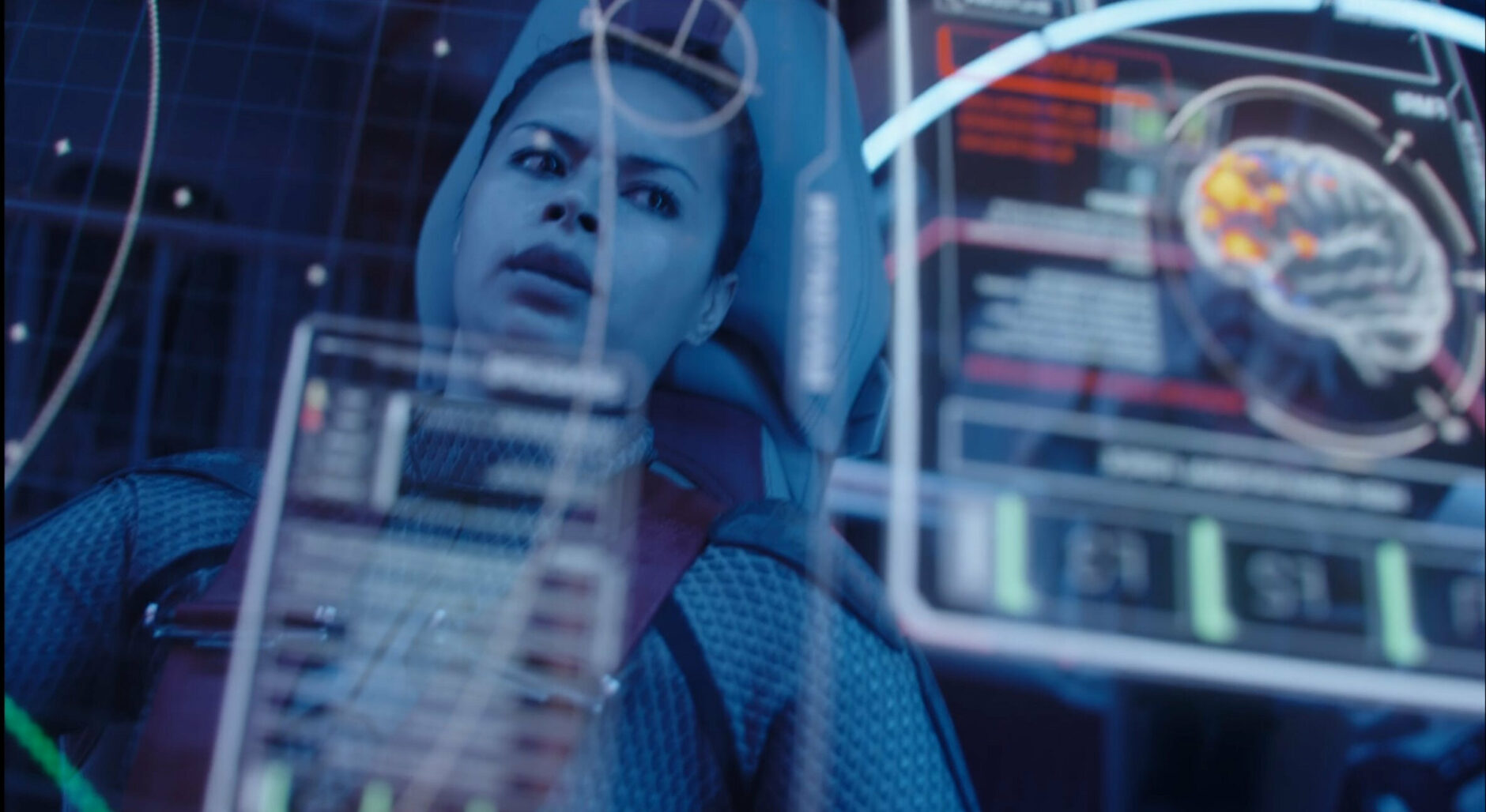
Measuring 376 meters in length the UNN Agatha King is one of the oldest serving spaceships in Earth’s history and is renowned for its reliability and sturdiness in battle. Early in it’s introduction we can see just how old it is. The ship’s form factor was inspired by WWII naval battle ships and its easily seen in the design of the control panels and layout. There are physical buttons everywhere, the bridge (main control center) layout has a more conservative design than modern ships with a raised desk which can disrupt communications between the crew, and 3D volumetric holograms can’t be rendered anywhere on the ship.
Agatha King – Interface Design
The UI on the Agatha King has a primarily blue palette with hints of orange and green for statuses and alerts. No matter how advanced technology becomes the human eye is unlikely to change. Blue, green, and red are perceived the fastest so it makes sense for a ship that will usually be in high stress situations where reading an interface accurately could mean life or death to have this palette, also for narrative reasons since this is an Earth ship. A smaller color palette also means better memorability for the operator leading to faster decision making, however sometimes the UI doesn’t take advantage of color and alerts such as incoming messages don’t draw attention and blend in with other elements.
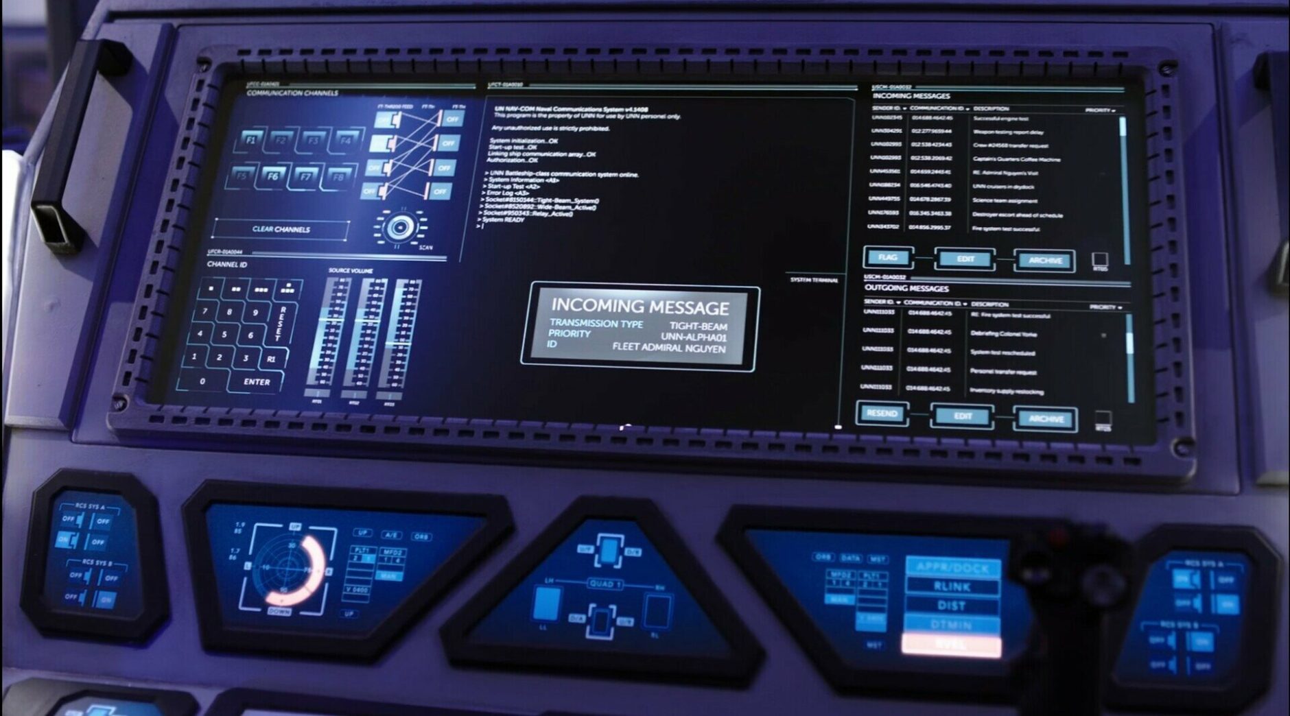
Interfaces on this ship are good at differentiating inputs by using size, color, and shape but some also use operation (placing inputs that function differently next to each other) and position as seen in the photo below with having the seemingly more important information read left to right. There’s also a hierarchy that uses bolder and bigger fonts with a divider to highlight what the section does.
Where this ship differs from almost every ship in the show is its use of physical buttons and inputs. These inputs include a physical keyboard, mouse ball, and side stick and above these are wide panel screens used to display large segments of information including radar, ship diagrams, and telecommunications. Under these panels are smaller screens that are a darker blue which creates more contrast when paired with a bright orange and also doesn’t distract from the large screen. Even the shape of the smaller screens can help the operator differentiate by its shape, size, and position. The physical triggers convey tactile information that touchscreens can’t do in the same capacity. Operators can blindly navigate the interface incase of power malfunctions or injury from battle, something virtually impossible with a touch screen or 3D holographic UI.
While the Agatha King excels in some areas like having highly legible typography, high contrast states and alerts combined with a simple color palette, and physical buttons, there are also a few drawbacks to the UX of the ship. The operating system (OS) of the ship is very dated, almost reminiscent of MS DOS (MS-DOS was the Microsoft-marketed version of the first operating system to be widely installed on personal computers), operators have to manually input commands to perform certain tasks where on other ships operators can use voice commands and even press a button or two to perform the same functions. Also the center console on the bridge can’t render 3D volumetric holograms and doesn’t support touch screens like most modern ships. An operator has to physically input all commands through a keyboard which can hinder collaboration because multiple individuals need to voice what they want to the operator instead of interacting with the screen themselves. While the center console functions well enough it’s important to consider the environment users will use an interface in and for what purposes, in a heated battle in the vacuum of space it’s easier to press a button to see the status of the ship instead of typing in a command.
The user experience (UX) of operating a station on the Agatha King may feel a bit antiquated when compared to ships of the same caliber, however there is an argument to be made against physical buttons versus touch screens and a streamline approach to visual design. While dated, the Agatha King is still functional enough to actively be in service and offers its crew a unique challenge to mastering its interfaces.
The Rocinante (Roci)
The corvette-class Martian frigate the Tachi, later renamed the Rocinante by James Holden and his crew when they “legitimately salvaged”, is a highly capable spaceship engaging in multiple combat roles. Rife with the latest in Martian technology this 46 meter long ship is as intuitive and functional as it gets for a ship of its class.
Rocinante – Interface Design
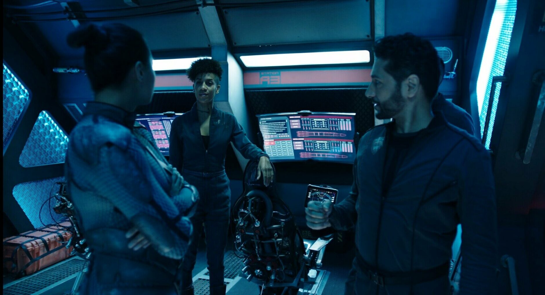
The first thing most may notice about the interfaces of this ship is its use of red as the primary color, this choice is also mainly due to the narrative as this is a Mars ship. This ship also has a limited palette consisting of red, green, and yellow. Having only “system colors” is practical for such a ship that is primarily used for battle since the crew can make fast decisions but also has its challenges. Red and green serve as the “do and don’t” colors while yellow can be used intermittently for mild alerts, warnings, or text that needs to draw attention without being urgent. Differentiating between error states and critical alerts can be difficult with red as the primary color. The image below is a good example of how the designers got around this. The interface communicates an alert with large typography and yellow borders differentiating from the solid red inputs on the “remote systems” left section.
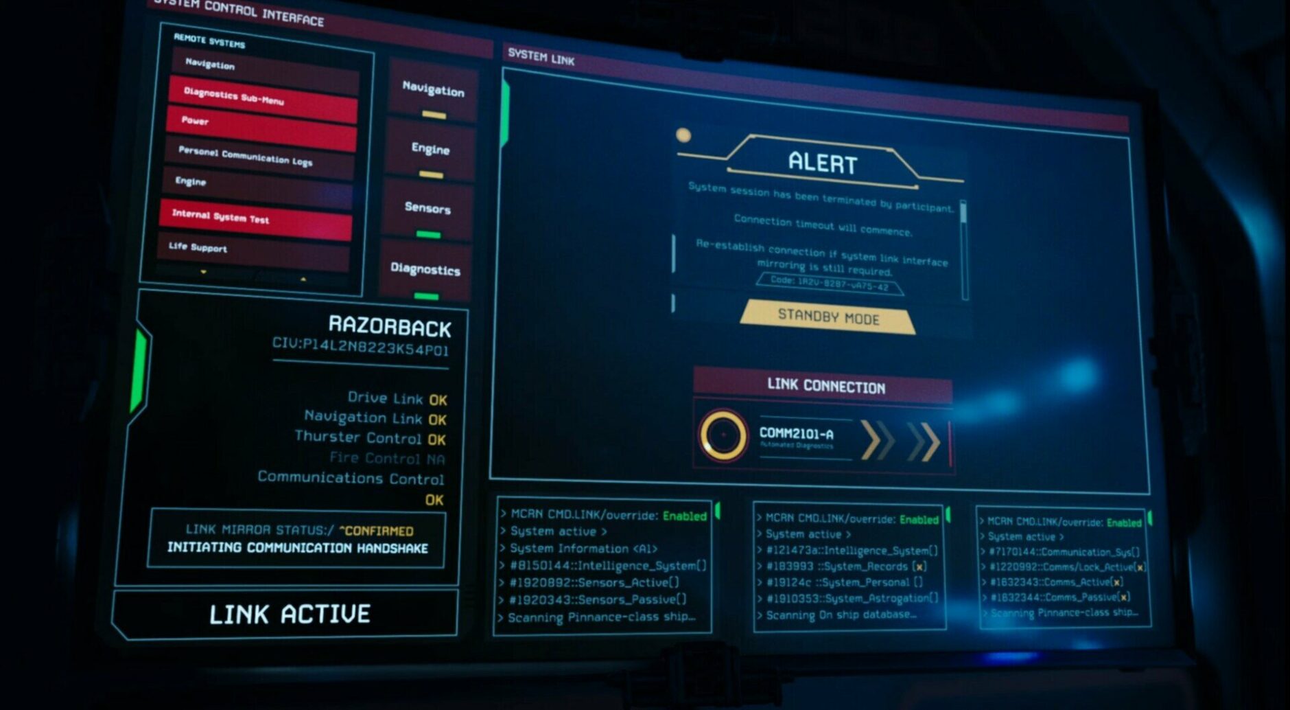
In the image above notice the container titled “Razorback”, small things like having the status of docking the Razorback be yellow lets the operator know if there are any problems faster than an operator on the Agatha King who’s UI doesn’t take advantage of color quite as well as the Rocinante. Even the decision to have the opacity of the fire controls be lower than the other statuses, they could’ve left it the same with the “NA” but thought it‘d be better to hide since it doesn’t apply to the context of the situation.
There are times when the UI relies on one color. The image below shows how using only one color takes away from the hierarchy of the UI, when everything is red or green, what’s important or wrong? There’s slight differentiation by size, shape, and operation but that might not be enough and a user can quickly become overwhelmed.
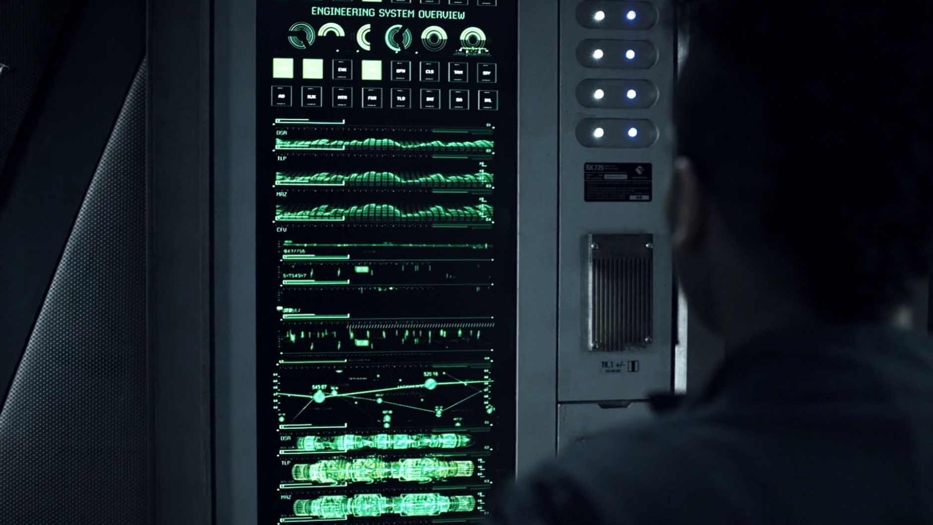
The Rocinante’s interfaces have a lot of personality and at a closer glance it’s clear this ship was primarily built for its crew. It’s a nice balance sitting in the middle of a front-end and back-end experience, command line text can be seen throughout the ship making the back-end experience more accessible to the crew if needed but most functions are accessible from the more polished front-end UI. The typography, while maybe not as legible as the Agatha King, is still accessible and gives the Rocinante a unique look.
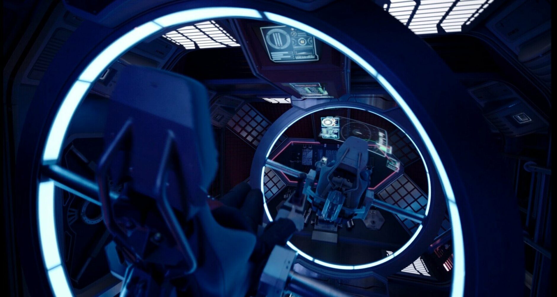
The ship’s OS is very advanced and fully integrated into all systems, all the various screens and inputs can access the same information. Most screens are large touch screen curved panels for a more immersive view and can be interacted with even when the crew is wearing gloves.
The crew frequently uses voice commands to interact with the system, the A.I. is very intelligent effortlessly completing commands such as “show me the ship’s logs”, it must know the intent of the user because how can it know which ship or which logs? It’s clear the A.I. in this show is constantly scanning for gestures, speech cadence, and general context like surrounding ships to infer what the user wants. This is extremely difficult if not impossible with current technology to achieve, however it’s clear the design focuses more on how people talk and not how they write like most VUI are designed. Most voice user interfaces (VUI) have personas to be more human-like and increase adoption and usage, but the A.I. here doesn’t say a word and only uses sounds for confirmation. While that might be practical for a battleship, one could imagine it’d be nice to have someone to talk to alone in the vacuum, just ask Alex the pilot.
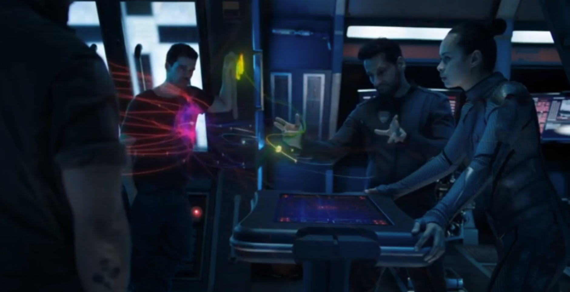
The center console is light-years ahead of the Agatha King. Fully integrated with the ship’s systems, touch screen, and ability to project 3D volumetric holograms, this interface gives the crew full autonomy of the ship from the bridge and allows for in-depth collaboration.
The Roci’s advanced technologies and intuitive UIs make it one of the most lethal and flat out coolest ships in The Expanse. A lot of consideration was put into how the crew would interact with the ship and its systems, its UX both in the physical build of the ship as well as its UI is hard to top.
Razorback
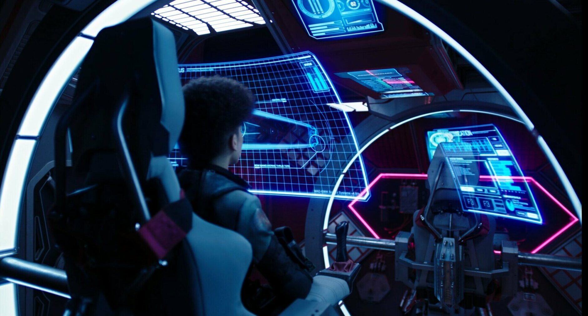
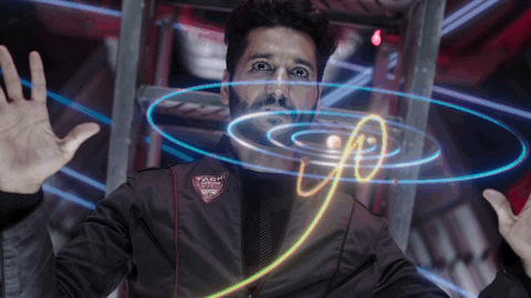
Not all spaceships have to be naval vessels, battleships, and ice miners, some ships were designed to simply go as fast as possible while keeping its occupants alive. Standing 20 meters in length, the Razorback is the equivalent of a formula 1 race car. It is highly advanced and equipped with numerous medical systems due to the stress of acceleration, fully 3D volumetric hologram interface, and the bridge is fixed on a multi-axis gimbal.
Razorback – Interface Design
One of the glaring differences of this interface is that it is distributed meaning all inputs and feedback aren’t in the same space similar to an airplane cockpit. The crew of 2 can reach speeds that exert gravitational forces well over 15Gs which can cause people to have a stroke. The ship needs to monitor various things such as health status, speed, power usage, and the list goes on. This will inevitably cause pop-up alerts that can be cast to another screen so other vital information isn’t disrupted when pilots need to see certain information quickly. A good reason for a hologram interface in this context is simply the size of the ship, the crew can maneuver around much easier by walking through a hologram instead of navigating around fixed screens, also if there is turbulence and objects begin to fly around the UI wouldn’t break.
The multi-axis gimbal rotates 180 degrees to protect the body from high stress maneuvers and abrupt turns, the hologram UI allows the crew to have better orientation of the interface and keep it in view as they rotate which potentially can be more practical than a fixed screen. There is also a small keyboard and side stick built into the chair which seems to be able to fully control the ships systems as an alternative to the holograms. This is great thinking by the ship’s designers not to depend on holograms because when the ship is moving at high speeds it becomes incredibly difficult to lift a hand to touch the hologram.
Fully interactive 3D volumetric holograms are used in many instances, from spaceships to consumer electronics like phones and video games. While they are primarily used to push the narrative forward and sometimes simply serve as eye candy it brings up a few questions, why do we still need screens? Can A.I. understand human gestures better than humans? Do the holograms follow accurate gesture heuristics (every hand motion makes a specific predetermined thing happen)?
The Razorback is a great example of how and why screens should be replaced with holograms at least in this context. Overall screens seem to be a dying breed in this world due to many factors such as a fixed aspect ratio and resolution, poor viewing angles (one reason why the Rocinante used curved screens), and interactivity.
The real problem is with the show assuming A.I. is interpreting complex gestures completely automatically with almost no effort from the user. Some shots do a great job mapping clear gestures to specific hand gestures like when Alex closes the hologram by putting his hands together, but is this gesture universal in closing holograms? Unfortunately the show has times where characters will simply swipe away a hologram like a pesky fly to close it, of course we don’t expect the designers to have a high level of heuristic accuracy for a TV show but it does show how difficult it can be to design for holograms and accurate gesture mapping.
The Future
One day humans will conquer space travel to the degree of The Expanse and possibly further than that. UX/UI designers will be needed to design the interfaces of these vessels that will take humans far beyond what people could even imagine today. Just like human physiology, design principles are also unlikely to change drastically, designers will always have to consider basic heuristics such as visibility of system statuses, user control, error prevention, and accessibility.
The Expanse is a window into how this can look. Even 300 years into the future humans will desire to feel tactile feedback from physical buttons and may still be incorporated into UI along with sound and other technologies. Just look at modern interior car design today, designers are ditching physical buttons for touch screens at a rapid rate. Studies have shown interiors that solely rely on touch obstruct the driver’s ability to focus on the road longer than physical buttons which is a safety hazard. All the ships discussed had some form of physical buttons for the crew to interact with suggesting that maybe we won’t rely solely on touch interfaces especially for large complex spaceships. Spaceships may also have high contrast colors and limited palettes used correctly will allow crews of these ships to quickly and accurately evaluate system status and navigate interfaces. Advanced voice recognition and sensors monitoring gestures could be used hand in hand with 3D volumetric holograms, this could add another layer of interactivity on ships of all sizes.
Holographic interfaces are a staple of sci-fi because it’s easy for the audience to think “this must be pretty far into the future” when they see one. Unfortunately, it might only serve as eye candy and might not be the most practical UI to implement today or in the future. Every ship explored had some level of physical inputs combined with physical screens. As stated before, there are some drawbacks to screens but there are also drawbacks to holograms that haven’t been discussed. Holograms have no background and unless there is a technology that can create an opaque holographic UI or users only use them in the dark then it just ruins the visual fidelity. Most people probably don’t want to partially see through a screen. Depth of field may also pose problems as well. Holograms by nature float in midair and pressing the wrong button because it “looks closer” or some other interference can disrupt pilots ability to operate a complex ship’s UI safely.
Ergonomics is something that also seems to be an afterthought in many sci-fi UI designs. What happens if a crew member gets hurt and needs to do a specific gesture to input a command but is unable to? How long could someone keep doing complex gestures without getting tired or being affected years later from repeating stressful movements? Where The Expanse gets kudos is their ability to have a fairly cohesive design language throughout each ship’s UI and not fall into the trap of most impractical sci-fi UIs that are a labyrinth of lens flares and tiny moving parts that update at high speeds making it hard to discern information.
When pondering the future of human computer interaction Hollywood and probably most people will use our current technology as a reference. The same reason many 80’s sci-fi movies had MS-DOS command lines permeate computer screens in what they thought would be the future is the same reason the The Expanse uses voice commands and smartphones in the future, because that’s what it looks like now so it must look that way in the future. Humans simply don’t have a good track record for predicting the future, however The Expanse arguably gives one of the most realistic depictions of how UIs will look and behave to human input. While physical buttons don’t seem to be going anywhere, holograms and VUIs may need more design thinking to make them more usable in both spaceships and consumer interfaces. Until then we get to enjoy the amazing adventures of James Holden and his crew as they fight to protect the order of the system from threats both human and nonhuman.
Sources
- Jono Yuen, The Expanse UI Design https://www.hudsandguis.com/home/2021/theexpanse
- Drainsmith, The Expanse massive screenshot dump – Ships and UI https://imgur.com/a/ZokAK
- Evan Warfel, Lessons from The Expanse: In Space, No One Complains About the Documentation https://medium.com/kineviz-blog/lessons-from-the-expanse-in-space-no-one-complains-about-the-documentation-7be065e145d
- Interaction Magic, The UX of Lego Interface Panels https://interactionmagic.com/UX-LEGO-Interfaces/
- Arun George, Designing Voice Experience https://uxdesign.cc/voice-user-experience-design-and-prototyping-for-mere-mortals-ef080c843640
- Dmitry Shatkov, Will Holograms One Day Replace LCD and LED Screens? https://hypervsn.com/blog/will-holograms-one-day-replace-lcd-and-led-screens.html
- Jack Cui, SMART Data Visualization GUI Template https://www.figma.com/community/file/1005023318907813812
- TexasGreenTea, Sci-fi UI Episode 1: The Expanse https://www.youtube.com/watch?v=m7WtNgesVbQ&t=642s