In the spirit of the season, Fuzzy Math would like to share with you a spooky story of hair-raising user experience (UX) design and its terrifying consequences. Gather round, boys and girls, as we tell this tale of terror.
‘Twas only a year ago this month when we invited our good friend Wolfio the Werewolf to the Fuzzy Math Halloween party. Wolfio, an old college chum of Fuzzy Math Co-Founder Ben Ihnchak, only recently moved to Chicago and had not yet encountered the Chicago Transportation Authority’s (CTA) new Ventra payment system.
Rolled out city-wide in 2014, the Ventra “contactless” payment system is the method people in Chicago use to pay for trips on buses and trains throughout the city. Ventra is comprised of a website where riders can manage the balance of their accounts, kiosks located at stations that allow riders to add funds to their accounts, contactless card scanners that govern admittance to CTA trains and buses, and the credit-card-like Ventra passes themselves, which are unique to individual users and do not expire.
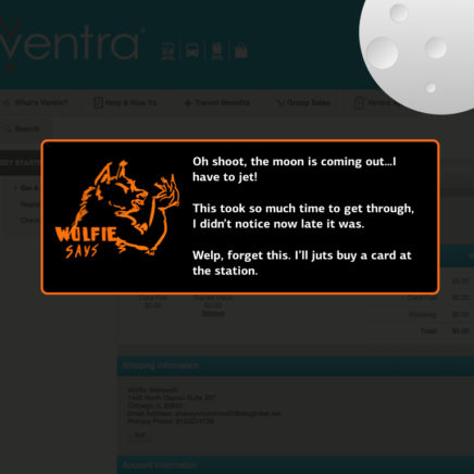
Unfortunately, Wolfio’s cell phone died before we had a chance to warn him about the myriad challenges he was likely to experience when confronted with purchasing and adding funds to his Ventra account. Without Fuzzy Math’s expert guidance, Wolfio was thrown to the… err… wolves, and was frustrated in his attempts to use the new Ventra system. Already in a rush and feeling disoriented, Wolfio was hurled into a rage of frustration. He then transformed into a wolf, and we didn’t hear from him for a week.
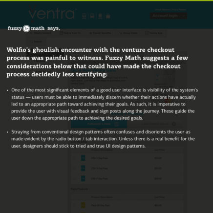
It is a scary story, but one we feel qualified to tell. The Ventra system is riddled with poor design decisions that fail to address the context in which its users come into contact with it. The system takes what should be a process optimized for fast and simple fare transactions and instead makes that process needlessly complex. Users who are already rushing to and from the train station or bus stop inevitably find it a disruptive and time consuming detour during what is oftentime already a hectic commuting experience. It doesn’t take a UX expert to identify the fact that Ventra is a pain, but as Chicago UX designers ourselves, we see an opportunity to evaluate why this pain occurs, as well as ways the experience could be improved. In honor of our dear lost friend Wolfio, that is just what we’ll do.
Spooky Scenarios
What follows are the gory details as recovered from the scene of Wolfio’s meltdown. We at Fuzzy Math will attempt to shed light on some of the pain points that may trap Ventra users like Wolfio in a netherworld of chaos and confusion.
Purchasing a new Ventra card on the Ventra website
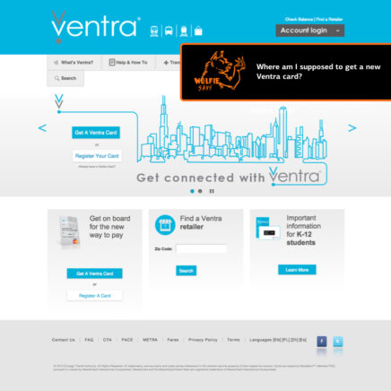
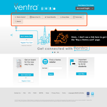
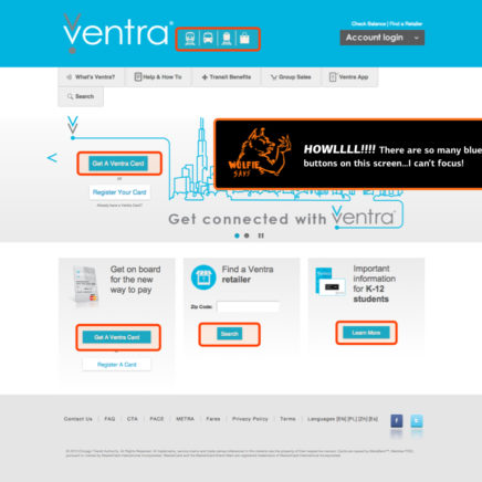
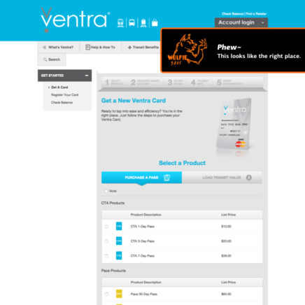
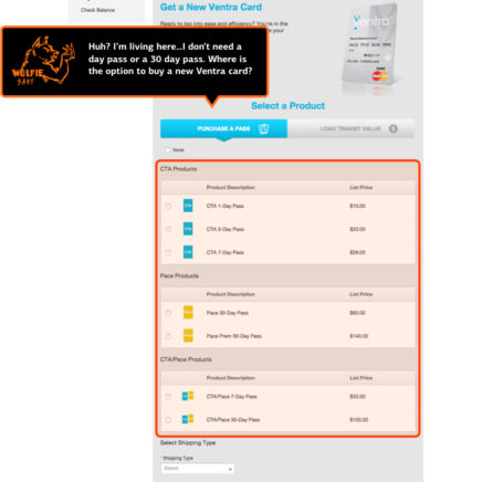
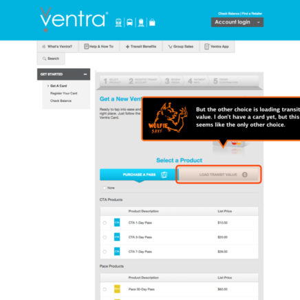
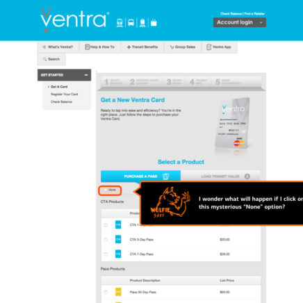
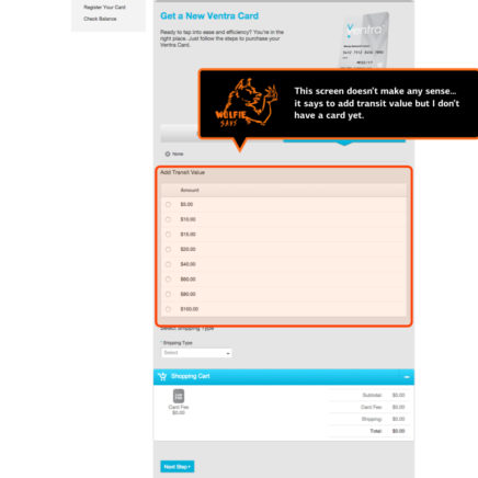
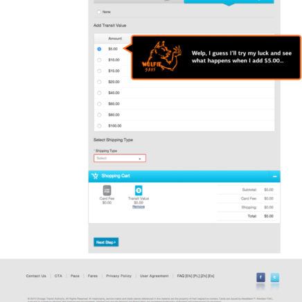
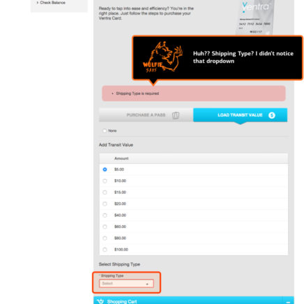
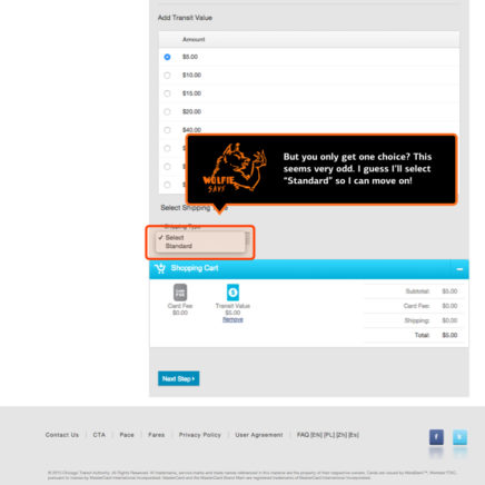
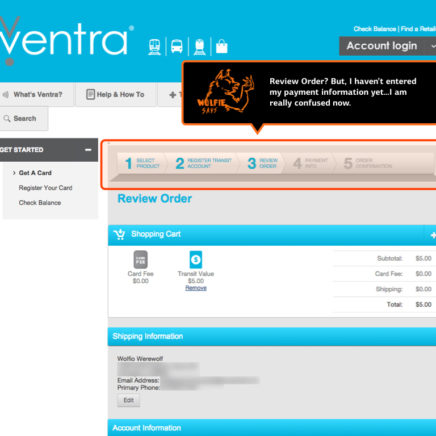
Wolfio just moved to town and needs to buy a new Ventra transit card. He’s planning to use this card to explore his new city over the weekend, as well as daily as he commutes to his job downtown. Most importantly, he’ll need a Ventra card so he can take the train to the Fuzzy Math Halloween party tomorrow evening. His helpful new roommate, Siouxsie (the Banshee), advises him to purchase a new card from the Ventra website. Poor Wolfio, he has no clue what horrors await him there:
Purchasing Ventra Card at Kiosk
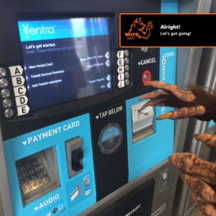
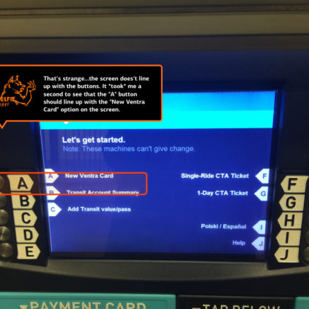
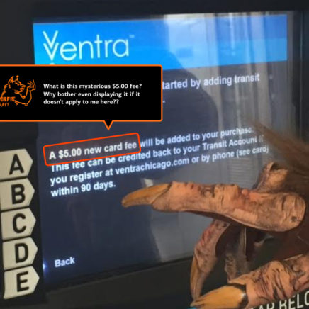
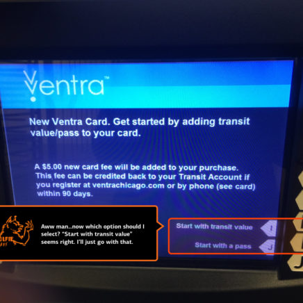
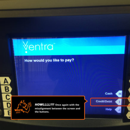
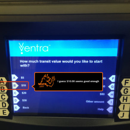
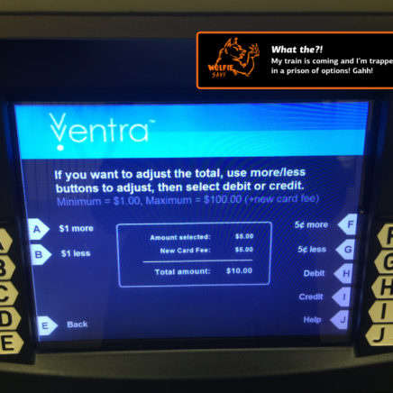
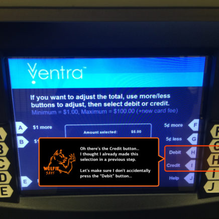
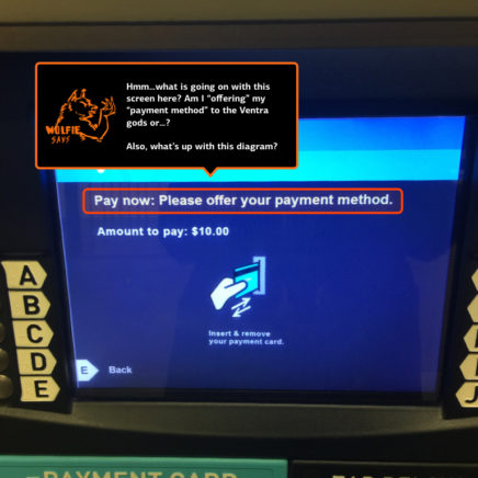
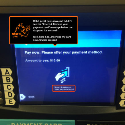
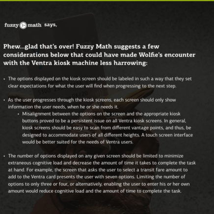
After his previous fiasco, Wolfio is ready to GET DOWN at the Fuzzy Math Halloween party. It’s rush hour when he makes it to the Blue Line station where he plans to buy a Ventra card in person from a Ventra Kiosk. Wolfio thrashes through the crowd of commuters and finds a Ventra Kiosk. He looks at the line — there are only two functioning kiosks and a line of six people — and lets out a blood-curdling howl. Tail between his legs, he gets in line. After 10 minutes, he steps up to an open kiosk. As he approaches, he hears an inbound train approaching the station in the distance — he knows he only has a minute or two to purchase his card and hurl himself up the stairs to the platform. Poor Wolfio will be haunted by what he is about to encounter on the kiosk screen:
From spooky scenarios to beautiful designs…
At Fuzzy Math, we make it our mission to fully understand the context in which users engage with a given system. It is essential to conduct research and analysis in order to understand the needs and goals of users, as well as the broader context by which they come to interact with our designs. In the case of Ventra, users like Wolfio come to the system with the need for a quick and efficient transaction, whether purchasing a new Ventra card or simply adding value to an active card. As can be seen in the above scenarios, these design needs were not met. The consequence is a mix of frustrated users, missed trains and buses, and a rageful and remorseless wolf-man roaming the streets of the city.
Tune in next time, as we move from these spooky scenarios to a more beautiful Ventra design in our blog post “Giving Thanks to Good UX.”
What terrifying Ventra encounters have you had? What would you change? Let us know on Twitter by mentioning @fuzzymath. We’d love to hear from you!
