I chose to trial-run the Fitbit Zip through a process of elimination. After careful research about the different wearable options at hand, I realized that most of the devices required a commitment to wear them physically and visibly. I am not one to accessorize much and don’t wear bracelets or watches on a daily basis. Because of this, and because most of the wearables come in a bracelet or watch form, I started to look into other options. When I came across the Fitbit Zip, I was convinced that it was a device I could deal with wearing daily. It appeared to be small enough that I wouldn’t notice it but had enough of a presence that I wouldn’t forget to put it on. Ultimately, I was looking for a wearable that was easily “wearable,” and also one that did its job.
Unboxing
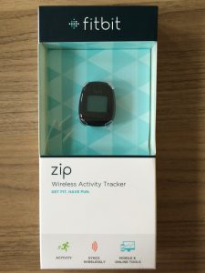
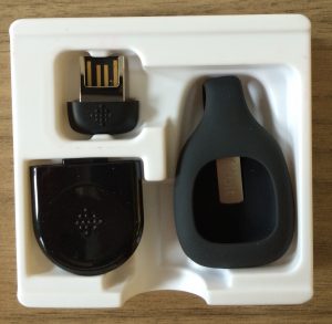
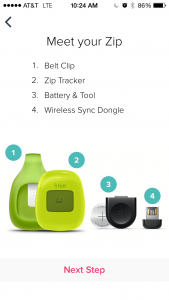
The device arrived nestled in classy packaging. Upon first glance, I was skeptical of its durability, but my concerns were forgotten when I found the sturdy, silicone case that the device slips into. Even with the case, the Zip was incredibly light and felt no heavier than a couple of coins. The box even contained a plastic tool to help undo the back of the Zip in order to put in the battery—a thoughtful item to include. The only confusing item in the box was called the “wireless sync dongle.” The single page instructions specified that you have to download an iPhone app to complete the set-up of your device, so I was confused about why I was being given a tool specifically for a computer. Was it necessary to work the device? Or was it something that I could choose whether to use or not? I ended up googling it and landed on an article on the Fitbit help page that encapsulated my exact thoughts: “What is the wireless sync dongle and how do I use it?” Guess I’m not the only one who didn’t get it. There was nothing in the article that said using the dongle was obligatory, so I opted to just use my phone for setup and data tracking.
App Setup
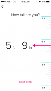
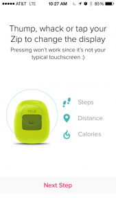
Overall, the app provided a great set-up experience. It was clear, enjoyable, and intuitive. After being prompted to enter my health information, I was fully introduced to all the components of my new device and how it worked. As the app instructions dictate, you truly do have to “thump” or “whack” the Zip’s display to cycle through the display options. It is not an iPhone touchscreen by any means, but you soon figure out how much whacking is needed (not too much).
Activity
I chose activity as my category. It aligned perfectly with my summer goal to “work out more” and I knew this wearables project would keep me motivated to stick to my goal.
The Fitbit Zip has the ability to track distance, calories, steps, and number of “active minutes.” Within the app, you can set goals for yourself — or use their curated goals as suggestions — and track your success. You can view your activity right on the device (by thwacking the display to cycle through the data categories) or you can use bluetooth to sync your device to the Fitbit app and view the data there.
User-Friendliness
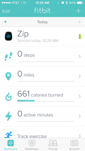 The device itself is extremely user friendly. It is simple to tap through display options, and the silicone case is comfortable—I don’t notice it while I’m wearing it. The app is also very user friendly. The homepage allows me to quickly sync my device or view my daily activity data. Within the app, the ability to challenge yourself or friends is easy to access. The “Account” tab makes it easy to modify your goals and view your accomplishments (called “badges”).
Comfort and Size
The Zip is wonderfully small, light, and unnoticeable when clipped to the waistband of my pants. The initial set-up tutorial also suggested that you could clip it to the front of your bra, but the pants positioning is working for me, so I haven’t changed it. The metal clip embedded in the silicone casing is extremely sturdy and has retained its original tension strength even with daily use. The display is simple and the screen has only the necessary fidelity to read the numbers it displays. The app gives you the option to customize the display to show any combination of a clock, your distance, calories, or a pixilated smiley face (your step count is always shown). I think the smiley face is a frivolous display option for such a small screen. In my mind, tapping to cycle through all five display options is tedious and annoying. I would also never twist down to look at the time on my tiny device. I opted instead to display just my distance (along with the default step display). Tapping and bending to view two screens of data is enough.
Difficulties
The biggest difficulty is the syncing of the device to the app. I usually keep my bluetooth off on my iPhone and manually turn it on when I want to sync the Zip. There is an understandable lag between when I turn my bluetooth on, wake the Zip, and when the Zip syncs to the app. However, the lack of a “sync now” button makes the lag frustrating as I have no indication that the Zip is recognized and is now in the process of syncing. The existence of a “sync now” button with a progress meter (or simply a progress meter) would reduce the period of darkness and answer the question: “Is this working?”
An additional annoying feature is that the device fits into the silicone case only one way. Once in the case, the display faces downward making it a challenge to view the screen. I find myself having to twist and bend down while pulling up on the device to get any readability. One easy fix would be to create a case that allows the Zip to be inputted so the screen faces “up” and is readable without a yoga maneuver. Perhaps I could try to flip the device around in its existing case, but it is pretty clear that the case has a designated way to hold the device.
Battery
The battery in the Zip is a typical 3V coin battery with an advertised lifetime of about six months. I haven’t noticed any discrepancies from the advertised lifetime and don’t predict that I will.
The App
Due to the simplistic nature of the device, the app is both good and necessary. It allows the Fitbit Zip to be more than just a pedometer as it gives you access to the Fitbit community, allows for goal tracking, and visually tracks your data over your history of Fitbit use. The tone of the app is playful and consistent, inviting users to explore the app and share with others. The community features are especially appealing as they offer challenges to further increase motivation to be active. In the case of a “Workweek Hustle,” it would be nice to have a calendar visual to countdown the time left in the challenge (app currently displays only a day/hour countdown). During my participation in the challenge, I missed the official “start” of the week-long challenge and could have benefited from a visualized countdown or more notification reminders.
In Conclusion…
Overall, the device is definitely matching my expectations. It is durable, simple to use, and (as far as I can tell) reliably collects data. I am liking the community features of the Fitbit app much more than I expected. They really do motivate and remind you to be active, and a little friendly competition can go a long way.
