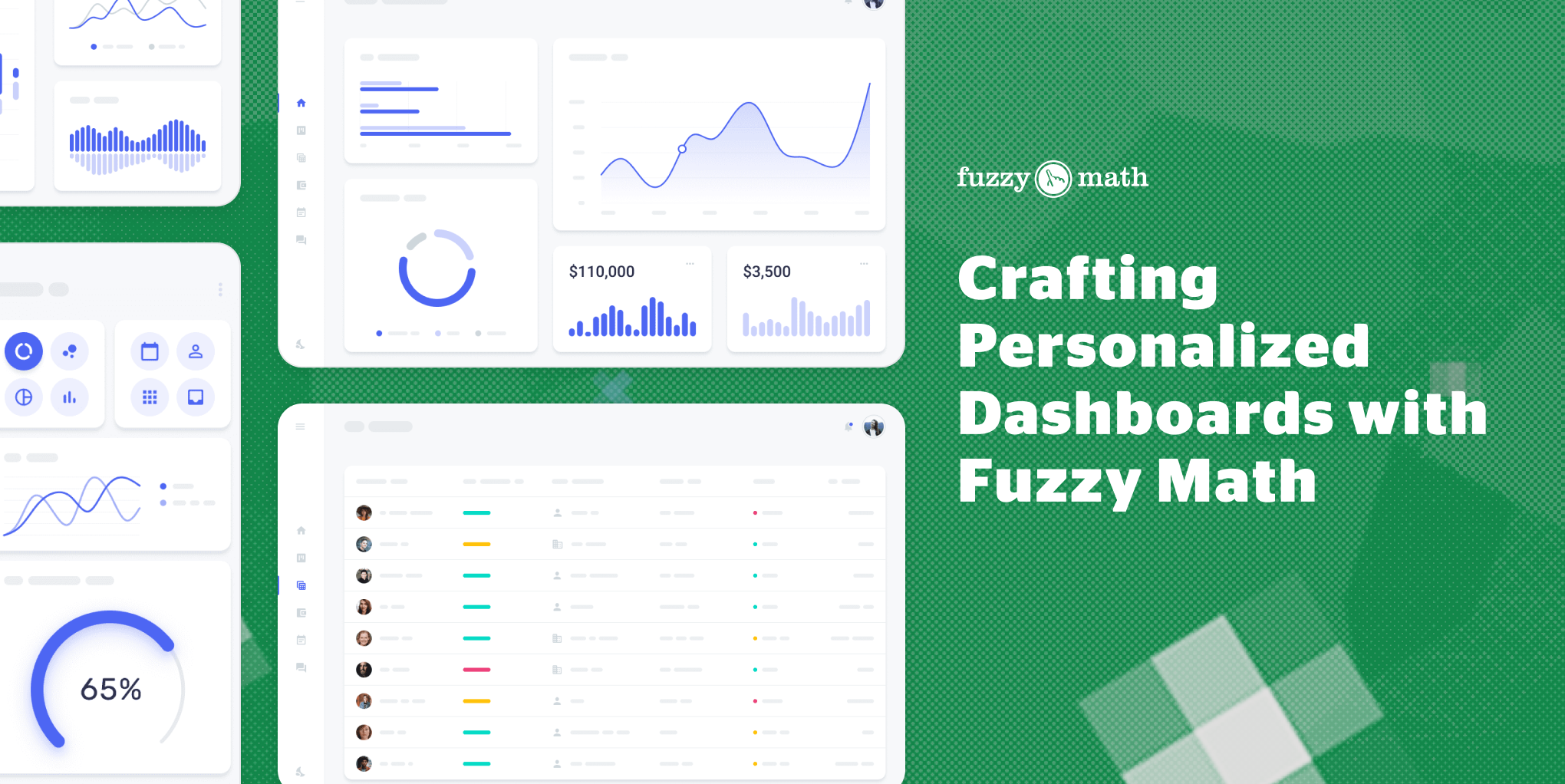
In this age of information overload, we’re practically swimming in data. That’s why clients trust us to make custom, visually engaging dashboards that effectively convey their desired data and integrate their branding.
Why choose a custom dashboard?
It’s the classic build vs buy conundrum of whether to develop a custom dashboard or buy a templated dashboard. Third party tools like PowerBI do work well as a hybrid solution to pulling data and displaying it in a custom format. The challenge arises when existing solutions don’t provide clients with the level of data exploration needed to take actionable next steps.
Mark Baldino, co-founder of Fuzzy Math details why a custom dashboard solution may be right for you:

”Custom dashboards are more likely to be action-oriented. I like to use the term ‘guided analytics’ when talking about what you can get from a custom dashboard. Instead of just giving some of the metrics (which is a visual report) when you go custom you can allow them to go deeper into the data and then take action with that data. For example, I look at a utilization report — and then double-click in deeper — and maybe it takes me into a guided workflow where I can change the parameters or do scenario planning. What if we did A, B and C scenarios and how does the utility report change? That would be impossible on a third party platform.”
It comes down to asking yourself, Are you satisfied with just glancing at data? Or are you ready to invest in actionable insights that drive real improvements within your organization?
Let’s dive into how Fuzzy Math designers tackle dashboard design from a UX and visual design perspective.
One senior designer at Fuzzy Math outlines how they categorize dashboard types:

Landing page dashboard
This dashboard is the first thing you see when you log into a tool. Users can see high level, time sensitive information in real time and are given the ability to dig deeper into it through managing the data, running reports, or editing something. This dashboard type can be further narrowed down into operational and tactical dashboards as they offer day-to-day information and require swift action.
Big-picture view dashboard
This type of dashboard is reserved for understanding big-picture data. Users will have the ability to save, customize, and share data for analysis and decision making purposes. When tools require this type of dashboard it will usually have its own section within the tool. This type of dashboard can be narrowed down into analytical and strategic dashboards because they provide in-depth analysis and trends while not needing to take immediate action.
Identifying the Purpose
The purpose of the dashboard should be defined before considering the UI to account for different user types and mental models and adjust the layout and flows accordingly.
Some questions to consider:
- How do different user roles influence the purpose and content of the dashboard?
- How does the dashboard contribute to solving users’ challenges or addressing issues?
- What decisions do users need to make based on the information presented?
- What needs their attention?
Dylan Drooger, a UX designer at Fuzzy goes on to explain,

“We need to determine what the user is going to need a dashboard for since we need to understand which data to present and how to present it. Aiding a trader to track stock market price movement calls for real-time data that can be acted on immediately while the manager of the trader calls for very different views of that same dashboard.”
Through conducting qualitative research (user interviews and watching people use the tool) we get a better understanding of how to tailor a dashboard to different user types. A great example of this comes from a solution we delivered to a client within the cybersecurity space where we designed a customizable dashboard with role-based access to allow users to see data that was relevant to their role.
Storytelling through data
Dashboards are data rich and dynamic in nature, unfortunately this means many designers can get carried away and overload users with too much information. Our understanding of the users can help us determine what they don’t need; for example, sometimes a large detailed table view of data can be condensed into a high-level number within a card.
A senior UX designer at Fuzzy Math details her approach to including relevant information in a previous dashboard design:
“What really drove our decision making process came from research and seeing that users had to be experts in not only the tool but also the back end in order to see the data they wanted to see. How we ended up approaching the dashboard was leveraging the data to tell the story – which is a big piece I think of whenever I design for dashboards. While we want to provide enough data for the user, we don’t want to provide the data that doesn’t contribute to the story the dashboard is telling. For example, our aim for the homepage dashboard was to help them be proactive in finding security threats rather than reactive. So we curated the dashboard to show which assets were at a higher risk of being exposed. We also curated it to the user type as well. For each of the four personas created, we recommended a different dashboard so that they would be able to see a holistic view of their data before diving into the details they cared about.”
Making a good looking dashboard
Fuzzy Math runs visual design workshops with its clients to get a better understanding of how their product can best utilize their branding as well as create an unique and visually appealing UI. Strategic use of color and accessibility are always at the forefront of our approach but the nuances of the visual design are up to the discretion of the designer.
Tré Wilson, a visual designer at Fuzzy Math details his approach to creating an appealing and functional UI:

“Good dashboard design requires intentional use of color, size, and other visual techniques for people to quickly understand data. So I’ll collaborate with UX designers to identify data types and emphasize key points which can be a good opportunity to utilize the client’s primary brand color. I like to use tools like Data Color Picker and Viz Palette to aid in creating accessible, contrasting color palettes. Keeping things like grid lines, unnecessary labels, icons, or anything else that doesn’t actually communicate data can make the process of interpreting the data easier.”
While third-party tools like PowerBI offer convenience, custom solutions provide unparalleled depth and flexibility critical for organizations seeking actionable insights. At Fuzzy Math, our designers take the time to understand what information your team needs. We then build dashboards that are easy to understand and visually appealing. These dashboards focus on presenting data in a way that tells a clear story. By making dashboards user-friendly and informative, we help organizations make better decisions and achieve their goals.
Sources
-
Part 1 — BI Tools vs. Custom Dashboard by Kalyan Chatterjee