What is end user experience monitoring?
In the UX universe, studying the way users experience a product or service goes far beyond the design process. Once an application is in place, companies carry out a process known as end user experience monitoring to examine how well their site or application performs overall.
End user experience monitoring is typically focused on indicators such as application response times or availability, the ease of using the application, or the number of calls users place to the help desk asking for assistance.
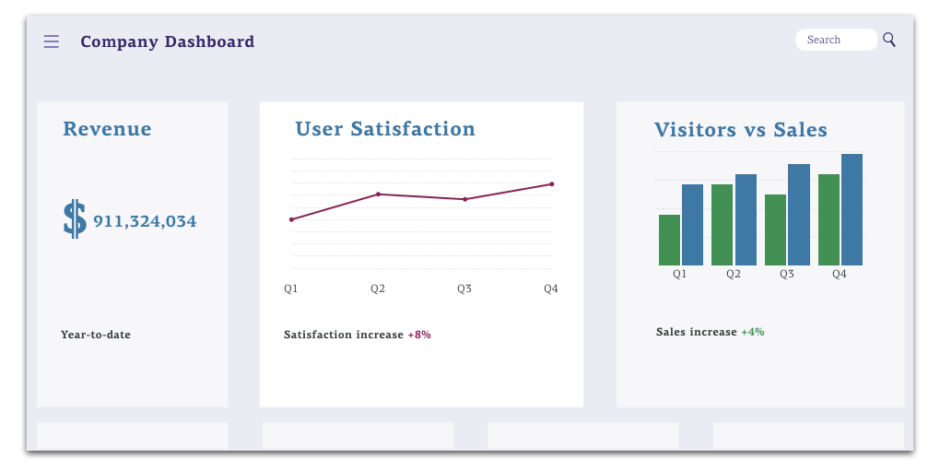
Similarly to how the best design departments and businesses create KPIs to track performance, IT KPIs related to the end user experience can provide quantitative evaluations of the digital experience. Though outside the purview of UX design firms, end user experience monitoring can help identify sticking points and can be used to show how design changes improve app or website performance. In this sense, end user experience monitoring helps optimize IT investments while also improving the end user experience.
Methods and strategies
There are two main types of technologies used in end user experience monitoring. Together, they provide a comprehensive look at the quality of a user’s interaction with a product. The first type is active or “synthetic” monitoring, which simulates a user’s interactions with applications and tracks system performance—through metrics like response time—of an application over the course of that interaction. The second is passive or “real user” monitoring, which tracks actual users and their key metrics, such as response time.
It has been noted that synthetic monitoring and real user monitoring are trending towards becoming increasingly interwoven. And the trend makes sense; by combining active and passive end user experience monitoring, the process becomes predictive rather than just reactive. Companies can use metrics to help predict where users may have issues in the future, which allows them to resolve those issues before real users are impacted.
Our approach—is monitoring enough?
As useful as end user experience monitoring can be, it’s not enough to provide a full picture of how users think about a given tool. At Fuzzy Math, we spend time doing user research, monitoring KPIs and design metrics, and talking to your users in order to gain a holistic view of your end user’s experience.
Here’s an example: one client’s data from end user experience monitoring indicated that its users weren’t using a certain tool, so they hired Fuzzy Math to redesign it. But when we talked with their users, we learned that there were several intersecting factors leading them to avoid the tool.
By sitting down with users and observing their process, we were able to recognize that this particular tool wasn’t necessarily the problem. Instead, users reported feeling frustrated at slow response times and having to navigate through dozens of tools in a vast ecosystem in order to find the piece of information they were looking for. We were able to use this knowledge to pivot the project from a tool rebuild to a larger digital transformation strategy addressing the underlying issues.
Our experience with this client does a great job of highlighting the importance of sitting down with users. There are several elements that might affect end user experience monitoring but won’t be clear unless you talk to your users. For instance:
- Is it slow?
- Are there data reliability issues?
- Do they even know that this feature exists?
- Is there something about the tool that makes it unappealing to use?
In another example, we had a client come to us whose original website wasn’t optimized for mobile. They wanted to change that, given that analytics data said nearly half of their traffic was from mobile users. However, we knew that there was more to the picture; instead, we worked with them to redesign their site responsively so that content functioned appropriately across every breakpoint between mobile and desktop. That task included customizing some types of content with unique functionality on a given type of device.
If you’re wondering whether your application needs end user experience monitoring, consider a more holistic investigation, such as a site review. In this process, UX and visual design experts take an objective look at the application and report back on any usability, experience, or UI design issues they identify.
A site review at Fuzzy Math can consist of a few different parts:
A UX review
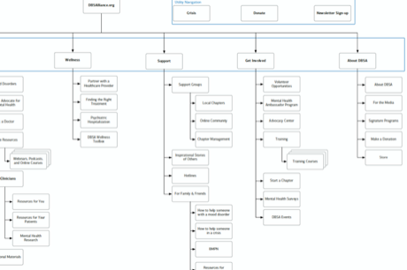
In this step, we evaluate aspects like how easy it is to navigate the site, how well interactive elements work, how clear the purpose of a given page is, and how clear forms and system messaging, such as errors, are. Examples of issues we’d draw attention to include inconsistent or confusing navigation, as informed by Google Analytics data about which pages are visited most.
It can also include a scored heuristic evaluation, where we rate a wide variety of factors that contribute to a user’s experience and output scores for the categories above.
A visual review
This component of a UX review focuses on aspects like how well colors work together, how consistent existing designs are, how clear the content and typographic hierarchy is, and how well the brand’s personality is conveyed. If your site has overly text-heavy landing pages or narrow columns that make it cumbersome for users to navigate, we’ll explain why it’s problematic and highlight ways to improve it.


A content inventory
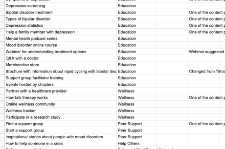
In addition, we create a spreadsheet, known as a content inventory, that details all of the content on each existing page. While building the spreadsheet, we take note of any content redundancies, duplication, and mismatches to ensure that we can both account for all necessary existing content and come up with ways to sort it more effectively.
What’s next?
Once we complete the UX review, we present our most important findings and strategic suggestions in a detailed but easy-to-navigate slide deck. We present it to our clients with opportunities for questions and feedback.
While end user experience monitoring is an important tool in ensuring a great experience for your users, a comprehensive UX review is a much more effective way to go about it.
Think Fuzzy Math can help?
