
The software product world is filled with unhappy customers who, in many cases, use software created by top-down approaches. This unhappiness can be solved by reorienting your product design and development process, and in a perfect world your entire organization, to be oriented towards the voice of your customers and their true needs.
Three failed approaches
We often run into three top-down approaches that fail often because they don’t consider what users want:
- Creative-directed approach that starts with what looks really great
- Market-directed approach that starts with what can be sold
- Engineering-directed approach that starts with what can be built
All of these approaches fail because they don’t deliver tools and apps aimed at user’s true needs and goals. They are top-down, forcing a creative direction, sales strategy, and/or piece of technology down onto users. Instead, companies should consider a bottom-up, user-directed approach that solves for these issues by truly enabling the voice of the customer to be heard throughout the design and development process.
As is always the case, no one approach should live on it’s own. Let’s examine how each of these three approaches must be adjusted, not entirely replaced, to include the user.
Creative-Directed Approach
Culprits
Marketing and advertising agencies, or the unicorn artist or visionary
Typical Result
Polished look with little substance
We firmly believe that creativity plays an important role in the design of a great digital product and that aesthetic design can be a huge differentiator between products. There are very successful apps (hello Snapchat) that have gained popularity based on their ability to look really great while connecting emotionally to their users. But problems arise when creative people design products in a silo. Their hope is that the superficial flash associated with their product creates enough of a bond for people to stick around. Most users aren’t willing to give products like this enough time. For example, a few years back our team had great hope for the nice looking app ThingList, but we found little more than looks and no improvements over simpler but uglier alternatives. The problem is that products like this can look polished but have very little substance. Users feel tricked that so much time, effort, and money was spent on aesthetics with little regard for the usability or the utility of the product. They will more often than not leave and never return. Creative-directed products aren’t necessarily all bad, and many succeed, but leading with an aesthetic vision for a product introduces a level of risk that can easily be reduced by studying your users, what they need, and providing an aesthetic design system to match. In Fuzzy Math’s design process aesthetics (visual) design is always directly influenced by our understanding of the user’s goals, wants, and needs, and layered on top of high value functionality. The foundation for the best creative design is user-centered.

Market-Directed Approach
Culprits
Agencies and internal marketing team
Typical result
Projected market did not match user needs; Market never materialized
Like creativity, determining that there is a market for your product is important because most products and services cannot exist without generating revenue. But the failure of the market-directed approach is to seek out the market first and then build a product to fit that market. Many times the market was a myth or a trend that didn’t actually materialize, as was seen with interesting, but now shuttered products like Google Glass. Another problem arises when a product was designed and developed to fit this market definition without considering the actual customer need. Emblematic of this problem are copy cats, people entering a market because someone else had success. The claim is that because an app like Slack succeeded, there should be plenty of space in that market for competition from someone like Microsoft. But just because one product survived in the market, think of the failed Facebook clones, doesn’t mean it requires another entrant. It’s much more likely it was a short term trend or something else that made the first-to-market player a success. As user-centered designers we are routinely made aware of market research and the resulting expected consumer behavior. This research is always targeted at what can be sold and rarely on the why: what people actually want or need. And so while important, market research should be heavily influenced by open-ended user research that explains “why” someone needs something — understanding these deeper needs allows you to see beyond trends and markets to solve real problems for real customers. This is a better balance to bring a new product into market.

Engineering-Directed Approach
Culprits
IT-led organizations, engineers forced to design
Typical result
Unusable/difficult-to-use software
All software products and applications require engineering and development. Sadly, this is where the majority of products start and end. We continually encounter amazingly talented engineers that have been working on their product for years and have built something highly functional with an incredible technology layer. However these same engineers have been forced, through lack of knowledge or funding, to design their product themselves. They are happy to encounter a user-centered firm that will take the burden of delivering a positive user experience. In many ways this isn’t a surprise. Out of all of the approaches discussed, engineering is the only one required to get a product out the door. And, therefore, it is sometimes the only one that gets considered. There are also companies that are so excited about their technology (remember 3D TVs or even the previously mentioned Google Glass) that they release it to the market because they can do it, not because they should. Not because anyone wants it.
If there is an example of a long suffering end-user, it’s those forced to use enterprise software that hasn’t embraced any sense of usability or experience design. But today even enterprise companies are facing increased competition from consumer apps or consumer-oriented enterprise applications. All users have choice and when they encounter powerful software that is hard to use, they will opt for easier, less powerful software. But not all is lost in the engineer-lead product company. In fact it’s the most fertile ground for user-centered-design, and why we’ve made it a core component of our work to solve problems in the enterprise software space. To add further hope to the engineering-directed approach, you can see success in companies, like Google, that started in this fashion and shifted. Google was led by an algorithm, then backed into various markets to generate revenue, and eventually shifted into making user-centered design a critical components of their products. This engineering led model — build something, test, and refine — is a successful one. But there are simple ways to add user-directed methodologies to existing development and engineering focused organizations. Conducting user research and interface design rapidly, before development, will result in less product churn, and save time, energy, and resources building something no one wants to use.
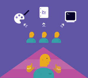
The solution: Integrate a user-directed approach
This article wouldn’t be very helpful without recommending how these three top-down approaches can be modified by thinking and acting more user-directed. In fact, this eliminates the downward pressure from others onto the user and instead puts users in charge. Then as designers, product people, marketers, salespeople, developers, and engineers we can be enablers of the voice of our customers in our product and service. The role of a user-centered designer is to listen to users, synthesize that research, and then advocate for the goals and needs of the user. Our job is to listen and amplify so that we place the user at the center of the equation and building products to meet their needs. This reduces the number of assumptions or reliance on third-party data. It ensures you aren’t providing a piece of technology that no one wants. It’s much less risky, and the upfront investment will reduce the overall churn on a project. There are plenty of user-directed product success in the market, such as AirBnB and MailChimp that have embraced a design-first approach while still having a healthy respect for creativity, marketing, sales, and engineering.
Conclusion
While we’ve pointed out a number of areas where the other approaches can succeed, it’s also important to understand where and why they fail. And it is in these failures we can advocate for a reorientation of an organization’s’ processes. We ask you to consider becoming more user-directed, combining this approach with existing creative, marketing, sales, and engineering so that you have the best blend: a usable product that is truly desired by users and that looks and feels pleasing, is technically robust, and generates revenue.
