Julia and Rachel here.
Recently we had the opportunity to take part in an expedited service design project, which involved re-organizing our office kitchen and food experience.
As interactive designers, we mainly exercise our problem solving skills visually, in a digital space. Rarely do we get the chance to enter the world of our UX colleagues and learn about their methods and processes. Join us as we apply some service design processes to our project.
With a hunger to learn we took to the Kitchen.
The Dilemma
Make no mistake, Fuzzy Math’s kitchen is small but mighty. It’s filled with food, drinks, and an espresso machine (that may or may not be a spaceship). We’ve got it pretty good, and when it’s Thanksgiving everyday, “What’s the problem?” you may wonder.
As the amount of food ordered is directly correlated with our office’s continual growth, the line between, “Who orders when?” and, “Can I eat these Eggos?” starts to become blurry.
We recognized that there was an opportunity to let the visual design team take a chance to learn and acquire new skills while helping tackle an internal issue that was making everyone hangry.
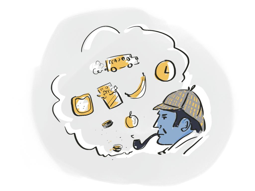
With the guidance of two UX designers, we put our thinking caps on and became service designers detectives.
Stickies (Contextual Research)
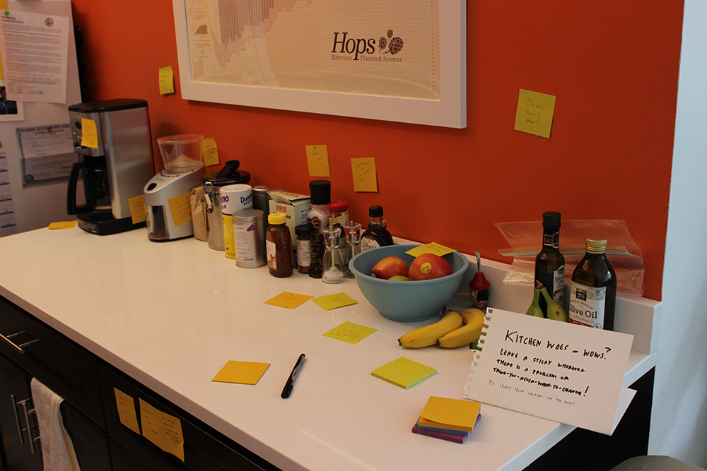
After an initial goals meeting with the UX team, we found that while we could recall general frustrations, yet specifics seemed to elude us. This inspired our decision to use sticky notes as a method of collecting real-time data from people who were using our kitchen. We encouraged our team to write down things they noticed and other opportunities for improvement, and to physically place them in relevant locations. By having a pad of sticky notes on the table, the burden of recalling feedback was virtually nonexistent.
We quickly discovered two things:
People have an easier time identifying pain points when they have a chance to make a note while living through them. The opportunity to quickly jot down a frustration and physically see it in the space creates a good visual representation of where to start looking for answers.
 Secondly, As the few allotted days went by, the stickies quickly multiplied. The kitchen was glittered with feedback. With the volume of insights in plain sight it became clear that there were things that needed improved. What was unclear, as there was a disconnect between user and researcher, was what priority to give to each note.
Takeaways:
• Do not underestimate the anonymous power of opinion to influence feedback.
• Outline clear goals, and have your goals in mind after each step to avoid shifting your focus.
User Interviews
After collaborating with our UX team to create a session guide, we began interviewing around the office. Something we quickly learned about the interview process was that it was challenging to juggle interviewing alone and notetaking.
“I did one interview without a notetaker and I had to stop often to write my thoughts and it broke up my train of thought, making the interviewee have to wait for me to stop typing to rejoin the conversation.” —Rachel V.
After a couple interviews in, we decided to pair up and iron out our previous dilemma.
Conducting user interviews was foreign territory for both of us, so having a session guide was immensely helpful for keeping us on track. The session guide functions like a set of cue cards, but ideally the conversation should ebb and flow around the questions so that you don’t feel like a drill sergeant.
Takeaways:
• Respect the interviewee’s time: People have things to do
• Have a sidekick/notetaker/timewatcher
• You could potentially lose a lot of input going at it alone
• Keep in mind the most critical questions to ask, but don’t be afraid to go off script
• Try not to pigeonhole or drive the conversation too much
• Record everything, and sort it out later
Synthesize Findings
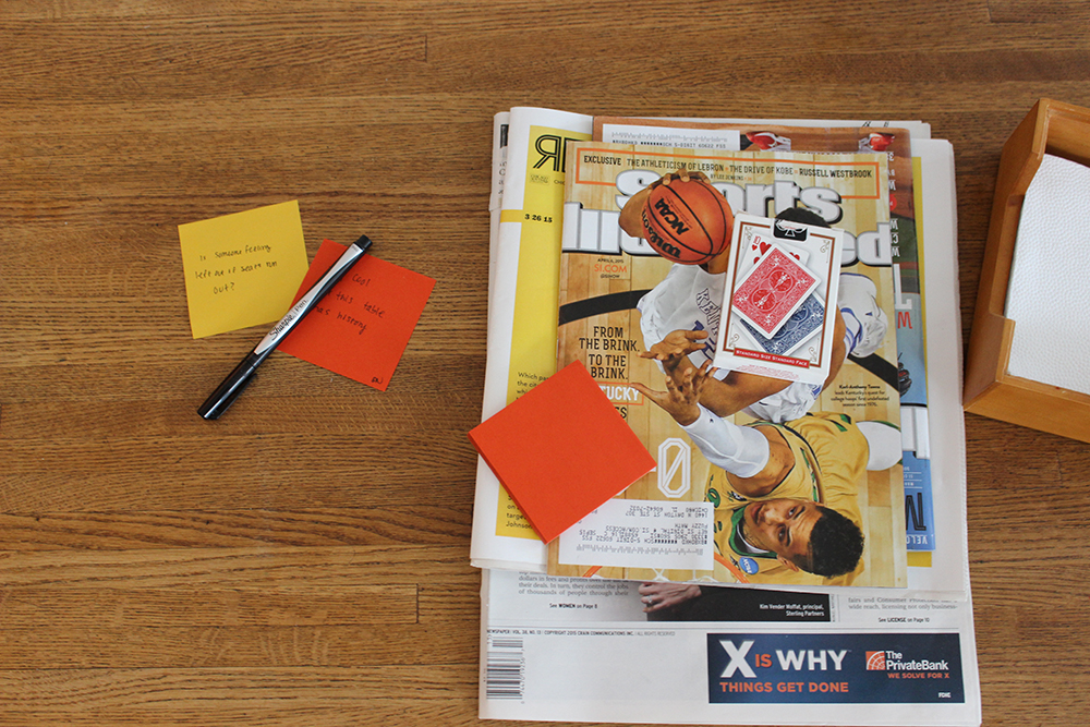
Thanks to our combined efforts of tag-team interviewing, we had a pow wow to map out the main themes/issues that were coming up for the “users.” For this session we got out our trusty sticky notes and wrote down comments that stood out. Through affinity diagramming, we categorized our findings, starting with broad categorizations until more specific groups started to emerge.
Takeaways
• Organize your notes so it is is easier to combine them with other interviewers if that is the case
• Start with broad categories and then start narrowing them down as trends emerge
• Work on finding themes (whether that be similar or distinctly different themes)
• Pull out positives and negatives — everything is insightful
• Gauge the most important themes for the scope/time
Strategic Opportunities
Both our audience and we the presenters were enlightened by the findings. We identified three distinct opportunities that could be improved to benefit our overall food experience:
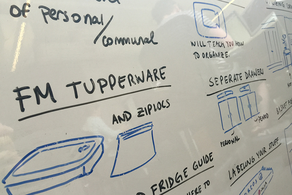
• Create a distinction between communal and personal items
• Define a more efficient process for maintaining a steady food supply
• Build a more defined system for effective organization
With these opportunities in mind, we broke off into groups and brainstormed specific ideas to improve our kitchen experience.
Takeaways:
• Finding solutions that can be easily implementable can be a challenge
• Keeping the ball rolling on internal projects
• Documenting the process from beginning to end
Summary
Our familiarity with the space (kitchen) and our user base (co-workers) allowed us to bring our own bias and personal experiences. While this helped us immensely with understanding the problem, we recognize that it is a luxury client work doesn’t often provide.
Given the limited time we had allotted to this service design project, we only experienced a sneak peek into a much more in depth and immersive process. As visual designers at a UX shoppe, we’re always looking for new ways to grasp the ins and outs of the UX process, to better understand decisions made, and to discover how we can better serve our clients. Most of this project was learning by doing and doing to learn, the best way if you ask us.


